

The Essential Guide to UI Design
.pdf190 Part 2: The User Interface Design Process
Display/read-only screens. For inquiry or display/read-only screens, it is best for the data to be presented on the background of the screen. This permits easier scanning and information location; the reasoning will be discussed in the “Display/Read-Only” screen organization section following shortly.
Temporarily inactive fields. If a displayed field is temporarily inactive, display the data content of the field lighter than the data content of active fields. Do not change the background color of the entry area or lighten the caption.
Visual emphasis. Data or information is the most important part of any screen. It should be highlighted in some manner, either through higher intensity, boldness, or a brighter color. Headings and captions are most important for the new or casual user. As people become familiar with a system and screens, their attention is immediately drawn to the data when a screen is presented. An experienced user will often work with a screen just perusing the data, ignoring captions and headings. Highlight the data so it will attract the user’s eyes. Other screen elements will be easier to ignore.
Control Caption — Data Field Differentiation
■Differentiate captions from data fields by using
—Contrasting features, such as different intensities, separating columns, boxes, and so forth.
—Consistent physical relationships.
Figure 3.22
■For single data fields
— Place the caption to left of the data field.
Figure 3.23
—Align the caption with the control’s data.
—Alternately, place the caption above the data field.
—Align captions justified, upper left to the data field.
Figure 3.24
—Maintain consistent positional relations within a screen, or within related screens, whenever possible.

Step 3: Principles of Good Interface and Screen Design 191
■For multiple listings of columnar-oriented data, place the caption above the columnized data fields.
Figure 3.25
Captions must be complete, clear, easy to identify, easy to scan, and distinguishable from other captions and data fields. Captions must also be clearly related to their associated data fields.
Differentiating captions from data. Captions and data should be visually distinguishable in some manner so that they do not have to be read in context to determine which is which. A common failing of many past screens is that the captions and data have the same appearance and blend into one another when the screen is filled. This made differentiation difficult and increased caption and field data search time. Methods that can be used to accomplish differentiation, in addition to designating captions with a colon, are using contrasting display features and consistent positional relationships.
Single data fields. The recommended location for the caption is to the left of the data field and horizontally aligned with the field data. Alternately, the caption for a single data field may be positioned left-aligned above the data field. Maintain consistent positional relationships within a screen, and between multiple related screens whenever possible.
Columnar-oriented listings. For multiple listings of columnar data, place the caption above the data fields. Left/justify the caption above the data fields. Use horizontal caption formats for single fields and a columnar caption orientation for repeating fields to provide better discrimination between single and repeating fields. The single-field caption will always precede the data, and captions for repeating columnar fields will always be above the top data field.
Control Caption — Data Field Justification
■1. First Approach
—Left-justify both captions and data fields.
—Leave one space between the longest caption and the data field column.
Figure 3.26
192Part 2: The User Interface Design Process
■2. Second Approach
—Left-justify data fields and right-justify captions to data fields.
—Leave one space between each.
Figure 3.27
Figures 3.28 through 3.44 contain a series of screens in a variety of formats containing either entry/modification fields or display/read-only fields. The author’s comments are found with each screen. What are your thoughts?
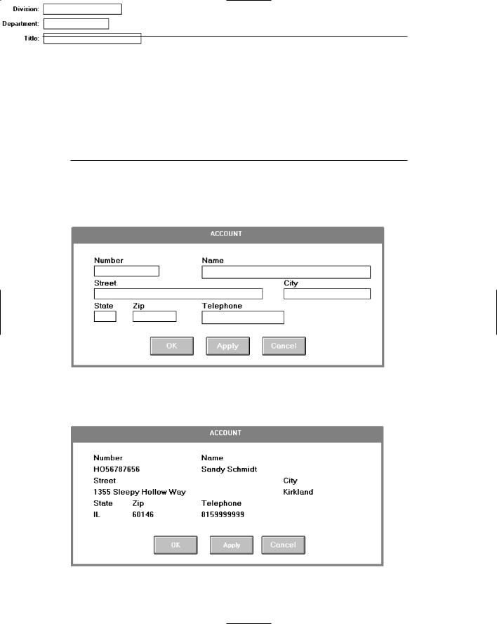
Figure 3.28: Entry screen with captions above single data fields. Captions distinct from data but with poor alignment and organization of fields. Left-to-right orientation and no groupings. Fair readability.
Figure 3.29: Display/read-only inquiry screen maintaining same structure as 3.22. Extremely poor differentiation of captions and data. Crowded look and extremely poor readability.

Step 3: Principles of Good Interface and Screen Design 193
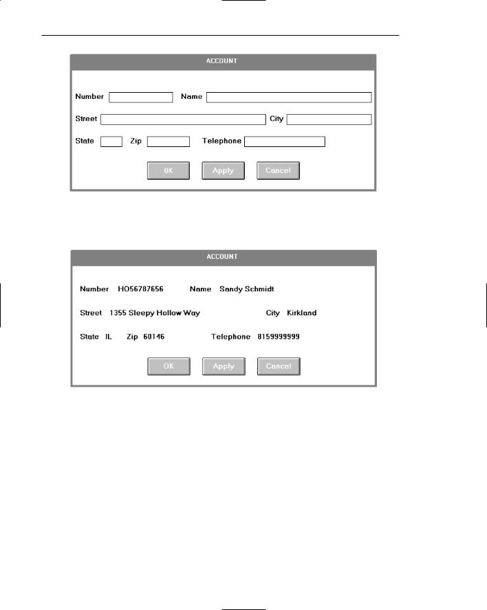
Figure 3.30: Entry screen in 3.28 with colons attached to captions. Captions somewhat more distinctive but still with poor alignment and organization of fields, left-to-right orientation and no groupings. Fair readability.
Figure 3.31: Display/read-only screen maintaining same structure as 3.30. Somewhat better differentiation of captions and data than 3.29 but still with a crowded look and poor readability.
194 Part 2: The User Interface Design Process
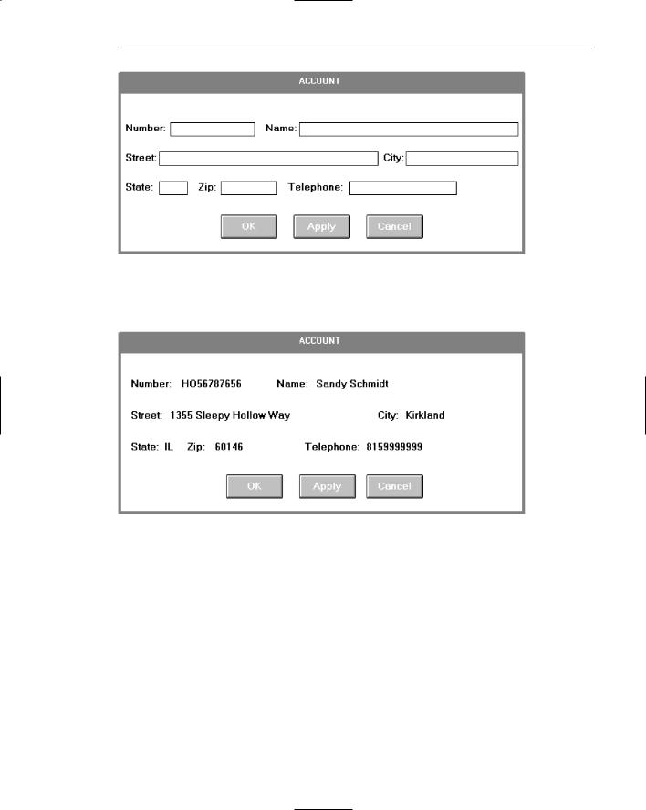
Figure 3.32: Entry/modification screen with captions to left of single-data fields. Captions distinct from data but with poor alignment and organization of fields. Left-to-right orientation and no groupings. Fair readability.
Figure 3.33: Display/read-only screen maintaining same structure as 3.32. Extremely poor differentiation of captions and data. Less crowded look than previous display/inquiry screens but still poor readability.
Step 3: Principles of Good Interface and Screen Design 195
Figure 3.34: Entry/modification screen in 3.32 with colons attached to captions. Captions somewhat more distinctive but still poor alignment and organization of fields, left-to-right orientation, and no groupings. Fair readability.
Figure 3.35: Display/read-only screen maintaining same structure as 3.34. Somewhat better differentiation of captions and data than 3.33 but still poor readability.

196 Part 2: The User Interface Design Process
Figure 3.36: Entry/modification screen with much better alignment and readability than previous screens. Captions crowd data fields, however. Also, has no groupings and does not maintain post office suggested format for City, State, and Zip.
Figure 3.37: Display/read-only screen maintaining same aligned structure as 3.36. Captions not very distinctive and poor readability. Again, it looks very dense and crowded.

Step 3: Principles of Good Interface and Screen Design 197
Figure 3.38: Entry/modification screen with the better alignment and readability of 3.36. Caption positioned to left, however, resulting in more distinctive data fields. Still no groupings, though, and does not maintain post office suggested format for City, State, and Zip.
Figure 3.39: Display/read-only screen maintaining same alignment and positioning of captions of 3.38. Captions and data much more distinctive. Still no groupings though, and does not maintain post office suggested format for City, State, and Zip.
198 Part 2: The User Interface Design Process
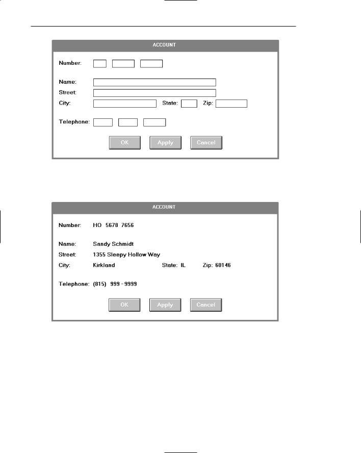
Figure 3.40: Entry/modification screen providing alignment, groupings, and the suggested and familiar post office address format. Data fields also segmented to enhance readability (Number and Telephone).
Figure 3.41: Display/read-only screen maintaining same item alignment and positioning, and data field segmentation as 3.40. Some data distinctiveness is lost and minor crowding occurs, however, because of the location of the captions for State and Zip between data fields.
Step 3: Principles of Good Interface and Screen Design 199
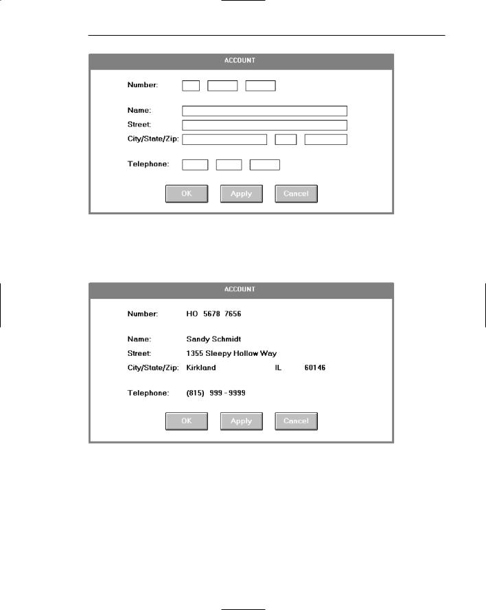
Figure 3.42: Entry/modification screen identical to 3.40 except that captions for State and Zip are stacked with City, enhancing distinctiveness and readability of the data fields. The screen also achieves a more compact and balanced look. The recommended style for this kind of entry screen.
Figure 3.43: Display/read-only screen maintaining same alignment, item positioning, and data segmentation as 3.42. Good readability but the lengthy caption City/State/Zip does impinge upon the distinctiveness for the data.