

The Essential Guide to UI Design
.pdf270 Part 2: The User Interface Design Process
Scale interpretation. Provide aids for scale interpretation. When reading accuracy is extremely critical, provide computer aids for interpretation, such as the following:
■■Displaying a fine grid upon request.
■■Vertical and horizontal rules that the user can move to the intersection point.
■■Letting the user point at a data item and having the computer then provide the exact values.
Consistency. Provide scaling consistency across two or more related graphics. If comparisons must be made between multiple graphs or charts, use the same scale for each. Data sets scaled differently lead to interpretation errors.
Labeling. Each scale axis should be clearly labeled in a conventional left-to-right reading orientation. A complete description of the values, with measurement units, should be provided. Do not, however, overwhelm the graph with tick labels. Default to a reasonable number of tick marks and labels.
Proportion
■Provide accurate proportion of the displayed surfaces to the data they represent.
■Provide proper proportion by
—Conforming to the shape of the data.
—Making the width greater than the height.
The displayed surfaces on graphics should be directly proportional to the numeric qualities they represent. Failure to display the correct proportions can create false impressions of magnitudes of differences in sizes or changes. This kind of graphical distortion can be eliminated through clear, detailed, and thorough labeling, a topic to be addressed shortly.
Provide proper proportion. When the relative proportions of a graphic are in balance, it looks better. Graphics should tend toward the horizontal, assuming a greater length than height. There are a number of reasons for this recommendation. First, people prefer this shape. Second, it is easier to read words arrayed left-to-right. Third, many graphics plot cause and effect relationships, with effect on the vertical axis and cause on the horizontal. An elongated horizontal axis helps describe the causal variable in more detail. If, however, the data being displayed suggests a shape either square or higher than wide, conform to the shape suggested by the data.
Lines
■Data lines should be the heaviest.
■Axes lines should be of medium weight.
—Extend the lines entirely around the graphic.
■Grid lines should be very thin or absent.
—Let the user turn the grid on or off.

Step 3: Principles of Good Interface and Screen Design 271
The most important part of the graphic is the data. Emphasize the data by making the data lines the heaviest. Of secondary importance are the axes lines. Display them in a medium thickness. Axes lines should be extended entirely around the graphic to create a rectangle (or box). This will define the graphic area and help focus attention on the data itself.
Grid lines should be avoided if at all possible, unless absolutely needed for accurate data interpretation. When included, grids should be in the background. Let the user turn the grid on or off as needed.
Labeling
A graph also needs a label for its title, the axes, its key or legend, and its data. First, however, some general labeling guidelines follow.
■Employ clear, detailed and thorough labeling.
■Maintain a left-to-right reading orientation.
■Integrate the labeling with the drawing.
—Do not curve letters to match the shape of curved lines.
■Use only one typeface, font, and weight.
—For emphasis, use different type sizes.
■Do not separate labeling from the data through ruled lines.
Clear and detailed. Employ clear, detailed, and thorough labeling. Words should be fully spelled out. Follow standard capitalization schemes, using both upper and lowercase, with lowercase used for textual information. Use the simplest and shortest word forms possible. If an abbreviation is necessary, use standard word abbreviations.
Left-to-right. Maintain a left-to-right reading orientation. Display all labels horizontally. Avoid words that are organized vertically or words that run in different directions. Whereas non-horizontal words on hard-copy graphics can easily be read by turning the paper, this screen capability is not available, nor yet easy to accomplish.
Integrate. Integrate the labeling with the drawing. Explanations on graphics help the viewer and should be incorporated as much as possible. Words are data, and they can occupy space freed up by nondata elements or redundant data. Integrating words and captions with the graphic eliminates the need for a legend and the eye movements back and forth required to read it. Also, incorporate messages to explain the data, and label interesting or important points. Never curve letters to match the shape of curved lines. This is terribly distracting. Run all text horizontally.
One typeface. Use only one typeface, font, and weight. Using the same type style for graphics and text aids the visual integration of the two. If text needs to be emphasized, use different type sizes.
Separation. Do not separate labeling from the data through ruled lines. Again, this creates visual noise and impairs proper associations.

272Part 2: The User Interface Design Process
Title
■Create a short, simple, clear, and distinctive title describing the purpose of the graphic.
■Position the title above, centered, or left-aligned to the rectangle formed by the extended axes.
■Spell it out fully, using a mixed-case or uppercase font.
A title should be brief and descriptive of the graphic. A title may be centered or flush left to the rectangle formed by the extended axes. Marcus (1992) feels that leftaligning it yields a stronger composition. Titles should be spelled out fully, and may be displayed larger, bolder, and in mixedor uppercase font.
Axis Labels
■Center the X-axis label below its scale.
■Center the Y-axis label above the scale or adjacent to the scale.
■State units of measurement.
■Provide information about the source of the data.
Center axis labels. Center the X-axis label below its scale. Center the Y-axis label above the scale or position adjacent to the scale. Avoid turning the label sideways whenever possible. If it must be positioned sideways, center it facing the scale. A facing position will make it more difficult to read, however. Never stack words on the Y-axis in a vertical format because the shape of the words will be destroyed and they will be difficult to read.
Units of measurement. Include the units of measurement in the axes labels. Show the name of the variable first and the unit of measurement immediately after or below the name.
Data source. Provide information about the source of the data. This information can be placed, in small type, below the X-axis label or in a caption. It can also be made available through online help.
Key or Legend
■ Incorporate a key or legend for complicated graphs.
If a graph is complicated and contains a lot of data and a lot of visual coding, use a key or legend. Although a key or legend is not as easy to comprehend as integrated labeling, its use is better than cluttering up a graph with too much integrated labeling, or presenting illegible labels. A key or legend should contain the name of the data series and the symbols or colors used to show the displayed data.

Step 3: Principles of Good Interface and Screen Design 273
Data Labels
■ Permit data labels to be turned on or off.
Data labels contain the names or values for individual data points. If they are always on, they can easily clutter up the graph. If they are always off, the viewer must look back and forth between the legend and the graph. Permit the user to turn labels on or off as needed.
Aiding Interpretation of Numbers
■Display a grid on request.
■Permit the viewer to click on a data point to display actual values.
■Show numeric values automatically for each point or bar.
■Permit the viewer to zoom in on an area of the graphic.
■Permit the user to change the scale values.
■Permit toggling between a graphic and a table.
Computer graphics, unlike paper graphics, can be easily manipulated. Fowler and Stanwick (1995) suggest that the interpretation of numbers in graphical displays can be aided by permitting the aforementioned actions.
Types of Statistical Graphics
Statistical graphics take many forms. There are curve and line graphs, surface charts, scatterplots, bar charts, histograms, segmented or stacked bars, and pie charts.
Curve and Line Graphs
■Display data curves or lines that must be compared in a single graph.
■Display no more than four or five curves in a single graph.
■Identify each curve or line with an adjacent label whenever possible.
■If a legend must be included, order the legend to match the spatial ordering of the lines.
■For tightly packed curves or lines, provide data differentiation with a line-coding technique, such as different colors or different line composition types.
■Highlight curves or lines representing important or critical data.
■When comparing actual to projected data
—Use solid curves or lines for actual data.
—Use broken curves or lines for projected data.
■Display a reference index if the displayed data must be compared to a standard or critical value.
■Display differences between two data sets as a curve or line itself.

274 Part 2: The User Interface Design Process
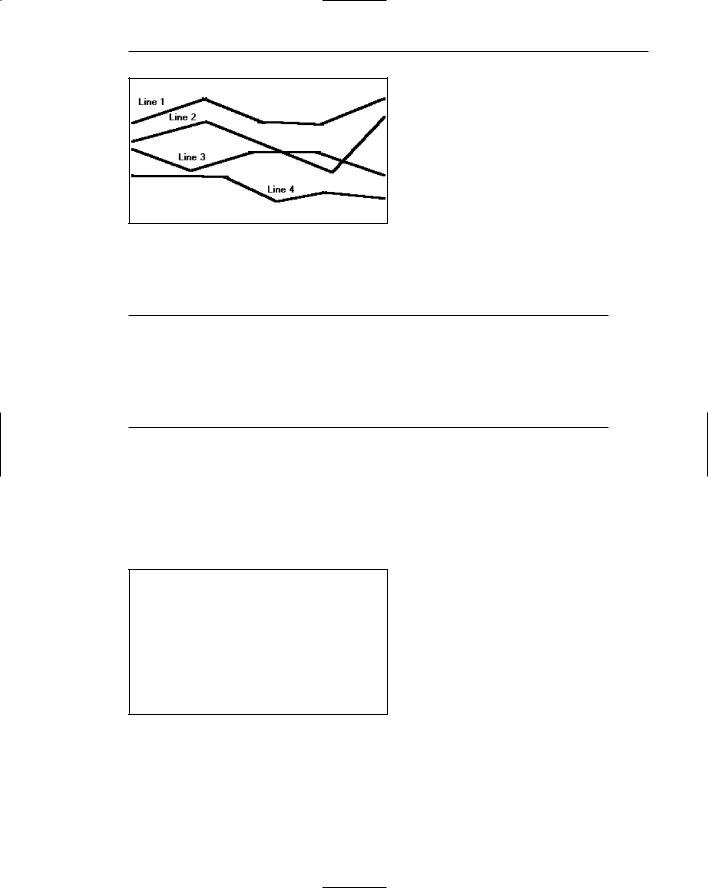
Curve and line graphs can be used to show relationships between sets of data defined by two continuous variables. They are especially useful showing data changes over time, being superior to other graphic methods for speed and accuracy in determining data trends. With a curve, a smoothed line summarizes the data relations. With a line, straight line segments connect the data plots. A line graph is illustrated in Figure 3.76. This kind of graph implies a continuous function. If the data point elements are discrete, it is better to use a bar graph.
Single graph. If several curves must be compared, display them in one combined graph to facilitate their comparison.
Four or five maximum. Display no more than four or five curves in a single graph. As more curves or lines are added to a graph, visually discriminating among them becomes more difficult. The maximum number of lines presented should be limited to four or five. If one particular curve or line must be compared to several others, consider multiple graphs where the line of interest is compared separately with each other line.
Label identification. Identify each curve or line with an adjacent label whenever possible. A label is preferable to a separate legend. If direct labeling is impossible due to the tightness of the lines, a legend may be the only alternative. If a legend is used, visually differentiate the lines (colors, line types, and so on), and include the coding scheme in the legend.
Legend. If a legend must be included, order the legend to match the spatial ordering of the lines. If legends are to be used on a series of graphs, however, maintain one consistent order for the legends on all graphs.
Tightly packed curves or lines. For tightly packed curves or lines, provide data differentiation through a line coding technique. Common coding techniques include different colors and line types. Do not exceed the maximum number of alternatives for the method selected, as shown in Table 11.1 in Step 11. If colorcoding is used, choose colors on the basis of the considerations described in Step 12. Line width and dot size coding should be avoided because of their similarity to grids and scatterpoints. If a series of related graphs are line coded, be consistent in the selection of techniques for corresponding data.
Important or critical data. Highlight curves or lines representing important or critical data. If one curve or line in a multiple-line graph is of particular significance, highlight that curve (high intensity, different color, and so on) to call attention to it. The coding scheme selected should be different from that used for spatial differentiation. Use solid curves or lines for actual data; use broken curves or lines for projected data.
Comparing actual and projected data. When a curve or line must be compared to a standard or critical value, display a reference curve or line reflecting that value.
Data differences. If the difference between two sets of data must be determined, display the difference itself as a curve or line. This is preferable to requiring the user to visually compare the two values and calculate the difference between them. If the difference between the related curves is of interest, consider a band chart where both lines and curves are displayed and the area between them coded through use of a texture, shading, or color.
Step 3: Principles of Good Interface and Screen Design 275
Figure 3.76: A line graph.
Surface Charts
■Order the data categories so that
—The least variable is at the bottom, and the most variable at the top.
—The largest is at the bottom and the smallest at the top.
■Use different texture or shading coding schemes to differentiate the areas below each curve or line.
■Incorporate labels within the bands of data.
If the data being depicted by a curve or line represents all the parts of a whole, consider developing a surface or area chart, as illustrated in Figure 3.77. In this kind of graph, the curves or lines are stacked above one another to indicate individual amounts or aggregated amounts. Each boundary height is determined by the height of the line below it, and the area between each line or curve is differently coded, usually by textures or shading. A surface chart is similar to a segmented bar chart.
Figure 3.77: A surface chart.

276 Part 2: The User Interface Design Process
Ordering. In ordering the data categories, place the least variable at the bottom and the most variable at the top. Irregularities in the bottom curve or line will affect those above it. This makes it difficult for a viewer to determine whether the irregularity in the upper curves reflect real data differences or is the result of this style of graph. Displaying the least variable data at the bottom will minimize this effect. Alternately, place the widest area at the bottom and the narrowest at the top. Wide bands look like they belong at the bottom, narrow at the top. If the data itself implies that some logical organization must be followed, and the resulting organization creates confusing distortions in the curves, this kind of graph should not be used.
Coding schemes. Use different texture or shading coding schemes. Ensure that the coding scheme chosen for each area is visually distinguishable from all the others. Place darker shades or colors toward the bottom.
Labels. Labels with a left-to-right reading orientation should be included within textured or shaded bands, if possible. Legends showing individual percentages, or cumulative percentages, should only be incorporated where space constraints exist within the bands.
Scatterplots
■Limit use to two-dimensional displays of data.
■Maintain consistent scale size intervals.
■Provide distinguishable, equal-sized plot points.
■If there is more than one set of data on the plot, use different symbols for each data set’s points.
■Visually distinguish points of particular significance through a highlighting technique.
Scatterplots can be used to show relationships among individual data points in a two-dimensional array. A point is displayed on the plot where the X-axis and Y-axis variables intersect, as illustrated in Figure 3.78. Correlations and trends on scatterplots can be indicated by the superimposition of curves (thus combining the scatterplot with another kind of graphic display).
Two dimensions. Limit scatterplots to two dimensions. Three-dimensional scatterplots, while possible, do not yield clear, unambiguous displays.
Consistent intervals. Maintain consistent scale size intervals. Inconsistent spacing size between scale ticks on the two axes will distort the displayed data.
Distinguishable plots. Construct the plot points of distinguishable, equal-sized circles, squares, rectangles, or diamonds. These symbols may be filled in or empty. Color may also be used to designate the points. Keep in mind that, when using color, different colors can look different in size, and some people using the graphic may be colorblind.

Step 3: Principles of Good Interface and Screen Design 277
Figure 3.78: A scatterplot.
Multiple data sets. If there is more than one set of data on the plot, use different symbols for each data set’s points. Choose distinguishable symbols from those described above.
Significant points. Visually distinguish significant points. Points of particular significance on scatterplots can be made distinctive through highlighting techniques such as the use of high intensity, different colors, or different shapes.
Bar Charts
■Orient bars consistently, either horizontally or vertically.
■Use vertical bars when the item being counted is of greatest interest.
■Use horizontal bars
—When the data labels are long.
—To highlight the information rather than the count.
■Use a meaningful organizing principle.
—If none exists, arrange the bars so that the length of bars is in ascending or descending order.
■Make the spacing between bars equal to one-half the width of the bars or less.
—If groupings of bars are presented, leave space between the groupings only.
■If different kinds of bars must be easily distinguished, provide differentiation through a coding technique.
—If possible, use a pattern or color that reinforces the data.
■Highlight bars representing important or critical data.
■Provide a consistent ordering for related groups of bars.
■Display a reference index if displayed data must be compared to a standard or critical value.
■Identify each bar with an adjacent label.
—Place labels below, or to the left of, the baseline.
■When a great many pieces of data must be compared, consider using histograms or step charts.

278 Part 2: The User Interface Design Process
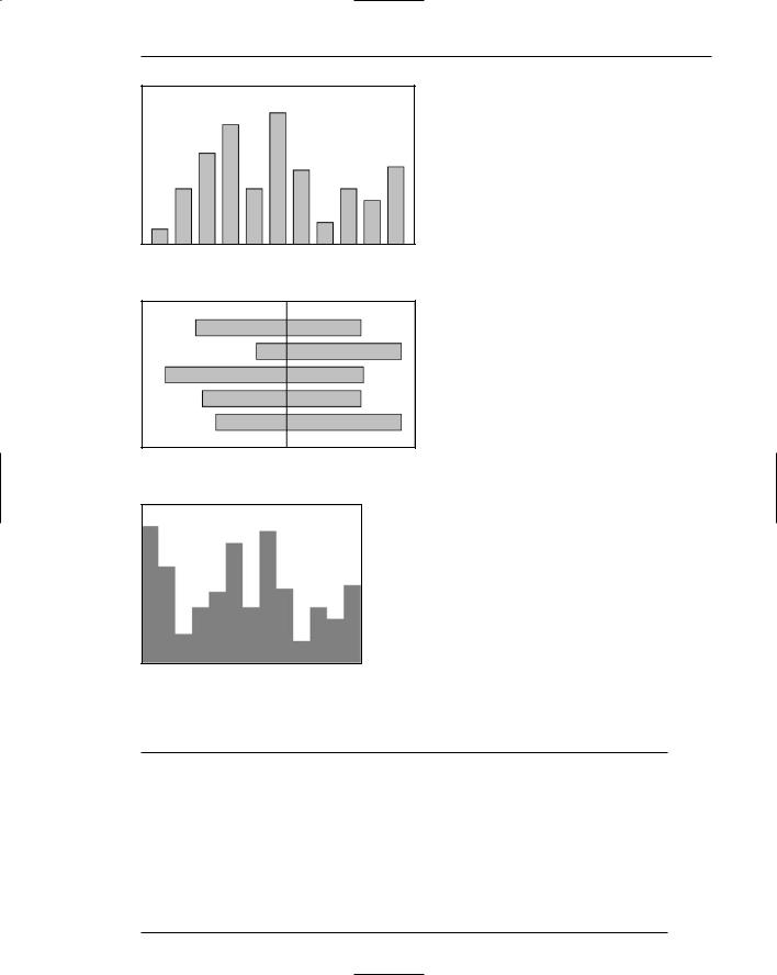
Bar charts can be used to show a few differences between separate entities or to show differences in a variable at a few discrete intervals. They are useful for comparing or ranking a small number of values — no more than 10 or 12. A bar chart consists of a series of bars extending from a common origin or baseline, as illustrated in Figure 3.79, or they may extend between separately plotted high and low points, as illustrated in Figure 3.80, having only one axis. Bar charts may be arrayed horizontally or vertically. Vertical bar charts are sometimes called column charts.
Consistent orientation. While bars may be oriented either horizontally or vertically, a consistent orientation should be maintained for bars displaying similar information. In general, frequency counts are best displayed in vertical bars. Also, use vertical bars when the values or count being displayed are of greatest interest. Use horizontally arrayed bars for time durations. Also use this orientation when the data labels are long and room is needed to present them, and when the information categories must be highlighted, rather than the count.
Meaningful organization. Use a meaningful organizing principle, such as volumes, dates, or alphabetical. If no meaningful principle exists, arrange the bars so that the length of bars are in ascending or descending order. If the information is being compared to a baseline or other comparative data, place the baseline bar to the far left or at the top.
Bar spacing. Space the bars for ease of visual comparison. Comparison of bars should be accomplishable without eye movement. Generally, the spacing between bars should be one-half or less of the bar width. If many bars are to be displayed, the alternating pattern of bright and dark bands that results can be visually disturbing to some viewers. In this case it is better to completely eliminate the spacing between bars. (The graph is then called a histogram.) If groupings of bars are presented, leave the space between the groupings.
Differentiation. If different kinds of bars must be easily distinguished, provide differentiation through a coding technique such as the use of color, texture, or shading. If possible, use a meaningful pattern or color that reinforces the differences.
Important or critical data. Highlight important or critical data. If one bar represents data of unusual significance, call attention to that bar through a different coding technique. Related groups of bars should be ordered in a consistent manner.
Related bar ordering. Provide a consistent ordering for related groups of bars.
Reference index. When bars must be compared to some standard or critical value, display a reference line to aid that comparison.
Labeling. A label associated with each bar, in left-to-right reading orientation, is preferable to a separate legend. Place labels below, or to the left of, the baseline. If the labels on a horizontal bar chart are short, left-align them. If they are long, right-align them to the axis. If groups of bars are repeated, it is only necessary to label one group rather than all bars in all groups.
Histograms or step charts. When a great many pieces of data must be compared, consider histograms or step charts. These are bar charts without spaces between each of the bars, as illustrated in Figure 3.81. The area of a bar in a histogram reflects the amount of the value; so all bars should be of equal width.
Step 3: Principles of Good Interface and Screen Design 279
Figure 3.79: A bar chart with a common origin point.
Figure 3.80: A bar chart with separately plotted high and low points.
Figure 3.81: A histogram or step chart.
Segmented or Stacked Bars
■Order the data categories in the same sequence.
■Order the data categories so that
—The least variable is at the bottom.
—The most variable is at the top.
■Limit the number of segments to those that are large enough to be seen and labeled.
■Use different texture or coding schemes to differentiate the areas within each bar.
■Clearly associate labels with bars or segments.
—Place segment labels to the right on a vertical chart or above on a horizontal chart.