

The Essential Guide to UI Design
.pdf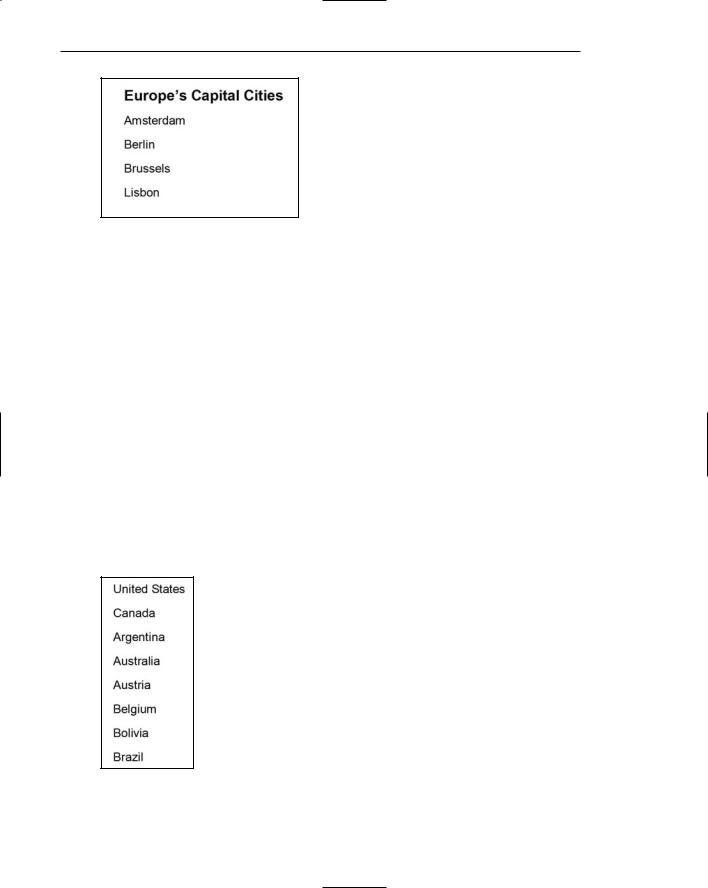
210 Part 2: The User Interface Design Process
Figure 3.59: A List Heading.
Ordering lists. Establish a list ordering that is most meaningful to the user. If a list contains important or frequently used items, locate them at the top of the list as illustrated in Figure 3.60. Studies show that experienced users usually look at the top item in a list first, and almost always look at the first three items before scanning down the list. Research also indicates that users stop scanning a list as soon as they see something relevant, reinforcing the need to place important items at the top (Koyani et al., 2004). Provide a consistent ordering scheme on all lists with similar content.
For list items of equal value, designate each item with a bullet or arrange alphabetically. For list items possessing a particular order, identify each item with a number beginning with the number 1, not 0. Numbered lists are especially important when the listing is a series of instructions.
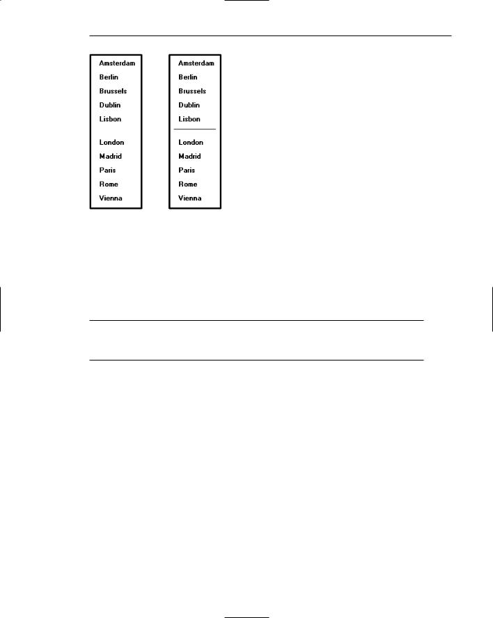
Formatting. A list should be easily identifiable as a list. Display techniques aiding a list being readily identified as a list include its vertical structure, a surrounding border, consistent backgrounds, a sufficient amount of surrounding white space, and appearance consistency between lists. See Figure 3.61. Scanning is aided by use of fonts of the proper type, size, and styles, and good character-background contrast.
Figure 3.60: Most important or frequently chosen list items at top.
Step 3: Principles of Good Interface and Screen Design 211
Figure 3.61: Lists with border and white space and divider rule separators.
Keying Procedures
For large-volume data entry applications substantial keying may still be required. The following must be considered in establishing keying procedures.
Keystrokes
■Do not focus on minimizing keystrokes without considering other factors such as
—The keying rhythm.
—The goals of the system.
A sought-after goal in many past data entry applications has always been to minimize keystrokes. Fewer keystrokes have been synonymous with faster keying speeds and greater productivity in the minds of many practitioners. But this is not always true. Fewer keystrokes may actually decrease keying speeds and reduce productivity in many cases.
One research study compared manual tabbing with auto skip in a data entry application. Auto skip, while requiring fewer keystrokes, was found to result in longer keying times and more errors than manual tabbing because it disrupted the keying rhythm. This study is described in more detail in the following section.
Another study, in an information retrieval task, compared input keystrokes to the time needed to evaluate the system output. They found that more keystrokes yielded more meaningful inputs. This yielded more precise and informative outputs, which resulted in faster problem solving.
So the number of keystrokes, and selections, must be considered in light of keying rhythms and the objectives of the system. Fewer are not necessarily always better.

212Part 2: The User Interface Design Process
Tabbing
■Initially, position the cursor in the first field or control in which information can be entered.
■Tab in the order in which the screen’s information is organized.
When a screen is first presented, the cursor must be positioned in the first field or control in which information can be entered. Tabbing order must then follow the flow of information as it is organized on the screen.
Manual Tab versus Auto Skip
■Define fields to permit manual tabbing.
■Consider using Auto Skip for
—Expert users.
—Easily learned entry screens.
—Screens containing fields always completely filled.
—Moving within common fixed-length fields segmented into parts.
Auto skip is a feature that causes a cursor to automatically move to the beginning of the next text entry control field once the previous field is completely filled. Auto skip obviates manual tabbing and requires fewer keystrokes to complete a screen. Theoretically, keying speeds should increase with auto skip. In practice, they do not always do so.
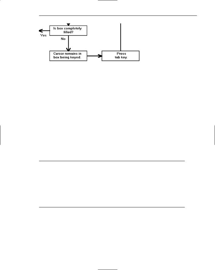
Rarely are many text entry screen fields completely filled to their maximum length with data. When an entry field is not full, the user must still press the tab key to move the cursor to the next entry field. Figure 3.62 illustrates auto skip functioning.
Auto skip, therefore, imposes decision-making and learning requirements. After keying text into each field, one must determine where the cursor is and whether to press the tab key or not to go to the next field. Only then can the next keying action be performed. As illustrated in Figure 3.63, manual tabbing requires extra keystrokes but no decisions must be made. The keying task is rhythmic. One study, comparing auto skip with manual tabbing, found that manual tabbing resulted in faster keying performance and fewer keying errors.
Auto skip can delay detection of one particular kind of error. If an extra character is inadvertently keyed into a field, the cursor will automatically move to the next field while keying continues. The error may not be immediately detected, and spacing in subsequent fields may also be one position off, at least until the tab key is pressed. Were this situation to occur while using manual tabbing, the keyboard would lock as soon as the entry field was full. The error would be immediately detected.
Auto skip, despite its limitations, can be useful for expert users who have learned field structures or if all screen fields are always completely filled. Common fixedlength fields segmented into logical parts may be auto tabbed between the parts (for example, a segmented social security number or a standard segmented numeric date). Nevertheless, most high-volume data entry applications would not appear to meet these criterion.
Step 3: Principles of Good Interface and Screen Design 213
Figure 3.62: Text entry using auto skip.
Figure 3.63: Text entry using manual tabbing.
Keying Rules
■Do not require recoding, changing, omitting, or including data based on special rules or logical transformations.
■Do not require formatting of data.
■Do not make keyed codes case-sensitive.
— Exception: Passwords.
■Do not require units of measurement to be keyed.
■Minimize use of the Shift key.
■Ensure that double-clicking will not cause problems.
In large-volume entry applications, decisions that must be made during the keying process impose learning requirements and greatly slow down the entry process. The fewer rules and decisions involved in keying, the faster and more accurate entry will be. Coding, omitting, changing, and including data by special rules or transformations as a group represent probably the greatest single decrement to data entry speed.

214 Part 2: The User Interface Design Process
Requiring the formatting of data should also be avoided. The software should
■■Left-justify alphabetic data.
■■Right-justify numeric data.
■■Justify the entry around the decimal point if it is decimal.
Upperand lowercase letters should be treated as equivalents when codes are keyed, unless there is a valid reason for not doing so (for example, secure passwords). If codes must be entered in a case-specific manner, inform the user using a field Completion Aid. When storing user-keyed data, show the data as it was keyed.
Never require units of measurement to be keyed because keystrokes will be reduced and keying speed increased. Incorporate all units of measurement such a pounds, inches, etc. within the caption or specify in a Completion Aid. Entry of characters that require the use of the Shift key should be avoided. To use the Shift key requires extra user attention and is prone to errors.
Often people double-click when only one click is needed. If an erroneous doubleclick is made and both are detected by the computer, a double action can possibly be implemented. This should be prevented from happening.
Data Output
Data output includes
■■Reports, a list of records designed to be printed out.
■■Tables, printouts of a listing of records derived from database queries.
Being able to print out a table or report is a very common user requirement. Fowler and Stanwick (2004), upon whom many of the following guidelines are based, describe paper printouts as advantageous because
■■Items are easier to check off or mark than items on a screen.
■■Items can all be seen at once. Cumbersome scrolling is not necessary.
■■Easier discussion of the information with other people or at meetings is permitted.
■■Printouts can be easily perused on a bus, train, or airplane.
■■Printouts provide hard-copy documentation and a more visible audit trail.
■■A more visible sense of completion or closure results.
■■A printout is a better external memory than a screen.
In regards to the latter, Sellen and Harper (2004) in an analytical study, confirmed obvious human behavior. When people write a report they study, highlight, and annotate printouts, spread printouts out over work surfaces, and refer back to the printouts continually. Printed copies accommodate these activities, and human memory limitations, much more readily than screen versions do.

Step 3: Principles of Good Interface and Screen Design 215
Reports
■Report Body
—Provide clear column headings.
—Show units of measurement.
—Use the right fonts.
—Clearly identify rows.
—For a body that is too wide:
•Let users move or resize the columns.
•Wrap information in a column of cells.
—Break up pages logically.
■For headers:
—Minimally include:
•Print date.
•What or whom the report is for.
•Title.
—Consider including:
•Report or file parameters.
•Print or retrieval time.
•Logo and other organization identity items.
■For footers:
—Minimally include:
•Current Page Number.
—Consider including:
•Number of pages in report.
•Print date (if not in the header).
•Data source (file, database or table name).
•Report format name.
•URL or other location information.
•Legal information.
—Repeat at the bottom of every page.
Body. A report body usually contains rows of columnized data and column headings. Page and data breaks may also require inclusion of subheadings, subtotals, or summaries at each break. Design guidelines for a report body are as follows.
Column headings. Column headings must clearly describe the column’s contents. Avoid abbreviations in column headings whenever possible. If an abbreviation is necessary, use a ToolTip to spell out an abbreviation. (ToolTips are described in Step 7.)
Units of measurement. Some types of data can be described by different units of measurement, for example: inches or centimeters; miles, or kilometers? If there is any possibility of ambiguity, always include the unit of measurement in a column heading. Data interpretation errors will be prevented.

216 Part 2: The User Interface Design Process
Fonts. Alignment of numeric data is important for any report containing numbers. Data comparisons will be easier to perform, and errors easier to detect. In reports, numbers in columns should always be presented right-aligned using monospaced fonts. A monospaced type is fixed-width, each number possessing the same width. The standard PC monospaced typeface is Courier. Monaco is the standard on the Macintosh. Courier, however, is a very wide type. The numbers in some of the common software fonts are always presented as monospaced, even though the letters are not. Examples include Arial, Times New Roman, and Verdana. Always use proportional fonts (variable-width letters depending on character width) for textual information because monospaced text will consume about 30 percent more real estate on a screen.
Rows. Visually distinguish individual rows by displaying alternate rows in a light color. As described previously in Tables, Tullis (2003) found that alternate-row shading yielded the best performance (speed and accuracy of response) and was rated as the best alternative by study participants. If alternate-row spacing cannot be implemented, or if more than seven rows are presented, insert extra white space after every fifth row.
Wide body. If a report is too wide to be completely seen on a screen, or printed on a paper, it may be narrowed in a couple of ways. One solution is to allow users to move, shrink, or expand columns so all information, or at least the important information, can be seen simultaneously. While some columns may have to be fixed in size, many can be modified. Another solution is to wrap a wide cell’s content into two lines, as illustrated in Table 3.2.
Page breaks. For multipage reports, break pages at logical points in the presented information.
Headers. Headers usually contain information about what is contained in the printout. Minimally include the date the report is printed, or, for onscreen reports, the retrieval date. Also include the name of the intended recipient and the report title. Recipient name and title may be wrapped, if necessary, on more than one line. Optional information that may be included are report or file parameters (such as a date range), print or retrieval time, and organization identity graphics and logos.
Footers. Footers are strictly for reference, containing information about the printout itself. As such, they should not draw attention to themselves. A smaller non-bold, non-italic font is recommended. Minimally, a footer should contain a page number. Optional information that may be included are print date (if not in header), the data source (file, database or table name), the report format name so that the same format can be found to update the report, URL or other location information, and legal information such as copyrights, and so on. Repeat the footer at the bottom of each page. If a footer is rarely printed, it may not be necessary to create a specialized footer. If printed, the browser will add page numbers to the bottom and the URL to the top by default.

Step 3: Principles of Good Interface and Screen Design 217
Tables
Large amounts of information that must be viewed and compared can be displayed in a table. Like a data entry grid, a table is a matrix of information arranged in columns and rows. Tables usually consume less screen space than do individual data elements. A table may be created from a query but may also be fixed in format.
■Table Title and Headings:
—Provide a clear and descriptive title, headings and, where appropriate, subheadings for columns and rows.
•Do not include colons (:) after the headings.
•Show units of measurement.
—Justify column headings according to the data presented in the table cells.
•Left-justify for columns containing text.
•Right-justify for columns containing numbers.
—Left-justify row headings.
■Table Data or Information:
—Organize the presented data or information logically and clearly.
•Place similar information together.
•Place most important or frequently used at the top.
•Arrange chronologically or sequentially.
—Justify the data presented in a column according to its content.
•Left-justify textual data.
•Right-justify numeric data.
•To reduce table width, wrap information in a column of cells.
■Table Format:
—Provide alternate-row shading.
—Use light backgrounds.
—Highlight a particular cell, column, or row using a contrasting display technique.
•Avoid scrolling, if possible.
■Printouts:
—The entire record listing must be printed, not simply what is currently visible.
—Users must be able to modify the font size and type and/or column width so the printout completely fits on the available printer paper.
—The printout must maintain the users choices of columns, column locations, and sort, not resetting these elements to a default.
—The printout must have a header and footer.
A table, illustrated in Table 3.1, should possess the following qualities:
Descriptive headings. Provide clear and descriptive headings and, where necessary and appropriate, subheadings for columns and rows. Do not include colons
(:) after the headings. Avoid abbreviations in column headings whenever possible. If an abbreviation is necessary, use a ToolTip to spell out an abbreviation. (ToolTips are described in Step 7.) Some types of data can be described by different units of measurement (for example, inches or centimeters, miles or kilometers?). If there is any possibility of ambiguity, always include the unit of measurement in a heading. Data interpretation errors will be prevented.

218 Part 2: The User Interface Design Process
Heading justification. Justify column headings according to the data presented in the table cells. Use left-justification for columns containing text and right-justifi- cation for columns containing numbers. Row headings should be left-justified.
Table organization. Organization of table data or information will follow the general organization guidelines described previously. Organize table data logically and clearly so it can be quickly identified, scanned, and compared. Place most important or frequently used information at the top, place together information that must be directly compared, and arrange it chronologically or sequentially.
Data justification. Justify the data presented in a column according to its content. For textual data, use left-justification; for numeric data, use right-justification. Alignment of numeric data is important for any report containing numbers. Data comparisons will be easier to perform, and errors easier to detect. In reports, numbers in columns should always be presented right-aligned using monospaced fonts. A monospaced type is fixed-width, meaning each number possesses the same width. The standard PC monospaced typeface is Courier. Monaco is the standard on the Macintosh. Courier, however, is a very wide type. The numbers in some of the common software fonts are always presented as monospaced, even though the letters are not. Examples include Arial, Times New Roman, and Verdana. Always use proportional fonts (variable-width letters depending on character width) for textual information because monospaced text will consume about 30 percent more real estate on a screen.
Table width. To reduce the width of a table, a cell’s content can be wrapped into two lines, as illustrated in the “LANGUAGES” column in Table 3.2.
Alternate-row shading. Visually distinguish individual rows by displaying alternate rows in a light color. Tullis (2003) evaluated three methods of distinguishing rows and/or columns: (1) alternate-row shading using alternating white and light gray backgrounds; (2) horizontal and vertical line row and column separators; and (3) horizontal line separators only. These methods were compared with a fourth alternative: space as the only separator. The finding — in the visual search task alternate-row shading yielded the best performance (speed and accuracy of response) and was rated as the best alternative by study participants. Borders apparently interfere with scanning and readability. If alternate-row spacing cannot be implemented, or if more than seven rows are presented, insert extra white space after every fifth row.
Table 3.1: A Table
EUROPEAN UNION NEW MEMBER STATES IN 2004
COUNTRY |
CAPITAL |
GOVERNMENT |
POPULATION |
AREA (SQ.MI.) |
Czech Republic |
Prague |
Republic |
10,320,000 |
30,450 |
|
|
|
|
|
Estonia |
Tallinn |
Republic |
1,450,000 |
17,413 |
Hungary |
Budapest |
Republic |
9,963,000 |
35,920 |
Latvia |
Riga |
Republic |
2,452,000 |
24,595 |
|
|
|
|
|

Step 3: Principles of Good Interface and Screen Design 219
Table 3.1 (continued)
EUROPEAN UNION NEW MEMBER STATES IN 2004
COUNTRY |
CAPITAL |
GOVERNMENT |
POPULATION |
AREA (SQ.MI.) |
Lithuania |
Vilnius |
Republic |
3,639,000 |
25,174 |
Poland |
Warsaw |
Republic |
38,915,000 |
120,728 |
Slovakia |
Bratislava |
Republic |
5,385,000 |
18,933 |
|
|
|
|
|
Slovenia |
Ljubljana |
Republic |
1,947,000 |
7,819 |
Highlighting cells. If highlighting a cell or cells is necessary, use a contrasting display technique that does not diminish the legibility of the displayed data.
Avoid scrolling. Avoid long vertical tables if possible. A table should be entirely visible for readability and making data comparisons.
Printouts. Like reports, a table to be printed must be capable of being resized for paper and possess a header and footer. Additionally, non-visible elements must also be printed and the printout must maintain user choices, not resetting them to a default.
Table 3.2: A Table with Wrapped Cells
EUROPEAN UNION NEW MEMBER STATES IN 2004
COUNTRY |
CAPITAL |
GOVERNMENT |
POPULATION |
LANGUAGES |
Czech Republic |
Prague |
Republic |
10,320,000 |
Czech, Slovak |
|
|
|
|
|
Estonia |
Tallinn |
Republic |
1,450,000 |
Estonian, |
|
|
|
|
Russian |
Hungary |
Budapest |
Republic |
9,963,000 |
Hungarian |
|
|
|
|
|
Latvia |
Riga |
Republic |
2,452,000 |
Latvian, |
|
|
|
|
Russian |
Lithuania |
Vilnius |
Republic |
3,639,000 |
Lithuanian, |
|
|
|
|
Russian, |
|
|
|
|
Polish |
Poland |
Warsaw |
Republic |
38,915,000 |
Polish |
Slovakia |
Bratislava |
Republic |
5,385,000 |
Slovak, |
|
|
|
|
Hungarian |
Slovenia |
Ljubljana |
Republic |
1,947,000 |
Slovene |
|
|
|
|
|