

The Essential Guide to UI Design
.pdf290 Part 2: The User Interface Design Process
It is best to stick with the default fonts installed on the user’s computers. All available options must be known before beginning the design process. Then ensure that the text is readable and legible in all usage environments.
Color. The color palette must be of a variety large enough to permit establishment of a family of discriminable colors. The colors used must be accurately and clearly presented in all situations, but be aware that colors may appear slightly differently on different monitors, and all users may not default their palettes to high color settings. Use colors that will succeed on a variety of platforms and monitors. Design using a browser-safe, cross-platform palette of 216 colors. It is sometimes referred to as a “Web safe” color palette.
Versions. To provide universal access to a Web site, provide multiple versions that support multiple browsers. To limit the site to one browser may deny access to, and alienate, users who do not have the proper one. Make use of browser “sniffers,” programs on the server that detect the user’s browser type and determine which version should then be downloaded.
Always provide a text-only version of the Web site. This will be necessary as long as users with small displays and low bandwidths exist. Vision-impaired users with readers will also require a text-only version, as will users with textonly browsers, and those who turn off image display.
Other Web Considerations
■Downloading:
—Provide fast page download times, no more than 8 to 10 seconds per page.
•Minimize the use of design techniques that cause longer download times.
•Long pages.
•Large chunky headings.
•Numerous or large graphics and images.
•Animation.
•Excessive amount of color.
•Excess use of frames.
—Provide enough information to the user so that whether or not to request a download can be determined, including
•Program or document description.
•Type of download.
•Size of download.
•Download version.
•Estimated loading time.
•Special operating requirements.
■Currency:
—Keep Web site information current.

Step 3: Principles of Good Interface and Screen Design 291
■Page printing:
—Provide a means to print
•Groups of related pages.
•Individual pages.
•Sections of pages.
■Maintainability:
—Ensure easy Web site maintainability.
Downloading. Slow download speeds are an ongoing complaint of Web users. Download times of 8 to 10 seconds per page should not be exceeded, even for bandwidths of 28.8 Kbps. In general, keep graphics and page size as small as possible. Specifically, use text instead of graphics whenever possible. When graphics are desirable, keep the graphic as small as possible. Also, repeatedly use a graphic so it may be stored in the browser’s cache.
The cache is a temporary storage area for Web pages and images. There are two types: memory and hard drive. Once a graphic is downloaded, it is placed in the cache and remains there for a prescribed period of time. Download times, then, are longest when a site is visited and downloaded for the first time. After the first download, the graphic is in the cache. It is retrieved from there, reducing the time it takes to display the page.
In addition to graphics, other design elements that slow download times include large and chunky headings, the use of many colors, animation, excessive use of frames, and the use of Java and JavaScript. Limit the use of these elements that require a long time to download. Create graphics that load quickly. Limit an individual image to 5KB, the images on a page to 20KB. Use Graphics Interchange Format (GIF) files because they are smaller than Joint Photographic Experts Group (JPEG) files. GIFs and JPEGs are described in more detail in Step 11.
Also, because few monitors display images at greater than 72 dpi, restrict the resolution of downloaded images to 72 dpi. Using a higher dpi ratio will not produce a better image, but will increase file size, causing longer download times. All images should also contain alternate text (alt text). This will give the user something to read while the image downloads, and is necessary for text-only viewers.
Always provide enough information to let the users know whether it is worth their time and trouble to download something of apparent interest described on a Web page. Provide a program or document description, type, size, version, estimated loading time, and any special operating requirements, including such things as hardware needed, the required operating system, special software needed, and memory requirements.
Currency. Update the Web site regularly to keep information current. The nature of the Web implies timeliness. Outdated information casts doubts on a Web site’s credibility. Currency means trustworthiness to many users.

292 Part 2: The User Interface Design Process
Page Printing. Some people prefer to read hard copy, especially anything longer than half a page. Make printing easy for users, including the capability to print sections, pages, or groups of related pages with minimal effort. Since most lowend printers print at 300 dpi, pages may be printed at this resolution. This higher resolution will result in a longer printing time, however.
Maintainability. Provide easy Web site maintainability to sustain its currency. Change must be easily accommodated as the Web site grows, evolves, and matures. Web site maintenance is, in reality, Web site enhancement. Remove outdated information and expired links, link old pages to those newly created. Properly designed, modular system pages covering specific topics can be updated quickly without needing to change and reformat large amounts of information.
The User Technology Profile Circa 2006
While a great variety does exist in the technological tools people use to interact with the Internet, the dominance of certain operating systems and browsers is quite evident. Following is a summarization of several characteristics as of December 2006 (from www.thecounter.com/stats). Statistics from December 2001 are included for comparison purposes.
|
|
BROWSERS |
|
December 2006 |
|
December 2001 |
|
Internet Explorer 6.x |
70% |
Internet Explorer 5 |
68% |
Internet Explorer 7.x |
12% |
Internet Explorer 6 |
19% |
Firefox |
11% |
Internet Explorer 4 |
5% |
Safari |
3% |
Netscape 4.x |
4% |
Internet Explorer 5.x |
1% |
Other |
4% |
Opera |
1% |
|
|
Unknown/Other |
2% |
|
|
|
OPERATING SYSTEMS |
|
|
Windows XP |
82% |
Windows 98 |
68% |
Windows 2000 |
7% |
Windows 2000 |
15% |
Mac |
4% |
Windows 95 |
6% |
Windows 98 |
3% |
Windows NT |
4% |
Unknown/Other |
4% |
Mac |
1% |
|
|
Unknown/Other |
6% |

Step 3: Principles of Good Interface and Screen Design 293
SCREEN RESOLUTION IN PIXELS |
|
||
December 2006 |
|
December 2001 |
|
1024×768 |
54% |
800×600 |
53% |
1280×1024 |
21% |
1024×768 |
33% |
800×600 |
14% |
640×480 |
4% |
1152×864 |
3% |
1280×1024 |
3% |
Unknown/Other |
5% |
1152×864 |
2% |
|
|
Unknown/Other |
5% |
|
COLOR IN BITS |
|
|
32 |
84% |
16 |
54% |
16 |
11% |
32 |
30% |
24 |
2% |
24 |
10% |
Unknown/Other |
3% |
8 |
4% |
|
|
Unknown/Other |
2% |
Assuming that these four elements are independent, the probability of a person having on his or her computer elements found in each listing above is .80. This means that designing for the above technological characteristics will satisfy the needs of four out of five Web users. Bailey (2001) suggests that when it is impossible to design for all users, because of cost, schedule, or personnel considerations, designing for the above computer characteristics will at least satisfy the needs of most users.
Examples of Screens
What follows are examples of poor and proper design. The problems of the poorly designed screens will be described in the discussion to follow. Redesigned versions of these poorly designed screens will be presented at the end of Step 8. Examples of other, properly designed, screens will also be presented as models of good design.
Example 1
Here are three information entry/modification dialog boxes from a popular drawing program, PRINT MERGE, PAGE SETUP, and EXPORT. Analyze them for problems, including inconsistencies between them.
Screen 1.1
The controls on the PRINT MERGE screen are very poorly aligned. The File text box is located quite far from its associated list box. What does the Up button do? It is actually related to the Directories list box. This is certainly not clear. Look at the required sequence of eye movements through this screen, as illustrated by the line drawn between successive controls. This is very inefficient.

294 Part 2: The User Interface Design Process
Screen 1.1A
Screen 1.1B
Step 3: Principles of Good Interface and Screen Design 295
Screen 1.2A
Screen 1.2B
296 Part 2: The User Interface Design Process
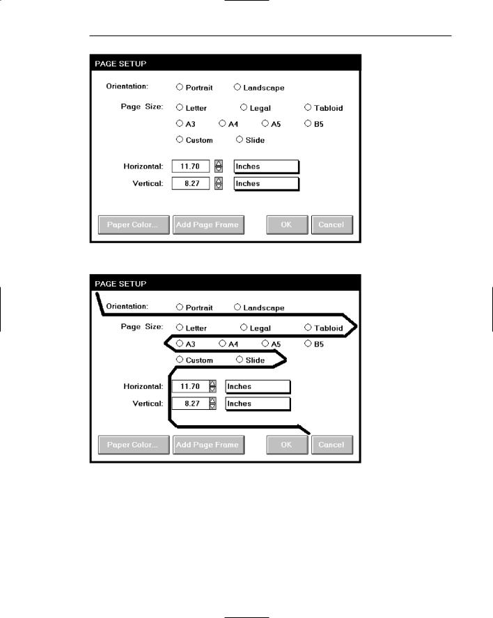
Screen 1.2
The controls on the PAGE SETUP screen are very poorly grouped. Are the nine radio buttons beginning at the Page Size caption one or three groupings? The horizontal orientation of the radio buttons necessitates a less efficient horizontal scanning and makes visual comparison of the alternatives more difficult. Why is the Orientation caption not right-aligned with the other captions? What are the controls inscribed with Inches? They are actually nonstandard controls but this is not clear until one discovers how to operate them (clicking on the rectangular bar changes the value [inches] now displayed). Nonstandard controls increase learning requirements and add to the complexity of the interface. Again, look at the required sequence of eye movements through this screen, as illustrated by the line drawn between successive controls. This is very inefficient.
Screen 1.3
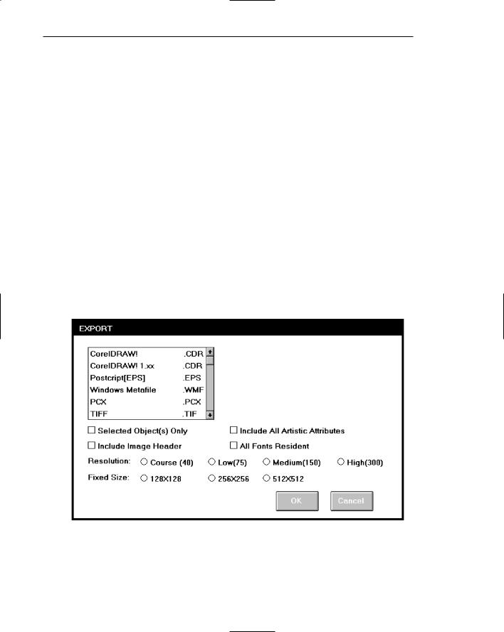
The check boxes and radio buttons on the EXPORT screen are again very poorly grouped. Their horizontal orientation necessitates a less efficient horizontal scanning and makes visual comparison of the alternatives more difficult. Can the check boxes be grouped? The list box has no caption with it. Screen balance is also poor, with the large open area in the upper-right part of the screen. Again, look at the required eye scan through this screen.
Screen 1.3A

Step 3: Principles of Good Interface and Screen Design 297
Screen 1.3B
Now, look at the inconsistencies between these three screens. The Print Merge title is in mixed case; PAGE SETUP and EXPORT are capitalized. The Print Merge command buttons are on the right side; the PAGE SETUP and EXPORT ones are on the bottom. Print Merge uses the action being accomplished as the button label (Merge); the others use the standard OK. This will certainly cause user confusion. Print Merge and EXPORT appear to use left-aligned captions, PAGE SETUP right-alignment.
Example 2
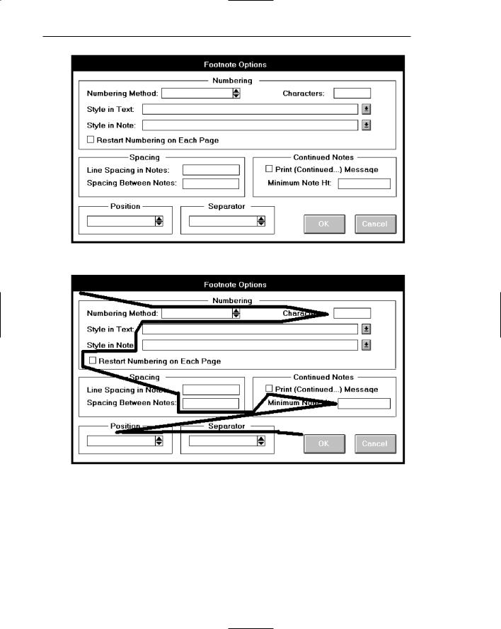
Here are two information entry/modification dialog boxes from a popular word-pro- cessing program, Footnote Options and Location of Files. Some design enhancements are immediately obvious. The command buttons are consistently positioned in the lower-right corner and group boxes or borders are included to visually strengthen information groupings.
Screen 2.1
This screen’s main problem is poor alignment of controls. The standalone check boxes tend to get lost. The centered headings in the group boxes are not a severe problem, but they do somewhat compete with the control captions for the screen viewer’s attention. The Position and Separator control borders are placed around single elements. This is not recommended, but it does help to provide screen balance, which is quite good. The sequentiality of this screen, as illustrated by one’s required eye scan, is quite poor, as illustrated.
298 Part 2: The User Interface Design Process
Screen 2.1A
Screen 2.1B

Step 3: Principles of Good Interface and Screen Design 299
Screen 2.2A
Screen 2.2B