

The Essential Guide to UI Design
.pdf
320 Part 2: The User Interface Design Process
basic principles. Large, linearly ordered, well-learned listings, such as months of the year, or numbers, would be better presented in a one-level menu, rather than by breaking them into multiple levels.
Limit the number of choices. Be conservative in the number of menu choices presented on a screen. If the choices cannot be logically grouped, restrict the number to four to eight as just described. If the choices can be grouped, 18 to 24 can be displayed, with no more than 10 items within a group. Mayhew (1992) suggests that if the menu choices are complex and/or there are no groupings of items, choices presented should be restricted to 10 or fewer. This recommendation is similar to the eight or fewer recommendations above. If the menu choices are not complex, items on the menu can be grouped, and the users are infrequent or casual, she recommends 20 or fewer choices. If the menu choices are not complex, items on the menu can be grouped, and the users are frequent or expert, she suggests 21 or more choices can be provided.
MAXIM The best journey is the one with the fewest steps.
Provide decreasing direction menus. In addition to breadth and depth, direction has been found to affect menu choice selection performance. In a multilevel menu, a decreasing direction structure presents successively fewer choices as each lower level is traversed. An increasing direction structure presents successively more choices as each lower level is traversed. Bishu and Zhan (1992), in a study of 16 and 32 item iconic menus, found that decreasing direction menus were significantly faster and more accurate than increasing menus. As just described, however, the research of Norman and Chin (1988) and Bernard (2002) suggests a concave hierarchical menu structure is optimal for browsing.
Scrolling. Never require menus to be scrolled. Keep all choices visible at all times.
Complexity
■Provide both simple and complex menus.
■Simple: a minimal set of actions and menus.
■Complex: a complete set of actions and menus.
Providing two sets of menus will more effectively satisfy the differing needs of the novice and expert user. The novice or casual user often only requires a minimal set of actions and menus to accomplish tasks. The expert may prefer a full set of options. Make selection, and changing, between simple and complex menus easy to accomplish, preferably through a menu bar choice. IBM’s SAA CUA refers to these menus as short and full.

Step 4: Develop System Menus and Navigation Schemes 321
Item Arrangement
■Align alternatives or choices into single columns whenever possible.
—Orient for top-to-bottom reading.
—Left-justify descriptions.
■If a horizontal orientation of descriptions must be maintained
—Organize for left-to-right reading.
For scanning ease, menu choices should be left-justified and aligned vertically into columns. Research has found that columnar menus and listings are searched much faster than horizontally-oriented menus. Do not array a menu in multiple columns.
When menus are included on other screens, space constraints often exist, and the menu must be arrayed horizontally. If a single-row (horizontal) orientation is necessary organize for left-to-right reading. If two or more rows are available for displaying choices, organize for top-to-bottom, then left-to-right reading to facilitate visual scanning.
Ordering
■Order lists of choices by their natural order, or
—For lists associated with numbers, use numeric order.
—For textual lists with a small number of options (seven or less), order by
•Sequence of occurrence.
•Frequency of occurrence.
•Importance.
•Semantic similarity.
■Use alphabetic order for
—Long lists (eight or more options).
—Short lists with no obvious pattern or frequency.
■Separate potentially destructive actions from frequently chosen items.
■Maintain a consistent ordering of options on all related menus.
—For variable-length menus, maintain consistent relative positions.
—For fixed-length menus, maintain consistent absolute positions.
Within information categories included on a menu, or in menus in which categories are not possible, options must be ordered in meaningful ways. When a menu contains multiple categories of information, the ordering of categories will follow these same principles. A meaningful ordering is necessary to
■■Facilitate search for an item.
■■Provide information about the structure and relationships among items.
■■Provide compatibility with the user’s mental model of the item structure.
■■Enhance the user’s ability to anticipate a choice’s location.

322 Part 2: The User Interface Design Process
When items are organized along some dimension or characteristic, the user can use that information to locate items faster. An alphabetized list, for example, provides an indication of approximately where in the listing an item beginning with a particular letter will be found. Understanding structure and relationships, item similarities and dissimilarities, can also aid in focusing attention on that which is relevant. Any incompatibility with the user’s mental model will disrupt searching as the user tries to make sense of something that had been well understood, but now is being presented in a way that has not been well learned. Months of the year presented in alphabetic order, for example, would be very disrupting.
Experienced users often anticipate the location of a desired choice within a familiar menu. Hornof and Kieras (1999), in studying how items are selected from pull-down menus, found that people often make an initial eye and mouse-positioning movement toward the expected choice location before the pull-down even appeared on the screen. They also found that choices in the top three positions of the pull-down were selected faster than those in other positions. This may have been caused by users’ ability to better predict a choice’s location at the top, and/or the shorter mouse movement required from the menu bar to the pull-down. Observational studies also reveal that experienced users also anticipate the location of command buttons appearing within a window. While waiting for a window to appear upon which a command button will be immediately “clicked,” the pointer is often positioned at the button’s expected location before the window appears.
Another study, Byrne, John, Wehrle, and Crow (1999), studied how people search unfamiliar pull-down menus. They found that the search primarily flowed from menu top to bottom, and that the initial eye fixation was usually focused on the choice in the topmost menu position. Almost all recorded eye fixations were on one of the first three items.
Both of the studies point out the importance of presenting important menu items at the top of menu arrays, and providing consistency in menu organization schemes and menu locations. Common ordering schemes for menus, then, are the following:
Natural ordering. If items have a natural sequence, such as chapters in a book, days in a week, or months in the year, the ordering scheme should follow this natural sequence. The screen viewer will have learned these ordering schemes very well.
Numeric ordering. Use numeric ordering for choices associated with numbers, for example, type size, baud rate, or number of pixels.
Small number of options. For groupings with a small number of options (about seven or fewer), sequence of use, frequency of use, or importance are good ordering schemes. Also consider ordering by semantic similarity, along a semantic dimension such as impact, potency, or emphasis. Type style, for example, may be ordered by emphasis from least to most: regular, underlined, italicized, and bold.
Alphabetic order. For a large number of options, alphabetic ordering of alternatives is desirable. Alphabetic ordering is also recommended for small lists where no frequency or sequence pattern is obvious. It has been found that alphabetically ordered menus can be searched much faster than randomly ordered menus. One study, for example, found that an 18-item alphabetic menu was visually searched four times faster than a randomly organized menu. Search time was a function of

Step 4: Develop System Menus and Navigation Schemes 323
saccadic eye movements through the display. Search patterns were random, but fewer eye movements were required with the alphabetic arrangement. After 20 trials, however, only one eye movement was required for all conditions, and search time was the same. Another study has found that the longer the list, the greater the value of an alphabetic ordering scheme. As list length increased, the time to find items in longer random lists increased significantly faster than the time to find items in longer alphabetic lists. Learning of a randomly ordered menu will eventually take place, but this learning will be greatly aided by a meaningful choice-ordering scheme.
Separate destructive choices. Destructive menu choices, such as delete or clear, should be positioned as far away from frequently chosen choices as possible to minimize the chance of accidental selection.
Consistency between menus. Options found on more than one menu should be consistently positioned on all menus. If menus are of variable length, maintain relative positioning of all item options (for example, always place Exit at the bottom or end of the list). If menus are of fixed length, place options in the same physical position within the list.
Groupings
■Create groupings of items that are logical, distinctive, meaningful, and mutually exclusive.
■Categorize them in such a way as to
—Maximize the similarity of items within a category.
—Minimize the similarity of items across categories.
■Present no more than six or seven groupings on a screen.
■Order categorized groupings in a meaningful way.
■If meaningful categories cannot be developed and more than eight options must be displayed on a screen, create arbitrary visual groupings that
—Consist of about four or five, but never more than seven, options.
—Are of equal size.
■Separate groupings created through either
—Wider spacing, or
—A thin ruled line.
■Provide immediate access to critical or frequently chosen items.
Create groupings. Items displayed on menus should be logically grouped to aid learning and speed up the visual search process. Studies have demonstrated that logically categorized menus are easier to learn and result in faster and more accurate performance. Categorical organization may facilitate the transition from novice to expert user because information is visually represented in the way people think about it.

324 Part 2: The User Interface Design Process
Categorizing. Groupings should also cover all the possibilities and contain items that are non-overlapping. While some collections of information will be easily partitioned into logical groups, others may be very difficult to partition. Some users may not understand the designer’s organizational framework, and there may be differences among users based on experience. Thus, no perfect solution may exist for all, and extensive testing and refinement may be necessary to create the most natural and comprehensible solution.
Number. Limit the number of groupings on a screen to six or seven. The total number of items within all the groupings should not exceed about 18 to 24.
Ordering. Groupings of menu items may be ordered following the guidelines described in “Ordering” earlier in this step. Ordering alternatives include alphabetic, sequence of use, frequency of use, importance, and semantic similarity.
Arbitrary visual groupings. Uncategorized menus should be broken in arbitrary visual groupings through the use of space or lines. Groups should be as equal in size as possible and consist of about four or five options. Groupings should never exceed more than seven options.
Separation. Perceptually separate groupings by a leaving a wider spacing between groupings, or by inscribing line separators between groupings. Guidelines for displaying line separators follow.
Critical choices. Choices that are critical or frequently chosen should be accessible as quickly and through as few steps as possible. Place them on the highest-level menu, whenever possible.
Line Separators
■Separate vertically arrayed groupings with subtle solid lines.
■Separate vertically arrayed subgroupings with subtle dotted or dashed lines.
■For subgroupings within a category,
—Left-justify the lines under the first letter of the columnized choice descriptions.
—Right-justify the lines under the last character of the longest choice description.
■For independent groupings,
—Extend the line to the left and right menu borders.
Inscribing subtle solid or dashed lines between groupings can reinforce groupings and subgroupings of vertically arrayed related choices. For breaking subgroupings within one category, the line or lines should only extend from the first character of the descriptions to the end of the longest description, as shown in Figure 4.6. Many graphical platforms always extend the line from menu border to border, as illustrated in Figure 4.7. This extended line results in too strong a visual separation between what are related menu parts. Visual separation should exist, but it should not be too overpowering.

Step 4: Develop System Menus and Navigation Schemes 325
 Short line separator
Figure 4.6: Partial line separators.
 Line separator
Figure 4.7: Extended line separators.
For independent groups of choices, extend the horizontal line from menu border to border. This will indicate to the user that the groupings are independent of one another. In summary, use a partial line for separating related choices; use an extended line for separating unrelated or independent choices.
Selection Support Menus
■When a small, discrete set of functions is accessed 90 percent or more of the time
—Use Folded menus.
■When a small set of items is selected between 31 percent and 89 percent of the time and the other items are selected with lower frequencies
—Use Split menus.
■If there is no small, discrete set of items that is used 30 percent of the time or more
—Use traditional menus.
■Do not reorder menus.

326 Part 2: The User Interface Design Process
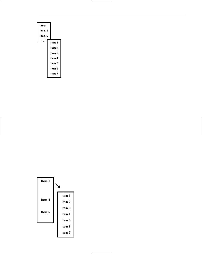
Selection support menus support the user by providing faster access to frequently used functions. More frequent choices are positioned at the top of a menu where a person’s eye initially goes when a menu is presented. High-frequency items at the top may be specified by the menu designer and remain static or unchangeable, or the menu may be restructured reflecting a person’s use pattern over a period of time. Changeable menus are called adaptive menus. Duplicating the more frequent items in a separate section at the top is commonly called a split menu. Sears and Shneiderman (1994) showed that split menus were better than traditional menus both performancewise and preference-wise. A traditional menu is illustrated in Figure 4.8, a split menu in Figure 4.9.
A version of the split menu is one called the folded menu. In this menu the high-fre- quency items appear first and alone. The complete menu appears after a time delay, or after the user clicks on a down arrow at the bottom of the initial menu. The additional choices are displayed “below the fold” as illustrated in Figure 4.10.
In addition to providing faster access to choices in a location where the user first looks, it is argued that adaptive menus aid user learning by simplifying menus. Also, where the menu changes are made based upon user behavior, a user’s exact needs are anticipated and more completely fulfilled.
These menus may also create problems for users. If lower frequency items are incorrectly chosen for placement above the split or fold, high-frequency items placed below will take longer to perform. When items are relocated to different positions, a person’s spatial memory is impacted. If users do not see the additional menu items, system learning may also be degraded. Some studies do show that users dislike the extra click or delay imposed by folded menus (Card, 1982; Somberg, 1987).
Figure 4.8: Traditional menu.
Figure 4.9: Split menu.
Step 4: Develop System Menus and Navigation Schemes 327
Figure 4.10: Folded menu.
To address some of the issues, Lee and Yoon (2004) conducted a study to determine when it was best to use various kinds of these menus. They evaluated traditional (static) menus, split menus, folded menus, and a fourth type they called temporal. A temporal menu is a traditional menu that first presents only the high-frequency items in their regular menu positions. After a short delay, the remaining lower-frequency items are filled in their normal positions as illustrated in Figure 4.11.
The study task was to select randomly selected items from menus containing seven choices. The menus were not adaptive in the sense that they were not reordered to reflect the choices being made. Two-thirds of the way through the test, however, the items were reordered to see the impact. The conclusion:
■■Split menus had the fastest overall performance and were liked the best.
■■For high-frequency items, split and folded menus were about equal.
■■Performance on folded menus declined fastest as selection frequency went down (a wide range of functions being regularly used).
■■After the item order switch, performance for both split and folded menus was poorer than that for the traditional and temporal menus.
Figure 4.11: Temporal menu.

328 Part 2: The User Interface Design Process
Based upon the results of this research Lee and Yoon developed a network to model the impact of selection frequency on selection times. The results, as presented in the preceding guidelines, are as follows:
■■When a small, discrete set of functions is accessed 90 percent or more of the time, use folded menus.
■■When a small set of items is selected between 31 percent and 89 percent of the time and the other items are selected with lower frequencies, use split menus.
■■If there is no small, discrete set of items that is used 30 percent of the time or more, use traditional menus.
Although adaptivity is thought to be a desirable quality of a computer system, this appears to not be so for menu option ordering. Both split and folded menus in this study resulted in poorer performance after item reorganization. Another study compared static or fixed menus with dynamic menus whose options were continually reordered based upon the frequency in which they were chosen. Dynamic menus were slower to use and less preferred than static menus. The continual reordering interfered with menu order learning.
Phrasing the Menu
A menu must communicate to the user information about
■■The nature and purpose of the menu itself.
■■The nature and purpose of each presented choice.
■■How the proper choice or choices may be selected.
Writing the content of menu components, the menu’s title, the choice descriptions, and instructions, is often made difficult because of the varying experience levels of the menu users. At one extreme, there is the desire to explain, on the screen, everything in great detail. On the other hand, brevity is also important because of screen space constraints and limits on what people want to read. These conflicting goals often cause a trade-off between thoroughness and brevity. Also important in hierarchical menu systems is the role menus play in enabling a person to maintain a sense of place, or “Where am I now?” Also very important is a menu’s ability to enable the user to accurately predict where a choice will lead, or what it will cause to happen, preventing user tedium and frustration. So, the menu content must be informative, but not intrusive. And it must balance the needs of all its expected users.
Following are guidelines for creating menu titles, choice descriptions, Web navigation links, and menu instructions. The standard graphical system conventions inscribed on menus, intent indicators, keyboard equivalents, and keyboard accelerators are also described.

Step 4: Develop System Menus and Navigation Schemes 329
Menu Titles
■Main menu:
—Create a short, simple, clear, and distinctive title, describing the purpose of the entire series of choices.
■Submenus:
—Submenu titles must be worded exactly the same as the menu choice previously selected to display them.
■General:
—Locate the title at the top of the listing of choices.
—Spell out the title fully using either an
•Uppercase font.
•Mixed-case font in the sentence or headline style.
—Superfluous titles may be omitted.
A meaningful menu title aids in defining the context of the menu and increases menu comprehension. An experimental study has demonstrated the value of titles to comprehension. Study participants were presented the detailed steps to perform a function. A descriptive title for the steps was (A) not included, (B) presented at the start of the steps, and (C) presented at the end of the steps. Participants given a title at the start of the steps (B), reported higher comprehension and recalled twice as many items as those who were not given a title (A), or who were presented the title at the end
(C). The title established the context of the task, and knowing this context greatly aided comprehension.
Main menu. The menu title should immediately orient the viewer to the menu’s content and purpose. It should be a short, clear, distinctive, and descriptive title, representing the entire series of choices. It’s an important contextual and navigation component. A title such as MAIN MENU OPTIONS provides no information except that the user is probably at the top of a hierarchical menu tree.
Submenus. Submenu titles must be worded exactly the same way as the menu choice previously selected to display them. This will provide structural continuity and assure users that they are progressing as expected through a menu hierarchy.
General. Locate the title at the top of a listing of choices, in the title bar if one is available. Display the title in uppercase or in a mixed-case font using the sentence or headline style of presentation. Whichever style is chosen should be consistently followed for all menus. When using the headline style, capitalize the first letter of each significant title word. The case style chosen should be consistently used on all menus. Superfluous titles, titles that add nothing to the understanding of menu content and context, may be omitted. A pop-up menu requested during a text-editing task, for example, is displayed within the context of the task being performed. The presented choice descriptions by themselves (Copy, Font, and so on) provide the necessary context. Message windows do not need a title either; the text of the message provides the context.