

The Essential Guide to UI Design
.pdf
300 Part 2: The User Interface Design Process
Screen 2.2
Note the improved alignment of this screen’s controls. It is excellent, except for the single check box in the lower-left corner. Again, this check box can get lost here. This screen does have two problems. First, the headings, in mixed case and centered in the group boxes, visually compete with the information within the boxes for the viewer’s attention. It would be much better if they were positioned away from the important screen information and capitalized to set them off visually from the captions and data. Second, for completeness and closure, a group box around the top five controls should also be included.
Example 3
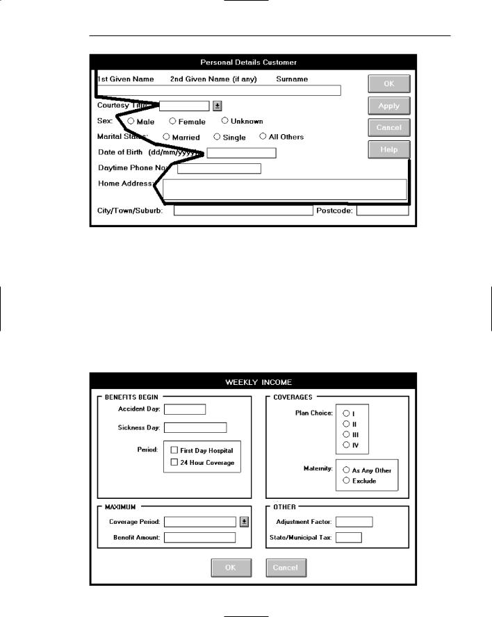
This is an information entry/modification screen from a banking system. The major problem is very poor alignment of the controls, as illustrated by the eye scan requirements. There are some other problems. There are no groupings. Does the name control have a caption? Are the labels above the Name text box intended as captions? Are they intended as prompts? This is not clear. Is the prompt (dd/mm/yyyy) in the proper location? In its current position, it is set up as an aid to a novice or casual user of the system. For an expert user of the system, who does not need the prompt, it is positioned where it is visual noise. For the expert, it should be to the right side of the text box.
Screen 3.1A
Step 3: Principles of Good Interface and Screen Design 301
Screen 3.1B
Example 4
This is a properly designed information entry/modification screen. It contains groupings reinforced by group boxes, alignment of controls, right-alignment of all captions (in this case) located consistently to the left of each control, capitalized section headings aligned to the upper-right of the group boxes, and command buttons centered at the bottom. Scanning of the columns of information is simplified by the control alignment. Headings do not compete with control captions for the viewer’s attention. The screen also possesses balance.
Screen 4.1A
302 Part 2: The User Interface Design Process
Screen 4.1B
Example 5
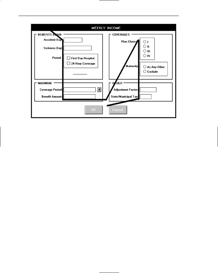
This is a read-only/display screen from the drawing program. It possesses good balance and nice groupings reinforced through use of group boxes. The problems are as follows. There are no colons with the captions. Other screens from this system have colons included with captions, violating the viewer’s mental model of a caption possessing a colon. Which caption style is used, headline (all significant word initial caps) or sentence (capitalization of the first word only)? If you examine the screen you’ll find many instances of both styles. The section headings are mixed case just like the control captions, competing with each other visually for the viewer’s attention. The numeric data fields are not properly right-aligned although fairly good top-to-bottom scanning does exist. Units in the Image Size/Resolution groupings are at the bottom of listing. They would more appropriately be placed at the top because they appear to be column headings. In the Image Resolution grouping the use of “res” is redundant, since it already appears in the section heading.

Step 3: Principles of Good Interface and Screen Design 303
Screen 5.1
Example 6
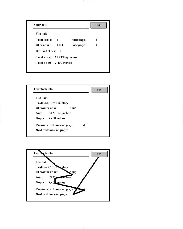
Here is a pair of similar read-only/display screens from another system. Both are poorly aligned, the data getting buried among the captions. See the illustration of how Textblock Info will be scanned. Why abbreviate Info; there is plenty of room to spell it out. The groupings are not very strong, either. Notice the inconsistencies in captions, Character count versus Char count, Area versus Total area, and Depth versus Total depth. Again, there is room to spell them out fully. Otherwise, the viewer has to establish two mental models for the same element. Why establish this learning requirement?
304 Part 2: The User Interface Design Process
Screen 6.1A
Screen 6.1B
Screen 6.1C
Step 3: Principles of Good Interface and Screen Design 305
Example 7
Here are two properly designed read-only/inquiry screens, both possessing good alignment, grouping, and balance. The data is displayed on the screen background for ease of identification and comprehension.
Screen 7.1
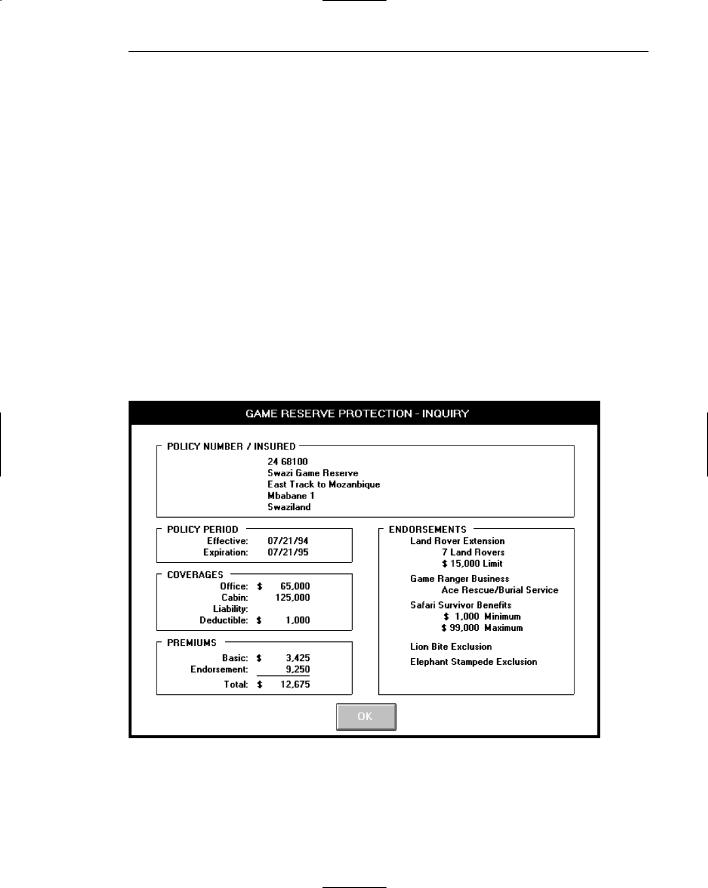
From an insurance system, this screen summarizes some of the most important kinds of information a policyholder would want to know about an insurance policy. Captions are omitted in the POLICY NUMBER/INSURED section at the top. Contextually, this information is self-explanatory. The information presented in the ENDORSEMENTS section reflects the principle of displaying something only if it is present or applicable. If one or more of these endorsements were not included with another similar policy, they would not be displayed at all. In that case, the applicable endorsements would fill this section beginning at its top. The descriptive information included with the top three endorsements reflects the conversion of the more customary “caption: data” format into simple data statements. The data statements are selfexplanatory; captions are not required.
Screen 7.1

306 Part 2: The User Interface Design Process
Screen 7.2
This screen from a shoe manufacturer is similar to the insurance screen in structure.
Screen 7.2
Step 3 Exercise
An exercise for Step 3 can be found on this book’s companion Web site, www.wiley.com/college/galitz.

S T E P
4
Develop System Menus
and Navigation Schemes
A system contains large amounts of information and performs a variety of functions. Regardless of its purpose, the system must provide some means to tell people about the information it possesses or the things it can do. This is accomplished by displaying listings of the choices or alternatives the user has at appropriate points while using the system; or creating a string of listings that lead a person from a series of general descriptors through increasingly specific categories on following listings until the lowest level listing is reached. This lowest level listing provides the desired choices. These listings of choices are commonly called menus. Menus are a major form of navigation through a system and, if properly designed, assist the user in developing a mental model of the system. In this step, the following menu topics will be addressed:
■■The structures of menus.
■■The functions of menus.
■■The content of menus.
■■Formatting menus.
■■Writing menus.
■■Navigation using menus.
■■Web site navigation and links.
■■Web site navigation elements.
■■Maintaining a sense of place in Web sites.
■■Types of menus.
307

308 Part 2: The User Interface Design Process
Menus are effective because they utilize the more powerful human capability of recognition rather than the weaker capability of recall. Working with menus reminds people of available options and information that they may not be aware of or have forgotten.
Menus are not without problems, however. New and inexperienced system users might find learning large systems difficult. Menu information must often be remembered and integrated across a series of screens. If each menu is viewed in isolation, relationships between menus may be difficult to grasp. Words and phrases with multiple meanings may also be wrongly interpreted because of the user’s inability to see relationships between menus. Ambiguities, also, may not be correctly resolved if the user makes incorrect assumptions about menu structure. The frequent result is that people make mistakes and can get lost in the hierarchical structure.
Experienced system users, while finding menus helpful at first, may find them tedious as they learn the system. Continually having to step through a series of menus to achieve the desired objective can be time-consuming and frustrating. Therefore, the design of menu systems must consider the conflicting needs of both inexperienced and experienced users.
Graphical and Web systems are heavily menu-oriented. They vary in form and are applied in diverse ways. In graphical systems they are used to designate commands, properties that apply to an object, documents, and windows. When selected, a graphical menu item may lead to another menu, cause a window to be displayed, or directly cause an action to be performed. To accomplish these goals, a graphical system presents a variety of menu styles to choose from. Included are entities commonly called menu bars, and menus called pull-downs, pop-ups, cascades, tear-offs, and iconic. In Web site design, common menus include textual links to other pages, command buttons, and both graphical and textual toolbars.
In this step, graphical and Web system menus will be addressed. It will begin with a description of the kinds of menu structures available and their content, and then present a series of general menu design guidelines for formatting, phrasing, selecting choices, and navigating menus. Next, Web-specific navigation issues and guidelines will be discussed. Finally, specific types of graphical menus will be described, recommendations for proper usage given, and relevant specific guidelines summarized.
Structures of Menus
Menus vary in form from very simple to very complex. They may range from small dialog boxes requesting the user to choose between one of two alternatives, to hierarchical tree schemes with many branches and levels of depth. A menu’s structure defines the amount of control given to the user in performing a task. The most common structures are the following.
Single Menus
In this simplest form of menu, a single screen or window is presented to seek the user’s input or request an action to be performed, as illustrated in Figure 4.1. In using

Step 4: Develop System Menus and Navigation Schemes 309
the Internet, for example, at a point in the dialog people may be asked if they wish to “Stay Connected” or “Disconnect.” In playing a game, choices presented may be “novice,” “intermediate,” or “expert.” Single menus conceptually require choices from this single menu only, and no other menus will follow necessitating additional user choices. The user need only consider the immediate consequences of the item being chosen and need not be concerned with any other additional system menus. While other single menus may exist in the system and might be encountered later, these other menus are not perceived by the user as comprising a series of choices.
A single menu may be iterative if it requires data to be entered into it and this data input is subject to a validity check that fails. The menu will then be represented to the user with a message requesting reentry of valid data.
Sequential Linear Menus
Sequential linear menus are presented on a series of screens possessing only one path. The menu screens are presented in a preset order, and, generally, their objective is for specifying parameters or for entering data. The length of the path may be short or long, depending upon the nature of the information being collected. All the menus are important to the process at hand and must be answered in some manner by the user. Sequential linear menus are illustrated in Figure 4.2.
Sequential path menus have several shortcomings. A long sequence may become tedious as menu after menu is presented. The user may not remember an answer to a previous question, a question important to the currently presented choices. The user may also want to return to a previous menu to change an answer or look at an answer, an awkward process that must be allowed. Finally, the user may, conceptually, want to complete the menus in a different order than that in which they are being presented.
Simultaneous Menus
Instead of being presented on separate screens, all menu options are available simultaneously, as illustrated in Figure 4.3. The menu may be completed in the order desired by the user, choices being skipped and returned to later. All alternatives are visible for reminding of choices, comparing choices, and changing answers. The tedium associated with a long series of sequential menus is greatly reduced.
Choice 1
Choice 2
Choice 3
Figure 4.1: Single menu.