

The Essential Guide to UI Design
.pdf380 Part 2: The User Interface Design Process
Because a tear-off menu is a pull-down style, all pull-down guidelines should be followed.
Iconic Menus
■Use to remind users of the functions, commands, attributes, or application choices available.
■Create icons that
—Help enhance recognition and hasten option selection.
—Are concrete and meaningful.
—Clearly represent choices.
An iconic menu is the portrayal of menu items or objects in a graphic or pictorial form. The purpose of an iconic menu is to remind users of the functions, commands, attributes, or application choices available.
Advantages/disadvantages. Pictures help facilitate memory of applications, and their larger size increases speed of selection. Pictures do, however, consume considerably more screen space than text, and they are difficult to organize for scanning efficiency. To create meaningful icons requires special skills and an extended amount of time. Iconic menus should be used to designate applications or special functions within an application. Icons must be meaningful and clear. They should help enhance recognition and hasten option selection. See Step 11 for a complete review of icon design guidelines.
Pie Menus
■Consider using for
—Mouse-driven selections, with oneor two-level hierarchies, short lists, and choices conducive to the format.
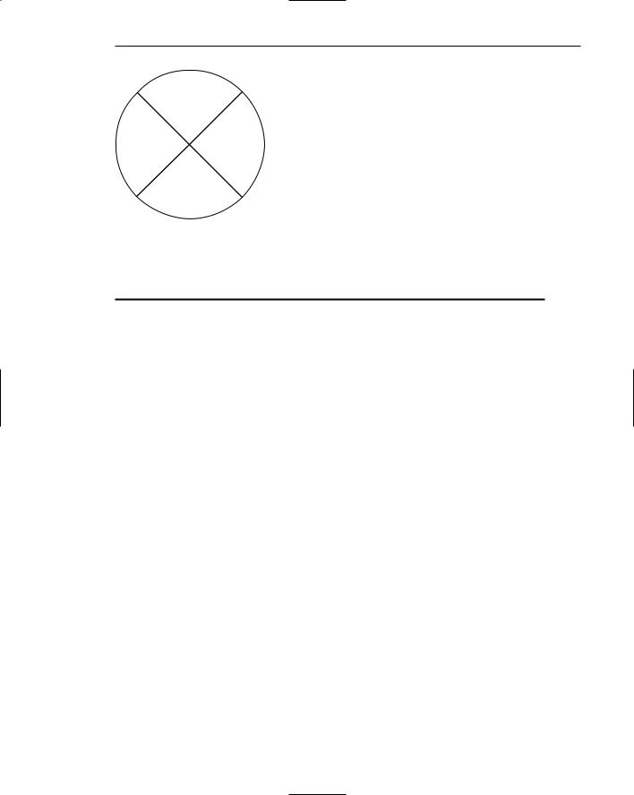
A pie menu is a circular representation of menu items, as illustrated in Figure 4.35 that can be used as an alternative to a pull-down or pop-up menu. Research has found that this style of menu yields higher performance than the typical vertical array, especially when the menu tasks are unrelated. Their basic advantage is that, when presented with the mouse pointer positioned in the pie’s center, average movement to any pie wedge is shorter. Mayhew (1992) concludes that pie menus might work well for mouse-driven selections with oneor two-level hierarchies, short choice listings, and data conducive to the format. Performance advantages for keyboard selection are doubtful, however.
Step 4: Develop System Menus and Navigation Schemes 381
North
West East
South
Figure 4.35: Pie menu.
Table 4.4: Menu Proper Usage Summary
Menu Bar |
To identify and provide access to |
|
• Common and frequently used application actions. |
|
• Actions that take place in a wide variety of different windows. |
|
|
Pull-Down Menu |
For frequently used application actions that take place in a wide |
|
variety of different windows, |
|
• A small number of items (five–ten). |
|
• Items rarely changing in content. |
|
|
Cascading Menu |
To simplify a higher-level menu. |
|
To provide easier browsing of a higher-level menu. |
|
For mutually exclusive choices. |
|
Restrict to one–two cascades. |
Pop-Up Menu |
For |
|
• Frequent users. |
|
• Frequently used contextual commands. |
|
• A small number of items (five–ten). |
|
• Items rarely changing in content. |
|
• Items that require a small amount of screen space. |
Tear-Off Menu |
For items |
|
• Sometimes frequently selected. |
|
• Sometimes infrequently selected. |
|
• Small in number (five–ten). |
|
• Rarely changing in content. |
|
|
Iconic Menu |
To designate applications available. |
|
To designate special functions within an application. |
|
|
382 Part 2: The User Interface Design Process
Graphical Menu Examples
What follows are examples of poor and proper menu design.
Example 1
An improperly presented menu bar and pull-down.
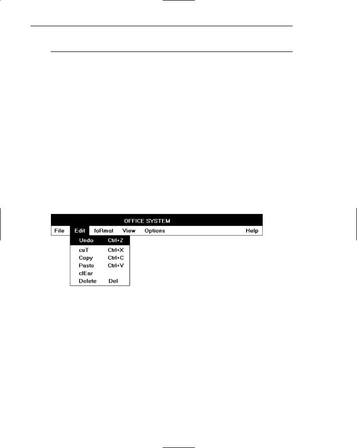
Menu 1.1
What are the problems in the way this menu bar and pull-down menu are presented?
(1)Keyboard mnemonics are designated by capital letters. Note the uncommon shape of “foRmat,” “cuT,” and “clEar” when the mnemonic is not the first letter of the word.
(2)Item groupings do not exist in the pull-down. The differences in basic functions are not obvious, and the more destructive operations (Undo, Clear, and Delete) are positioned close to standard actions, increasing the potential for accidental selection. (3) The keyboard accelerators are adjacent to the choice descriptions and not set off in any way. Therefore, these alternate, and supplemental, actions visually compete with choice descriptions for the viewer’s attention.
Menu 1.1
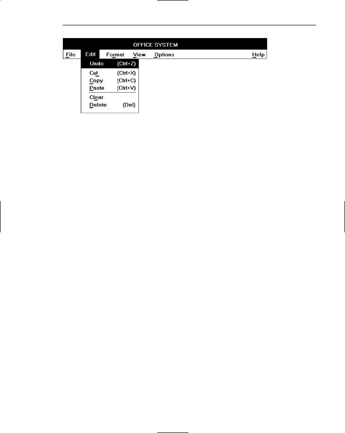
Menu 1.2
Keyboard mnemonics are designated by underlines, not capital letters. Choice descriptions now assume more common and recognizable shapes. Groupings, through use of white space, are established for choices in the pull-down. The different functions are much more obvious and separation is provided for the destructive actions. The different groupings are visually reinforced through use of separating lines. The lines are not extended to the pull-down border so as not to completely disassociate the choices. Keyboard alternatives are right-aligned to move them further from the choice descriptions. They are also enclosed in parentheses to visually deemphasize them, thereby reducing their visual competition with the choices. Choice descriptions are now more obvious.
Step 4: Develop System Menus and Navigation Schemes 383
Menu 1.2
More examples and an exercise for Step 4 can be found on this book’s companion Web site, www.wiley.com/college/galitz.

S T E P
5
Select the Proper Kinds
of Windows
A window is an area of the screen, usually rectangular in shape, defined by a border that contains a particular view of some area of the computer or some portion of a person’s dialog with the computer. It can be moved and rendered independently on the screen. A window may be small, containing a short message or a single field, or it may be large, consuming most or all of the available display space. A display may contain one, two, or more windows within its boundaries. In this step the following is addressed:
■■A window’s characteristics.
■■A window’s components.
■■A window’s presentation styles.
■■The types of windows available.
■■Organizing window system functions.
■■A window’s operations.
■■Web system frames and pop-up windows.
Window Characteristics
A window is seen to possess the following characteristics:
■■A name or title, allowing it to be identified.
■■A size in height and width (which can vary).
385

386Part 2: The User Interface Design Process
■■A state, accessible or active, or not accessible. (Only active windows can have their contents altered.)
■■Visibility — the portion that can be seen. (A window may be partially or fully hidden behind another window, or the information within a window may extend beyond the window’s display area.)
■■A location, relative to the display boundary.
■■Presentation, that is, its arrangement in relation to other windows. It may be tiled, overlapping, or cascading.
■■Management capabilities, methods for manipulation of the window on the screen.
■■Its highlight, that is, the part that is selected.
■■The function, task, or application to which it is dedicated.
The Attraction of Windows
The value of windowing is best seen in the context of a task or job. A person performs a variety of tasks, often in a fairly unstructured manner. A person is asked to monitor and manipulate data from a variety of sources, synthesize information, summarize information, and reorganize information. Things are seldom completed in a continuous time frame. Outside events such as telephone calls, supervisor or customer requests, and deadlines force shifts in emphasis and focus. Tasks start, stop, and start again. Materials used in dealing with the tasks are usually scattered about one’s desk, being strategically positioned in the workspace to make handling the task as efficient as possible. This spatial mapping of tools helps people organize their work and provides reminders of uncompleted tasks. As work progresses and priorities change, materials are reorganized to reflect the changes.
Single-screen technology supported this work structure very poorly. Because only one screen of information could be viewed at one time, comparing or integrating information from different sources and on different screens often required extensive use of one’s memory. To support memory, a person was often forced to write notes or obtain printed copies of screens. Switching between tasks was difficult and disruptive, and later returning to a task required an extensive and costly restructuring of the work environment.
The appeal of windowing is that it allows the display workspace to mirror the desk workspace much more closely. This dramatically reduces one’s short-term memory load. One’s ability to do mental calculations is limited by how well one keeps track of one’s place, one’s interim conclusions and products, and, finally, the results. Windows act as external memories that are an extension of one’s internal memory. Windows also make it much easier to switch between tasks and to maintain one’s context, because one does not have to reestablish one’s place continually. In addition, Windows provide access to more information than would normally be available on a single display of the same size. Overwriting, or placing more important information on top of that of less importance at that moment, does this.

Step 5: Select the Proper Kinds of Windows 387
While all the advantages and disadvantages of windows are still not completely understood, windows do seem to be useful in the following ways.
Presentation of Different Levels of Information
Information can be examined in increasing levels of detail. A document table of contents can be presented in a window. A chapter or topic selected from this window can be simultaneously displayed in more detail in an adjoining window. Deeper levels are also possible in additional windows.
Presentation of Multiple Kinds of Information
Variable information needed to complete a task can be displayed simultaneously in adjacent windows. An order-processing system window could collect a customer account number in one window and retrieve the customer’s name and shipping address in another window. A third window could collect details of the order, after which another window could present factory availability of and shipping dates for the desired items. Significant windows could remain displayed so that details may be modified as needed prior to order completion. Low inventory levels or delayed shipping dates might require changing the order.
Sequential Presentation of Levels or Kinds of Information
Steps to accomplish a task can be sequentially presented through windows. Successive windows are presented until all the required details are collected. Key windows may remain displayed, but others appear and disappear as necessary. This sequential preparation is especially useful if the information-collection process leads down various paths. An insurance application, for example, will include different types of coverage. A requested type of coverage might necessitate the collection of specific details about that type of coverage. This information can be entered into a window presented to collect the unique data. The windows disappear after data entry, and additional windows appear when needed.
Access to Different Sources of Information
Independent sources of information may have to be accessed at the same time. This information may reside in different host computers, operating systems, applications, files, or areas of the same file. It may be presented on the screen alongside the problem, greatly facilitating its solution. For instance, a writer may have to refer to several parts of a text being written at the same time. Or, a travel agent may have to compare several travel destinations for a particularly demanding client.

388 Part 2: The User Interface Design Process
Combining Multiple Sources of Information
Text from several documents may have to be reviewed and combined into one. Pertinent information is selected from one window and copied into another.
Performing More Than One Task
More than one task can be performed at one time. While waiting for a long, complex procedure to finish, another can be performed. Tasks of higher priority can interrupt less important ones. The interrupted task can then be resumed without the necessity to “close down” and “restart.”
Reminding
Windows can be used to remind the viewer of things likely to be of use in the near future. Examples might be menus of choices available, a history of the path followed or the command choices to that point, or the time of an important meeting.
Monitoring
Changes, both internal and external, can be monitored. Data in one window can be modified and its effect on data in another window can be studied. External events, such as changes in stock prices, out of normal range conditions, or system messages can be watched while another major activity is carried out.
Multiple Representations of the Same Task
The same thing can be looked at in several ways — for example, alternate drafts of a speech, different versions of a screen, or different graphical representations of the same data. A maintenance procedure may be presented in the form of textual steps and illustrated graphically at the same time.
Constraints in Window System Design
Windowing systems, in spite of their appeal and obvious benefits, have failed to completely live up to their expectations. In the past, a windows user interface has been described as “chaotic” because of the great amount of time users must spend doing such things as pointing at tiny boxes in window borders, resizing windows, moving windows, closing windows, and so forth. The problems with windowing systems can be attributed to three factors: historical considerations, hardware limitations, and human limitations.

Step 5: Select the Proper Kinds of Windows 389
Historical Considerations
Historically, system developers have been much more interested in solving hardware problems than in user considerations. Because technical issues abound, they have received the most attention. There has been little research addressing design issues and their impact on the usability of window systems. Therefore, few concrete window design guidelines are available to aid designers.
This lack of guidelines makes it difficult to develop acceptable and agreeable window standards. While many companies have developed style guides, they are very general and limited in scope to their products. Standardization is also made more difficult by the complexity and range of alternatives available to the designer. Without user performance data, it is difficult to compare realistically the different alternatives, and design choices become a matter of preference.
Standardization of the interface is also inhibited by other factors. Some software developers, who are proud of their originality, see standards as a threat to creativity and its perceived monetary rewards. Some companies are wary of standards because they fear that other companies are promoting standards that reflect their own approach. Finally, some companies have threatened, or brought, legal action against anyone who adopts an approach similar to their own.
The result is that developers of new systems create another new variation each time they design a product, and users must cope with a new interface each time they encounter a new windowing system.
Hardware Limitations
Many of today’s screens are not large enough to take full advantage of windowing capabilities. As a result, many windows are still of “Post-it” dimensions. As already mentioned, there is some evidence that many users of personal computers expand their windows to cover a full screen. Either seeing all the contents of one window is preferable to seeing small parts of many windows or the operational and visual complexity of multiple windows is not wanted.
Also, the slower processing speeds and smaller memory sizes of some computers may inhibit the use of windows. A drain on the computer’s resources may limit feedback and animation capabilities, thereby reducing the system’s usability. Poor screen resolution and graphics capability may also deter effective use of windows by not permitting sharp and realistic drawings and shapes.
Human Limitations
A windowing system, because it is more complex, requires the learning and using of more operations. Much practice is needed to master them. These window management operations are placed on top of other system operations, and window management can become an end in itself. This can severely detract from the task at hand. In one study comparing full screens with screens containing overlapping windows, task completion times were longer with the window screens, but the non-window screens generated more user errors. After eliminating screen arrangement time, however, task solution times were shorter with windows. The results suggest that advantages for