

The Essential Guide to UI Design
.pdf
440Part 2: The User Interface Design Process
performed, the pointer can assume the shape of a progress indicator such as an hourglass, providing an indication of processing status.
A pointer should contrast well with its background and be visible at all times. The user should always be in control of its location on the screen. The shape of a pointer should clearly indicate its purpose and meaning. Always use predefined shapes provided by graphical systems. Microsoft Windows, for example, provides about two dozen standard shapes. To aid learning and avoid user confusion, never create new shapes for already defined standard functions or use a shape for any purpose other than its previously defined meaning. Also, use only as many shapes as absolutely necessary to keep the user informed about current position and status. Too many shapes can also confuse a person.
Be conservative in making changes as the pointer moves across the screen. Excessive changes can be distracting to a person. To avoid frequent changes while crossing the screen, establish a short time-out before making noncritical pointer changes. Any pointer animation should not distract the viewer or restrict one’s ability to interact with the system.
Output Devices
The computer communicates to the user through output devices. The most common is the display screen.
Screens
Screens are very useful for presenting a wide range of visual elements and complex data. They have been the workhorse of computer systems for decades. For many years the visual display terminal, or VDT (as it was called before the term monitor became popular when the keyboard and monitor were detached), has been constructed using a raster-scan cathode ray tube (CRT). In its earlier years CRT’s were very prone to flickering, but technological improvements have resulted in flicker-free CRTs with excellent resolution. Their one drawback is their size.
Recent years have seen tremendous improvement in an alternative display, the liquid crystal display (LCD). LCDs are much smaller, thinner, and lighter than CRTs while possessing the same viewing area. They consume less power than a CRT and are now much more affordable. Stone et al. (2005) suggests the following should be considered in choosing a screen:
Image. How detailed does the image need to be? For highly graphic applications involving images and photographs, a high-resolution screen will be desirable. For text work and larger letter sizes, a lower resolution may be satisfactory.
Colors. How many colors are needed? The number of colors can range from monochrome to millions. The application will determine this requirement.
Size. Like televisions, screen sizes are measured across the diagonal. Common desktop sizes are 17, 19, and 21 inches. The larger the screen, the more advantages exist. More information can be displayed, as can larger text and images. Size will

Step 6: Select the Proper Interaction Devices 441
depend upon the needs of the application and the needs of the user. A visually impaired person, for example, may well want larger text and images. Much smaller screens are required for hand-held devices.
Portability. Does the screen need to be portable? CRTs are heavy and not portable. LCDs are lightweight and very portable.
Usage space. CRTs have a much larger desktop footprint. LCDs take up much less space. Crowded desks and environments will find benefits in an LCD.
Speakers
Computer sounds have advanced from a simple beep to the reproduction of speech, music, and sound effects. The quality of the speaker should reflect the quality of the sound being presented.
Step 6 Exercise
An exercise for Step 6 can be found on this book’s companion Web site, www.wiley
.com/college/galitz.


S T E P
7
Choose the Proper
Screen-Based Controls
Screen controls, sometimes called widgets, are the elements of a screen that constitute its body. By definition, they are graphic objects that represent the properties or operations of other objects. A control may
■■Permit the entry or selection of a particular value.
■■Permit the changing or editing of a particular value.
■■Display only a particular piece of text, value, or graphic.
■■Cause a command to be performed.
■■Possess a contextual pop-up window.
In the last decade, some platforms have expanded the definition of a control to include all specifiable aspects of a screen, including screen text, headings, and group boxes. For the purposes of this discussion, this broader definition of a control will be assumed. This step will encompass
■■Identifying the characteristics and capabilities of the various screen controls, including
——Buttons.
——Text entry/read-only controls.
——Selection controls.
——Combination entry/selection controls.
——Specialized operable controls.
——Custom controls.
443

444Part 2: The User Interface Design Process
——Presentation controls.
——Web controls.
■■Selecting the proper controls for the user and tasks.
The screen designer is presented with an array of screen controls to choose from. Selecting the right one for the user and the task is often difficult. But, as with input devices, making the right choice is critical to system success. A proper fit between user and control will lead to fast, accurate performance. A poor fit will result in lower productivity, more errors, and dissatisfaction.
We’ll start by describing the types of controls and identifying their advantages, disadvantages, and proper usage. Relevant control design guidelines will also be presented. Not all toolkits or platforms will necessarily possess all the kinds of controls to be described. After describing the controls, we’ll look at several research studies addressing the way to choose the best control or controls for particular situations. By the time these studies are reviewed, their findings will have been incorporated into the control usage and design guidelines already presented. This organization has been chosen because it is more meaningful to first clearly describe each control before discussing it in a research context. We’ll finish by providing some general guidance in choosing the proper kind of control to enable tasks to be performed quickly and efficiently by the user.
In describing the controls, we’ll break them down into categories that reflect the way they are used. We’ll begin with operable controls, those that are manipulable, changeable, or settable. We’ll then review presentation controls, those used to inscribe permanent information on a screen or used to give the screen structure. Before starting this review, three extremely important principles regarding controls should be noted:
■■A control must
——Look the way it works.
——Work the way it looks.
■■A control must be used exactly as its design intended.
■■A control must be presented in a standard manner.
The look of a control should make it obvious that it is a control. Its design characteristics should signal “enterability” or “clickability.” Microsoft Windows, for example, presents the following simple rules:
■■Raised elements can be pressed.
■■Recessed elements cannot be pressed.
■■Elements on a flat white background can be opened, edited, or moved.
A control must also be presented in a standard and consistent manner, and used exactly as its design intended. The nonstandard design use of controls destroys consistency and aggravates and frustrates users, who have developed expectations based upon their past experiences. Using standard controls allows people to focus on their tasks or the content of the screens with which they are interacting, instead of having to figure out what to do.

Step 7: Choose the Proper Screen-Based Controls 445
Web page design has unleashed and exposed thousands of instances where these basic principles (and others to be described) have been violated. Page designers, all too often it seems, have been placing greater value on personal creativity than on interface usability. Some examples will be presented throughout the following pages.
Operable Controls
Operable controls are those that permit the entry, selection, changing, or editing of a particular value, or cause a command to be performed. Classes include buttons, text entry/read-only, selection, combination entry/selection, and other specialized controls.
Buttons
■Description:
—A square or rectangular-shaped control with a label inside that indicates action to be accomplished.
—The label may consist of text, graphics, or both.
■Purpose:
—To start actions.
—To change properties.
—To display a pop-up menu.
■Advantages:
—Always visible, reminding one of the choices available.
—Convenient.
—Can be logically organized in the work area.
—Can provide meaningful descriptions of the actions that will be performed.
—Larger size generally provides faster selection target.
—Can possess 3-D appearance:
•Adds an aesthetically pleasing style to the screen.
•Provides visual feedback through button movement when activated.
—May permit use of keyboard equivalents and accelerators.
—Faster than using a two-step menu bar/pull-down sequence.
■Disadvantages:
—Consumes screen space.
—Size limits the number that may be displayed.
—Requires looking away from main working area to activate.
—Requires moving the pointer to select.
■Proper usage:
—Use for frequently used actions that are specific to a window.
•To cause something to happen immediately.
•To display another window.
•To display a menu of options.
•To set a mode or property value.
—In Web page or application design use buttons to perform an action.
•Use links to show information
446 Part 2: The User Interface Design Process
A button comes in three styles. The first resembles the control commonly found on electrical or mechanical devices and is sometimes called a pushbutton. These are most often rectangular, with text that indicates the action to be taken when they are selected or pressed. These buttons are usually placed within a window, and activating them causes the action or command described on them to be performed immediately. This kind of button may take a variety of forms, some of which are illustrated in Figure 7.1. They are often referred to as command buttons.
The second style is square or rectangular in shape with an icon or graphic inside. It may have an associated label. This kind of button is illustrated in Figure 7.2. The label may be permanently affixed to the screen within the button, adjacent to it, or only appear when the pointer is moved to the button (called ToolTip, to be discussed). These buttons may appear singly or be placed in groupings commonly called button bars or toolbars. We’ll refer to them as toolbars in this text. They are most frequently used to quickly access commands, many of which are normally accessed through the menu bar, or to initiate other actions or functions. These button groupings are usually placed at the screen’s top or side. They are usually relocatable and removable by the user.
The third style is square or rectangular in shape with a symbol inscribed inside, as illustrated in Figure 7.3. The symbol, when learned, identifies the button and the action to be performed when the button is selected. These buttons, specific to a platform and provided by it, are located in the borders of windows and are used to do such things as obtain a system menu or resize a window. They are discussed in more detail in Step 5 and will not be addressed in this step. This step will focus on command and toolbar buttons.
Figure 7.1: Command buttons.
Figure 7.2: Toolbar buttons without labels.
Figure 7.3: A symbol button.

Step 7: Choose the Proper Screen-Based Controls 447
Command button advantages. An advantage of a command button is that it is always visible, providing a reminder of its existence. Command buttons are conveniently and logically located in the work area and can be inscribed with meaningful descriptions of what they do. Their ability to assume a fairly large size speeds selection, and their three-dimensional appearance is aesthetically pleasing. Buttons can also provide meaningful visual feedback through the movement of the button when activated. Their activation is much easier and faster than using a two-step menu bar/pull-down sequence.
Command button disadvantages. Among the disadvantages of command buttons is their larger size, which consumes considerable screen space and limits the number that can be displayed.
Toolbar advantages. Advantages of toolbar buttons include their continuous visibility and ease and speed of use. They also, individually, consume a relatively small amount of space.
Toolbar disadvantages. Disadvantages include their location being away from the main work area and their small size, which slows down selection. Another disadvantage is that when a large number of buttons are grouped in a bar, they consume a great deal of screen space, and they can easily create screen clutter. In circumstances where they do not possess a label, the necessity of learning and remembering what they are used for can also cause problems.
Proper usage. Buttons are best for frequently used actions in a window. They can be used to cause actions to occur immediately, such as saving a document, quitting a system, or deleting text. They can be used to display a menu of options, such as colors or fonts. Microsoft Windows calls a button that leads to a menu a menu button. Buttons can also be used to display other secondary windows or dialog boxes, and to expand the dialog or invoke dialog features. Windows calls a button that expands the dialog an unfolding button. Buttons may also be used to reflect a mode or property value setting similarly to the use of radio buttons or check boxes. In some kinds of windows, command buttons may be the only command method available to the user.
In Web application or page design, buttons should be only used to cause an action to occur. They should never be used to retrieve or show information. A button is designed to imply it can be pressed. When it is pressed it does something. Always use links to show information. Maintaining this distinction aids understanding and learning.
Command Buttons
Command button guidelines include the following.
Usage
■For windows with a menu bar,
—Use to provide fast access to frequently used or critical commands.
■For windows without a menu bar,
—Use to provide access to all necessary commands.

448 Part 2: The User Interface Design Process
For fast access to commands contained in a menu bar, especially those frequently used or critical, also provide access by command buttons. Buttons must also be provided for situations where a command is not available through the menu bar. For windows without menu bars, buttons must be provided to provide access to all window commands.
Structure
■Provide a rectangular shape with the label inscribed within it.
■Give the button a raised appearance.
■Maintain consistency in style throughout an application.
The shape of a button can vary. Generally, rectangular-shaped buttons are preferred because they provide the best fit for horizontally arrayed textual captions. Square-cor- nered rectangles are found in some platforms including Microsoft Windows, while rounded-cornered rectangles are found in others. The button style chosen must reflect the three cornerstone principles presented at the beginning of this step, including giving it a raised appearance to make it obvious that it is a command button. To do this, drop shadows are used in some platforms, beveled edges in others. “Invisible” buttons must never exist. Web command button styles are noted for their variety in shape and size. The button style chosen is mostly a matter of preference. Web-specific button styles should be consistently designed and maintained throughout the Web site.
Labels
■Use standard button labels when available.
■Provide meaningful descriptions of the actions that will be performed.
■Use single-word labels whenever possible.
—Use two to three words for clarity, if necessary.
■Use mixed-case letters with the first letter of each significant label word capitalized.
■Display labels
—In the regular system font.
—In the same size font.
■Do not number labels.
■Center the label within the button borders, leaving at least two pixels between the text and the button border.
■Provide consistency in button labeling across all screens.

Step 7: Choose the Proper Screen-Based Controls 449
Labels. Button labels should be clearly spelled out, with meaningful descriptions of the actions they will cause to be performed. Choices should be composed of mixed-case single words. Multiple words are preferred, however, to single words lacking clarity in their intent. If multiple-word labels are used, capitalize the first letter of each word (headline style). Use the same size and style of font in all buttons. The regular system font is preferred. Never change font style or size within buttons; these kinds of changes can be very distracting to the viewer. Center each label within the button borders, leaving at least two pixels between the text and the border.
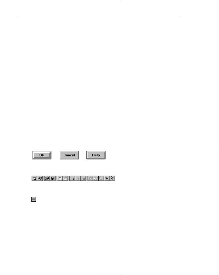
Common button functions should have standard names and uses. Microsoft windows, for example, provides these standard names and definitions:
OK — Any changed information in the window is accepted and the window is closed.
Cancel — Closes window without implementing unsubmitted changes.
Reset — Resets defaults and cancels any changed information that has not been submitted.
Apply — Any changed information in the window is accepted and again displayed in the window that remains open.
Close — Closes the window.
Help — Opens online Help.
Always follow all platform presentation and usage guidelines for standard button functions.
Size
■Provide as large a button as feasible.
■Maintain consistent button heights and widths.
■Exception: Buttons containing excessively long labels may be wider.
Provide as large a button as possible, consistent with Fitts’ Law (see Step 1). Buttons must, at minimum, be wide enough to accommodate the longest label. Leave at least two pixels between labels and button borders. A command button’s minimum height should be 25 pixels. Create, however, standard, equal-sized buttons encompassing the majority of system functions. When a button’s label will not fit within the standard size, expand the button’s size to achieve a proper label fit. Never reduce the font size of some labels to create equal-sized buttons. In this case, buttons of different widths are preferable. Also, do not create an unnecessarily wide button for aesthetic balance purposes, as illustrated by the Color Palette button in Figure 7.4. The perceptual model we possess in our memory for a button will be lost.