

The Essential Guide to UI Design
.pdf
400 Part 2: The User Interface Design Process
Primary Window
■Proper usage
—Use to represent an independent function or application.
—Use to present constantly used window components and controls.
•Menu bar items that are
•Used frequently.
•Used by most, or all, primary or secondary windows.
•Controls used by dependent windows
—Use for presenting information that is continually updated, such as date and time.
—Use for providing context for dependent windows to be created.
—Do not
•Divide an independent function into two or more primary windows.
•Present unrelated functions in one primary window.
The primary window is the first one that appears on a screen when an activity or action is started. It is required for every function or application, possessing a menu bar and some basic action controls, as previously described. It should present the framework for the function’s commands and data, and provide top-level context for dependent windows. It has also been variously referred to as the application window or the main window. In addition, it may be referred to as the parent window if one or more child windows exist. A Microsoft Windows primary window is shown in Figure 5.7.
The primary window is the main focal point of the user’s activities and should represent an independent function. Avoid dividing an independent function into two or more primary windows, and avoid presenting unrelated functions in a single primary window. This tends to confuse people.
Independent functions should begin in a primary window. A primary window should contain constantly used window components such as frequently used menu bar items and controls (for example, control bars) used by dependent windows. Also include in a primary window continually updated information such as the date and time. The components of a primary window are summarized in Table 5.2.
Figure 5.7: Microsoft Windows primary window.

Step 5: Select the Proper Kinds of Windows 401
Secondary Windows
■Proper usage:
—For performing subordinate, supplemental, or ancillary actions that are
•Extended or more complex in nature.
•Related to objects in the primary window.
—For presenting frequently or occasionally used window components.
■Important guidelines:
—Should typically not appear as an entry on the taskbar.
––A secondary window should not be larger than 263 dialog units x 263 dialog units.
Secondary windows are supplemental windows. Secondary windows may be dependent upon a primary window or displayed independently of the primary window. They structurally resemble a primary window, possessing some of the same action controls (Close button) and possibly a What’s This? button.
A dependent secondary window is one common type. It can only be displayed from a command on the interface of its primary window. It is typically associated with a single data object, and appears on top of the active window when requested. It is movable, and scrollable. If necessary, it uses the primary window’s menu bar. Most systems permit the use of multiple secondary windows to complete a task. In general, dependent secondary windows are closed when the primary window closes, and hidden when their primary window is hidden or minimized.
An independent secondary window can be opened independently of a primary window — for example, a property sheet displayed when the user clicks the Properties command on the menu of a desktop icon. An independent secondary window can be typically closed without regard to the state of any primary window unless there is an obvious relationship to the primary window.
A Microsoft Windows secondary Window is illustrated in Figure 5.8.
Proper usage. Although secondary windows share many characteristics with primary windows, they also differ from primary windows in behavior and use. Secondary windows are used to perform supplemental or subordinate tasks, or tasks that are extended in nature. Frequently and occasionally used window components should also be presented in secondary windows. Microsoft Windows possesses several types of secondary windows called dialog boxes, property sheets, property inspectors, message boxes, palette windows, and pop-up windows.
Figure 5.8: Microsoft Windows secondary window.

402 Part 2: The User Interface Design Process
Guidelines. A secondary window should typically not appear as an entry on the taskbar. Secondary windows obtain or display supplemental information that is usually related to the objects that appear in a primary window.
A secondary window is typically smaller than its associated primary window and smaller than the minimum display resolution. Microsoft recommends not displaying any secondary window larger than 263 dialog units x 263 dialog units. Microsoft defines size and location of user-interface elements not in pixels but in dialog units (DLUs), a device-independent unit of measure.
■■One horizontal DLU is equal to one-fourth of the average character width for the current system font.
■■One vertical DLU is equal to one-eighth of the average character height for the current system font.
These sizes keep the window from becoming too large to display at most resolutions. However, they still provide reasonable space to display supportive information, such as Help information, that applies. The components of a secondary window are summarized in Table 5.2.
Table 5.2: Microsoft Window Types and Components
PRIMARY WINDOW |
|
Purpose: |
To perform a major interaction. |
|
|
Components: |
Frame or border. |
|
Title bar. |
|
—Access point for commands that apply to the window, with |
|
commands displayed in a pop-up menu. |
|
Title Bar icon. |
|
—Small version of the icon of the object being viewed. |
|
—Access point for commands that apply to the object being |
|
displayed in the window, with commands displayed in a |
|
pop-up window. |
|
Title bar text. |
|
Title bar buttons to close/minimize/maximize /restore a window. |
|
Menu bar. |
|
Status bar. |
|
Scroll bar. |
|
Size grip. |
|
|
SECONDARY WINDOWS |
|
Purpose: |
To obtain or display supplemental information related to the |
|
objects in the primary window. |
|
|
Components: |
Frame or border. |
|
Title bar. |
|
Title bar text. |
|
Close button. |
|
What’s This? button. |
|
—Context-sensitive Help about components displayed in the |
|
window; this is optional. |

|
Step 5: Select the Proper Kinds of Windows 403 |
|
Table 5.2 (continued) |
|
|
|
|
|
SECONDARY WINDOWS |
|
|
Kinds: |
Modal and modeless. |
|
|
|
|
Dialog Boxes |
|
|
Purpose: |
To obtain additional information needed to carry out a particular |
|
|
command or task. |
|
|
|
|
Description: |
Secondary window. |
|
|
Contains the following common dialog box interfaces: |
|
|
— Open/Replace/Find. |
|
|
— Save As /Print/Print Setup. |
|
|
— Page Setup/Font/Color. |
|
|
|
|
Property Inspectors |
|
|
|
|
|
Purpose: |
To display the most common or frequently accessed properties of |
|
|
a current selection, usually of a particular type of object. |
|
|
|
|
Description: |
A modeless secondary window. |
|
|
Typically modal with respect to the object for which it displays |
|
|
properties. |
|
|
|
|
Usage: |
Displayed when requested from selected object. |
|
|
|
|
Property Sheets |
|
|
Purpose: |
For presenting the complete set of properties for an object. |
|
|
|
|
Description: |
A modeless secondary window. |
|
|
Typically modal with respect to the object for which it displays |
|
|
properties. |
|
|
|
|
Usage: |
Displayed when requested from selected object. |
|
|
|
|
Message Boxes |
|
|
Purpose: |
To provide information about a particular situation or condition. |
|
|
|
|
Description: |
Secondary window. |
|
|
Types of message boxes: |
|
|
— Information/Warning/Critical. |
|
|
|
|
Palette Windows |
|
|
|
|
|
Purpose: |
To present a set of controls such as palettes or toolbars. |
|
Description: |
Modeless secondary window. |
|
|
|
|
Pop-Up Windows |
|
|
|
|
|
Purpose: |
To display additional information when an abbreviated form of |
|
|
the information is the main presentation. |
|
|
|
|
Description: |
Secondary window. |
|
|
Does not contain standard secondary window components such |
|
|
as title bar and close button. |
|
|
Example: ToolTip. |
|
|
|
|

404 Part 2: The User Interface Design Process
Modal and Modeless
■Modal:
—Use when interaction with any other window must not be permitted.
—Use for
•Presenting information; for example, messages (sometimes called a message box).
•Receiving user input; for example, data or information (sometimes called a prompt box).
•Asking questions; for example, data, information, or directions (sometimes called a question box).
—Use carefully because it constrains what the user can do.
■Modeless:
—Use when interaction with other windows must be permitted.
—Use when interaction with other windows must be repeated.
A secondary window can be modal or modeless.
Modal. Most secondary windows will be modal. Modal windows will not permit interaction with another window until the current dialog is completed. It remains displayed until the appropriate action is taken, after which it is removed from the screen. Modal dialog boxes typically request critical information or actions that must be reacted to before the dialog can continue. Because modal dialog boxes constrain what the user can do, limit their use to situations in which additional information is required to complete a command or when it is important to prevent any further interaction until satisfying a condition.
Modeless. A modeless dialog box permits the user to engage in parallel dialogs. Switching between the box and its associated window is permitted. Other tasks may be performed while a modeless dialog box is displayed, and it may be left on the screen after a response has been made to it. Actions leading to a modeless dialog box can be canceled, causing the box to be removed from the screen.
Use a modeless dialog box when interaction with a primary window or another secondary window must be permitted, for example, during the accessing of the Help function. Also, use a modeless dialog box when interaction with other windows must be repeated; for example, in a word search operation.
Cascading and Unfolding
■Cascading
—Purpose:
•To provide advanced options at a lower level in a complex dialog.
—Guidelines:
•Provide a command button leading to the next dialog box with a “To a Window” indicator, an ellipsis (. . . ).
•Present the additional dialog box in cascaded form.
Step 5: Select the Proper Kinds of Windows 405
•Provide no more than two cascades in a given path.
•Do not cover previous critical information.
—Title Bar.
—Relevant displayed information.
•If independent, close the secondary window from which it was opened.
■Unfolding
—Purpose:
•To provide advanced options at the same level in a complex dialog.
—Guidelines:
•Provide a command button with an expanding dialog symbol (>>).
•Expand to right or downward.
Access to additional options can be accomplished by inclusion of a command button that opens another secondary window. These multiple secondary windows needed to complete a task may be presented in two forms, cascading or expanding.
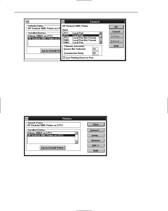
Cascading. A cascading window keeps the original window displayed, with the dependent window displayed on top, offset slightly to the right and below the original secondary window. A cascade, illustrated in Figures 5.9 and 5.10, is generally used when advanced options at a lower level in a complex dialog must be presented. An indication that the dialog will be cascading is signaled by an ellipsis placed in the command button used to display the additional dialog box. Because of the confusion that can develop with too many cascades, restrict the number of cascades to no more than two in a given path. Do not cover information on the upper-level dialog boxes that may have to be referred to, such as box title bars and other critical or relevant information. If the cascaded window is independent in its operation, close the secondary window from which it was opened and display only the new window.
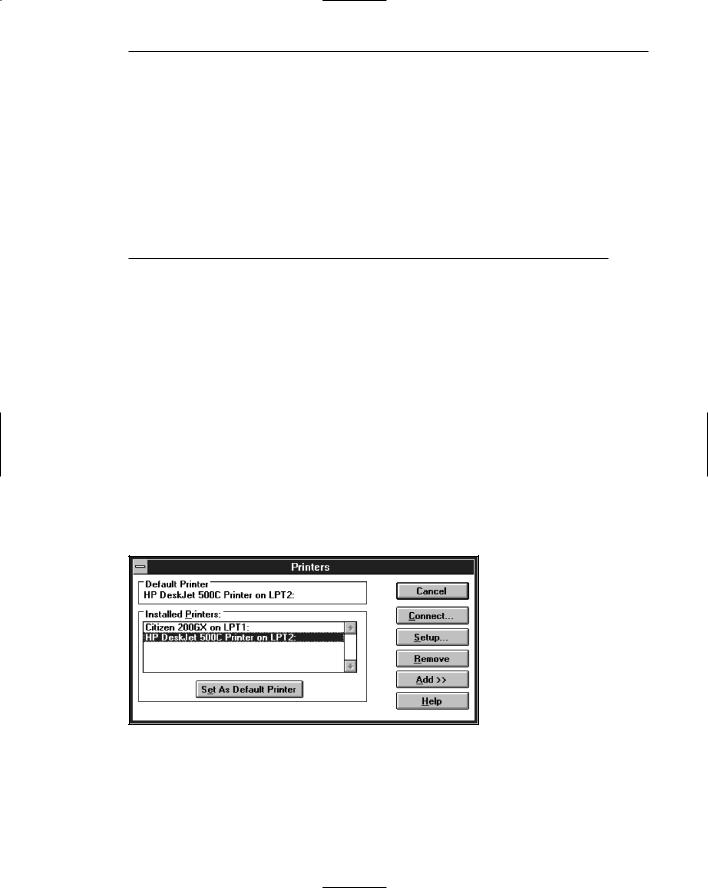
Figure 5.9: Printers secondary window with Connect cascade button.
406 Part 2: The User Interface Design Process
Figure 5.10: Cascading Connect secondary window.
Unfolding. An unfolding secondary window expands to reveal additional options, a form of progressive disclosure. Unfolding windows, sometimes called expanding windows, are generally used to provide advanced options at the same level in a complex dialog. They are good alternatives when the interface contains a fixed set of options or controls that seldom need to be accessed. An unfolding window is illustrated in Figures 5.11 and 5.12. An indication that the dialog will be expanding is signaled by a double arrow (>>) placed in the command button used to display the additional dialog box. Expand the box to right, preferably, or downward if screen space constraints exist. As an option, the same button can be used to “refold” the additional part of the window.
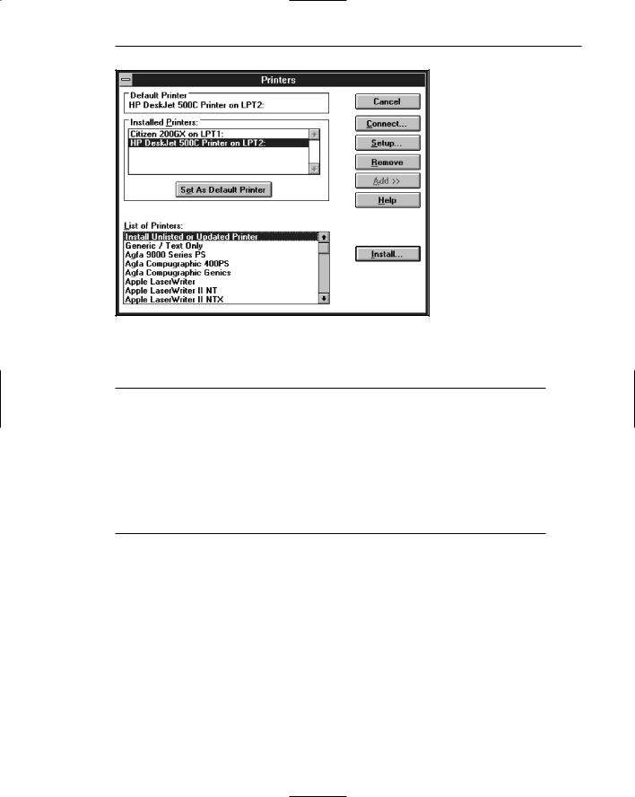
Figure 5.11: Printers secondary window with Add >> unfolding button.
Step 5: Select the Proper Kinds of Windows 407
Figure 5.12: Unfolded Printers secondary window.
Dialog Boxes
■Use for presenting brief messages.
■Use for requesting specific, transient actions.
■Use for performing actions that
—Take a short time to complete.
—Are not frequently changed.
■Command buttons to include
—OK.
—Cancel.
—Others as necessary.
Dialog boxes are used to extend and complete an interaction within a limited context. Dialog boxes are always displayed from another window, either primary or secondary, or another dialog box. They may appear as a result of a command button being activated or a menu choice being selected, or they may be presented automatically by the system when a condition exists that requires the user’s attention or additional input. They may possess some basic action controls (Close button and possibly a What’s This? button), but do not have a menu bar. A Microsoft Windows dialog box is illustrated in Figure 5.13.
Most windowing systems provide standard dialog boxes for common functions, some examples being Open, Save As, and Print. Many platforms also recommend a set of standard command buttons for use in the various kinds of dialog boxes, such as OK, Cancel, and so on. Dialog boxes are of two types, modal and modeless, as recently described. They may also cascade or unfold.

408 Part 2: The User Interface Design Process
Figure 5.13: Microsoft Windows dialog box.
Uses. Dialog boxes are used for presenting brief amounts of information or to request specific transient actions. Dialog box actions will usually be those that do not occur frequently.
Command buttons. Dialog boxes commonly include OK and Cancel command buttons. OK and Cancel buttons work best in dialog boxes that allow the user to set the parameters for a particular command. OK is typically defined as the default command button when the dialog box window opens. Other command buttons may be included in a dialog box in addition to or instead of the OK and Cancel buttons. Follow the design conventions for command buttons found in Step 7.
Property Sheets and Property Inspectors
The properties of an object in an interface can be displayed in a variety of ways. For example, the image and name of an icon on the desktop reflect specific properties of that object, as do other interface components such as toolbars, status bars, and even scroll bars. Secondary windows provide two other techniques for displaying properties, property sheets and property inspectors.
Property Sheets
■Use for presenting the complete set of properties for an object.
■Categorize and group within property pages, as necessary.
— Use tabbed property pages for grouping peer-related property sets.
Step 5: Select the Proper Kinds of Windows 409
—The recommended sizes for property sheets are
•252 DLUs wide×218 DLUs high
•227 DLUs wide×215 DLUs high
•212 DLUs wide×188 DLUs high
—Command buttons to include
•OK.
•Cancel.
•Apply.
•Reset.
•Others as necessary.
—For single property sheets, place the commands on the sheet.
—For tabbed property pages, place the commands outside the tabbed pages.
Use. A property sheet is the most common way to present an object’s complete set of properties in a secondary window. A property sheet is a modeless secondary window that displays the user-accessible properties of an object, properties that may be viewed but not necessarily edited. A single page property sheet is illustrated in Figure 5.14.
Property pages. Because there can be many properties for an object and the object’s context, the categorization and grouping of properties within sets may be necessary. A technique for supporting navigation to groups of properties in a property sheet is a tabbed property page, where each set of properties is presented within the window as a separate page. Each page tab is labeled with the name of the set, as shown in Figure 5.15. Use tabbed property pages for grouping peer-related property sets. Tabs are described in Step 7.
Size. The sizes recommended for property sheets by Microsoft shown earlier will create a window smaller than its associated window and smaller than the minimum display resolution.
Figure 5.14: Microsoft Windows property sheet.