

The Essential Guide to UI Design
.pdf
340 Part 2: The User Interface Design Process
Unavailable Choices
■Unavailable choices should be dimmed or “grayed out.”
■Do not add or remove items from a menu unless the user takes explicit action to add or remove them through the application.
Choices not available to the user should be made visually distinctive by dimming them or graying them out. They must not compete with active items for the user’s attention. Items should not be added or removed from a menu unless the user takes explicit action to do so. Allowing the system to change menu items takes control away from the user and can also lead to user confusion.
Mark Toggles or Settings
■Purpose:
—Use to designate that an item or feature is active or inactive over a relatively long period of time.
—Use to provide a reminder that an item or feature is active or inactive.
■Guidelines:
—Position the indicator directly to the left of the option.
—For situations where several nonexclusive choices may be selected, consider including one alternative that deselects all the items and reverts the state to the “normal” condition.
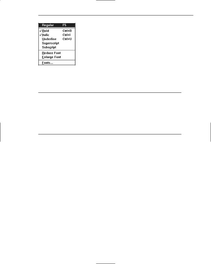
Purpose. Mark toggles or settings, illustrated in Figure 4.15, are menu items that toggle between active and not active. When it is active, an indicator is displayed adjacent to the item description. For nonexclusive choices, a check mark is displayed; for mutually exclusive choices, another distinctive symbol, such as a diamond or circle, is displayed. When the item is not active, no mark or symbol will appear.
Examples of items using mark toggles are having a specific application automatically loaded after the system is loaded; having windows automatically reduced to icons when they are made inactive; or making a setting without requiring a dialog box. The purpose of mark toggles is to activate or deactivate an attribute by setting one menu item.
Advantages/disadvantages. Mark toggles provide a visual indication of the state of an item. They are accessed quickly, but may not always be visible. Mark toggles are best suited to items or features that remain active or inactive over relatively long periods of time. They provide good reminders of the state that exists.
Guidelines. Position the mark toggle indicator directly to the left of the menu option. In situations where several nonexclusive choices may be selected on one menu, consider including one alternative that deselects all the items and reverts the state to the normal condition, as illustrated by “Regular” in Figure 4.15.
Step 4: Develop System Menus and Navigation Schemes 341
Figure 4.15: Mark toggles or settings.
Toggled Menu Items
■Purpose:
—Use to designate two opposite commands that are accessed frequently.
—Use when the menu item displayed will clearly indicate that the opposite condition currently exists.
■Guidelines:
—Provide a meaningful, fully spelled-out description of the action.
—Begin with a verb that unambiguously represents the outcome of the command.
—Use mixed-case letters, with the first letter of each word capitalized.
Purpose. A toggled menu item is a one-menu item command that toggles back and forth between the current state and its alternative state. When the menu item is first displayed, it reflects the alternative state to the condition that currently exists. For example, in Figure 4.16, if a background grid is currently being displayed, the menu item reads Hide Grid. When Hide Grid is selected, the grid is removed from the window, and the menu item dynamically changes to reflect the opposite action. It will now read Show Grid. When a grid is again requested, it will change back to Hide Grid. The purpose of toggled menu item is to use a single menu item to designate and activate the one, opposite, alternative of a twostate command setting.
Advantages/disadvantages. Toggled menu items shorten menus, decrease visual clutter, provide quicker access, and foster faster comprehension of the command action. When they are located on a pull-down menu, however, the actions themselves are not always visible. The opposite action reflecting the current state of the attribute, because it too is not visible, can cause uncertainty for novice users concerning what the state actually is. Toggled menu items are also limited in use to commands only.
Guidelines. Use toggled menu items to designate two opposite commands that are accessed frequently. The menu item displayed must be one that clearly indicates that the opposite condition currently exists. The menu captions should clearly state what would happen if the menu item action were requested. It is most meaningful to begin the command with a verb.

342 Part 2: The User Interface Design Process
Figure 4.16: Toggled menu item.
Web Site Navigation
Navigation refers to the method people use to find what they want in a Web site. Navigation, and an efficient navigational structure, is the most important element in system usability. A simple and clear navigational structure is the backbone upon which all system features are draped. To navigate to a destination, people use available spatial and environmental information, a process called wayfinding (Lynch, 1960; Downs and Stea, 1973). Wayfinding involves four stages: orientation, route decision, route monitoring, and destination recognition.
Orientation. One’s current location relative to nearby objects and the destination must be determined. This is called orientation. Dividing a space into small parts and providing landmarks and meaningful signage (titles) aids orientation. The result is that locations have identities that are easier to remember.
Route decision. A path must be chosen to get to the destination. Route decisionmaking is improved by minimizing the number of navigational choices, and by providing signs or prompts at decision points. People generally prefer shorter routes to longer routes, even if the shorter route is more complex. Routes are followed most efficiently when clear directions or signs are available. Site maps provide good mental representations of the space to be navigated, and are very useful if the space is large, complex, or poorly designed.
Route monitoring. The chosen route must be monitored to confirm that it is leading to the proper destination. Connect locations with paths that have clear beginnings, middles, and ends. A person should be able to gauge his or her progress as the path is followed. Breadcrumbs, a visible history of the path followed, aids monitoring, especially when a mistake has been made, and going back is necessary.
Destination recognition. The destination, when it is found, must be easily recognized. To aid recognition, provide clear and consistent identities to destinations.
In Web site design, the most successful sites have been found to be those that enhance wayfinding, possessing easy-to-use and understandable navigational systems. No amount of graphical “sparkle” has yet been able to overcome a poor navigational design. A Web site’s organizational structure, its navigational tools and their obviousness, and the labels on its navigational elements influence a Web site’s usability. The navigational elements of Web sites are referred to as links. Navigational elements that link usually consist of textual phrases or images. A person selects a link through clicking a device-based control, such as the mouse, on the link itself. A navigational link, therefore, is said to be clickable. A link, when selected or clicked, typically

Step 4: Develop System Menus and Navigation Schemes 343
causes a new page to be presented containing the content described by the link’s label. A fundamental principle in Web page design is to clearly visually differentiate clickable links from other page elements.
Other design aspects also influence Web site usability. Among them are the navigational aids available, including indexes. In Web site navigation design, the unique, often incompatible, relationship the browser has to the Web site application being presented can also influence its navigational ease.
Web Site Navigation Problems
To fully understand what comprises good navigation, let’s first look at some Web site navigational issues and problems, both technical and usage-related. The Web and its navigation is undoubtedly the most complex computer interface facing people today.
Technical issues. Unlike a graphical system application, whose screens tend to flow in an orderly and predictable manner, a Web site is composed of pages, each of which can, theoretically, be linked to any other page in the site. The graphical application user normally begins a process at a prescribed starting point and proceeds sequentially until a process or task is finished. Web users, on the other hand, can perform tasks or satisfy needs at will, easily moving between most pages in the “spider web” in any order desired, and even jumping to other spider webs when the urge arises. In an analogy to driving a car, the graphical system user is essentially following a freeway in Nevada. The Web site user is wandering around in downtown Boston without a road map and, encountering a road link (a bridge over the Charles River), suddenly finds himself in Cambridge.
The graphical system user must deal with only one operating system whose navigational characteristics are standard and fairly consistent. The Web user must confront two navigational systems, that of the browser being used and that of the Web site being viewed. A click of the browser Back button, for example, simply redisplays the page that was previously displayed. This page may have been in another Web site, and the user is transported there. Neither Web site is aware of this change. Nothing that might have been done on the page “moved back from” is changed. To move around within a Web site requires links within the Web site, either in the form of textual links or command buttons. The data must always be thought of as separate from the controls used to display it, not as being seamless, as occurs in graphical systems. Web users, especially novices, often do not recognize where the browser ends and the Web site begins.
Another problem: Because of the rapidly evolving and expanding nature of the Web, Web sites also have a tendency to grow and grow. As more and more is added, what may have been initially a reasonable structure and menu scheme slowly dissolves into a confusing mass of listings and linked pages. The result is unrelated information that is presented in no particular order.
Usage problems. The two most serious user problems in Web navigation are the heavy mental loads imposed to use the Web and the feeling of spatial disorientation that often occurs. This problem may also occur in hierarchically structured graphical systems. The cognitive or mental overhead the user must expend in making decisions concerning which links to follow, or to abandon, can be overwhelming.
344 Part 2: The User Interface Design Process
Often, there are too many links presented on a page, many of whose meanings are not clear. Links frequently offer few clues to where they lead, how much information will be found at the other end, and how this information relates to the currently displayed page. For the user to reach a goal, each link’s relevance to the task at hand must be determined. Another problem is that not all links on a page are always obvious. This often leads to trial-and-error behavior; the user aimlessly clicking to see what happens.
Feelings of disorientation are easily experienced when one becomes “lost in Web space.” Studies have shown that most people do not seem to become familiar with the layout of sites or develop useful mental models of their structure (Spool et al., 1997). Many people also don’t understand where they are in a Web site’s information structure (Nielsen, 2000). A scrolling page can lead to loss of local context when the basic navigational elements, such as links to other local pages in the Web site, disappear. There are then no familiar landmarks to then navigate by. Long chains of links to reach relevant material can be tedious and also lead to loss of context, and a “Where am I?” reaction.
A research paper found that 39 percent of users of shopping sites failed in their buying attempts because the sites were too difficult to navigate. If people get buried in information, or lost on a side trip with no signposts or landmarks in sight, the most frequently implemented solution to the problem is to abandon the entire process.
Web Site Navigation Goals
As previously described, understanding a Web site’s navigational scheme is made more difficult because Web sites usually have much less perceived structure than typical graphical system applications. Web pages can also be of any length and possess any number of links to any number of other pages. The user can wander at will or whim through multitudes of links, pages, and Web sites, and any meaningful structure a Web site design does possess can easily disappear from one’s memory in the maze of directional twists and turns being made. The potential for getting lost is extremely high, unless numerous, obvious, and understandable landmarks are available as a guide.
MAXIM The time it takes to make a decision increases as the number of choices increases.
A well-designed navigation system facilitates quick and easy navigation between components whose structure and relationship are easily comprehendible. For the user, answers to the following questions must be obvious at all times during an interaction:
■■Where am I now?
■■Where did I come from?
■■Where can I go from here?
■■How can I get there quickly?

Step 4: Develop System Menus and Navigation Schemes 345
A good navigational scheme and features, and the proper navigational tools, will minimize, if not eliminate, the problems associated with cognitive or mental overload and feelings of disorientation.
Web Site Navigation Design
The section focuses specifically on Web site navigation design. It will review typical Web site organizational schemes; the navigational components of a site, including the browser command buttons, links, Web site toolbars, and Web site command buttons; and the characteristics and components of a Web site that contribute to maintaining a “sense of place.” In designing a Web site navigation scheme there are two things to always remember. Never assume that users know as much about a site as the site designers do (this has been said before), and any page can be an entry point into the Web site.
Web Site Navigation Aids
■To aid Web site navigation and learning
—Provide a map or overview of the menu hierarchy.
—Provide clickability cues.
—Provide a “look ahead” at the next level of choices, alternatives that will be presented when a currently viewed choice is selected.
—Change the color of a link that has been clicked.
■Provide feedback concerning one’s current location
—Provide navigation history.
—Match link text (or label) to the destination page heading.
Map or overview. As has been discussed, as one wanders deeper into a multilevel menu system, it is increasingly difficult to maintain a sense of position or orientation. The result is that getting lost in the maze is quite easy to do. The value of a map or overview in reducing disorientation has been demonstrated in some studies. In these studies, providing a graphic representation of a menu structure in map form, either in hard copy or online, resulted in fewer errors or wrong choices, faster navigation, and greater user satisfaction when compared to providing no guides or simply providing indexes or narrative descriptions of the menu structure. So, maps or graphic representations of the Web site structure are desirable and should be included on the Homepage. They should also be included in the Web site documentation (where available), and through a Help function.
Clickability cues. It should be obvious which items on a page are clickable. Provide a visual indication that an item or word on a page is clickable using techniques such as color, underlining, bullets, and arrows.
Look-aheads. Navigation and learning will be assisted if a person is able to browse the next level of choices before the currently displayed choice is selected. As the

346 Part 2: The User Interface Design Process
cursor moves across a menu bar, for example, the pull-down menu may be automatically dropped, permitting review of the choices available if that menu bar item is selected. Such look-aheads are useful if ambiguity exists at higher-level choice points. They have been found to decrease errors and improve satisfaction. Menu search time may be longer, however.
Link color. Changing the color of a link that has been selected reminds a person that this destination has already been visited.
Navigation history. It has been found that being able to view, on the screen, the path one is following improves learning and performance, and reduces feelings of disorientation. Provide a navigation history that summarizes the menu choices made leading to the currently displayed menu or screen.
Link text. The importance of good Web site labeling has already been discussed. Matching link text and destination page heading will assure the user that the path being followed is correct.
Web Site Organization
■Divide content into logical fragments, units, or chunks.
■Establish a hierarchy of generality or importance.
■Structure the relationships among content fragments, units, or chunks.
—Establish global or site-wide navigation requirements.
■Create a well-balanced hierarchical tree.
—Restrict to two levels requiring no more than two clicks to reach deepest content, whenever possible.
It is easier to develop a clear and comprehendible navigation scheme if the Web site is organized and structured in a meaningful way. The design goal is a proper balance of menus and pages that can be easily and efficiently moved between.
Logical fragments, units, or chunks. Because of limitations in short-term human memory, smaller discrete fragments or chunks of information are often easier to navigate than long, undifferentiated units. The concept employed in Web site design, in reaction to this human memory frailty, is called hypertext. Hypertext is a nonlinear way of organizing information based upon the following principles:
■■A large body of information exists that can be organized into fragments.
■■The fragments relate to one another.
■■The user needs only a small fraction of the fragments at any one time.
In organizing a Web site, information is first divided into logical fragments, units, or chunks. Coherent chunks that focus on a single topic is the desired goal. These small chunks of related information are easier to organize into the modular groups of information that will compose the organization scheme, and form the basis for hypertext links to be described shortly. A design-organizing aid, card sorting, is discussed in Step 2.

Step 4: Develop System Menus and Navigation Schemes 347
Hierarchy of generality or importance. Having identified the information units, information is now organized in according to importance or generality, from general to specific. A hierarchical tree is the most recommended organization scheme; Sun Microsystems (1998) suggests that whenever possible
■■State conclusions and link to supporting details.
■■Enumerate categories of information and link them to detailed listings.
■■Summarize information and link to full-length treatments.
A document organizational tree structure, (table of contents, chapters, sections, and subsections) is a good scheme, because people are very familiar with, and have an excellent mental model of this organization. Such a structure provides information about information sequence, information quantity, and the relationships existing between components. Other organizational schemes include topics followed by subtopics, or prioritization from most to least important. The objective is to allow the user to scan the page and then select relevant and useful content for further review. Excessive fragmentation of a long, sequential story, however, should be avoided. Reading will be impeded and printing made more difficult.
Structure the relationships. Identify the relationships that exist between various elements in the hierarchical tree. In a large Web site, two levels of navigation will exist. The first is movement within the subject area. This navigation includes moving within a branch—up to a parent page or down to a child page. It also involves navigating across branches to sibling pages or other sections of a site. What points on other tree branches it will be beneficial to go directly to then, must also be established. The second navigation type is global or site-wide. What other site features, such as search a facility, site maps, and other major content areas should be mentioned on each page? Do not mention all features on all pages. Restrict the number presented to the several most useful features.
To unveil the Web site’s structure, use progressive disclosure. Heading levels, shown in varying type sizes (as on paper), will also be helpful in aiding understanding of site organization.
Hierarchical tree. Web site pages should be organized as offshoots of a single homepage. If a site has a large number of information categories, and each category contains a lot of content, create submenus to aid navigation. The design goal: a well-balanced hierarchical tree that facilitates quick access to all information and also helps people understand how the site is organized. The so-called spoke design, where every page is linked to every other page, has been found to lead to lower usability.
Hierarchical breadth has been found by many research studies to be greatly preferable to hierarchy depth. A few menus with a larger number of choices are better than a large number of menus each with a smaller amount of choices. When menu levels go to four, five, or more, the chance of users becoming lost or disoriented is greatly increased. As studies have found (Zaphiris and Mtei, 1998; Larson and Czerwinski, 1998), restrict, whenever possible, the hierarchical tree to two levels requiring no more than two clicks to reach the deepest content. A twolevel structure encompasses a homepage and two additional levels below it.

348 Part 2: The User Interface Design Process
Navigation Page Design
■Use appropriate menu types.
—Sequential menus for simple forward-moving tasks.
—Simultaneous menus for tasks that would otherwise require extensive Back button use.
■Keep navigation-only pages short.
■Limit prose text.
■Scrolling:
—Never require scrolling of navigation-only pages.
—Minimize the need for scrolling to view all links on pages containing content.
—Never require horizontal scrolling.
A navigation page contains no content and is designed to direct or redirect users. It may take the form of a homepage, a site map, an overview, and so forth.
Appropriate menu types. Use sequential menus, menus arranged in a predetermined order, for simple forward-moving tasks. Use simultaneous menus, menus displayed together, if the use of sequential menus will require extensive use of the Back button (Hochheiser and Shneiderman, 2000). Simultaneous menus are usually presented in frames, a feature supported by most browsers. A frame allows the display area to be divided into two or more sections whose contents behave like independent Web pages.
Short pages. Confine navigation pages to one screen whenever possible. Nonvisible items may never be noticed.
Prose text. When navigation pages contain many words, readers tend to scan looking for specific words and clicking links rather than reading the text associated with links (Koyani, 2004.)
Scrolling. Never require scrolling of navigation-only pages. Besides being tedious, not being able to see all links at the same time makes comparison of the alternatives for selection purposes much more difficult. For scrollable content pages, minimize the need to scroll to see all links. Also, ensure that all related links on a screen are seen together to facilitate comparison. Never require horizontal scrolling. It makes text reading difficult and users dislike it.
Components of a Web Navigation System
To move between Web site information fragments necessitates the creation of many navigation links. They are contained within a framework of tools or controls, including the browser’s command buttons, textual phrases, Web site navigation bars, and Web site command buttons. Collectively, these are all referred to as links. Links are one of the most discussed issues in Web site design.
A link functions as a menu choice that, when selected, results in the connected information being displayed, or results in a file being opened or downloaded. A movement

Step 4: Develop System Menus and Navigation Schemes 349
link may transport the user to another location within a page, to a new site page, or to another Web site. Originally, due to the nature of technology at the time hypertext was employed in computer systems, links only consisted of textual or binary files. Utilization of hypertext on the Web allowed links to be created using images as well as text, so the term hypermedia was coined to reflect this expanded nature.
In addition to being the critical component in Web navigation, links give the user an idea of what a Web site, document, or page is all about. The wording of a textual link should enable a person to predict what lies submerged below, or what will happen if it is activated. Descriptive links let the user determine whether a link should be followed or not. This is a complex cost-benefit calculation that the user makes many times in a Web interaction session.
Providing an extensive collection of link navigation tools will focus the user on the Web site itself and its content, drawing attention away from the general-purpose browser links. Making these tools consistent and predictable will help the user create an understandable mental model of the site and its organization. To begin, several general link guidelines are
■■All navigation elements must
——Make sense in the absence of site context.
——Be continually available.
——Be obvious and distinctive.
——Be consistent in appearance, function, and ordering.
——Possess a textual label or description.
——Offer multiple navigation paths.
Sensible. All navigation controls, in the absence of site context, must make sense to the user. The user may have “lost” the context, or the page or Web site may have been entered from almost anywhere.
Available. All navigational controls must be easy to access. If they are not readily available, the full advantages of hypermedia may not be achieved.
Obvious and distinctive. A navigation link or control must look like a navigation control. Its appearance to the user must immediately suggest that it is an entity to be clicked or otherwise selected. This is accomplished through a control’s appearance as well as its location. Non-obvious link or control choices lead to aimless and tedious page clicking and ultimately confusion and frustration. Conversely, do not make any other screen element look like a navigation tool if it is not one.
The obviousness of a link is called its affordance. A control with high affordance will be quickly identified as a control. Bailey (2000) in a study compared the link affordances of the homepages for two large Web sites. Each page contained 29 links. The link affordance rate for one site was 97 percent (participants, on the average, identified 28.2 page links). The rate for the other site was only 76 percent (the average link identification rate being 21.9 per page). This difference was statistically significant. Because of the non-obviousness of one-quarter of the poorer site’s links, its users would have spent longer times searching for links, and would probably not have even discovered some links. Techniques to create the necessary affordance and distinctiveness differ depending upon the kind of