

The Essential Guide to UI Design
.pdf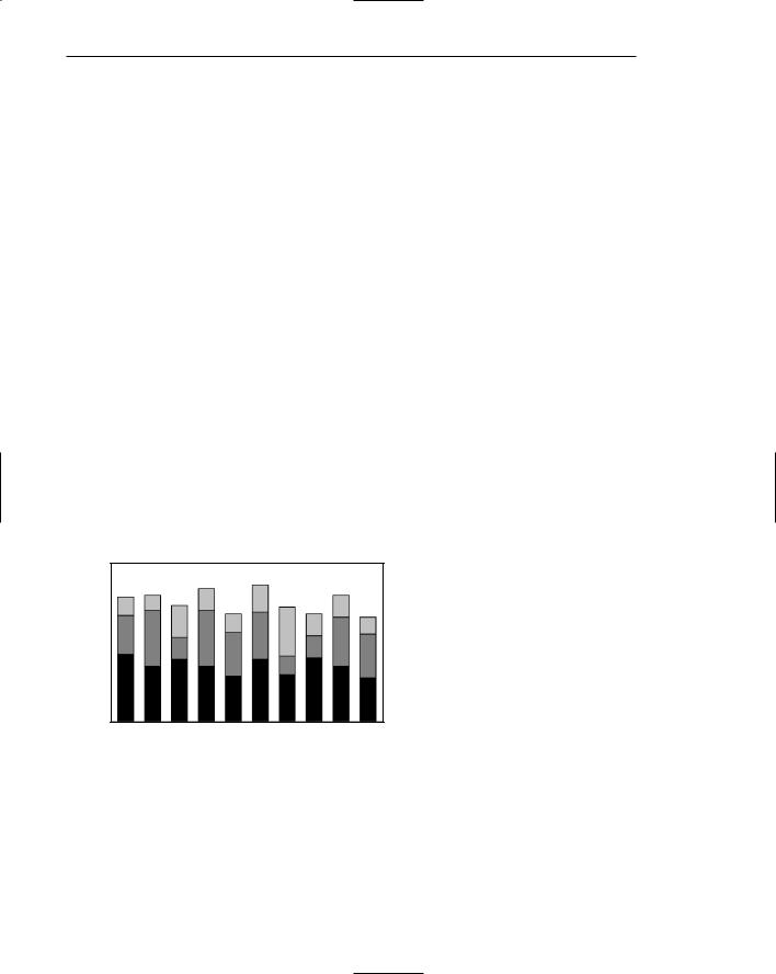
280 Part 2: The User Interface Design Process
If both the total measure of a value and its component portions are of interest, consider using segmented or stacked bars. These bars are similar to bar charts except that the bar is segmented into two or more pieces reflecting the component values, as illustrated in Figure 3.82. In this way they are similar to surface graphs and pie charts. Design guidelines are similar to stacked bars, except for the following:
Data category ordering. To provide consistency, order the data categories in the same sequence for all bars. Order data categories to show least variable at bottom and most variable at top. Irregularities in the bottom segment will affect those above it. This can make it difficult for a person to determine whether the irregularity in the upper segments reflects real data differences or is the result of this style of graph. Displaying least variable data at the bottom will minimize this effect. Also consider displaying the least variable values at the bottom, as is done with surface charts, unless the data itself dictates that some other logical organization must be followed.
Large segments. Limit the number of segments to those that are big enough to be seen and labeled. If small segment components exist, group them into an “other” category.
Coding schemes. Use different texture or shading coding schemes. Ensure that the coding scheme chosen for each segment is visually distinguishable from all others. Place darker shades or colors toward the bottom or toward the left.
Labeling. Associate labels with bars and segments. Labels, with a left-to-right reading orientation, are preferable to legends. Do not place labels within segments, as they most often will not fit. Legends should only be used if space does not allow labels.
Figure 3.82: A segmented, or stacked, bar graph.

Step 3: Principles of Good Interface and Screen Design 281
Pie Charts
■Pie charts should be used with caution.
■If pie charts are used,
—They must add up to 100 percent.
—Use five segments or fewer.
—Each segment should take up at least 5 percent (18 degrees) of the circle.
—Place the largest segment starting at 12:00.
—Directly label each segment in the normal reading orientation.
•If leaders for labels in small segments are necessary, orient them in as few angles as possible.
—Include numbers with segment labels to indicate percentages of absolute values.
—Textureor color-coding selected for segments should not emphasize one segment over another (unless it is intended).
—Highlight segments requiring particular emphasis through a contrasting display technique or by “exploding” it.
—Never tilt a pie.
Pie charts, a circle broken up into pie-shaped pieces, can be used to show an apportionment of a total into its component parts, as illustrated in Figure 3.83. Bar graphs, however, usually permit more accurate estimates of proportions. Experts caution against the use of pie charts because
■■They provide no means of absolute measurement.
■■They cannot represent totals greater than 100 percent.
■■They can only represent a fixed point in time.
■■Human estimation of relationships is more accurate with linear than with angular representations.
Figure 3.83: A pie chart.

282 Part 2: The User Interface Design Process
If pie charts are used, the guidelines below should be followed.
Total 100 percent. The parts must add up to 100 percent. To convert from percentages to degrees, multiply the percentage by 3.6.
Five segments or fewer. To minimize confusion, restrict pies to five segments or fewer. This permits adequate differentiation of its pieces and accurate labeling.
Minimum five percent. Avoid very small segments. Segments should take up at least 5 percent (18 degrees) of the circle in order to provide adequate segment differentiation. If small portions exist, combine the pieces into an “other” category and list them in a caption or note.
Start at 12:00. Start with the largest wedge at 12:00 (or a quarter hour) and order from largest to smallest in a clockwise order.
Labeling. To provide maximum association of the label with data, and for reading clarity, use a left-to-right reading orientation. If it is impossible to include the label within the segment, it may be placed outside and tied to the segment with a leader line. Place the labels in one or two columns (one on each side). If multiple outside labels and leader lines are necessary, orient the lines in as few angles as possible.
Numbers with segment labels. Include numbers with the segment labels to indicate percentages or absolute values. Only by including numbers with segment labels can numeric values be accurately established. Alternately, make actual percentages available when requested.
Segment coding. The kinds of textures or colors selected for segments should not emphasize one segment over another, unless this emphasis is intended.
Highlighting. Highlight segments requiring emphasis. Use a contrasting display technique or explode segments requiring emphasis. Exploding is accomplished by slightly displacing a segment from the remainder of the pie.
Tilting. Never tilt a pie. Distortion will occur with tilting. Small wedges at the front will look larger than they actually are.
Choosing a Graph Type
■Determine what kind of information is most important for the viewer to extract.
■Choose the type of graph best suited for presenting that kind of information.
The types of graphics just described have rarely been experimentally studied to determine their most effective use. Some studies addressing this issue, however, are those of Hollands and Spence (1992) and Simkin and Hastie (1987). These researchers collected data on three tasks: (1) determining a proportion of a whole where the proportion was a part of the whole (proportion), (2) determining a proportion of a whole where the proportion was not a part of the whole (comparison), and (3) determining a change over time (change). The results are summarized in Table 3.4.

Step 3: Principles of Good Interface and Screen Design 283
Table 3.4: Tasks and Best Types of Graphs
PROPORTION
|
WITH SCALE |
WITHOUT SCALE |
COMPARISON |
CHANGE |
Best |
Line Graphs |
Segmented Bars |
Bar Graphs |
Line Graphs |
|
Bar Graphs |
Pie Charts |
Segmented Bars |
Bar Graphs |
|
Segmented Bars |
|
|
|
|
Pie Charts |
|
|
|
|
|
|
|
|
Poorest |
— |
Bar Graphs |
Pie Charts |
Segmented |
|
|
|
|
Bars |
|
Line Graphs |
Pie Charts |
|
|
|
|
|
||
Source: Hollands and Spence (1992) and Simkin and Hastie (1987). |
|
|
||
In estimating proportion, if a scale is not included on the graph, pie charts and segmented bars were found to be best. If a scale is included, line graphs and bar graphs are also usable, both actually having a slight edge in speed over pie charts and bar graphs. In the comparison task, bar graphs and segmented bars were superior to pie charts. In estimating change over time, line graphs and bar graphs were both very effective, and pie charts and segmented bars the poorest.
In choosing a graph to display information, the kind of information important to the viewer must always be determined first. This will point to the kind of graphic most effective for the task.
Flow Charts
■Displayed steps should be designed to
—Follow some logical order.
—Minimize path link.
■Orient the chart following common flowchart reading conventions such as left-to- right and top-to-bottom.
■Follow common flowchart coding conventions to distinguish elements.
■Use arrows in conventional ways to indicate directional relationships.
■Highlight elements requiring particular attention through a contrasting display technique.
■Require only one decision at each step.
■Be consistent in all option ordering and wording.
If the data to be displayed flows in a complex, yet sequential, process, consider using a flowchart to schematically represent it. Flowcharts can also be used to aid problem solving in which a solution can be reached by answering a series of questions. They are not useful when trade-offs must be made.

284 Part 2: The User Interface Design Process
Order of steps. One logical ordering scheme is to follow a sequence of operations or processes from start to finish. Other potential ordering schemes include placing the most important decisions first or the decisions that can be made with the most certainty. If no logical order is apparent, order the flowchart to minimize the length of the path through it. If some decision paths are more likely to occur than others, minimize the length of the most likely path.
Orientation. Follow a left-to-right and top-to-bottom orientation.
Coding conventions. Follow existing shape coding conventions for the kinds of boxes being displayed. Adhere to standards and people’s expectations.
Arrows. Use arrows to indicate directional relations and sequential links.
Highlighting. Contrasting display techniques, such as high intensity or color, should be used to call attention to relevant paths or elements. Color is particularly effective in this regard.
Only one decision at each step. Multiple decisions reduce flowchart size. However, requiring multiple decisions such as “Is A true and B false?” can be confusing. Require that only single decisions be made.
Consistency. Consistently order and word all choices. Consistency always aids learning.
Technological Considerations in Interface Design
Interface design is also affected, and constrained by, characteristics of the hardware being used and the interface’s controlling software.
Graphical Systems
■Screen design must be compatible with the capabilities of the system, including
—System power.
—Screen size.
—Screen resolution.
—Display colors.
—Other display features.
■Screen design must be compatible with the capabilities of the
—System platform being used.
—Development and implementation tools being used.
—Platform style guide being used.
Graphical system design must be compatible with the system’s power, screen size, screen resolution, and displayable colors, fonts and other features. Designs for Web systems must also take into consideration the characteristics of the browsers being used and the bandwidth of the communication medium. The design must also be compatible

Step 3: Principles of Good Interface and Screen Design 285
with the system platform and any development and implementation tools being used. The design must also take into consideration any available platform style guide.
System Power
A slow processing speed and small memory may inhibit effective use of a system. Feedback and animation capabilities may be limited, reducing the system’s usability. Slow responses can be error prone, grossly inefficient, and very aggravating. A slow screen refresh rate will increase the user’s chances of perceiving screen flicker, which can be visually fatiguing. A system must be powerful enough to perform all necessary actions promptly, responsively, and meaningfully.
Screen Size
Through the years, the physical size of an available monitor’s screen area has been gradually increasing. Current typical monitor sizes range from 13 to 21 inches (measured diagonally), with 17 inches being most common.
Many of today’s screens are not large enough in size to take full advantage of windowing capabilities. As a result, many windows are still of Post-It dimensions. There is some evidence, from studies and personal observation, that many users of windowing systems expand their windows to cover a full screen. Either seeing all the contents of one window is preferable to seeing small parts of many windows, the operational complexity of multiple windows is not wanted, or visual noise is being eliminated. Whatever the case, these actions indicate a shortcoming in windowing systems, as they exist today.
Best monitor size was the focus of a study by Simmons and Manaham (1999). They compared monitors of 15, 17, 19, and 21 inches for search activities using Microsoft’s Word and Excel, and for browsing the Web. The 21-inch monitor resulted in fastest task completion. Users, however, preferred using the 19-inch monitor. DiPierro et al., (2000) compared Web navigation performance using small, medium, and large screens. No performance difference was found between small and medium screens, but the large screen elicited a 26 percent faster performance.
Clearly, these studies point out that bigger screens may be better. One typical-sized screen today hardly approximates one standard-sized piece of paper. Comparisons between information contained on separate pieces of paper are still difficult using current monitor sizes. The answer to this problem may lie in providing multiple monitors for doing one’s work or performing other activities. Multiple monitors reflect more closely the “cluttered desk” metaphor, for better or worse.
Continually expanding monitor and screen size as a solution, though, may create other problems. A large display area will require longer control movements to reach all locations on the screen, and more head and eye movements. Even with today’s relatively small screens, many activities in the peripheries of vision still go unnoticed. Larger screens will compound this problem. The effect on user’s physical comfort, and the possibility of needing an expanded working area must be considered. Clearly, the screen size/multiple monitor usability trade-off must be studied further.

286 Part 2: The User Interface Design Process
Screen Resolution
Screen resolution is the horizontal and vertical height of a screen in pixels. It is a function of the monitor’s capabilities and its video card. Most common display resolutions currently are 800×600 (pixels width and height), 1024×768, and 1280×1024. Higher resolutions are also available. Poor screen resolution may deter effective use of a graphical system by not permitting sharp and realistic drawings and shapes. Window structure and icon design may be severely affected.
In a study mentioned previously, Ziefle (1998) evaluated reading performance, using both hard-copy paper documents and monitors at different resolutions. In the first study, she compared paper printed at 255 dots per inch (dpi) and monitors whose resolutions were 832×600 pixels (60 dpi) and 1664× 1200 pixels (120 dpi). A 19-inch monitor showing black characters on a light background was used, and reading speeds and proofreading accuracy were compared. Ziefle found no difference in performance between the monitors with different resolutions. In the second Ziefle study, participants performed a continuous visual search task. Performance was compared using screens of lower resolution, 720× 540 (62 dpi), and higher, 1024×768 (89 dpi). She found that the higher resolution screen was searched significantly faster. Using the lower resolution, she found that after 30 minutes the participants began to search more slowly, made more errors, and had more and longer eye fixations.
In conclusion, looking just at the differences between the monitors of different resolutions, both studies found advantages for the higher resolution screens in terms of both preference and performance. Adequate screen resolution, then, is a necessity to achieve meaningful representations. Higher resolution screens also appear to be better for one’s eyes.
Colors
The color palette must be of a variety large enough to permit establishment of a family of discriminable colors. The colors used must be accurately and clearly presented in all situations. The contextual effect of colors must also be considered, because hues may change based on factors such as size and one color’s location in relation to other colors. Color is thoroughly discussed in Step 12.
Other Display Features
A wide range screen attributes or properties are available to aid the screen design process. Included are such techniques as higher brightness, reverse polarity, different font sizes and styles, underlining, blinking, line rules and boxes, color, and white space. Before beginning design, the designer must be aware of what capabilities exist, how they may be most effectively used, and what their limitations are. All of these techniques are described in other sections in this text.
The design must be compatible with the system platform and any development and implementation tools being used. The design may also take into consideration any available platform style guide. Finally, the design must effectively utilize the various available display features or attributes.

Step 3: Principles of Good Interface and Screen Design 287
Platform Compatibility
The design must be compatible with the windowing platform being used — Apple Computer’s Macintosh, Microsoft Windows, or any other.
Development and Implementation Tool Compatibility
More that half of software code is now devoted to user interface design. To use a very old cliché, the tail is now beginning to wag the dog. Available tools include toolkits, interface builders, and user interface management systems.
A toolkit is a library of controls or widgets such as menus, buttons, and scroll bars. Toolkits have a programmatic interface and must be used by programmers. They are usually for a specific windowing platform. Examples of toolkits include those for Motif, OpenLook, and the Macintosh.
An interface builder is a graphical tool that helps a programmer create dialog boxes, menus, and other controls. It provides a palette to select and position controls, and to set properties. Interface builders are limited to use in laying out the static parts of the interface. They cannot handle the parts of the interface that involve graphical objects moving around. A user interface management system (UIMS) extends the features of a builder by also providing assistance with creating and managing the insides of windows. Examples include HyperCard and Visual Basic.
MAXIM Software should be seen and not heard.
Style Guide Compatibility
A thrust for commonality in graphical system application design has emerged as providers have finally come to realize that design consistency is a virtue that has been ignored too long. To achieve this consistency in interface design, most providers have developed style guidelines for system developers. These guidelines specify the appearance and behavior of the user interface. They describe the windows, menus, and various controls available, including what they look like and how they work. They also provide some guidance on when to use the various components.
Examples of industry-produced guidelines include Apple’s Macintosh Human Interface Guidelines, IBM’s System Application Architecture Common User Access (SAA CUA) and Microsoft’s The Windows Interface Guidelines for Software Design. Product style guides vary in their ability to control compliance with the guidelines they present. Some present strict requirements, leading to excellent consistency across applications; others provide little guideline compliance control. The design should comply with the relevant platform style guide.
Web Systems
■Understand the current level of Web technology.
■Design for system configuration used by most users.
■Refrain from haphazard use of leading-edge technology.

288 Part 2: The User Interface Design Process
The Web is truly a Web, a Web of users whose only consistency is inconsistency in the variety of the technologies they possess. Old PCs with few features must coexist with new PCs possessing the latest technological advances. Monitors with small screens must coexist with large screens. High-resolution displays must coexist with those of lower resolution. High-speed information transmission must coexist with low speed. New browsers that contain and support many different and desirable features must coexist with old browsers that support less. To make matters worse for the designer, users can reconfigure their own PCs, further changing some of their characteristics.
The designer must be capable of handling these various demands while creating usable Web pages accessible through different browsers, operating systems, and computer platforms. To do this requires having an awareness of system configurations that satisfy the needs of the majority of users, and then designing for these users. To utilize the Web’s richest features, however, the designer must understand the current level of technology and apply it in a meaningful and usable way, especially for those users at the high end of the technological spectrum. The temptation, though, to apply technology simply for technology’s sake must be resisted. The goal in design is to satisfy the user’s need or want, not the designer’s. The following sections address technological considerations affecting Web site design.
Browsers
■Compatibility:
—Design for the most common browsers.
—Account for browser differences.
■Operating systems:
—Design for popular operating systems.
■Connection speed:
—Design for the most commonly used connection speeds.
■Monitor size and resolution:
—Design within the boundaries of an image-safe area for all browsers.
—Design for commonly used screen resolutions.
■Fonts:
—Use fonts that can be displayed on a variety of browsers.
■Colors:
—Use colors that succeed on a variety of browsers and platforms.
•Use a palette of 216 colors.
■Versions:
—Create multiple versions that support multiple browsers.
•Always provide a text-only version.
•Make use of browser sniffers.
The pressure for lowest-common-denominator design is often outweighed by the designer’s desire to create larger displays and employ the latest display and browser features. The needs of all users must be considered in design. A year 2006 user technology profile is shown in the next section.

Step 3: Principles of Good Interface and Screen Design 289
Compatibility. The entire Web page content should be accessible from the browsers of at least 95 percent of all users, presenting content as consistently and predictable as possible. In general, use browser defaults as much as possible, designing for what everyone can see. Do not assume, however, that all users will have the same browser features, and will have set the same defaults. Some people may use larger fonts, override fonts, or use fewer colors. So, never assume that the designed page will look exactly the same to users as it does to the designer. Test the design on all browsers and all versions of the each. Specify on the Web site what assumptions were made about the browser settings.
Operating Systems. Provide a design that will work well with the most common operating systems. Test the design on all popular operating systems.
Connection speed. Design for the connection speeds used by most users. Currently, the typical Web home user is dialing in at 56 Kbps (or slower) through a regular telephone line. High-speed access is increasing in popularity for home users, however. The typical business user possesses a high-speed connection to the Web. At the other end of the connection speed scale are users with low-cost devices, users wanting low-bandwidth wireless access, users with small personal display devices, and users in developing countries with poor communication infrastructures. All must be supported in Web page design. Failure to consider these modem speed limitations will lead to long download times and can result in user frustration. The biggest influence on download speed is the number and size of graphics on Web pages.
Monitor Size and Resolution. Designed page content should always be restricted to the boundaries of an “image-safe” area horizontally, and perhaps vertically, depending upon whether vertical scrolling is determined as necessary to see the page’s entire content. Exceeding the horizontal safe area will require horizontal scrolling to see the page’s entire width. Because some information will not always be visible, content usability and interpretation will be severely degraded, and the user inconvenienced. Exceeding the safe area length will require vertical scrolling to see the entire page, and could push important information out of the user’s view. A display’s safe area will be dependent upon the monitor’s size and the resolution at which it is set. It must be established based upon the anticipated or known range of monitor sizes and their set resolutions. Current typical monitor sizes range from 13 to 21 inches (measured diagonally) with 17 inches being most common.
Today, about 90 percent of users have their screen resolution set to 800×600, 1024×768, or 1280×1024 pixels. Designing for these settings will accommodate the majority of users.
Fonts. Not all browsers provide the same typographic operations. Different default font types and sizes may exist, depending on the type of browser, browser version, and operating system the browser runs on. If a page is designed using a font the user does not have installed, the browser displays its default fonts. Many older browsers support only two fonts, Times New Roman and Courier. Newer browsers support more fonts but they must be installed on the machine doing the browsing. Default fonts may include Times New Roman, Arial, Helvetica, and Verdana. Type displayed on a Windows browser may look 2 to 3 points larger than that on a Macintosh.