

The Essential Guide to UI Design
.pdf
390Part 2: The User Interface Design Process
windows do exist, but they can be negated by excessive window manipulation requirements.
It is also suggested that to be truly effective, window manipulation must occur implicitly as a result of user task actions, not as a result of explicit window management actions by the user.
Other Limitations
Other possible window problems include the necessity for window borders to consume valuable screen space, and that small windows providing access to large amounts of information can lead to excessive, bothersome scrolling.
Where To?
In spite of their problems, windows do have enormous benefits and are here to stay. So, we must cope with their constraints for now and, in the meantime, enjoy the benefits they possess.
Components of a Window
A typical window may be composed of up to a dozen or so elements. Some appear on all windows, others only on certain kinds of windows, or under certain conditions. For consistency purposes, these elements should always be located in the same position within a window. Most windowing systems provide consistent locations for elements in their own windows. Some inconsistencies do exist in element locations between different systems, however, as do some differences in what the elements are named, or what graphic images or icons are chosen to identify them. What follows is a description of typical window components and their purposes, with emphasis on the most popular windowing system, Microsoft Windows. Specifically reviewed will be primary windows, secondary windows, and a form of secondary window called the dialog box. An illustration of a primary window is found in Figure 5.1. Illustrations of secondary windows and dialog boxes are illustrated in Figures 5.8 and 5.13. How these different types of windows are used will be described in a later section in this step. A summary of window components for these types of windows is also found in Table 5.1.
Frame
A window will have a frame or border, usually rectangular in shape, to define its boundaries and distinguish it from other windows. While a border need not be rectangular, this shape is a preferred shape for most people. Also, textual materials, which are usually read from left to right, fit most efficiently within this structure. The border comprises a line of variable thickness and color. This variation can be used as an aid in identifying the type of window being displayed. Windows filling an entire screen may use the screen edge as the border. If a window is resizable, it may contain control points for sizing it. If the window cannot be resized, the border coincides with the edge of the window.

Step 5: Select the Proper Kinds of Windows 391
Figure 5.1: Microsoft Windows primary window.
Title Bar
The title bar is the top edge of the window, inside its border and extending its entire width. This title bar is also referred to by some platforms as the caption, caption bar, or title area. The title bar contains a descriptive title identifying the purpose or content of the window. In Microsoft Windows, the title bar may also possess, at the extreme left and right ends, control buttons (described later) for retrieving the system menu and performing window resizing. The title bar also serves as a control point for moving the window and as an access point for commands that apply to a window. For example, as an access point, when a user clicks on the title bar using the secondary mouse button, the pop-up or shortcut menu for the window appears. Pressing the Alt+Spacebar key combination also displays the shortcut menu for the window. Title bars are included on all primary and secondary windows. Title bar text writing guidelines are described in Step 8.
Microsoft recommends that one never place application commands or other controls in the title bar. Doing so may conflict with the special user controls Windows adds for configurations that support multiple languages.
Title Bar Icon
Located at the left corner of the title bar in a primary window, this button is used in Windows to retrieve a pull-down menu of commands that apply to the object in the window. It is a 16×16 version of the icon of the object being viewed. When clicked with the secondary mouse button, the commands applying to the object are presented. Microsoft suggests that
■■If the window contains a tool or utility (that is, an application that does not create, load, and save its own data files), a small version of the application’s icon should be placed there instead.
■■If the application creates, loads, and saves documents or data files and the window represents the view of one of its files, a small version of the icon that represents its document or data file type should be placed there.
■■Even if the user has not yet saved the file, display the data file icon rather than the application icon, and again display the data file icon after the user saves the file.

392Part 2: The User Interface Design Process
Table 5.1: Microsoft Windows Components
WINDOWS CONTAINING COMPONENT
COMPONENT |
PRIMARY |
SECONDARY |
DIALOG BOX |
Frame or Border |
X |
X |
X |
•Boundary to define shape.
•If sizable, contains control points for resizing.
Title Bar Text |
X |
X |
X |
•Name of object being viewed in window.
•Control point for moving window.
Title Bar Icon |
X |
•Small version of icon for object being viewed.
•Access point for commands that apply to the object.
Title Bar Buttons |
X |
X |
X |
• Shortcuts to specific commands. |
|
|
|
|
|
|
|
Close |
X |
X |
X |
|
|
|
|
Minimize/Maximize/Restore |
X |
|
|
What’s This? |
|
X |
X |
•Displays context-sensitive Help about any object displayed on window.
Menu Bar |
X |
•Provides basic and common application commands.
Status Bar |
X |
•An area used to display status information about what is displayed in window.
Scroll Bar |
X |
• Standard control to support scrolling. |
|
Size Grip |
X |
• Control to resize window, located at |
|
right side of status bar. |
|
Window Sizing Buttons
Located at the right corner of the title bar, these buttons are used to manipulate the size of a window. The leftmost button, the minimize button — inscribed with a short horizontal line toward the bottom of the button — is used to reduce a window to its minimum
Step 5: Select the Proper Kinds of Windows 393
size, usually an icon. It also hides all associated windows. The maximize button — typically inscribed with a large box — enlarges a window to its maximum size, usually the entire screen. When a screen is maximized, the restore button replaces the maximize button, because the window can no longer be increased in size. The restore button — typically inscribed with a pair overlapping boxes — returns a window to the size it had before a minimize or maximize action was performed. A close button — typically inscribed with an X — closes the window. Minimize, maximize, and close buttons are shown in Figure 5.1. These command buttons are graphical equivalents to the actions available through the Title Bar icon.
Sizing buttons are included on primary windows only. All buttons on a primary window’s title bar must have equivalent commands on the pop-up or shortcut menu for that window.
When these buttons are displayed, use the following guidelines:
■■When a window does not support a command, do not display its command button.
■■The Close button always appears as the rightmost button. Leave a gap between it and any other buttons.
■■The Minimize button always precedes the Maximize button.
■■The Restore button always replaces the Maximize button or the Minimize button when that command is carried out.
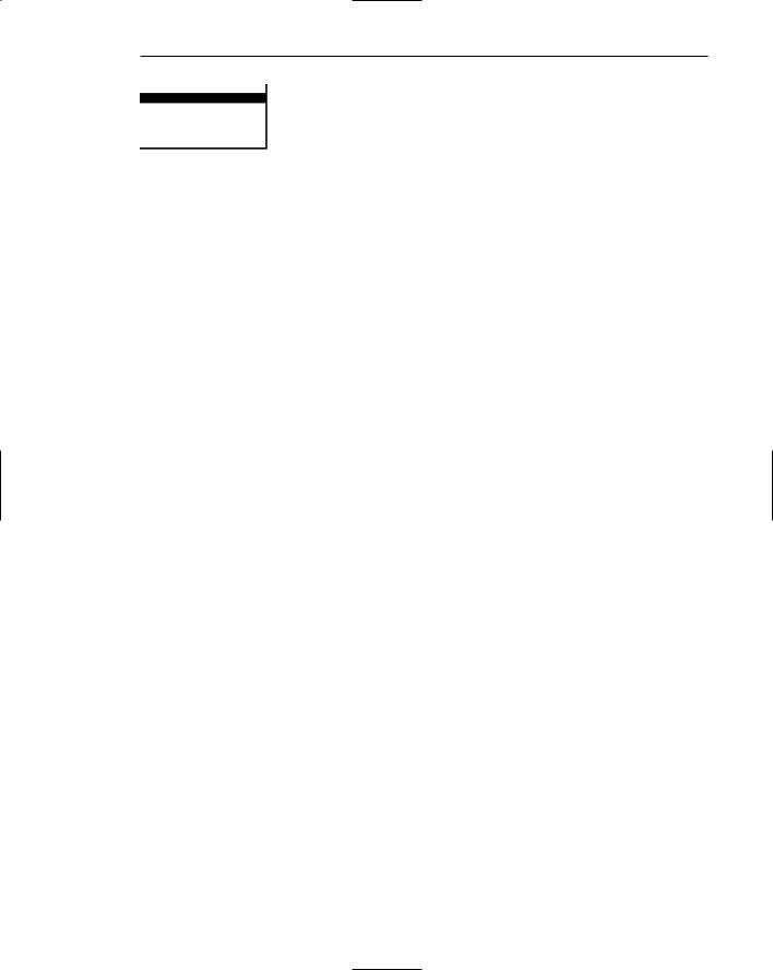
What’s This? Button
The What’s This? button, which appears on secondary windows and dialog boxes, is used to invoke the What’s This? Windows command to provide contextual Help about objects displayed within a secondary window. When provided, it is located in the upper-right corner of the title bar, just to the left of the close button. It is inscribed with a question mark, as illustrated in Figure 5.2.
On a primary window this command is accessed from the Help drop-down menu. This command may also be included as a button on a toolbar or as a command on a pop-up menu for a specific object. This command is described more fully in Step 9.
Menu Bar
A menu bar is used to organize and provide access to actions. It is located horizontally at the top of the window, just below the title bar. A menu bar contains a list of topics or items that, when selected, are displayed on a pull-down menu beneath the choice. A system will typically provide a default set of menu actions that can be augmented by an application. In the past, some platforms have called the menu bar an action bar. Menu bar design guidelines were presented in Step 4. The contents of the menu bar and its pull-downs are determined by the application’s functionality and the context in which the user is interacting with it.
Figure 5.2: What’s This? button.

394 Part 2: The User Interface Design Process
Status Bar
Information of use to the user can be displayed in a designated screen area or areas. They may be located at the top of the screen in some platforms and called a status area, or at the screen bottom. Microsoft recommends the bottom location and refers to this area as the status bar. It is also referred to by other platforms as a message area or message bar.
Microsoft Windows suggests using the status bar to display information about the current state of what is being viewed in the window, descriptive messages about a selected menu or toolbar button, or other noninteractive information. It may also be used to explain menu and control bar items as the items are highlighted by the user.
Scroll Bars
When all display information cannot be presented in a window, the additional information must be found and made visible. This is accomplished by scrolling the display’s contents through use of a scroll bar. A scroll bar is an elongated rectangular container consisting of a scroll area or shaft, a slider box or elevator, and arrows or anchors at each end. For vertical scrolling, the scroll bar is positioned at the far right side of the work area, extending its entire length. Horizontal scrolling is accomplished through a scroll bar located at the bottom of the work area. Scroll bars are more fully described in Step 7.
Split Box
A window can be split into two or more pieces or panes by manipulating a split box located above a vertical scroll bar or to the left of a horizontal scroll bar. A split box is sometimes referred to as a split bar. A window can be split into two or more separate viewing areas that are called panes. Splitting a window permits multiple views of an object. A split window enables the user to
■■Examine two parts of a document at the same time.
■■Display different, yet simultaneous, views of the same information.
To support the splitting of a window that is not presplit by design, include a split box. The split box should be just large enough for the user to successfully target it with the pointer; the default size of a size handle, such as the window’s sizing border, is a good guideline.
Toolbar
Toolbars, illustrated in Figure 5.3, are panels or arrays of choices or commands that must be accessed quickly. They are sometimes called command bars. Toolbars are designed to provide quick access to specific commands or options. Specialized toolbars are sometimes referred to as ribbons, toolboxes, rulers, or palettes. Toolbars may occupy a fixed position on a window, be movable, or be contained in a pop-up window. The design of toolbars is discussed in Step 7.

Step 5: Select the Proper Kinds of Windows 395
Figure 5.3: Toolbars.
Command Area
In situations where it is useful for a command to be typed into a screen, a command area can be provided. The desired location of the command area is at the bottom of the window. If a horizontal scroll bar is included in the window, position the command area just below it. If a message area is included on the screen, locate the command area just above it.
Size Grip
A size grip is a Microsoft Windows special handle included in a window to permit it to be resized. When the grip is dragged the window resizes, following the same conventions as the sizing border. Three angled parallel lines in the lower-right corner of a window designate the size grip. If the window possesses a status bar, the grip is positioned at the bar’s right end. Otherwise, it is located at the bottom of a vertical scroll bar, the right side of a horizontal scroll bar, or the junction point of the two bars. A size grip is shown in the lower-right corner of Figure 5.1.
Work Area
The work area is the portion of the screen where the user performs tasks. It is the open area inside the window’s border and contains relevant peripheral screen components such as the menu bar, scroll bars, or message bars. The work area may consist of an open area for typing, or it may contain controls (such as text boxes and list boxes) or customized forms (such as spreadsheets). The work area may also be referred to as the client area.
Window Presentation Styles
The presentation style of a window refers to its spatial relationship to other windows. There are two basic styles, commonly called tiled or overlapping. In early windowing days, most systems commonly used one or the other style exclusively, seldom using both at the same time. Now, the user is usually permitted to select the style to be presented on the display.
396 Part 2: The User Interface Design Process
Tiled Windows
Tiled windows, illustrated in Figure 5.4, derive their name from the common floor or wall tile. Tiled windows appear in one plane on the screen and expand or contract to fill up the display surface, as needed. Most systems provide two-dimensional tiled windows, adjustable in both height and width. Some less-powerful systems, however, are only one-dimensional, the windows being adjustable in only one manner (typically the height). Tiled windows, the first and oldest kind of window, are felt to have these advantages:
■■The system usually allocates and positions windows for the user, eliminating the necessity to make positioning decisions.
■■Open windows are always visible, eliminating the possibility of them being lost and forgotten.
■■Every window is always completely visible, eliminating the possibility of information being hidden.
■■They are perceived as less complex than overlapping windows, possibly because there are fewer management operations or they seem less “magical.”
■■They are easier, according to studies, for novice or inexperienced people to learn and use.
■■They yield better user performance for tasks where the data requires little window manipulation to complete the task.
Perceived disadvantages include the following:
■■Only a limited number can be displayed in the screen area available.
■■As windows are opened or closed, existing windows change in size. This can be annoying.
■■As windows change in size or position, the movement can be disconcerting.
■■As the number of displayed windows increases, each window can get very tiny.
■■The changes in sizes and locations made by the system are difficult to predict.
■■The configuration of windows provided by the system may not meet the user’s needs.
■■They are perceived as crowded and more visually complex because window borders are flush against one another, and they fill up the whole screen. Crowding is accentuated if borders contain scroll bars or control icons. Viewer attention may be drawn to the border, not the data.
■■They permit less user control because the system actively manages the windows.
Step 5: Select the Proper Kinds of Windows 397
Figure 5.4: Tiled windows.
Overlapping Windows
Overlapping windows, illustrated in Figure 5.5, may be placed on top of one another like papers on a desk. They possess a three-dimensional quality, appearing to lie on different planes. Users can control the location of these windows, as well as the plane in which they appear. The sizes of some types of windows may also be changed. Most systems today normally use this style of window. They have the following advantages:
■■Visually, their look is three-dimensional, resembling the desktop that is familiar to the user.
■■Greater control allows the user to organize the windows to meet his or her needs.
■■Windows can maintain larger sizes.
■■Windows can maintain consistent sizes.
■■Windows can maintain consistent positions.
■■Screen space conservation is not a problem, because windows can be placed on top of one another.
■■There is less pressure to close or delete windows no longer needed.
■■The possibility exists for less visual crowding and complexity. Larger borders can be maintained around window information, and the window is more clearly set off against its background. Windows can also be expanded to fill the entire display.
■■They yield better user performance for tasks where the data requires much window manipulation to complete the task.
Disadvantages include the following:
■■They are operationally much more complex than tiled windows. More control functions require greater user attention and manipulation.
■■Information in windows can be obscured behind other windows.
■■Windows themselves can be lost behind other windows and be presumed not to exist.

398Part 2: The User Interface Design Process
■■That overlapping windows represent a three-dimensional space is not always realized by the user.
■■Control freedom increases the possibility for greater visual complexity and crowding. Too many windows, or improper offsetting, can be visually overwhelming.
Cascading Windows
A special type of overlapping window has the windows automatically arranged in a regular progression. Each window is slightly offset from others, as illustrated in Figure
5.6.Advantages of this approach include the following:
■■No window is ever completely hidden.
■■Bringing any window to the front is easier.
■■It provides simplicity in visual presentation and cleanness.
Figure 5.5: Overlapping windows.
Figure 5.6: Cascading windows.
Step 5: Select the Proper Kinds of Windows 399
Picking a Presentation Style
■Use tiled windows for
—Single-task activities.
—Data that needs to be seen simultaneously.
—Tasks requiring little window manipulation.
—Novice or inexperienced users.
■Use overlapping windows for
—Switching between tasks.
—Tasks necessitating a greater amount of window manipulation.
—Expert or experienced users.
—Unpredictable display contents.
Tiled windows. Tiled windows seem to be better for single-task activities and data that must be seen simultaneously. A study found that tasks requiring little window manipulation were carried out faster using tiled windows. They also found that novice users performed better with tiled windows, regardless of the task.
MAXIM An activity will be pursued only if its benefits are equal to or greater than the cost.
Overlapping windows. Overlapping windows seem to be better for situations that necessitate switching between tasks. A research study concluded that tasks requiring much window manipulation could be performed faster with overlapping windows but only if user window expertise existed. For novice users, tasks requiring much window manipulation were carried out faster with tiled windows. Therefore, the advantage to overlapping windows comes only after a certain level of expertise is achieved. Overlapping windows are the preferred presentation scheme.
Types of Windows
People’s tasks must be structured into a series of windows. The type of window used will depend on the nature and flow of the task. Defining standard window types is again difficult across platforms because of the varying terminology and definitions used by different windowing systems, and changes in terminology for new versions of systems. For simplicity, the Microsoft Windows windowing scheme will be described. Summarized are a description of the window, its purpose, and its proper usage. Any other platform’s windows may not behave exactly as presented, and some platform windows may exhibit characteristics common to more than one of the described window types.