

The Essential Guide to UI Design
.pdf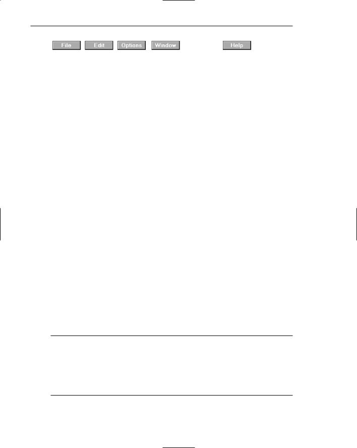
370 Part 2: The User Interface Design Process
Figure 4.28: Menu bar composed of buttons.
Each menu bar item is the top level of a hierarchical menu. It will have a pull-down menu associated with it, detailing the specific actions that may be performed. Some products have tried to circumvent this pull-down rule and have included items in menu bars that are direct actions themselves. These direct action items have frequently been designated by an exclamation point (!) following the menu bar description. The inclusion of direct items in a menu bar should be avoided. It creates inconsistency in menu bar use and may easily cause an action to be erroneously selected. Menu bars should always possess an associated pull-down menu.
Menu bars are used to present application alternatives or choices to the screen user. Typically, each system provides a default set of menu bar commands (for example, File, Edit, View, Window, Help).
The advantages of menu bars are that they
■■Are always visible, reminding the user of their existence.
■■Are easy to browse through.
■■Are easy to locate consistently on the screen.
■■Usually do not obscure the screen working area.
■■Usually are not obscured by windows and dialog boxes.
■■Allow for use of keyboard equivalents. The disadvantages of menu bars are that
■■They consume a full row of screen space.
■■They require looking away from the main working area to find.
■■They require moving pointer from the main working area to select.
■■The menu options are smaller than full-size buttons, slowing selection time.
■■Their horizontal orientation is less efficient for scanning.
■■Their horizontal orientation limits number of choices that can be displayed.
Item Descriptions
■The menu item descriptions must clearly reflect the kinds of choices available.
■Menu item descriptions will be the “titles” for pull-down menus associated with them.
■Use mixed-case letters to describe choices.
■Use single-word choices whenever possible.
■Do not display choices that are never available to the user.
The menu item descriptions must clearly reflect alternatives available. Choices should be composed of mixed-case single words. Typically, only the first letter of the

Step 4: Develop System Menus and Navigation Schemes 371
choice is capitalized. Acronyms, abbreviations, or proper nouns that are normally capitalized may be capitalized. Choices should never be numbered.
If a multiple-word item must be used for clarity, consider including a hyphen between the multiple words to associate the words and differentiate them from other items. Do not display choices that are never available to the user.
Organization
■Follow standard platform ordering schemes where they exist.
—Place application-specific choices where they fit best.
■Order choices left-to-right with
—Most frequent choices to the left.
—Related information grouped together.
■Choices found on more than one menu bar should be consistently positioned.
■Left-justify choices within the line.
■When choices can be logically grouped, provide visual logical groupings, if possible.
■Help, when included, should be located at the right side of the bar.
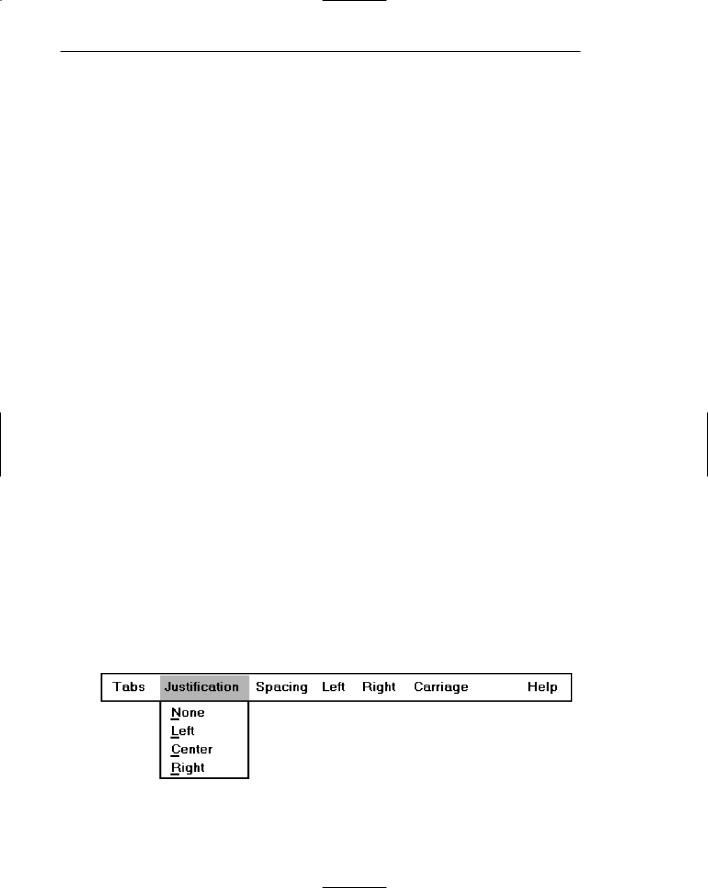
Figure 4.29
Follow standard platform ordering schemes where they exist. Place applicationspecific choices where they fit best. Order all choices left-to-right, with the most frequently elected choices to the left and related information grouped together. Choices found on more than one menu bar should be consistently positioned.
Left-justify all choices within the line (as opposed to centering them when there are not enough choices to completely fill the line). However, always locate Help, when included, at the far right side. Right side positioning will always keep Help in a consistent location within the bar. Also, provide visual groupings of all related choices, if space on the bar permits.
MAXIM Hierarchical organization is the simplest structure for visualizing and understanding complexity.
Pull-Down Menu
■Proper usage:
—To initiate frequently used application actions that take place on a wide variety of different windows.
—A small number of items.
—Items best represented textually.
—Items whose content rarely changes.
372 Part 2: The User Interface Design Process
Selection of an alternative from the menu bar results in the display of the exact actions available to the user. These choices are displayed in a vertically arrayed listing that appears to pull down from the bar. Hence, these listings, as illustrated in Figure 4.30, are typically referred to as pull-downs. Other identification terms may be used, such as drop-downs.
Pull-downs are first-level menus used to provide access to common and frequently used application actions that take place on a wide variety of different windows. They are most useful for a small number of rarely changing items, usually about five to ten. Larger numbers of choices become awkward to use, being best handled by incorporating cascade menus (see discussion that follows). Pull-downs are best suited for items represented textually, but graphical presentations, such as colors, patterns, and shades, may also be used.
The advantages of pull-down menus are
■■The menu bar cues a reminder of their existence.
■■They may be located relatively consistently on the screen.
■■No window space is consumed when they are not used.
■■They are easy to browse through.
■■Their vertical orientation is most efficient for scanning.
■■Their vertical orientation is most efficient for grouping.
■■Their vertical orientation permits more choices to be displayed.
■■They allow for display of both keyboard equivalents and accelerators.
The disadvantages of pull-down menus are
■■They require searching and selecting from another menu before seeing options.
■■They require looking away from main working area to read.
■■They require moving the pointer out of working area to select (unless using keyboard equivalents).
■■The items are smaller than full-size buttons, slowing selection time.
■■The may obscure the screen working area.
In Web use, for searching tasks, pull-down menus provide fastest performance. For browsing tasks, using the combined global/local navigation elements provided the fastest performance (Yu and Roh, 2002).
Figure 4.30: Menu bar pull-down.

Step 4: Develop System Menus and Navigation Schemes 373
Display
■Display all possible alternatives.
■Gray-out or dim items that cannot be chosen due to the current state of an application.
Display all possible alternatives on a pull-down. Gray-out or dim items that cannot be chosen due to the current state of an application. If all items are, at any one point, not applicable, they must still be capable of being retrieved for perusal through the menu bar.
Size
■Must contain a minimum of two choices.
■Restrict to no more than five to ten choices, preferably eight or less.
A typical pull-down consists of about five to ten choices, although more or less are sometimes seen. A pull-down should always contain more than one choice. Because of their vertical orientation, there is space for more choices containing longer descriptions than on a menu bar, and they can easily be positioned on one screen.
Organization
■Follow standard platform ordering schemes when they exist.
—Place application-specific choices where they fit best.
■Place frequent or critical items at the top.
■Separate destructive choices from other choices.
■Provide a traditional, split, or folded structure, as necessary.
—If a folded menu is used, visually differentiate the opened choices from those high frequency choices first displayed.
■Align choices into columns, with
—Most frequent choices toward the top.
—Related choices grouped together.
—Choices found on more than one pull-down consistently positioned.
■Left-align choice descriptions.
■Multicolumn menus are not desirable. If necessary, organize top-to-bottom, then left-to-right.
Follow standard platform ordering schemes when they exist. Place application-spe- cific choices where they fit best. Place frequent or critical items at the top of the listing, and separate destructive choices from other choices. Align all pull-down choices into

374Part 2: The User Interface Design Process
columns with their descriptions left-aligned. Locate most frequently chosen alternatives toward the top, and group related choices together. Provide a traditional, split, or folded structure, as necessary (see Selection Support Menus previously described). If a folded menu is used, visually differentiate the opened choices from those high frequency choices first displayed.
Choices found on more than one pull-down should be consistently positioned. Multicolumn menus are not desirable; if necessary, organize pull-downs from top-to- bottom, then left-to-right.
Groupings
■Provide groupings of related pull-down choices.
—Incorporate a solid line between major groupings.
—Incorporate a dotted or dashed line between subgroups.
—Left-justify the lines under the first letter of the columnized choice descriptions.
—Right-justify the lines under the last character of the longest choice description.
—Display the solid line in the same color as the choice descriptions.
Figure 4.31
Indicate groupings of related choices by inscribing a line between each group. The line, or lines, should only extend from the first character of the descriptions to the end of the longest description, as shown above.
Some common style guides recommend that the line extend from pull-down border to border. Many other system pull-downs also follow this border-to-border approach. This extended line, however, results in too strong a visual separation between pulldown parts. The parts should be separated, but not too strongly.

Step 4: Develop System Menus and Navigation Schemes 375
Cascading Menus
■Proper usage:
—To reduce the number of choices presented together for selection (reduce menu breadth).
—When a menu specifies many alternatives and the alternatives can be grouped in meaningful related sets on a lower-level menu.
—When a choice leads to a short, fixed list of single-choice properties.
—When there are several fixed sets of related options.
—To simplify a menu.
—Avoid using for frequent, repetitive commands.
A cascading menu is a submenu derived from a higher-level menu, most typically a pull-down. Cascades may also be attached to other cascades or pop-up menus, however. Cascading menus are located to the right of the menu item on the previous menu to which they are related, as illustrated in Figure 4.32. Menu items that lead to cascading menus are typically indicated by a right-pointing triangle.
Cascading menus are developed to simplify menus by reducing the number of choices that appear together on one menu. Cascades can be used when many alternatives exist that can be grouped meaningfully. The top-level menu may contain the grouping category headings, and the cascaded menu the items in each group. Any menu choices with a fixed set of related options may utilize cascades.
The advantages of cascading menus are that
■■The top-level menus are simplified because some choices are hidden.
■■More first-letter mnemonics are available because menus possess fewer alternatives.
■■High-level command browsing is easier because subtopics are hidden.
The disadvantages of cascading menus are
■■Access to submenu items requires more steps.
■■Access to submenu items requires a change in pointer movement direction.
■■Exhaustive browsing is more difficult; some alternatives remain hidden as pulldowns become visible.
Changing pointer movement from a vertically oriented menu such as a pull-down to an adjacent cascade is an error-prone manual movement. Sliding the mouse and its pointer horizontally is not a very precise hand movement. As the pointer moves horizontally across the menu from which the cascade is selected it has a tendency to move vertically as well, sometimes exiting the menu over an item above or below the desired choice. When this occurs in Microsoft Windows the cascade displayed is not the one desired, but the cascade for the adjacent choice over which the pointer exited. The wrong cascade is then presented to the user, and the selection process must be repeated. Apple minimizes this problem by presenting a movement “cone” for the selected choice. This cone gradually widens as it approaches the cascade, extending somewhat over the adjacent choices. If the mouse and pointer exit the menu within an adjacent choice, but still within this cone, the originally designated cascade is still presented. The Apple solution is much more understanding of human motor limitations.
376 Part 2: The User Interface Design Process
Figure 4.32: Cascading menu.
Cascade Indicator
■Place an arrow or right-pointing triangle to the right of each menu choice description leading to a cascade menu.
■Separate the indicator from the choice description by one space.
■Display the indicator in the same color as the choice descriptions.
Figure 4.33
To indicate that another lower-level menu will appear when a menu item is selected, place an arrow or right-pointing triangle immediately to its right. Display the cascade indicator in the same color as the choice descriptions.
Levels
■Do not exceed three menu levels (two cascades).
— Only one cascading menu is preferred.

Step 4: Develop System Menus and Navigation Schemes 377
Each additional cascade level presented reduces ease of access and increases visual clutter. The number of cascade levels presented should represent a balance between menu simplification, ease in menu comprehension, and ease in item selection. Whenever possible, do not exceed three levels of menus (original and two cascades). Try to limit cascades to one. If too many cascade levels are derived, create additional pull-down menus, or provide a window for some alternatives. A window is useful for establishing independent settings or the setting of multiple options. A toolbar may also be used to eliminate the necessity for traversing cascades.
Pop-Up Menus
■ Use to present alternatives or choices within the context of the task.
Choices may also be presented to the user on the screen through pop-up menus, vertically arrayed listings that only appear when specifically requested. Pop-up menus may be requested when the mouse pointer is positioned over a designated or hot area of the screen (a window border or text, for example) or over a designated icon. In look, they usually resemble pull-down menus, as shown in Figure 4.34.
The kinds of choices displayed in pop-up menus are context sensitive, depending on where the pointer is positioned when the request is made. They are most useful for presenting alternatives within the context of the user’s immediate task. If positioned over text, for example, a pop-up might include text-specific commands.
The advantages of pop-up menus are
■■They appear in the working area.
■■They do not use window space when not displayed.
■■No pointer movement is needed if selected by button.
■■Their vertical orientation is most efficient scanning.
■■Their vertical orientation most efficient for grouping.
■■Their vertical orientation allows more choices to be displayed.
■■They may be able to remain showing (“pinned”) when used frequently.
■■They allow for display of both keyboard equivalents and accelerators.
Figure 4.34: Pop-up menu.

378 Part 2: The User Interface Design Process
The disadvantages of pop-up menus are
■■Their existence must be learned and remembered.
■■Means for selecting them must be learned and remembered.
■■They require a special action to see the menu (mouse click).
■■Items are smaller than full-size buttons, slowing selection time.
■■They may obscure the screen working area.
■■Their display locations may not be consistent.
For experienced users, pop-up menus are an alternative to retrieve frequently used contextual choices in pull-down menus. Choices should be limited in number and stable or infrequently changing in content.
Windows contains many contextual pop-up menus. They are also referred to as context menus or shortcut menus. Examples include the window pop-up and an icon pop-up, which presents operations of the objects represented by icons.
Display
■Provide a pop-up menu for common, frequent, contextual actions.
—If the pointer is positioned over an object possessing more than one quality (for example, both text and graphics), at minimum present actions common to all object qualities.
■Items that cannot be chosen due to the current state of an application should not be displayed.
■Continue to display a pop-up until
—A choice is selected.
—An action outside the pop-up is initiated.
—The user removes the pop-up.
Provide a pop-up menu for common, frequent, contextual actions. If the pointer is positioned over an object possessing more than one quality (for example, both text and graphics), at minimum present actions common to all object qualities. Items that cannot be chosen due to the current state of an application should not be displayed.
Continue to display a pop-up until the user selects a choice, initiates an action outside the pop-up, or requests that the pop-up be removed.
Location
■Position the pop-up
—Centered and to the right of the object from which it was requested.
—Close enough to the pointer so that the pointer can be easily moved onto the menu.
—But not so close that the pointer is positioned on an item, possibly leading to accidental selection.

Step 4: Develop System Menus and Navigation Schemes 379
■If the pointer is positioned in such a manner that the pop-up would appear offscreen or clipped, position the menu
—As close as possible to the object, but not covering the object.
—So that it appears fully on the screen.
Position a pop-up menu in a consistent location relative to the object from which it is requested. The preferable location is centered to the right. Locate the pop-up close enough to the pointer so that the pointer can be easily moved onto the menu. Positioning of the pointer on the menu itself could lead to accidental selection of an action.
If the pointer is positioned in such a manner that a right-centered position would force the pop-up partially or fully off the screen, locate the pop-up fully on the screen as close as possible to the object. Do not move the pointer to make a menu fit in the most desirable location.
Size
■ Restrict the pop-up to no more than five to ten choices, preferably eight or less.
Limit pop-up menus to about eight choices or fewer. If a large number of choices are needed, consider creating cascading menus. Minimize the number of levels of cascades, however, to provide ease of access and prevent visual clutter.
Tear-Off Menus
■ Follow all relevant guidelines for pull-down menus.
A tear-off menu is a pull-down menu that can be positioned anywhere on the screen for constant referral. As such, it possesses all the characteristics of a pull-down. It may also be called a pushpin, detachable, or roll-up menu. Its purpose is to present alternatives or choices to the screen user that are needed infrequently at some times and heavily at other times.
Advantages/disadvantages. No space is consumed on the screen when the menu is not needed. When needed, it can remain continuously displayed. It does require extra steps to retrieve, and it may obscure the screen working area.
Tear-off menus are most useful for expert users. Use these menus in situations where the items are sometimes frequently selected and other times infrequently selected. Items should be small in number and rarely change in content. A typical use would be to detach and permanently leave displayed a pull-down menu when it must be frequently used.