

aswath_damodaran-investment_philosophies_2012
.pdf240 |
INVESTMENT PHILOSOPHIES |
Charts, the believers argue, send advance warning of shifts in demand and supply in the form of price and volume patterns.
The views of technical analysts are best described by another quote from Edwards and Magee:
The market price reflects not only the differing fears and guesses and moods, rational and irrational, of hundreds of potential buyers and sellers, but it also reflects their needs and resources—in total, factors which defy analysis and for which no statistics are obtainable. These are nevertheless all synthesized, weighted and finally expressed in the one precise figure at which a buyer and seller get together and make a deal. The resulting price is the only figure that counts.
Both the anecdotal and the empirical evidence seem to suggest that investors often are irrational, at least based on the economic definition of rationality. Whether this irrationality results in systematic price patterns is a little more difficult to assess, though the serial correlation in prices over both short and long periods and the periodic appearance of price bubbles in asset markets seem to indicate that irrational behavior has price effects. Finally, even if there are systematic price patterns caused by irrationality, there is the question of whether you can take advantage of these price patterns. It is entirely possible that the price patterns are so unpredictable that no investor can take advantage of them to earn excess returns. Technical analysts and chartists would disagree.
T E C H N I C A L I N D I C A T O R S A N D C H A R T I N G P A T T E R N S
Over the years, technical analysts have developed hundreds of technical indicators and detected dozens of chart patterns that they contend help them forecast future price changes. While we cannot describe or even list all of them, we can categorize them based on the nature of irrationality that we attribute to markets. Consolidating all of the irrationalities that have been attributed to financial markets, we have created five groupings:
1.Market participants overreact to new information. If this is true (i.e., prices rise too much on good news and fall too much on bad news), you would draw on contrarian indicators that would help you to gauge the direction in which the crowd is going and to go against it.
2.Market participants are slow learners. In many ways, this is the polar opposite of the first grouping. If investors are slow learners, prices will

Smoke and Mirrors? Price Patterns, Volume Charts, and Technical Analysis |
241 |
underreact to new information and you would expect price direction to persist; you would therefore use momentum strategies, which would gauge market direction and move with it.
3.Investors change their minds frequently and often irrationally, causing significant shifts in demand and supply that cause prices to move. If you believe that this is the way markets work, you would use technical indicators and charting patterns to detect these shifts.
4.There are certain investors who lead markets, and finding out when and what they are buying and selling can provide a useful leading indicator of future price movements. If this is what you believe about markets, you would track the trading of these leading investors and try to follow them.
5.There are external forces that govern up and down movements in markets that override fundamentals and investor preferences. Technical indicators and charting patterns that allow us to see the larger cycles in stock prices can allow us to get ahead of other investors.
Within each group, we can consider different technical indicators that we can broadly categorize into three groups: price indicators, which are based on past price movements; volume indicators, which look at trading volume; and sentiment indicators, which use qualitative measures of how bullish or bearish investors are about stocks.
M a r k e t s ’ O v e r r e a c t i o n — C o n t r a r i a n I n d i c a t o r s
There are many practitioners and some economists, especially in the behavioral school, who believe that investors overreact to new information. This, in turn, can create patterns in stock prices that can be exploited by investors to earn excess returns. In this section, we consider some of the indicators, which we label contrarian, that have been developed by analysts who subscribe to this view.
T h e B a s i s f o r O v e r r e a c t i o n a n d I m p l i c a t i o n s Why would markets overreact to new information? Some researchers in experimental psychology suggest that people tend to overweight recent information and underweight prior data in revising their beliefs when confronted with new information. Others argue that a few investors tend to panic when confronted with new information, and they take the rest of the market with them. As evidence, you could point to the strong evidence of price reversals over long periods that we presented earlier in this chapter.
If markets overreact, it follows that large price movements in one direction will be followed by large price movements in the opposite direction.

242 |
INVESTMENT PHILOSOPHIES |
In addition, the more extreme the initial price movement, the greater will be the subsequent adjustment. If markets overreact, the road to investment success seems clear. You buy assets when others are most bearish about them, and sell assets when other investors are most optimistic and buying. If your assumption about market overreaction is correct, you will earn excess returns as markets correct themselves over time.
T e c h n i c a l T r a d i n g R u l e s B a s e d o n C o n t r a r i a n O p i n i o n There are a number of indicators, some based on price patterns, some based on trading volume, and some based on market views, that are designed to provide you with a sense of market direction. The objective is to not follow the market direction but to go against it, and these are contrarian indicators. We consider three widely used indicators in this section, each of which is focused on a different subset of investors.
Trades that are in lots of less than 100 are called odd lots and are usually made by small investors. There are data services that track the number of odd-lot trades—both buys and sells—in individual stocks and in the market. As small investors become more enthusiastic about a stock, odd-lot buys increase relative to sells. When they become pessimistic, the reverse occurs. To the extent that you view small investors as more likely to overreact to information, you would sell as odd lot buying increases and buy as odd lot selling decrease.
But what if you believe that it is institutional investors who panic and not small investors? After all, large price movements are usually caused by institutional buying and selling, rather than by individual traders. There are indicators that track the stocks that institutions are selling and buying, with the objective of doing the opposite. There are also indicators that track the percentage of mutual fund portfolios that are invested in cash and near-cash investments, a good indicator of how bullish or bearish mutual fund investors are. When mutual funds are optimistic about the market, cash holdings tend to fall, whereas cash holdings increase as they become more pessimistic. If you believe that mutual fund managers overreact, you would buy when they are bearish and sell when they are bullish.
Finally, you could look at investment advisers who claim to have divined the future. Investment advisory services often have their lists of most desirable and least desirable stocks. Value Line and Standard & Poor’s categorize stocks into classes based on their perceived attractiveness as investments. In keeping with the notion that the market is usually wrong, you would sell those stocks that investment advisers are most bullish on and buy those stocks they are most bearish on.
Smoke and Mirrors? Price Patterns, Volume Charts, and Technical Analysis |
243 |
|
34 |
S&P 500 |
|
|
P /E30 |
|
|
||
|
|
|
|
|
|
||||
|
|
PV of dividends |
|
|
|
||||
|
30 |
|
t |
t |
|
|
|||
|
|
|
|
|
|
|
|
|
|
|
26 |
|
|
|
|
|
|
|
|
30 |
22 |
|
|
|
|
|
|
|
|
|
|
|
|
|
|
|
|
|
|
P/E |
18 |
|
|
|
|
|
|
|
|
|
|
|
|
|
|
|
|
|
|
|
14 |
|
|
|
|
|
|
|
|
|
|
|
|
|
|
P /E30 |
|
|
|
|
10 |
|
|
|
|
t |
t |
|
|
|
|
|
|
|
|
|
|
|
|
|
6 |
|
|
|
|
|
|
|
|
|
|
1910 |
1920 |
1930 |
1940 |
1950 |
1960 |
1970 |
1980 |
|
|
|
|
|
Year |
|
|
|
|
F I G U R E 7 . 1 5 Are Markets Too Volatile?
Source: R. Shiller, Market Volatility (Cambridge, MA: MIT Press, 1990).
S h i f t i n g D e m a n d
Technical analysts often argue that the greatest profits are to be made at what can be called inflection points—a fancy term for shifts in price trends from positive to negative or vice versa. Since price is ultimately determined by demand and supply, analysts often look for leading indicators of shifts in demand, especially when those shifts are caused my emotion rather than fundamentals. If they succeed, they will make money.
T h e B a s i s f o r S h i f t i n g D e m a n d a n d I m p l i c a t i o n s The basis for the shifting demand argument is that demand shifts cause price changes and that these demand shifts often have no basis in economic fundamentals. The anecdotal evidence seems to bear out this view. Markets often move for no discernible reason, and the volatility in stock prices seems to vastly exceed the volatility in underlying value. The empirical evidence also backs up the view that prices are more volatile than fundamental value. Shiller compared stock price movements over time to movements in the present value of dividends (which he viewed as a measure of fundamental value) and concluded that stock prices were significantly more volatile (see Figure 7.15).31
Note that the smoothed-out line is the present value (PV) of dividends, whereas the volatile line represents the S&P 500.
It should be noted, though, that neither the anecdotal evidence nor Shiller’s study conclusively proves that stock price is too volatile. In fact,
31R. Shiller, Market Volatility (Cambridge, MA: MIT Press, 1990).

244 |
INVESTMENT PHILOSOPHIES |
some researchers have argued that if the value of a stock is based on expectations, small news announcements can cause big shifts in expectations and stock prices.
T e c h n i c a l T r a d i n g R u l e s A i m e d a t D e t e c t i n g S h i f t i n g D e m a n d There are numerous pricing patterns and indicators that chartists claim provide advance warning of shifting demand. We will consider four broad measures here. The first relates to the entire market, and measures the breadth of the market by looking at the number of stocks that advance relative to those that decline. The argument here is that a market that goes up with limited breadth (a few stocks are creating much of the upward momentum, while the rest are flat or declining) is a market where demand (and prices) is likely to decline soon. In fact, an extension of this measure is the advance/decline line, which is reported in many financial newspapers, where you graph the ratio of the number of stocks that have gone up to the number of stocks that have dropped. Here again, analysts argue that a divergence between index levels and the advance/decline line—a drop in the index accompanied by an improvement in the advance/decline line—may indicate an upcoming shift toward buying.
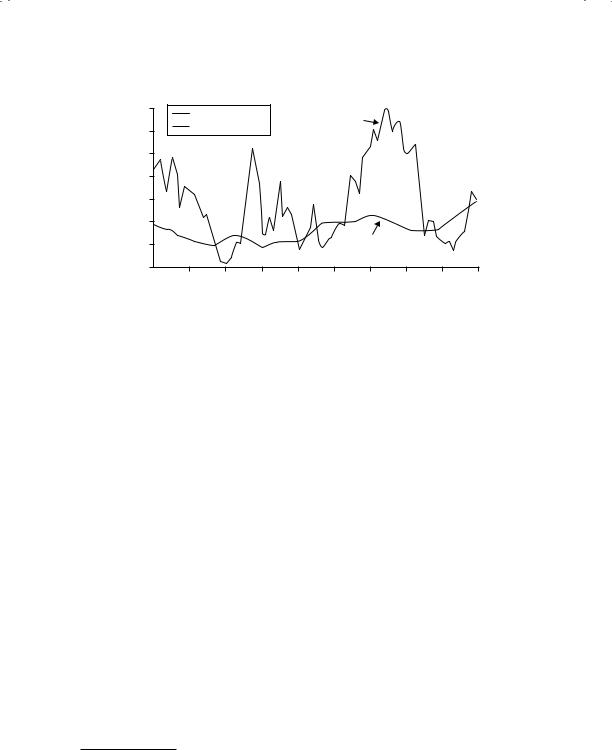
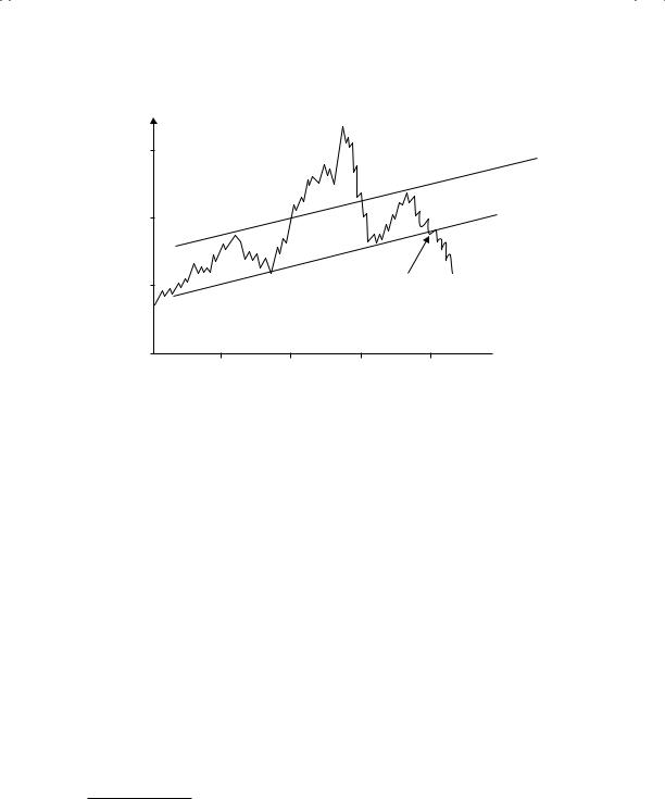
The second is the presence (at least perceived presence) of support and resistance lines in prices. A resistance line is an upper bound on the price whereas a support line represents a lower bound on the price. Both are extracted by looking at past prices. Thus, a stock that has tended to move between $20 and $40 over the last few periods has a support line at $20 and a resistance line at $40. It may be pure coincidence (though we think not), but support and resistance lines often are nice round numbers—you very seldom see a resistance line at $39.88 and a support line at $21.13. Figure 7.16 provides a chart with support and resistance lines.
The fact that the stock stays below the resistance line and above the support line is not news, but a stock that breaks through either gets attention. When a stock breaks through the resistance line, technical analysts view it as a sign of a shift in demand upward and the beginning of a sustained upward movement in prices. Conversely, when a stock falls below the support line, analysts view it as a breakdown in demand and the precursor of a further decline in prices. While the notion of arbitrary support and resistance lines strikes us as fanciful, if enough investors buy into their existence, there can be a self-fulfilling prophecy. To see why, assume that a stock with a resistance line of $40 sees its stock price go up to $40.50. Investors who believe that this is a beginning of a surge in prices will all try to buy the stock on the event, causing the stock price to continue going up. Whether such a price increase can be sustained for more than a few days is an open question. In the graph in Figure 7.16, you can also see another widely followed chart
Smoke and Mirrors? Price Patterns, Volume Charts, and Technical Analysis |
245 |
Head
$30
$20
Price
$10
$0
Resistance Line
Right Shoulder
Support Line
Left Shoulder
This example also shows price falling below its support line. However, the head and shoulders pattern is a much stronger graph,
indicating more emphatically the future price decline.
 Time
Time
January |
February |
March |
April |
May |
F I G U R E 7 . 1 6 Support and Resistance Lines
pattern, called head and shoulders. In fact, there are hundreds of patterns that chartists have uncovered over time that they have offered as leading indicators of price changes.32
Central to much of technical analysis is a reverence for moving averages (i.e., averages of stock prices over the past few months or weeks). Often, you will see price charts with a moving average line superimposed on actual prices. Again, analysts view any deviation of stock prices from a moving average line as an indication of an underlying shift in demand that can be exploited for profits. As with many technical indicators, there are numerous variants that have developed around the concept of the simple moving average, where the average is computed over a moving time window—for example, time-weighted moving averages, where you weight recent prices more than older observations.
In recent years, information on trading volume for individual stocks has become increasingly accessible. Technical analysts now routinely look at trading volume for clues of future price movements, either in conjunction with price changes or by itself. For instance, an increase in the stock price that is accompanied by heavy trading volume is considered a more positive prognosticator of future price increases than one generated on light volume.
32R. Colby and T. Myers, The Encyclopedia of Technical Market Indicators (New York: Dow Jones Irwin/McGraw-Hill, 1988).

246 |
INVESTMENT PHILOSOPHIES |
E m p i r i c a l E v i d e n c e o n T e c h n i c a l I n d i c a t o r s |
There is not much empiri- |
cal evidence for or against many of the individual charting patterns. Part of the reason for this is that many of these patterns are so subjectively defined (different analysts use different and often shifting definitions of what comprises a support or a resistance line, for instance) that they cannot be tested empirically, which serves both sides of the argument very well. Supporters of charting can then use their own tests, which are often biased, to offer proof that their patterns work. Opponents of technical analysis can rest secure in their absolute conviction that charting is for the naive and the misguided and not worry about evidence to the contrary.
It is quite ironic that some of the best defenses of technical analysis have been offered by academics, who would not categorize themselves as chartists or technical analysts. Lo, Wang, and Mamaysky present a fairly convincing defense of technical analysis from the perspective of financial economists.33 They use daily returns of stocks on the New York Stock Exchange and NASDAQ from 1962 and 1996 and employ the most sophisticated computational techniques (rather than human visualization) to look for pricing patterns. They find that the most common patterns in stocks are double tops and bottoms, followed by the widely used head and shoulders pattern. In other words, they find evidence that some of the most common patterns used by technical analysts exist in prices. Lest this be cause for too much celebration among chartists, they also point out that these patterns offer only marginal incremental returns (an academic code word for really small) and offer the caveat that these returns may not survive transaction costs.
A R E C U R R E N C Y M A R K E T S D I F F E R E N T ?
While there is little empirical evidence to back the use of charts in the stock market, a number of studies claim to find that technical
indicators may work in currency markets. To name a few:
Filter rules, where you buy a currency if it goes up by X percent and sell if it goes down by the same amount earned substantial
33A.W. Lo, H. Mamaysky, and J. Wang, “Foundations of Technical Analysis: Computational Algorithms, Statistical Inference, and Empirical Implementation,” Journal of Finance 55 (2000): 1705–1765.

Smoke and Mirrors? Price Patterns, Volume Charts, and Technical Analysis |
247 |
profits in the deutsche mark, yen, and sterling markets between 1973 and 1981.34
Moving average rules would have generated excess returns in foreign currency markets.35
Head and shoulders patterns would have generated excess returns in the pound sterling, Canadian dollar, French franc, and Swiss franc markets between 1973 and 1994.36
Though there are dissenting voices, there clearly seem to be more opportunities for technical analysis in currency markets. Some attribute it to central bank intervention. When central banks target exchange rates, especially in conflict with the fundamentals, they can generate speculative profits for investors.
S l o w L e a r n i n g M a r k e t s : M o m e n t u m I n d i c a t o r s
If investors are slow to assess the effects of new information on stock prices, you can see sustained up or down movements in stock prices after news comes out about the stock—up movements after good news and down movements after bad news. There are analysts who contend that this is indeed the case and create trading rules that take advantage of this slow learning process. Since these rules are based on the assumption that trends in prices tend to continue for long periods, they can be categorized as momentum rules.
T h e B a s i s f o r S l o w L e a r n i n g a n d I m p l i c a t i o n s What is the evidence that markets learn slowly? The best support for slow learning markets comes from studies that look at information events such as earnings announcements or acquisitions. As we will see later in this book, there is evidence that markets continue to adjust to the information well after it has come out.
34M. P. Dooley and R. Shafer, “Analysis of Short-Run Exchange Rate Behavior: March 1973 to November 1981,” in Exchange Rate and Trade Instability, Causes, Consequences and Remedies (Ballinger, 1983).
35B. C. Kho, “Time-Varying Risk Premia, Volatility, and Technical Trading Rule Profits,” Journal of Financial Economics 41 (1996): 246–290.
36C. L. Osler and P. H. K. Chang, “Head and Shoulders: Not a Flaky Pattern” (Staff Paper, Federal Reserve Bank of New York, 1995).

248 |
INVESTMENT PHILOSOPHIES |
For instance, a firm that reports much better than expected earnings will generally see its stock price jump on the announcement and continue to drift upward for the next few days. The same seems to occur to a target firm in an acquisition. While there are alternative explanations for price drifts, one potential explanation is that markets learn slowly and it takes them a while to assimilate the information.
If markets learn slowly, you should expect to see prices move in the same direction after a precipitating action. If the initial news was good—a good earnings report or an earnings upgrade from an analyst—you should expect to see upward price momentum. If the news was bad, you should expect to see the opposite. In fact, recent empirical studies (referenced in the earlier part of this chapter) have found evidence of price momentum in equity markets in the United States at least in the short term.
T e c h n i c a l I n d i c a t o r s t o T a k e A d v a n t a g e o f S l o w L e a r n i n g M a r k e t s Momentum investors firmly believe that the trend is your friend and that it is critical that you look past the day-to-day movements in stock prices at the underlying long-term trends. The simplest measure of trend is a trend line. Figure 7.17 contains two trend lines—the graph on the left is for Apple Computers from 2008 to 2012 and the graph on the right is for Nokia over the same time period.
N U M B E R W A T C H
Sectors with highest relative strength: Take a look at the relative strength numbers for U.S. companies, categorized by sector.
In this Apple Computer chart to the left, you see an uptrend line, as the stock moved strongly upwards during the period. On the right, you see Nokia’s price follow a downtrend line as the stock prices dropped over the perio. As momentum investors, you would buy stocks that are going up and staying above the uptrend line. If the price falls below the uptrend line, it is viewed as a negative sign. Conversely, if the price rises above a downtrend line, it is considered a bullish sign.
A closely followed momentum measure is called relative strength, which is the ratio of the current price to an average over a longer period (say six months or a year). Stocks that score high on relative strength are therefore stocks that have gone up the most over the period, whereas those that score low are stocks that have gone down. The relative strength can be used in
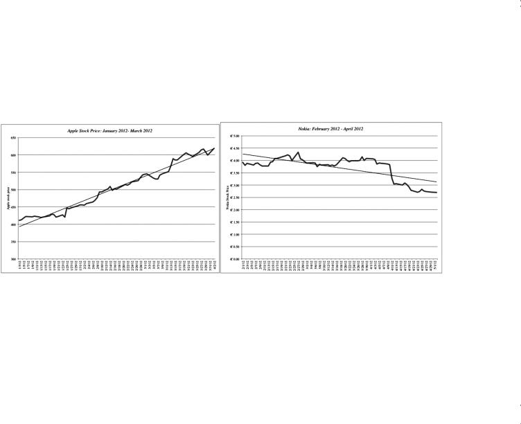
F I G U R E 7 . 1 7 Trend Lines
249