

The Essential Guide to UI Design
.pdf10 Part 1: The User Interface—An Introduction and Overview
A Brief History of Screen Design
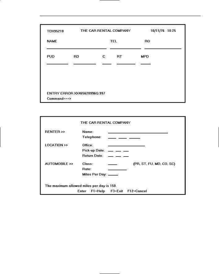
While developers have been designing screens since a cathode ray tube display was first attached to a computer, more widespread interest in the application of good design principles to screens did not begin to emerge until the early 1970s, when IBM introduced its 3270 cathode ray tube text-based terminal. The 3270 was used in myriad ways in the office, and company-specific guidelines for good screen design occasionally began to surface (e.g., Galitz and DiMatteo, 1974). Typically, however, design at this time period had little to guide it because it was driven by hardware and telephone line transmission issues. A 1970s screen often resembled the one shown in Figure 1.1. It usually consisted of many fields (more than are illustrated here) with very cryptic and often unintelligible captions. It was visually cluttered and often possessed a command field that challenged the user to remember what had to be keyed into it. Ambiguous messages often required referral to a manual to interpret. Effectively using this kind of screen required a great deal of practice and patience. Most early screens were monochromatic, typically presenting green text on black backgrounds.
At the turn of the decade, guidelines for text-based screen design were finally made widely available (Galitz, 1980, 1981) and many screens began to take on a much less cluttered look through concepts such as grouping and alignment of elements, as shown in Figure 1.2. User memory was supported by providing clear and meaningful field captions and by listing commands on the screen, and enabling them to be applied through function keys. Messages also became clearer. These screens were not entirely clutter-free, however. Instructions and reminders to the user had to be inscribed on the screen in the form of prompts or completion aids such as the codes PR and SC. Not all 1980s screens looked like this, however. In the 1980s, 1970s-type screens were still being designed, and some reside in old systems today.
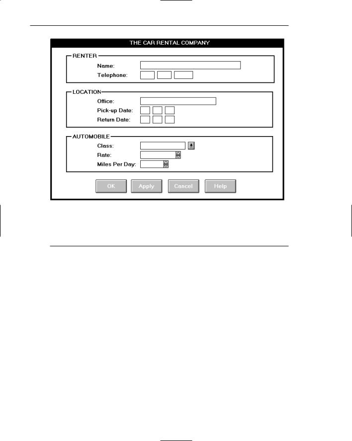
The advent of graphics yielded another milestone in the evolution of screen design, as shown in Figure 1.3. While some basic design principles did not change, such as groupings and alignment, borders were made available to visually enhance groupings, and buttons and menus for implementing commands replaced function keys. Multiple properties of elements were also provided, including different font sizes and styles, line thickness, and colors. The entry field was supplemented by many other kinds of controls, including list boxes, drop-down combination boxes, spin boxes, and so forth. These new controls were much more effective in supporting a person’s memory, now simply allowing for selection from a list instead of requiring a remembered key entry. Completion aids disappeared from screens, replaced by new listing controls. Screens could also be simplified, the much more powerful computers being able to quickly present a new screen.
In the 1990s our knowledge concerning what makes effective screen design continued to expand. Coupled with ever-improving technology, the result was even greater improvements in the user-computer screen interface as the new century dawned.
Chapter 1: The Importance of the User Interface 11
Figure 1.1 A 1970s screen.
Figure 1.2 A 1980s screen.
12 Part 1: The User Interface—An Introduction and Overview
Figure 1.3 A 1990s and beyond screen.
What’s Next?
The next chapter reviews the two dominant user interfaces today, GUI and Web. GUI interfaces are looked at in terms of their components, characteristics, and advantages over the older, text-based systems. Web interfaces are then compared to both GUI interfaces and conventional printed documents. How Web page design differs from Web application design is also discussed. Finally, the chapter concludes with a statement of the fundamental underlying principles for interface design.

C H A P T E R
2
Characteristics of Graphical
and Web User Interfaces
The graphical user interface differed significantly from its text-based forefather. The Web interface differs from a GUI interface in significant ways also. In this chapter, the following characteristics of GUI and Web interfaces are reviewed:
■■Interaction styles.
■■The concept of direct manipulation.
■■The characteristics of graphical interfaces.
■■The characteristics of Web interfaces.
■■Web page versus Web application design.
■■The general principles of user interface design.
Interaction Styles
An interaction style is simply the method, or methods, by which the user and a computer system communicate with one another. Today the designer has a choice of several interaction styles in graphical system or Web page and application design. They are as follows:
■■Command line
■■Menu selection
■■Form fill-in
■■Direct manipulation
■■Anthropomorphic
13

14 Part 1: The User Interface—An Introduction and Overview
The choice of interaction styles to be considered may be limited based upon the type of system being developed and the characteristics of the input and output devices to be used for the interface. A brief description of each interaction style follows. A summary of the advantages and disadvantages of each one is shown in Table 2.1.
Command Line
The command-line interface is the oldest and original user interaction style. It requires the user to press a function key or type a command into a designated entry area on a screen. The commands may be single characters, abbreviations, words, or multiple words and codes. The command-line style is powerful, offering immediate access to system functions. It is also flexible and able to incorporate options or parameters to vary its behavior. One problem with command lines is that they must be remembered and they test one’s power of recall. No clues about what commands are available exist on the screen. Another problem is that command lines can be cryptic and obscure with complex syntax. They are also very prone to, and intolerant of, typing errors that can lead to user frustration.
Menu Selection
A menu is a set of options or choices from which a user must choose. On screens, the user selects a choice with a pointing device or keystroke. Typically, some kind of visual feedback is then provided to indicate the option selected. Menu selections can also be provided by voice as exemplified by the “Press 1 to...” encountered after telephone calls to a business or organization. A newer version of telephone voice menus now appearing asks the caller to speak a request (or command), which, hopefully, the voice recognition system will understand. (Is this an auditory command line?)
Screen menus are advantageous because they utilize a person’s much stronger powers of recognition, not recall. (More about this in Step 3.) However, menu choice labels must be meaningful and understandable for the menu to be truly effective. Otherwise, speed of use will be degraded and errors increase. Menus can break a complex interaction into small steps, which structure and aid the decision-making process. This is especially helpful for infrequent users who are unfamiliar with the system. On the other hand, many small steps may slow the knowledgeable user. Techniques, however, are available to overcome these problems for the expert. Menus are discussed in more detail in Step 4.
Form Fill-in
The form fill-in style is very useful for collecting information. Today’s typical formstructured screen contains a series of controls or fields into which the user either types information or selects an option, or options, from a listing of choices. (Technically, a listing of choices presented to users is also a menu.) In old text-based systems, however, screen forms were composed entirely of fields into which the user had to type information. Screen fill-in forms are derived from their antecedents, paper forms. An advantage of a form is its familiarity. If it is designed well, a form will aid the user in

Chapter 2: Characteristics of Graphical and Web User Interfaces 15
understanding its purpose and allow fast and easy entry of information. Conversely, a poorly designed screen form can be inefficient and aggravating to complete. Screen form design principles are discussed in Step 3, and screen-based controls are discussed in Step 7.
Direct Manipulation
A direct manipulation interface, as found in graphical systems, enables the user to directly interact with elements presented on the screen. These elements (called objects) replace the keyed entry of commands and menus. Users typically select screen objects and actions by using pointing mechanisms, such as the mouse or joystick, instead of the traditional keyboard. They navigate the screen and execute commands by using menu bars and pull-down menus. The direct manipulation interaction style will be discussed in more detail in the “Graphical User Interface” section later in this chapter.
Anthropomorphic
An anthropomorphic interface tries to interact with people the same way people interact with each other. Anthropomorphic interfaces include spoken natural language dialogues, hand gestures, facial expressions, and eye movements. The development of these kinds of interfaces requires an understanding of human behavior; how people interact with one another, the meaning of gestures and expressions, what people mean when they look at things, and so forth. Wouldn’t it be nice, for example, if the system could track eye movement across the screen to a menu, and then recognize the blink of an eye to select the choice being viewed? Or, if a frown elicited the automatic display of a help screen and a smile meant OK?
Many of these interfaces exist, in some form, only in the laboratory or in researchers’ thoughts. The most advanced interface is the natural language dialog. Structured subsets of typed or spoken words are now capable of being recognized in limited ways, as exemplified by the telephone voice recognition described above.
With the exception of an anthropomorphic interface, most current systems contain a blend of these interaction styles. The proper mix can be created only after an understanding of the user, the tasks to be performed, and the goals of the system are obtained.
Table 2.1: Some Advantages and Disadvantages of Interaction Styles
STYLE |
ADVANTAGES |
DISADVANTAGES |
Command Line |
Powerful |
Commands must be memorized |
|
Flexible |
Requires learning |
|
Appeals to expert users |
Intolerant of typing errors |
|
Conserves screen space |
Difficult for casual users |
|
|
|
(continued)

16 Part 1: The User Interface—An Introduction and Overview
Table 2.1 (continued)
STYLE |
ADVANTAGES |
DISADVANTAGES |
Menu Selection |
Utilizes recognition memory |
May slow knowledgeable users |
|
Reduces interaction complexity |
Consumes screen space |
|
Aids decision-making process |
May create complex menu |
|
|
hierarchies |
|
Minimizes typing |
|
|
Aids casual users |
|
|
|
|
Form Fill-in |
Familiar format |
Consumes screen space |
|
Simplifies information entry |
Requires careful and efficient |
|
|
design |
|
Requires minimal training |
Does not prevent typing errors |
Direct Manipulation |
Faster learning |
Greater design complexity |
|
Easier remembering |
Window manipulation |
|
|
requirements |
|
Exploits visual/spatial cues |
Requires icon recognition |
|
Easy error recovery |
Inefficient for touch typists |
|
Provides context |
Increased chance for screen |
|
|
clutter |
|
Immediate feedback |
|
|
|
|
Anthropomorphic |
Natural |
Difficult to implement |
The Graphical User Interface
A user interface, as recently described, is a collection of techniques and mechanisms to interact with something. In a graphical interface, the primary interaction mechanism is a pointing device of some kind. This device is the electronic equivalent to the human hand. What the user interacts with is a collection of elements referred to as objects. They can be seen, heard, touched, or otherwise perceived. Objects are always visible to the user and are used to perform tasks. They are interacted with as entities independent of all other objects. People perform operations, called actions, on objects. The operations include accessing and modifying objects by pointing, selecting, and manipulating. All objects have standard resulting behaviors.
The Popularity of Graphics
Graphics revolutionized design and the user interface. A graphical screen bore scant resemblance to its earlier text-based colleagues. Whereas the older text-based screen

Chapter 2: Characteristics of Graphical and Web User Interfaces 17
possessed a one-dimensional, text-oriented, form-like quality, graphic screens assumed a three-dimensional look. Information floated in windows, small rectangular boxes that seemed to rise above the background plane. Windows could also float above other windows. Controls appeared to rise above the screen and move when activated. Lines appeared to be etched into the screen. Information could appear and disappear as needed, and in some cases text could be replaced by graphical images called icons. These icons could represent objects or actions.
Screen navigation and commands are executed through menu bars and pull-down menus. Menus “pop up” on the screen. In the screen body, selection fields such as radio buttons, check boxes, list boxes, and palettes coexisted with the reliable old text entry field. More sophisticated text entry fields with attached or drop-down menus of alternative options also became available. Screen objects and actions are typically selected through use of pointing mechanisms, such as the mouse or joystick, instead of the traditional keyboard.
Increased computer power and the vast improvement in the display enable a system to react to the user’s actions quickly, dynamically, and meaningfully. This new interface was characterized as representing one’s “desktop” with scattered notes, papers, and objects such as files, trays, and trash cans arrayed around the screen. It is sometimes referred to as the WIMP interface: windows, icons, menus, and pointing device.
Graphic presentation of information utilizes a person’s information-processing capabilities much more effectively than other presentation methods. Properly used, it reduces the requirement for perceptual and mental information recoding and reorganization, and also reduces the memory loads. It permits faster information transfer between computers and people by permitting more visual comparisons of amounts, trends, or relationships; more compact representation of information; and simplification of the perception of structure. Graphics also can add appeal or charm to the interface and permit greater customization to create a unique corporate or organization style.
The Concept of Direct Manipulation
The term used to describe graphical systems with this style of interaction was first used by Shneiderman (1982). He called them “direct manipulation” systems, suggesting that they possess the following characteristics:
The system is portrayed as an extension of the real world. It is assumed that a person is already familiar with the objects and actions in his or her environment of interest. The system simply replicates them and portrays them on a different medium, the screen. A person has the power to access and modify these objects, including windows. A person is allowed to work in a familiar environment and in a familiar way, focusing on the data, not the application and tools. The physical organization of the system, which most often is unfamiliar, is hidden from view and is not a distraction.
Objects and actions are continuously visible. Like one’s desktop, objects are continuously visible. Reminders of actions to be performed are also obvious, where labeled buttons replace complex syntax and command names. Cursor action and motion occurs in physically obvious and intuitively natural ways. Nelson (1980)

18 Part 1: The User Interface—An Introduction and Overview
described this concept as virtual reality, a representation of reality that can be manipulated. Hatfield (1981) is credited with calling it WYSIWYG (what you see is what you get). Rutkowski (1982) described it as transparency, where one’s intellect is applied to the task, not the tool. Hutchins, Hollan, and Norman (1986) considered it direct involvement with the world of objects rather than communicating with an intermediary.
One problem in direct manipulation, however, is that there is no direct analogy on the desk for all necessary windowing operations. A piece of paper on one’s desk maintains a constant size, never shrinking or growing. Windows can do both. Solving this problem required embedding a control panel, a familiar concept to most people, in a window’s border. This control panel is manipulated, not the window itself.
Actions are rapid and incremental with visible display of results. Because tactile feedback is not yet possible (as would occur with one’s hand when one touches something), the results of actions are immediately displayed visually on the screen in their new and current form. Auditory feedback may also be provided. The impact of a previous action is quickly seen, and the evolution of tasks is continuous and effortless.
Incremental actions are easily reversible. Finally, actions, if discovered to be incorrect or not desired, can be easily undone.
Earlier Direct Manipulation Systems
Using the aforementioned definition, the concept of direct manipulation actually preceded the first graphical system. The earliest full-screen text editors possessed similar characteristics. Screens of text resembling a piece of paper on one’s desk could be created (extension of real world) and then reviewed in their entirety (continuous visibility). Editing or restructuring could be easily accomplished (through rapid incremental actions) and the results immediately seen. Actions could be reversed when necessary. It took the advent of graphical systems to crystallize the direct manipulation concept, however.
Indirect Manipulation
In practice, direct manipulation of all screen objects and actions may not be feasible because of the following:
■■The operation may be difficult to conceptualize in the graphical system.
■■The graphics capability of the system may be limited.
■■The amount of space available for placing manipulation controls in the window border may be limited.
■■It may be difficult for people to learn and remember all of the necessary operations and actions.
When this occurs, indirect manipulation is provided. Indirect manipulation substitutes words and text, such as pull-down or pop-up menus, for symbols, and substitutes typing for pointing. Most window systems are a combination of both direct and indirect

Chapter 2: Characteristics of Graphical and Web User Interfaces 19
manipulation. A menu may be accessed by pointing at a menu icon and then selecting it (direct manipulation). The menu itself, however, is a textual list of operations (indirect manipulation). When an operation is selected from the list, by pointing or typing, the system executes it as a command.
Which style of interaction — direct manipulation, indirect manipulation, or a combination of both — is best, under what conditions and for whom, remains a question for which the answer still eludes us.
Graphical Systems: Advantages and Disadvantages
Graphical systems burst upon the office with great promise. The simplified interface they presented was thought to reduce the memory requirements imposed on the user, make more effective use of one’s information-processing capabilities, and dramatically reduce system learning requirements. Experience indicates that for many people they have done all these things.
Advantages
The success of graphical systems has been attributed to a host of factors. The following have been commonly referenced in literature and endorsed by their advocates as advantages of these systems:
Symbols recognized faster than text. Research has found that symbols can be recognized faster and more accurately than text, and that the graphical attributes of icons, such as shape and color, are very useful for quickly classifying objects, elements, or text by some common property. An example of a good classification scheme that speeds up recognition is the icons developed for indicating the kind of message being presented to the user of the system. The text of an informational message is preceded by an “i” in a circle, a warning message by an exclamation point, and a critical message by another unique symbol. These icons allow speedy recognition of the type of message being presented.
Faster learning. Research has also found that a graphical, pictorial representation aids learning, and symbols can also be easily learned.
Faster use and problem solving. Visual or spatial representation of information has been found to be easier to retain and manipulate, and leads to faster and more successful problem solving. Symbols have also been found to be effective in conveying simple instructions.
Easier remembering. Because of greater simplicity, it is easier for casual users to retain operational concepts.
More natural. Graphic representations of objects are thought to be more natural and closer to innate human capabilities. In human beings, actions and visual skills emerged before languages. It has also been suggested that symbolic displays are more natural and advantageous because the human mind has a powerful image memory.
Exploits visual/spatial cues. Spatial relationships are usually found to be understood more quickly than verbal representations. Visual thinking is believed to be better than logical thinking.