

C H A P T E R 1 5
Controls
Pop-Up Menus
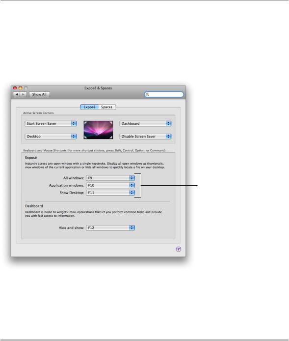
A pop-up menu presents a list of mutually exclusive choices in a dialog or window. The pop-up menu described in this section is suitable for use in window-body areas. If you need to provide pop-up menu functionality in a window-frame area (a toolbar or bottom bar), see “Window-Frame Controls” (page 249) for more information on controls you can use. If you want to add pop-up menu functionality to a bevel or icon button, see “Icon Buttons and Bevel Buttons With Pop-Up Menus” (page 279) for some specifications you can use. Figure 15-29 shows several pop-up menus in a window.
Figure 15-29 Pop-up menus provide users with menu functionality in a control
Pop-up menus
A pop-up menu behaves like other menus: Users press to open the menu and then drag to choose an item. The chosen item flashes briefly and is displayed in the closed pop-up menu. If users move the cursor outside the open menu without releasing the mouse button, the current value remains active. An exploratory press in the menu to see what’s available doesn’t select a new value.
Pop-Up Menu Usage
Use a pop-up menu to present up to 12 mutually exclusive choices that the user doesn’t need to see all the time. Sometimes a pop-up menu can be a good alternative to other types of selection controls. For example, if you have a dialog that contains a set of six or more radio buttons, you might consider replacing them with a pop-up menu to save space.
Avoid adding a submenu to any item in a pop-up menu. Doing so hides choices too deeply and is physically difficult for users to use.
Selection Controls |
281 |
2008-06-09 | © 1992, 2001-2003, 2008 Apple Inc. All Rights Reserved.
C H A P T E R 1 5
Controls
Avoid using pop-up menus:
■For more than 12 items; instead, use a scrolling list unless space is restricted.
■When the number of items in the list can change.
■When more than one simultaneous selection is appropriate, such as in a list of text styles (from which users might choose both bold and italic). In this situation, you should instead use checkboxes or a pull-down menu in which checkmarks appear.
Pop-Up Menu Contents and Labeling
A pop-up menu:
■Usually has a label to the left (in left-to-right scripts). The label should have sentence-style capitalization (see “Capitalization of Interface Element Labels and Text” (page 131) for more information on this capitalization style). The only exception is if the control is used as the title for a group box, which is not a common usage.
■Has a double-arrow indicator.
■Contains nouns (things) or adjectives (states or attributes), but not verbs (commands). If you need to display commands, use a pull-down menu instead. Use title-style capitalization for the item labels.
■Displays a checkmark to the left of the currently selected value when open.
Figure 15-30 shows the components of a pop-up menu.
Figure 15-30 An open pop-up menu
Label
282 |
Selection Controls |
2008-06-09 | © 1992, 2001-2003, 2008 Apple Inc. All Rights Reserved.
C H A P T E R 1 5
Controls
In special cases, you may want to include a command that affects the contents of the pop-up menu itself. For example, in the Print dialog, the Printer pop-up menu contains the Add Printer item, so users can add a printer to the menu; the new printer becomes the menu’s default selection. Put such commands at the bottom of a pop-up menu, below a separator.
Pop-Up Menu Specifications
Control sizes: The height of a pop-up menu is fixed for each size. The width should be wide enough to accommodate the longest item. If you display multiple pop-up menus in a stack the width of each control should be the same.
Label spacing and fonts: The menu-item text in a pop-up menu should be in a font that is proportional to the size of the control. The text of the introductory label should be an emphasized version of the same font. Use the following metrics and specifications for a pop-up menu:
■Regular size:
Menu-item text: System font. Leave 9 pixels from the left edge of the control and at least 9 pixels from the double-arrow area.
Introductory text: Emphasized system font. Leave 8 pixels between the end of the text (colon) and the left edge of the control.
■Small:
Menu-item text: Small system font. Leave 7 pixels from the left edge of the control and at least 7 pixels from the double-arrow area.
Introductory text: Emphasized small system font. Leave 6 pixels between the end of the text (colon) and the left edge of the control.
■Mini:
Menu-item text: Mini system font. Leave 5 pixels from the left edge of the control and at least 5 pixels from the double-arrow area.
Introductory text: Emphasized mini system font. Leave 5 pixels between the end of the text (colon) and the left edge of menu.
Figure 15-31 shows how the pop-up menu introductory text and menu-item text are positioned.
Figure 15-31 A pop-up menu with an introductory label and menu-item text
Control spacing: When you display multiple pop-up menus stacked vertically, leave the following amounts of space between them (Figure 15-32 shows how this looks with regular-size controls):
■Regular size: At least 10 pixels between stacked controls.
■Small: At least 8 pixels between stacked controls.
■Mini: At least 6 pixels between stacked controls.
Selection Controls |
283 |
2008-06-09 | © 1992, 2001-2003, 2008 Apple Inc. All Rights Reserved.