![](/user_photo/2706_HbeT2.jpg)
- •Contents
- •Figures and Tables
- •The Design Process
- •Involving Users in the Design Process
- •Know Your Audience
- •Analyze User Tasks
- •Build Prototypes
- •Observe Users
- •Guidelines for Conducting User Observations
- •Making Design Decisions
- •Avoid Feature Cascade
- •Apply the 80 Percent Solution
- •Characteristics of Great Software
- •High Performance
- •Ease of Use
- •Attractive Appearance
- •Reliability
- •Adaptability
- •Interoperability
- •Mobility
- •Human Interface Design
- •Human Interface Design Principles
- •Metaphors
- •Reflect the User’s Mental Model
- •Explicit and Implied Actions
- •Direct Manipulation
- •User Control
- •Feedback and Communication
- •Consistency
- •WYSIWYG (What You See Is What You Get)
- •Forgiveness
- •Perceived Stability
- •Aesthetic Integrity
- •Modelessness
- •Managing Complexity in Your Software
- •Keep Your Users in Mind
- •Worldwide Compatibility
- •Cultural Values
- •Language Differences
- •Text Display and Text Editing
- •Resources
- •Universal Accessibility
- •Visual Disabilities
- •Hearing Disabilities
- •Physical Disabilities
- •Extending the Interface
- •Build on the Existing Interface
- •Don’t Assign New Behaviors to Existing Objects
- •Create a New Interface Element Cautiously
- •Prioritizing Design Decisions
- •Meet Minimum Requirements
- •Deliver the Features Users Expect
- •Differentiate Your Application
- •The Mac OS X Environment
- •The Always-On Environment
- •Displays
- •The Dock
- •Conveying Information in the Dock
- •Clicking in the Dock
- •The Finder
- •File Formats and Filename Extensions
- •Internationalization
- •Multiple User Issues
- •Resource Management
- •Threads
- •Using Mac OS X Technologies
- •Address Book
- •Animation
- •Automator
- •Bonjour
- •Colors
- •Dashboard
- •High-Level Design Guidelines for Widgets
- •User-Interface Design Guidelines for Widgets
- •Fonts
- •Preferences
- •Printing
- •Security
- •Speech
- •Spotlight
- •User Assistance
- •Apple Help
- •Help Tags
- •Software Installation and Software Updates
- •Packaging
- •Identify System Requirements
- •Bundle Your Software
- •Installation
- •Use Internet-Enabled Disk Images
- •Drag-and-Drop Installation
- •Installation Packages
- •General Installer Guidelines
- •Setup Assistants
- •Updating Installed Applications
- •User Input
- •The Mouse and Other Pointing Devices
- •Clicking
- •Double-Clicking
- •Pressing and Holding
- •Dragging
- •The Keyboard
- •The Functions of Specific Keys
- •Character Keys
- •Modifier Keys
- •Arrow Keys
- •Function Keys
- •Keyboard Shortcuts
- •Reserved Keyboard Shortcuts
- •Creating Your Own Keyboard Shortcuts
- •User-Defined Keyboard Shortcuts
- •Keyboard Focus and Navigation
- •Type-Ahead and Key-Repeat
- •Selecting
- •Selection Methods
- •Selection by Clicking
- •Selection by Dragging
- •Changing a Selection
- •Selections in Text
- •Selecting With the Mouse
- •What Constitutes a Word
- •Selecting Text With the Arrow Keys
- •Selections in Spreadsheets
- •Selections in Graphics
- •Editing Text
- •Inserting Text
- •Deleting Text
- •Replacing a Selection
- •Intelligent Cut and Paste
- •Editing Text Fields
- •Entering Passwords
- •Drag and Drop
- •Drag-and-Drop Overview
- •Drag-and-Drop Semantics
- •Move Versus Copy
- •When to Check the Option Key State
- •Selection Feedback
- •Single-Gesture Selection and Dragging
- •Background Selections
- •Drag Feedback
- •Destination Feedback
- •Windows
- •Text
- •Lists
- •Multiple Dragged Items
- •Automatic Scrolling
- •Using the Trash as a Destination
- •Drop Feedback
- •Finder Icons
- •Graphics
- •Text
- •Transferring a Selection
- •Feedback for an Invalid Drop
- •Clippings
- •Text
- •Fonts
- •Style
- •Inserting Spaces Between Sentences
- •Using the Ellipsis Character
- •Using the Colon Character
- •Labels for Interface Elements
- •Capitalization of Interface Element Labels and Text
- •Using Contractions in the Interface
- •Using Abbreviations and Acronyms in the Interface
- •Developer Terms and User Terms
- •Icons
- •Icon Genres and Families
- •Application Icons
- •User Application Icons
- •Viewer, Player, and Accessory Icons
- •Utility Icons
- •Document Icons
- •Toolbar Icons
- •Icons for Plug-ins, Hardware, and Removable Media
- •Icon Perspectives and Materials
- •Creating Icons
- •Tips for Designing Icons
- •A Suggested Process for Creating Icons
- •Creating Icons for Mac OS X v10.5 and Later
- •Scaling Your Artwork
- •Designing Toolbar Icons
- •Designing Icons for Icon Buttons
- •Designing Icons for Capsule-Style Toolbar Controls
- •Designing Icons for Rectangular-Style Toolbar Controls
- •System-Provided Images
- •System-Provided Images for Use in Controls
- •System-Provided Images for Use as Standalone Buttons
- •System-Provided Images for Use as Toolbar Items
- •System-Provided Images that Indicate Privileges
- •A System-Provided Drag Image
- •Cursors
- •Standard Cursors
- •Designing Your Own Cursors
- •Menus
- •Menu Behavior
- •Designing the Elements of Menus
- •Titling Menus
- •Naming Menu Items
- •Using Icons in Menus
- •Using Symbols in Menus
- •Toggled Menu Items
- •Grouping Items in Menus
- •Hierarchical Menus (Submenus)
- •The Menu Bar and Its Menus
- •The Apple Menu
- •The Application Menu
- •The Application Menu Title
- •The Application Menu Contents
- •The File Menu
- •The Edit Menu
- •The Format Menu
- •The View Menu
- •Application-Specific Menus
- •The Window Menu
- •The Help Menu
- •Menu Bar Extras
- •Contextual Menus
- •Dock Menus
- •Windows
- •Types of Windows
- •Window Appearance
- •Window Elements
- •The Title Bar
- •The Window Title
- •Title Bar Buttons
- •Indicating Changes with the Close Button
- •The Proxy Icon
- •Toolbars
- •Toolbar Appearance and Behavior
- •Designing a Toolbar
- •Scope Bars
- •Scope Bar Appearance and Behavior
- •Designing a Scope Bar
- •Source Lists
- •Source List Behavior and Appearance
- •Designing a Source List
- •Bottom Bars
- •Bottom Bar Appearance and Behavior
- •Designing a Bottom Bar
- •Drawers
- •When to Use Drawers
- •Drawer Behavior
- •Window Behavior
- •Opening Windows
- •Naming New Windows
- •Positioning Windows
- •Moving Windows
- •Resizing and Zooming Windows
- •Minimizing and Expanding Windows
- •Closing Windows
- •Window Layering
- •Main, Key, and Inactive Windows
- •Click-Through
- •Scrolling Windows
- •Automatic Scrolling
- •Panels
- •Inspector Windows
- •Transparent Panels
- •When to Use Transparent Panels
- •Designing a Transparent Panel
- •Fonts Window and Colors Window
- •About Windows
- •Dialogs
- •Types of Dialogs and When to Use Them
- •Sheets (Document-Modal Dialogs)
- •Alerts
- •Dialog Appearance and Behavior
- •Accepting Changes
- •Dismissing Dialogs
- •Providing an Apply Button in a Dialog
- •Expanding Dialogs
- •Find Windows
- •Preferences Windows
- •The Open Dialog
- •Dialogs for Saving, Closing, and Quitting
- •Save Dialogs
- •Closing a Document With Unsaved Changes
- •Attempting to Save a Locked or Read-Only Document
- •Saving Documents During a Quit Operation
- •The Choose Dialog
- •The Print Dialog
- •Print Dialog
- •Page Setup Dialog
- •Controls
- •Window-Frame Controls
- •Rectangular-Style Toolbar Controls
- •Rectangular-Style Toolbar Control Usage
- •Rectangular-Style Toolbar Control Contents and Labeling
- •Rectangular-Style Toolbar Control Specifications
- •Rectangular-Style Toolbar Control Implementation
- •Capsule-Style Toolbar Controls
- •Capsule-Style Toolbar Control Usage
- •Capsule-Style Toolbar Control Contents and Labeling
- •Capsule-Style Toolbar Control Specifications
- •Capsule-Style Toolbar Control Implementation
- •Legacy Toolbar Controls
- •Buttons
- •Push Buttons
- •Push Button Usage
- •Push Button Contents and Labeling
- •Push Button Specifications
- •Push Button Implementation
- •Icon Buttons
- •Icon Button Usage
- •Icon Button Contents and Labeling
- •Icon Button Specifications
- •Icon Button Implementation
- •Scope Buttons
- •Scope Button Usage
- •Scope Button Contents and Labeling
- •Scope Button Specifications
- •Scope Button Implementation
- •Gradient Buttons
- •Gradient Button Usage
- •Gradient Button Contents and Labeling
- •Gradient Button Specifications
- •Gradient Button Implementation
- •The Help Button
- •Bevel Buttons
- •Bevel Button Usage
- •Bevel Button Contents and Labeling
- •Bevel Button Specifications
- •Bevel Button Implementation
- •Round Buttons
- •Round Button Usage
- •Round Button Contents and Labeling
- •Round Button Specifications
- •Round Button Implementation
- •Selection Controls
- •Radio Buttons
- •Radio Button Usage
- •Radio Button Contents and Labeling
- •Radio Button Specifications
- •Radio Button Implementation
- •Checkboxes
- •Checkbox Usage
- •Checkbox Contents and Labeling
- •Checkbox Specifications
- •Checkbox Implementation
- •Segmented Controls
- •Segmented Control Usage
- •Segmented Control Contents and Labeling
- •Segmented Control Specifications
- •Segmented Control Implementation
- •Icon Buttons and Bevel Buttons with Pop-Up Menus
- •Pop-Up Menus
- •Pop-Up Menu Usage
- •Pop-Up Menu Contents and Labeling
- •Pop-Up Menu Specifications
- •Pop-Up Menu Implementation
- •Action Menus
- •Action Menu Usage
- •Action Menu Contents and Labeling
- •Action Menu Specifications
- •Action Menu Implementation
- •Combination Boxes
- •Combo Box Usage
- •Combo Box Contents and Labeling
- •Combo Box Specifications
- •Combo Box Implementation
- •Path Controls
- •Path Control Usage
- •Path Control Contents and Labeling
- •Path Control Specifications
- •Path Control Implementation
- •Color Wells
- •Image Wells
- •Date Pickers
- •Date Picker Usage
- •Date Picker Implementation
- •Command Pop-Down Menus
- •Command Pop-Down Menu Usage
- •Command Pop-Down Menu Contents and Labeling
- •Command Pop-Down Menu Specifications
- •Command Pop-Down Implementation
- •Sliders
- •Slider Usage
- •Slider Contents and Labeling
- •Slider Control Specifications
- •Slider Control Implementation
- •The Stepper Control (Little Arrows)
- •Stepper Control Specifications
- •Placards
- •Indicators
- •Progress Indicators
- •Determinate Progress Bars
- •Indeterminate Progress Bars
- •Asynchronous Progress Indicators
- •Level Indicators
- •Capacity Indicators
- •Rating Indicators
- •Relevance Indicators
- •Text Controls
- •Static Text Fields
- •Text Input Fields
- •Text Input Field Usage
- •Text Input Field Contents and Labeling
- •Text Input Field Specifications
- •Text Input Field Implementation
- •Token Fields
- •Token Field Usage
- •Token Field Specifications
- •Token Field Implementation
- •Search Fields
- •Search Field Usage
- •Search Field Contents and Labeling
- •Search Field Specifications
- •Search Field Implementation
- •Scrolling Lists
- •Scrolling List Usage
- •Scrolling List Contents and Labeling
- •Scrolling List Specifications
- •Scrolling List Implementation
- •View Controls
- •Disclosure Triangles
- •Disclosure Triangle Usage
- •Disclosure Triangle Contents and Labeling
- •Disclosure Triangle Specifications
- •Disclosure Triangle Implementation
- •Disclosure Buttons
- •Disclosure Button Usage
- •Disclosure Button Contents and Labeling
- •Disclosure Button Specifications
- •Disclosure Button Implementation
- •List Views
- •List View Usage
- •List View Contents and Labeling
- •List View Implementation
- •Column Views
- •Column View Usage
- •Column View Contents and Labeling
- •Column View Implementation
- •Split Views
- •Split View Usage
- •Split View Specifications
- •Split View Implementation
- •Tab Views
- •Tab View Usage
- •Tab View Contents and Labeling
- •Tab View Specifications
- •Tab View Implementation
- •Grouping Controls
- •Separators
- •Separator Usage
- •Separator Labeling
- •Separator Specifications
- •Separator Implementation
- •Group Boxes
- •Group Box Usage
- •Group Box Contents and Labeling
- •Group Box Specifications
- •Group Box Implementation
- •Layout Guidelines
- •Positioning Regular-Size Controls in a Window Body
- •A Simple Preferences Window
- •A Tabbed Window
- •A Standard Alert
- •Positioning Small and Mini Controls in a Window Body
- •Layout Example for Small Controls
- •Layout Example for Mini Controls
- •Grouping Controls in a Window Body
- •Grouping with White Space
- •Grouping with Separators
- •Grouping with Group Boxes
- •Positioning Text and Controls in a Bottom Bar
- •Glossary
- •Index
![](/html/2706/180/html_UUKAsPLy1g.Wf7w/htmlconvd-2rDWZ2302x1.jpg)
C H A P T E R 1 5
Controls
Indicators
Indicators are controls that show users the status of something. For the most part, users don’t interact with indicators.
Important: The controls described in this section are suitable for use in the window body; they should not be used in the window-frame areas. See “Window-Frame Controls” (page 249) for controls designed specifically for use in the toolbar and bottom-bar areas in your window.
Progress Indicators
Progress indicators inform users about the status of lengthy operations. (For guidelines on when to provide such information, see “Feedback and Communication” (page 42).)
Progress indicators often appear in a dialog that describes the progress of a process. When the process being performed can be interrupted, the progress dialog should contain a Cancel button (and support the Esc key). If interrupting the process will result in possible side effects, the button should say Stop instead of Cancel. To learn more about dialogs in general, see “Dialogs” (page 230). To supply a Cancel (or Stop) button, you use a push button; for more information about this control, see “Push Buttons” (page 258).
Be sure to locate progress indicators in consistent locations in your windows and dialogs. For example, the Mail application displays the asynchronous progress indicator in the far right of the To field as it finds and displays email addresses that match what the user types. Choosing a consistent location for progress indicators allows users to quickly check a familiar place for the status of an operation. See “Consistency” (page 43) for more information on the importance of providing consistency in your application.
There are three types of progress indicators, each of which is suitable for a specific situation:
■Determinate progress bar
■Indeterminate progress bar
■Asynchronous progress indicator
Determinate Progress Bars
A determinate progress bar shows users that a process is occurring and gives them a rough idea of when it will finish. For example, Figure 15-55 shows the progress indicator Software Update displays when it is checking for new software.
302 Indicators
2008-06-09 | © 1992, 2001-2003, 2008 Apple Inc. All Rights Reserved.
![](/html/2706/180/html_UUKAsPLy1g.Wf7w/htmlconvd-2rDWZ2303x1.jpg)
C H A P T E R 1 5
Controls
Figure 15-55 A determinate progress bar provides feedback on a process with a known duration
Determinate Progress Bar Usage
Use a determinate progress bar when the full length of an operation can be determined and you can tell the user how much of the process has been completed. For example, you could use a determinate progress bar to show the progress of a file conversion.
You should ensure that a determinate progress bar in your application accurately associates progress with time. A progress bar that becomes 90 percent complete in 5 seconds but takes 5 minutes for the remaining 10 percent, for example, would be annoying and lead users to think that something is wrong.
Determinate Progress Bar Contents and Labeling
In a determinate progress bar, the “fill” moves from left to right and should fill in completely before it is dismissed. The fill is provided automatically, but you can determine the minimum and maximum values that should be represented.
If necessary, you can provide a complete or partial sentence that appears as a label with a determinate progress bar in a dialog. You can do this so users understand the context in which the process is occurring. Such a label should have sentence-style capitalization (see “Capitalization of Interface Element Labels and Text” (page 131) for more information on this style).
Determinate Progress Bar Specifications
Determinate progress indicators are available in regular and small sizes. The height of a determinate progress indicator is fixed for each size, but you can specify the length. Figure 15-56 shows a regular-size determinate progress bar as it looks when active and inactive.
Indicators |
303 |
2008-06-09 | © 1992, 2001-2003, 2008 Apple Inc. All Rights Reserved.
![](/html/2706/180/html_UUKAsPLy1g.Wf7w/htmlconvd-2rDWZ2304x1.jpg)
C H A P T E R 1 5
Controls
Figure 15-56 The active and inactive appearance of a determinate progress bar
Active fill
Inactive fill
Determinate Progress Bar Implementation
Determinate progress bars are available in Interface Builder. In the Attributes pane of the inspector, select Bar for the style and deselect the Indeterminate checkbox. To create a determinate progress bar using Application Kit programming interfaces, use the NSProgressIndicator class with style
NSProgressIndicatorBarStyle.
Indeterminate Progress Bars
An indeterminate progress bar shows users that processing is occurring, but does not give any indication of when it will finish. For example, Keynote displays an indeterminate progress bar as it begins opening a file, as shown in Figure 15-57.
Figure 15-57 An indeterminate progress bar provides feedback on a process of unknown duration
Indeterminate Progress Bar Usage
Use an indeterminate progress bar when the duration of a process can’t be determined. For example, if your applicationattemptstomakeadial-upcommunicationconnection,youhavenowaytoaccuratelydetermine how long it will take, so you can use an indeterminate progress indicator to let users know that processing is ongoing. If an indeterminate process reaches a point where its duration can be determined, switch to a determinate progress bar (see “Determinate Progress Bars” (page 302) for more on determinate progress bars).
Indeterminate progress bars work best in a dialog or window that focuses on the occurring process. For example, the indeterminate progress bar Keynote displays is in a dialog that is focused solely on the opening of the file (this dialog is shown in Figure 15-57). If you need to provide an indication of an indeterminate process that’s associated with a part of a window, such as a control, or if space is limited, consider using an asynchronous progress indicator instead. (See “Asynchronous Progress Indicators” (page 305) for more information on asynchronous progress indicators.)
304 Indicators
2008-06-09 | © 1992, 2001-2003, 2008 Apple Inc. All Rights Reserved.
![](/html/2706/180/html_UUKAsPLy1g.Wf7w/htmlconvd-2rDWZ2305x1.jpg)
C H A P T E R 1 5
Controls
Indeterminate Progress Bar Contents and Labeling
An indeterminate progress bar displays a spinning striped cylinder to indicate an ongoing process. Mac OS X provides this appearance automatically.
If necessary, you can provide a complete or partial sentence that appears as a label with an indeterminate progress bar in a dialog. You can do this so users know what process is occurring. Such a label should have sentence-style capitalization (see “Capitalization of Interface Element Labels and Text” (page 131) for more information on this style). Also, you can end the label with an ellipsis (...) to emphasize the ongoing nature of the processing.
Indeterminate Progress Bar Specifications
Indeterminate progress bars are available in regular and small sizes. The height of an indeterminate progress bar is fixed for each size, but you can specify the length. Figure 15-58 shows both regular-size and small indeterminate progress bars as they look when active and inactive.
Figure 15-58 The active and inactive appearance of an indeterminate progress bar
Active fill
Inactive fill
Indeterminate Progress Bar Implementation
Indeterminate progress bars are available in Interface Builder. In the Attributes pane of the inspector, select Bar for the style and be sure the Indeterminate checkbox is selected. To create an indeterminate progress bar using Application Kit programming interfaces, use the NSProgressIndicator class with style
NSProgressIndicatorBarStyle.
Asynchronous Progress Indicators
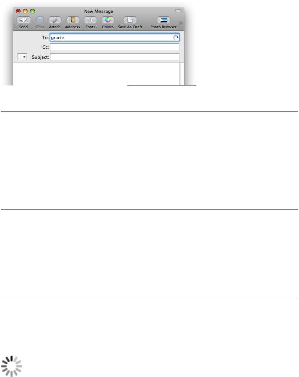
An asynchronousprogressindicatorshowsusersthatprocessingisoccurringbutdoesnotgiveanyindication of when the process will finish. For example, Mail briefly displays an asynchronous progress indicator in the To: field of a New Message window while it performs a search on the name the user types, as shown in Figure 15-59.
Indicators |
305 |
2008-06-09 | © 1992, 2001-2003, 2008 Apple Inc. All Rights Reserved.
![](/html/2706/180/html_UUKAsPLy1g.Wf7w/htmlconvd-2rDWZ2306x1.jpg)
C H A P T E R 1 5
Controls
Figure 15-59 An asynchronous progress indicator provides feedback on a process
An asynchronous progress indicator
Asynchronous Progress Indicator Usage
Use an asynchronous progress indicator when space is very constrained, such as in a text field or near a control. Because this indicator is small and unobtrusive, it is especially useful for asynchronous events that take place in the background, such as retrieving messages from a server.
Don’t use the asynchronous progress indicator in operations that start out indeterminate but could become determinate, because the determinate progress indicator is a different shape and takes up much more space. If the process might change from indeterminate to determinate, use an indeterminate progress bar instead of an asynchronous progress indicator, because it is the same shape and size as the determinate progress bar. (See “Indeterminate Progress Bars” (page 304) for more information about indeterminate progress bars.)
Asynchronous Progress Indicator Contents and Labeling
Because an asynchronous progress indicator typically appears when the user initiates a process, a label may not be necessary. If you decide to provide a label that appears with the indicator, create a complete or partial sentence that briefly describes the process that is occurring.
If you decide to provide a label that appears with an asynchronous progress indicator, be sure to use sentence-style capitalization (see “Capitalization of Interface Element Labels and Text” (page 131) for more information on this style). Also, you can end the label with an ellipsis (...) to emphasize the ongoing nature of the processing.
Asynchronous Progress Indicator Specifications
The appearance of the asynchronous progress indicator is provided automatically, but you can choose the size that fits best in your window layout. Asynchronous progress indicators are available in regular, small, and mini sizes. Figure 15-60 shows a regular-size asynchronous progress indicator.
Figure 15-60 A regular-size asynchronous progress indicator
306 Indicators
2008-06-09 | © 1992, 2001-2003, 2008 Apple Inc. All Rights Reserved.