

C H A P T E R 1 1
Icons
If you're not satisfied with the results when you scale art down to the 32 x 32 pixel and 16 x 16 pixel sizes, you can redraw the image at these sizes instead. If you decide to do this, setting up the proper grid can still help reduce extra work. For example, using a 32-pixel grid with a 1024 x 1024 pixel master file works well for creating the 32 x 32 pixel size, and a 64-pixel grid works well for creating the 16 x 16 pixel size.
Designing Toolbar Icons
The primary purpose of a set of toolbar icons is to provide users with easy access to frequently used commands (to learn more about the concepts behind toolbar design, see “Toolbars” (page 196)). To represent these commands in a toolbar, you need small, unambiguous icons or images that users can easily distinguish and remember. To accommodate different application styles and appearances, Mac OS X provides a few different styles of toolbar items. Depending on the overall look of your application, you can:
■Design icons that behave as buttons (see “Icon Buttons” (page 261) for more information on these controls).
■Design simplified icons to place in capsule-style toolbar controls (see “Capsule-Style Toolbar Controls” (page 254) for more information on these controls).
■Design small streamlined icons to place in rectangular-style toolbar controls (see “Rectangular-Style Toolbar Controls” (page 250) for more information on these controls).
■Use system-provided images in rectangular-style or capsule-style toolbar controls. Because you do not need to design these images, this section does not describe them. See “System-Provided Images” (page 151) for more information on the images available to you, and see “Window-Frame Controls” (page 249) for more information on the controls that can contain them.
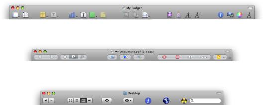
Figure 11-23 shows some examples of these types of toolbar items.
Figure 11-23 Three ways to represent toolbar items
|
Custom icons and standard toolbar icons |
|
Custom icons in capsule-style toolbar controls |
|
Standard images in rectangular-style toolbar controls and standard toolbar icons |
|
A toolbar can also contain icons that represent recognizable interface elements from elsewhere in the system |
|
(such as the Colors window icon or the iDisk icon) when they make sense in the context of the application. |
|
If you choose to include an icon such as the Colors window icon, be sure to preserve its meaning. Users |
|
expect such icons to mean the same thing in every context, so you should not repurpose them when you |
148 |
Designing Toolbar Icons |
2008-06-09 | © 1992, 2001-2003, 2008 Apple Inc. All Rights Reserved.

C H A P T E R 1 1
Icons
use them in a toolbar. For example, the Numbers toolbar (the top image in Figure 11-23) contains the Colors window and Fonts window icons, which are standard icons used throughout Mac OS X. In Numbers, clicking these toolbar icons displays the Colors window and the Fonts window, respectively, just as users expect.
Important:Do not use a system icon, such as the yellow caution icon, in your toolbar. A system icon provides important information to the user in a specific context, such as in an alert window; using it in a toolbar blurs its meaning and dilutes it effectiveness in the system.
Regardless of which style of toolbar icon you decide to design, be sure that each toolbar item represents a unique object or action that is directly related to the command it stands for. The best toolbar icons use familiar visual metaphors that are instantly recognizable to users. As a general rule, a toolbar icon that depicts an identifiable, real-world object or recognizable user-interface element gives first-time users a clue to its function and helps experienced users remember it. As much as possible, therefore, identify parts of the user’s mental model that lend themselves to visual representation (to learn more about this concept, see “Reflect the User’s Mental Model” (page 39)). For example, the iTunes toolbar (shown in Figure 11-24) displays rewind, play, and fast forward controls that use symbols similar to those users see in physical devices, such as iPod.
Figure 11-24 When possible, use familiar symbols and images to represent toolbar items
Making each toolbar icon distinct helps the user associate it with its purpose and locate it quickly. Variations in shape, color, and image all help to differentiate one toolbar icon from another. At the same time, however, an application's toolbar icons should harmonize together as much as possible in their perspective, use of color, size, and visual weight. This holds true whether the icon is free-standing or in a capsule-style toolbar control. As you can see in Figure 11-25, the icons inside the capsule-style toolbar controls in the Mail toolbar are easily distinguishable, yet consistent in size, color usage, and visual weight.
Figure 11-25 Images inside capsule-style toolbar controls should appear balanced and coordinated
How you design icons to represent actions and objects depends on whether you want to use free-standing icon buttons or icons in capsule-style or rectangular-style toolbar controls in your toolbar. The following sections provide some guidelines for each of these situations.
Designing Icons for Icon Buttons
Although toolbar icons should conserve screen real estate (32 x 32 pixels is the recommended size), they should be inviting and easy to identify. The perspective of a toolbar icon is straight-on, as if it is sitting on a shelfinfrontofyou(see “IconPerspectivesandMaterials” (page 141)foragraphicdepictionofthisperspective).
Designing Toolbar Icons |
149 |
2008-06-09 | © 1992, 2001-2003, 2008 Apple Inc. All Rights Reserved.
C H A P T E R 1 1
Icons
Although the perspective of icons designed specifically for use in a toolbar is straight-on, if you use a recognizable icon from elsewhere in the interface (such as the iDisk icon), that icon should retain its standard appearance and perspective. That is, don’t redesign a toolbar version of a well-known interface element. You may be able to use a system-provided image to represent a standard interface element; see “System-Provided Images” (page 151) for more information on which images are available and how to use them.
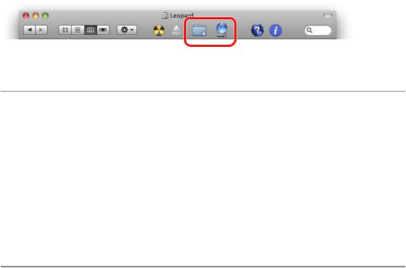
Figure 11-26 The circled icons appear elsewhere in the interface; they retain their perspective when used in a toolbar
Designing Icons for Capsule-Style Toolbar Controls
Icons that look good in capsule-style toolbar controls are simple, colorful images that don’t have lots of detail. As you design an icon for a capsule-style toolbar control, keep the following points in mind:
■Include only enough detail to unambiguously represent the object
■Use a straight-on perspective with minimal shadow
■Provide enough contrast so that the image stands out against the control background
■Consider using bright, clear colors
■Make sure the image is visually centered in the control (note that visually centered might not be the same as mathematically centered)
Designing Icons for Rectangular-Style Toolbar Controls
Icons that look good in rectangular-style toolbar controls are streamlined, black images that convey meaning through outline and contour, not internal detail. Because your icons should echo the appearance of the existing Mac OS X images inside rectangular-style toolbar controls, use the system-provided template images as a guide. As you design an icon for a rectangular-style toolbar control, keep the following points in mind:
■Make the outline sharp and clear
■Use a straight-on perspective
■Use full black and a few shades of gray to suggest dimensionality
■Use anti-aliasing
■Make sure the image is visually centered in the control (note that visually centered might not be the same as mathematically centered)
Icons for regular-size rectangular-style toolbar controls should measure no more than 19 x 19 pixels.
150 |
Designing Toolbar Icons |
2008-06-09 | © 1992, 2001-2003, 2008 Apple Inc. All Rights Reserved.