![](/user_photo/2706_HbeT2.jpg)
- •Contents
- •Figures and Tables
- •The Design Process
- •Involving Users in the Design Process
- •Know Your Audience
- •Analyze User Tasks
- •Build Prototypes
- •Observe Users
- •Guidelines for Conducting User Observations
- •Making Design Decisions
- •Avoid Feature Cascade
- •Apply the 80 Percent Solution
- •Characteristics of Great Software
- •High Performance
- •Ease of Use
- •Attractive Appearance
- •Reliability
- •Adaptability
- •Interoperability
- •Mobility
- •Human Interface Design
- •Human Interface Design Principles
- •Metaphors
- •Reflect the User’s Mental Model
- •Explicit and Implied Actions
- •Direct Manipulation
- •User Control
- •Feedback and Communication
- •Consistency
- •WYSIWYG (What You See Is What You Get)
- •Forgiveness
- •Perceived Stability
- •Aesthetic Integrity
- •Modelessness
- •Managing Complexity in Your Software
- •Keep Your Users in Mind
- •Worldwide Compatibility
- •Cultural Values
- •Language Differences
- •Text Display and Text Editing
- •Resources
- •Universal Accessibility
- •Visual Disabilities
- •Hearing Disabilities
- •Physical Disabilities
- •Extending the Interface
- •Build on the Existing Interface
- •Don’t Assign New Behaviors to Existing Objects
- •Create a New Interface Element Cautiously
- •Prioritizing Design Decisions
- •Meet Minimum Requirements
- •Deliver the Features Users Expect
- •Differentiate Your Application
- •The Mac OS X Environment
- •The Always-On Environment
- •Displays
- •The Dock
- •Conveying Information in the Dock
- •Clicking in the Dock
- •The Finder
- •File Formats and Filename Extensions
- •Internationalization
- •Multiple User Issues
- •Resource Management
- •Threads
- •Using Mac OS X Technologies
- •Address Book
- •Animation
- •Automator
- •Bonjour
- •Colors
- •Dashboard
- •High-Level Design Guidelines for Widgets
- •User-Interface Design Guidelines for Widgets
- •Fonts
- •Preferences
- •Printing
- •Security
- •Speech
- •Spotlight
- •User Assistance
- •Apple Help
- •Help Tags
- •Software Installation and Software Updates
- •Packaging
- •Identify System Requirements
- •Bundle Your Software
- •Installation
- •Use Internet-Enabled Disk Images
- •Drag-and-Drop Installation
- •Installation Packages
- •General Installer Guidelines
- •Setup Assistants
- •Updating Installed Applications
- •User Input
- •The Mouse and Other Pointing Devices
- •Clicking
- •Double-Clicking
- •Pressing and Holding
- •Dragging
- •The Keyboard
- •The Functions of Specific Keys
- •Character Keys
- •Modifier Keys
- •Arrow Keys
- •Function Keys
- •Keyboard Shortcuts
- •Reserved Keyboard Shortcuts
- •Creating Your Own Keyboard Shortcuts
- •User-Defined Keyboard Shortcuts
- •Keyboard Focus and Navigation
- •Type-Ahead and Key-Repeat
- •Selecting
- •Selection Methods
- •Selection by Clicking
- •Selection by Dragging
- •Changing a Selection
- •Selections in Text
- •Selecting With the Mouse
- •What Constitutes a Word
- •Selecting Text With the Arrow Keys
- •Selections in Spreadsheets
- •Selections in Graphics
- •Editing Text
- •Inserting Text
- •Deleting Text
- •Replacing a Selection
- •Intelligent Cut and Paste
- •Editing Text Fields
- •Entering Passwords
- •Drag and Drop
- •Drag-and-Drop Overview
- •Drag-and-Drop Semantics
- •Move Versus Copy
- •When to Check the Option Key State
- •Selection Feedback
- •Single-Gesture Selection and Dragging
- •Background Selections
- •Drag Feedback
- •Destination Feedback
- •Windows
- •Text
- •Lists
- •Multiple Dragged Items
- •Automatic Scrolling
- •Using the Trash as a Destination
- •Drop Feedback
- •Finder Icons
- •Graphics
- •Text
- •Transferring a Selection
- •Feedback for an Invalid Drop
- •Clippings
- •Text
- •Fonts
- •Style
- •Inserting Spaces Between Sentences
- •Using the Ellipsis Character
- •Using the Colon Character
- •Labels for Interface Elements
- •Capitalization of Interface Element Labels and Text
- •Using Contractions in the Interface
- •Using Abbreviations and Acronyms in the Interface
- •Developer Terms and User Terms
- •Icons
- •Icon Genres and Families
- •Application Icons
- •User Application Icons
- •Viewer, Player, and Accessory Icons
- •Utility Icons
- •Document Icons
- •Toolbar Icons
- •Icons for Plug-ins, Hardware, and Removable Media
- •Icon Perspectives and Materials
- •Creating Icons
- •Tips for Designing Icons
- •A Suggested Process for Creating Icons
- •Creating Icons for Mac OS X v10.5 and Later
- •Scaling Your Artwork
- •Designing Toolbar Icons
- •Designing Icons for Icon Buttons
- •Designing Icons for Capsule-Style Toolbar Controls
- •Designing Icons for Rectangular-Style Toolbar Controls
- •System-Provided Images
- •System-Provided Images for Use in Controls
- •System-Provided Images for Use as Standalone Buttons
- •System-Provided Images for Use as Toolbar Items
- •System-Provided Images that Indicate Privileges
- •A System-Provided Drag Image
- •Cursors
- •Standard Cursors
- •Designing Your Own Cursors
- •Menus
- •Menu Behavior
- •Designing the Elements of Menus
- •Titling Menus
- •Naming Menu Items
- •Using Icons in Menus
- •Using Symbols in Menus
- •Toggled Menu Items
- •Grouping Items in Menus
- •Hierarchical Menus (Submenus)
- •The Menu Bar and Its Menus
- •The Apple Menu
- •The Application Menu
- •The Application Menu Title
- •The Application Menu Contents
- •The File Menu
- •The Edit Menu
- •The Format Menu
- •The View Menu
- •Application-Specific Menus
- •The Window Menu
- •The Help Menu
- •Menu Bar Extras
- •Contextual Menus
- •Dock Menus
- •Windows
- •Types of Windows
- •Window Appearance
- •Window Elements
- •The Title Bar
- •The Window Title
- •Title Bar Buttons
- •Indicating Changes with the Close Button
- •The Proxy Icon
- •Toolbars
- •Toolbar Appearance and Behavior
- •Designing a Toolbar
- •Scope Bars
- •Scope Bar Appearance and Behavior
- •Designing a Scope Bar
- •Source Lists
- •Source List Behavior and Appearance
- •Designing a Source List
- •Bottom Bars
- •Bottom Bar Appearance and Behavior
- •Designing a Bottom Bar
- •Drawers
- •When to Use Drawers
- •Drawer Behavior
- •Window Behavior
- •Opening Windows
- •Naming New Windows
- •Positioning Windows
- •Moving Windows
- •Resizing and Zooming Windows
- •Minimizing and Expanding Windows
- •Closing Windows
- •Window Layering
- •Main, Key, and Inactive Windows
- •Click-Through
- •Scrolling Windows
- •Automatic Scrolling
- •Panels
- •Inspector Windows
- •Transparent Panels
- •When to Use Transparent Panels
- •Designing a Transparent Panel
- •Fonts Window and Colors Window
- •About Windows
- •Dialogs
- •Types of Dialogs and When to Use Them
- •Sheets (Document-Modal Dialogs)
- •Alerts
- •Dialog Appearance and Behavior
- •Accepting Changes
- •Dismissing Dialogs
- •Providing an Apply Button in a Dialog
- •Expanding Dialogs
- •Find Windows
- •Preferences Windows
- •The Open Dialog
- •Dialogs for Saving, Closing, and Quitting
- •Save Dialogs
- •Closing a Document With Unsaved Changes
- •Attempting to Save a Locked or Read-Only Document
- •Saving Documents During a Quit Operation
- •The Choose Dialog
- •The Print Dialog
- •Print Dialog
- •Page Setup Dialog
- •Controls
- •Window-Frame Controls
- •Rectangular-Style Toolbar Controls
- •Rectangular-Style Toolbar Control Usage
- •Rectangular-Style Toolbar Control Contents and Labeling
- •Rectangular-Style Toolbar Control Specifications
- •Rectangular-Style Toolbar Control Implementation
- •Capsule-Style Toolbar Controls
- •Capsule-Style Toolbar Control Usage
- •Capsule-Style Toolbar Control Contents and Labeling
- •Capsule-Style Toolbar Control Specifications
- •Capsule-Style Toolbar Control Implementation
- •Legacy Toolbar Controls
- •Buttons
- •Push Buttons
- •Push Button Usage
- •Push Button Contents and Labeling
- •Push Button Specifications
- •Push Button Implementation
- •Icon Buttons
- •Icon Button Usage
- •Icon Button Contents and Labeling
- •Icon Button Specifications
- •Icon Button Implementation
- •Scope Buttons
- •Scope Button Usage
- •Scope Button Contents and Labeling
- •Scope Button Specifications
- •Scope Button Implementation
- •Gradient Buttons
- •Gradient Button Usage
- •Gradient Button Contents and Labeling
- •Gradient Button Specifications
- •Gradient Button Implementation
- •The Help Button
- •Bevel Buttons
- •Bevel Button Usage
- •Bevel Button Contents and Labeling
- •Bevel Button Specifications
- •Bevel Button Implementation
- •Round Buttons
- •Round Button Usage
- •Round Button Contents and Labeling
- •Round Button Specifications
- •Round Button Implementation
- •Selection Controls
- •Radio Buttons
- •Radio Button Usage
- •Radio Button Contents and Labeling
- •Radio Button Specifications
- •Radio Button Implementation
- •Checkboxes
- •Checkbox Usage
- •Checkbox Contents and Labeling
- •Checkbox Specifications
- •Checkbox Implementation
- •Segmented Controls
- •Segmented Control Usage
- •Segmented Control Contents and Labeling
- •Segmented Control Specifications
- •Segmented Control Implementation
- •Icon Buttons and Bevel Buttons with Pop-Up Menus
- •Pop-Up Menus
- •Pop-Up Menu Usage
- •Pop-Up Menu Contents and Labeling
- •Pop-Up Menu Specifications
- •Pop-Up Menu Implementation
- •Action Menus
- •Action Menu Usage
- •Action Menu Contents and Labeling
- •Action Menu Specifications
- •Action Menu Implementation
- •Combination Boxes
- •Combo Box Usage
- •Combo Box Contents and Labeling
- •Combo Box Specifications
- •Combo Box Implementation
- •Path Controls
- •Path Control Usage
- •Path Control Contents and Labeling
- •Path Control Specifications
- •Path Control Implementation
- •Color Wells
- •Image Wells
- •Date Pickers
- •Date Picker Usage
- •Date Picker Implementation
- •Command Pop-Down Menus
- •Command Pop-Down Menu Usage
- •Command Pop-Down Menu Contents and Labeling
- •Command Pop-Down Menu Specifications
- •Command Pop-Down Implementation
- •Sliders
- •Slider Usage
- •Slider Contents and Labeling
- •Slider Control Specifications
- •Slider Control Implementation
- •The Stepper Control (Little Arrows)
- •Stepper Control Specifications
- •Placards
- •Indicators
- •Progress Indicators
- •Determinate Progress Bars
- •Indeterminate Progress Bars
- •Asynchronous Progress Indicators
- •Level Indicators
- •Capacity Indicators
- •Rating Indicators
- •Relevance Indicators
- •Text Controls
- •Static Text Fields
- •Text Input Fields
- •Text Input Field Usage
- •Text Input Field Contents and Labeling
- •Text Input Field Specifications
- •Text Input Field Implementation
- •Token Fields
- •Token Field Usage
- •Token Field Specifications
- •Token Field Implementation
- •Search Fields
- •Search Field Usage
- •Search Field Contents and Labeling
- •Search Field Specifications
- •Search Field Implementation
- •Scrolling Lists
- •Scrolling List Usage
- •Scrolling List Contents and Labeling
- •Scrolling List Specifications
- •Scrolling List Implementation
- •View Controls
- •Disclosure Triangles
- •Disclosure Triangle Usage
- •Disclosure Triangle Contents and Labeling
- •Disclosure Triangle Specifications
- •Disclosure Triangle Implementation
- •Disclosure Buttons
- •Disclosure Button Usage
- •Disclosure Button Contents and Labeling
- •Disclosure Button Specifications
- •Disclosure Button Implementation
- •List Views
- •List View Usage
- •List View Contents and Labeling
- •List View Implementation
- •Column Views
- •Column View Usage
- •Column View Contents and Labeling
- •Column View Implementation
- •Split Views
- •Split View Usage
- •Split View Specifications
- •Split View Implementation
- •Tab Views
- •Tab View Usage
- •Tab View Contents and Labeling
- •Tab View Specifications
- •Tab View Implementation
- •Grouping Controls
- •Separators
- •Separator Usage
- •Separator Labeling
- •Separator Specifications
- •Separator Implementation
- •Group Boxes
- •Group Box Usage
- •Group Box Contents and Labeling
- •Group Box Specifications
- •Group Box Implementation
- •Layout Guidelines
- •Positioning Regular-Size Controls in a Window Body
- •A Simple Preferences Window
- •A Tabbed Window
- •A Standard Alert
- •Positioning Small and Mini Controls in a Window Body
- •Layout Example for Small Controls
- •Layout Example for Mini Controls
- •Grouping Controls in a Window Body
- •Grouping with White Space
- •Grouping with Separators
- •Grouping with Group Boxes
- •Positioning Text and Controls in a Bottom Bar
- •Glossary
- •Index
![](/html/2706/180/html_UUKAsPLy1g.Wf7w/htmlconvd-2rDWZ2203x1.jpg)
C H A P T E R 1 4
Windows
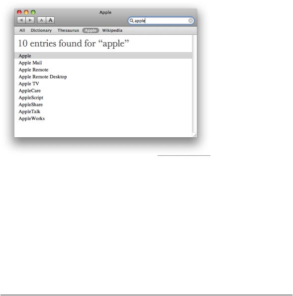
Figure 14-21 A scope bar can act as a filter
As you choose the locations and categories that should appear in a scope bar, revisit the user’s mental model of the tasks your application performs. (See “Reflect the User’s Mental Model” (page 39) for more information on discovering this cognitive model.) Determine the objects the user works with, and identify the attributes of those objects. For example, an application that allows users to create, use, and store recipes might display a scope bar when the user begins a search, providing buttons that correspond to different recipe collections.
If appropriate, allow users to define subsets of the locations and categories you offer by providing filter rows that display additional rules and filtering criteria. For example, the recipe application described above could display filter rows that allow users to filter their results by ingredient, cuisine, seasonal availability, complexity, date last used, diet type, and other criteria. You should also allow users to save their searches. As shown in Figure 14-20 (page 202), the Finder offers many types of additional filtering functionality and the ability to save searches.
Source Lists
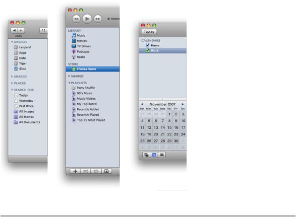
A source list (also called a sidebar) is an area of a window, usually set off by a movable splitter, that provides users with a way to navigate or select objects in the application (for more information on splitters, see “Split Views” (page 327)). Typically, users select an object in the source list that they act on in the main part of the window. You can provide a source list as the primary means of navigating or viewing within your application, as the Finder and iTunes do, or as a way to select a view in a part of the application, as some panes in System Preferences do.
Figure 14-22 shows some examples of source lists that function as primary navigation and selection mechanisms.
Window Elements |
203 |
2008-06-09 | © 1992, 2001-2003, 2008 Apple Inc. All Rights Reserved.
![](/html/2706/180/html_UUKAsPLy1g.Wf7w/htmlconvd-2rDWZ2204x1.jpg)
C H A P T E R 1 4
Windows
Figure 14-22 Source lists help users navigate and select collections of objects or data
Source List Behavior and Appearance
In Mac OS X v10.5 and later, source lists look different depending on their usage. A source list that provides the primary navigation or selection mechanism for the application as a whole displays a blue background. This type of source list should be the only source list in the application window and should always be visible (unless the user chooses to hide it). The Finder sidebar (shown on the left in Figure 14-22 (page 204)) is an example of this type of source list: It provides primary navigation and selection functionality for the application, it's separated from the rest of the window by a movable splitter, and it’s always visible (unless the user chooses to hide it and the toolbar).
The other style of source list is often used in preferences windows. This type of source list provides selection functionality for the window, but not the application as a whole. A source list of this type displays a white background and might not be separated from the rest of the window by a movable splitter. The Network System Preferences pane contains this type of source list, as shown in Figure 14-23.
204 |
Window Elements |
2008-06-09 | © 1992, 2001-2003, 2008 Apple Inc. All Rights Reserved.
![](/html/2706/180/html_UUKAsPLy1g.Wf7w/htmlconvd-2rDWZ2205x1.jpg)
C H A P T E R 1 4
Windows
Figure 14-23 A source list may support selection in a window, not in the application as a whole
Source lists don’t generally have headers like lists can, but they can display titles to distinguish subsets of objects or data. For example, the Finder displays several useful subsets of locations in its sidebar, such as Devices, Shared, and Places, as shown on the left in Figure 14-22 (page 204).
Designing a Source List
Source lists provide a very effective file-system abstraction. This means that a source list can shield users from the details of file and document management, allowing them to work with user-customizable, application-specific containers that hold related items. These high-level container objects can hide the actual file-system locations of their files and data and conceal the associations between them. This can relieve users of the burden of locating and opening the auxiliary or related files they need to do their work.
Source lists are especially useful in single-window applications that are not necessarily document-based, but that allow users to create and manage content. For example, iTunes allows users to ignore the file-system locations of their songs, podcasts, and movies, and instead work with libraries and playlists. Similarly, iWeb focuses on website creation, not file management.
You should consider including a source list in your application when:
■Navigation and selection of content are primary tasks.
■Collections of objects are key to the user’s mental model (see “Reflect the User’s Mental Model” (page 39) to learn more about the mental model).
■The hierarchical arrangement of objects presents a natural way to navigate.
■Arranging objects hierarchically removes complexity.
Window Elements |
205 |
2008-06-09 | © 1992, 2001-2003, 2008 Apple Inc. All Rights Reserved.
![](/html/2706/180/html_UUKAsPLy1g.Wf7w/htmlconvd-2rDWZ2206x1.jpg)
C H A P T E R 1 4
Windows
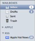
Because the source list is a navigation and selection tool, it should not contain controls other than controls used to organize the data itself. For example, you can use a disclosure triangle to reveal an additional level of hierarchy (disclosure triangles are described in “Disclosure Triangles” (page 320)). Figure 14-24 shows how Mail uses disclosure triangles to display two levels of hierarchically organized information.
Figure 14-24 A source list can contain disclosure triangles
A source list should not contain more than two levels of hierarchy. If the data you need to display is organized in more than two levels of hierarchy, you can use a second source list, but you should not use additional disclosure triangles to expose additional levels of hierarchy in a single source list. If, however, your application is centered on the navigation of deeply nested objects, you should consider using a browser view instead of multiple source lists.
As mentioned in “Source List Appearance and Behavior” (page 204), if your application contains a single source list that provides primary navigation and selection functionality, you can use the blue background. In all other cases, however, you should use the white background. Specifically, use the white background when:
■Your window contains more than one source list.
■You use a source list in a panel or preferences window.
You should allow users to customize the contents of a source list. This way, you allow users to decide what object containers are most important to them. You should also consider using Spotlight to support smart data containers. For more information on using Spotlight in your application, read Spotlight Overview.
If you need to allow users to add, remove, manipulate, or get information about items in the source list, you have two options:
■If your window has a bottom bar, you can place window-frame controls in the bottom bar directly below the source list. See “Controls for Toolbars and Bottom Bars” (page 250) for more information about the controls you can use in a bottom bar; see “Bottom Bars” (page 207) for more information on designing bottom bars.
■If your window does not have a bottom bar, you can use gradient buttons at the bottom edge of the source list. Gradient buttons blend well with the background of the source list and look good with the bottom edge of the window-body area. See “Gradient Buttons” (page 265) for details about using gradient buttons.
206 |
Window Elements |
2008-06-09 | © 1992, 2001-2003, 2008 Apple Inc. All Rights Reserved.