


C H A P T E R 1 0
Text
All user-visible text in your application should be anti-aliased, which is automatic if you use one of the standard system fonts.
Table 10-1 shows the constants to use in Carbon functions and the NSFont methods to use in Cocoa.
Table 10-1 Carbon constants and Cocoa methods for system fonts
Font |
Carbon constants |
Cocoa methods |
System font |
kThemeSystemFont |
[NSFont systemFontOfSize:[NSFont |
|
|
systemFontSizeForControlSize: |
|
|
NSRegularControlSize]] |
Emphasized system |
kThemeEmphasized- |
[NSFont boldSystemFontOfSize:[NSFont |
font |
SystemFont |
systemFontSizeForControlSize: |
|
|
NSRegularControlSize]] |
Small system font |
kThemeSmallSystemFont |
[NSFont systemFontOfSize:[NSFont |
|
|
systemFontSizeForControlSize: |
|
|
NSSmallControlSize]] |
Emphasized small |
kThemeSmall- |
[NSFont boldSystemFontOfSize:[NSFont |
system font |
EmphazisedSystemFont |
systemFontSizeForControlSize: |
|
|
NSSmallControlSize]] |
Mini system font |
kThemeMiniSystemFont |
[NSFont systemFontOfSize:[NSFont |
|
|
systemFontSizeForControlSize: |
|
|
NSMiniControlSize]] |
Emphasized mini |
Not Available |
[NSFont boldSystemFontOfSize:[NSFont |
system font |
|
systemFontSizeForControlSize: |
|
|
NSMiniControlSize]] |
Application font |
kThemeApplicationFont |
[NSFont userFontOfSize:0.0] |
Label font |
kThemeLabelFont |
[NSFont labelFontOfSize:[NSFont |
|
|
labelFontSize]] |
Style
The Apple Publications Style Guide covers style and usage issues, and is the key reference for how Apple uses language. This document is available in the Guides > User Experience; consult it whenever you have a question about the preferred style of particular terms.
For issues that aren’t covered in the Apple Publications Style Guide, Apple recommends three other works:
The American Heritage Dictionary,The Chicago Manual of Style, and Words Into Type. When these books give conflicting rules, The Chicago Manual of Style takes precedence for questions of usage and The American Heritage Dictionary for questions of spelling.
The rest of this section discusses specific details of how to present your text in a style that integrates properly with the Aqua user interface.
126 Style
2008-06-09 | © 1992, 2001-2003, 2008 Apple Inc. All Rights Reserved.

C H A P T E R 1 0
Text
Inserting Spaces Between Sentences
If any part of your application's user interface displays two or more sentences in a paragraph, be sure to insert only a single space between the ending punctuation of one sentence and the first word of the next sentence.
Although much of the text in an application's user interface is in the form of labels and short phrases, application help, alerts, and dialogs often contain longer blocks of text. You should examine these blocks of text to make sure that extra spaces do not appear between sentences.
Using the Ellipsis Character
When it appears in the name of a button or a menu item, an ellipsis character (…) indicates to the user that additional information is required before the associated operation can be performed. Specifically, it prepares the user to expect the appearance of a window or dialog in which to make selections or enter information beforethecommandexecutes. Becauseusersexpectinstantactionfrombuttonsandmenuitems(asdescribed in “Buttons” (page 258) and “Menu Behavior” (page 161)), it's especially important to prepare them for this alternate behavior by appropriately displaying the ellipsis character. The following guidelines and examples will help you decide when to use an ellipsis in menu item and button names.
Use an ellipsis in the name of a button or menu item when the associated action:
■Requires specific input from the user.
For example, the Open, Find, and Print commands all use an ellipsis because the user must select or input the item to open, find, or print. The Save As command uses an ellipsis because it allows the user to give the file or document a new name, location, or both.
You can think of commands of this type as needing the answer to a specific question (such as "Find what?") before executing.
■Is performed by the user in a separate window or dialog.
For example, Preferences, Customize Toolbar, and Send Feedback all use an ellipsis because they open a window (potentially in another application, such as a browser) or a dialog in which the user sets preferences, customizes the toolbar, or sends feedback.
To see why such commands must include an ellipsis, consider that the absence of an ellipsis implies that the application performs the action for the user. If, for example, the Send Feedback command did not include an ellipsis, it would imply that feedback is generated and sent automatically by the application.
■Always displays an alert that warns the user of a potentially dangerous outcome and offers an alternative.
For example, Restart, Shut Down, and Log Out all use an ellipsis because they always display an alert that asks the user for confirmation and allows the user to cancel the action. Note that Close does not have an ellipsis because it displays an alert only in certain circumstances (specifically, only when the document or file being closed has unsaved changes).
Before you consider providing a command that always displays an alert, determine if it's really necessary to get the user's approval every time. Displaying too many alerts asking for user confirmation can dilute the effectiveness of alerts.
Don't use an ellipsis in the name of a button or menu item when the associated action:
■Does not require specific input from the user.
Style |
127 |
2008-06-09 | © 1992, 2001-2003, 2008 Apple Inc. All Rights Reserved.
C H A P T E R 1 0
Text
For example, the New, Save, and Copy commands do not use an ellipsis because either the user has already provided the necessary information or no user input is required. That is, New always opens a new document or window, Save automatically saves the currently active document, and Copy copies the user's most recently selected text or item to the Clipboard.
■Is completed by the opening of a panel.
A user opens a panel to view information about an item or to keep essential, task-oriented controls available at all times (for more information about panels, see “Panels” (page 222)). A command to open a panel, therefore, is completed by the display of the window and should not have an ellipsis in its name. Examples of such commands are Get Info, About This Application, and Show Inspector.
■Occasionally displays an alert that warns the user of a potentially dangerous outcome.
If you use an ellipsis in the name of a button or menu item that only sometimes displays an alert, you cause the user to expect something that will not always happen. This makes your application's user interface inconsistent and confusing. Therefore, even though Quit and Close display an alert if the execution of the action might result in the loss of data (such as when there are unsaved changes in a document), they do not display an alert when no data loss is possible. For this reason, commands such as Quit and Close should not include an ellipsis.
An ellipsis character can also show that there is more text than there is room to display in a document title or list item. If, for example, the name of an item is too long to fit in a menu or list box, you should insert an ellipsis character in the middle of the name, preserving the beginning and the end of the name. This ensures that the parts of the name that are most likely to be unique are still visible.
Important: Be sure to create the ellipsis character using the key combination Option-; (Option-semicolon). This ensures that an assistive application can provide the correct interpretation of the character to a disabled user. If you use 3 period characters to simulate an ellipsis, many assistive applications will be unable to make sense of them. Also, 3 period characters and an ellipsis do not look the same because the periods are spaced differently than the points of an ellipsis.
Using the Colon Character
Use the colon character (:) in text that introduces and provides context for controls. The text can describe what the controls do or a task the user can perform with them. The combination of introductory text, colon, and controls forms a visually distinct grouping that helps users find the controls that apply to a particular task and understand what the controls do.
Because a colon implies a direct connection between the descriptive text and a particular control or set of controls, it does not belong in the text that appears in a control, such as a push button name or a command pop-down menu title. Similarly, you should not use a colon in the text that appears in the following user interface elements:
■Menu items (unless the colon is part of a user-created menu item) and menu titles
■Tab and segmented controls
■List view column headings
128 Style
2008-06-09 | © 1992, 2001-2003, 2008 Apple Inc. All Rights Reserved.
C H A P T E R 1 0
Text
Note:The colon is not used as a pathname separator in Mac OS X. If it is necessary to display a raw pathname, use the forward slash character (/). Always be sure to avoid displaying a pathname in a window title.
Although the colon is a good way to associate introductory text with related controls, be aware that you can depict this connection in other ways. For example, you might choose to place related controls in a group box and display the introductory text as the title of the group box (see “Group Boxes” (page 334) for group box guidelines). Or, you might use separators to divide a window into sections of related controls and display a section title aligned with each separator (see “Separators” (page 332) for separator guidelines). You might also use tab or segmented controls to display different groups of related controls (see “Tab Views” (page 329) and “Segmented Controls” (page 277) for guidelines on how to use these controls). To see how the appearance of a window changes when some of these different grouping methods are used, see “Grouping Controls in a Window” (page 349)
If you choose to use a group box or separator to group controls, do not use a colon in the text that serves as a group box title or the text that appears on the same line as a separator. In these cases, other graphical elements (that is, the group box and the separator) take the place of the colon and make explicit the relationship of the introductory text to the controls that follow it.
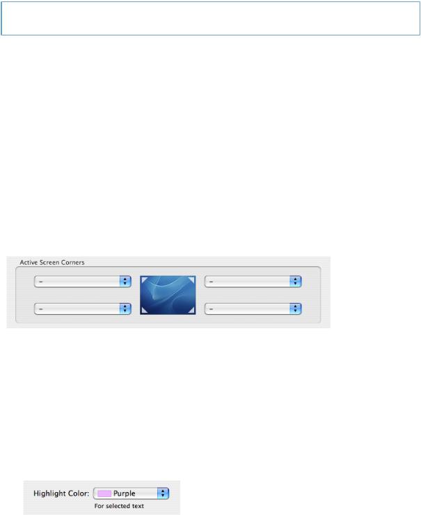
For example, Figure 10-1 shows the correct absence of a colon in text used as a group box title.
Figure 10-1 Don't use a colon in the title of a group box
If you choose to use a colon to show the relationship between introductory text and controls, the following guidelines and examples will help you use it appropriately.
Use a colon in introductory text that precedes a control or set of related controls. The text can be a noun or phrase that describes either the target of the control or the task the user can perform. The following examples illustrate some variations on this arrangement of text and controls:
■Figure 10-2 shows the correct usage of a colon in introductory text that describes the feature a control affects and appears on the same line with it.
Figure 10-2 Use a colon in text that precedes a control on the same line
■The introductory text shown in Figure 10-3 describes a task to which more than one control applies. The proximity of the two checkboxes and the colon in the descriptive text imply to the user that both controls can be used to affect the task.
Style |
129 |
2008-06-09 | © 1992, 2001-2003, 2008 Apple Inc. All Rights Reserved.

C H A P T E R 1 0
Text
Figure 10-3 Use a colon in text that precedes the first control in a vertical list of controls
The grouping of text and controls in Figure 10-4 shows another way to use a colon in text that introduces multiple controls.
Figure 10-4 Use a colon in text that precedes the first control in a horizontal list of controls
■Introductory text that appears above the control it describes should include a colon, as shown in Figure 10-5
Figure 10-5 Use a colon in introductory text that appears above a control
■If the text describes a radio button or checkbox state and also introduces a second control, it should include a colon before the second control, as shown in Figure 10-6 (Note that if the text describing a checkbox or radio button state does not introduce a second control, it should not include a colon.)
Figure 10-6 Use a colon in checkbox or radio button text that introduces a second control
Note: If you use the type of layout shown in Figure 10-6 be sure to disable the second control when the preceding checkbox or radio button is unselected.
130 Style
2008-06-09 | © 1992, 2001-2003, 2008 Apple Inc. All Rights Reserved.