![](/user_photo/2706_HbeT2.jpg)
- •Contents
- •Figures and Tables
- •The Design Process
- •Involving Users in the Design Process
- •Know Your Audience
- •Analyze User Tasks
- •Build Prototypes
- •Observe Users
- •Guidelines for Conducting User Observations
- •Making Design Decisions
- •Avoid Feature Cascade
- •Apply the 80 Percent Solution
- •Characteristics of Great Software
- •High Performance
- •Ease of Use
- •Attractive Appearance
- •Reliability
- •Adaptability
- •Interoperability
- •Mobility
- •Human Interface Design
- •Human Interface Design Principles
- •Metaphors
- •Reflect the User’s Mental Model
- •Explicit and Implied Actions
- •Direct Manipulation
- •User Control
- •Feedback and Communication
- •Consistency
- •WYSIWYG (What You See Is What You Get)
- •Forgiveness
- •Perceived Stability
- •Aesthetic Integrity
- •Modelessness
- •Managing Complexity in Your Software
- •Keep Your Users in Mind
- •Worldwide Compatibility
- •Cultural Values
- •Language Differences
- •Text Display and Text Editing
- •Resources
- •Universal Accessibility
- •Visual Disabilities
- •Hearing Disabilities
- •Physical Disabilities
- •Extending the Interface
- •Build on the Existing Interface
- •Don’t Assign New Behaviors to Existing Objects
- •Create a New Interface Element Cautiously
- •Prioritizing Design Decisions
- •Meet Minimum Requirements
- •Deliver the Features Users Expect
- •Differentiate Your Application
- •The Mac OS X Environment
- •The Always-On Environment
- •Displays
- •The Dock
- •Conveying Information in the Dock
- •Clicking in the Dock
- •The Finder
- •File Formats and Filename Extensions
- •Internationalization
- •Multiple User Issues
- •Resource Management
- •Threads
- •Using Mac OS X Technologies
- •Address Book
- •Animation
- •Automator
- •Bonjour
- •Colors
- •Dashboard
- •High-Level Design Guidelines for Widgets
- •User-Interface Design Guidelines for Widgets
- •Fonts
- •Preferences
- •Printing
- •Security
- •Speech
- •Spotlight
- •User Assistance
- •Apple Help
- •Help Tags
- •Software Installation and Software Updates
- •Packaging
- •Identify System Requirements
- •Bundle Your Software
- •Installation
- •Use Internet-Enabled Disk Images
- •Drag-and-Drop Installation
- •Installation Packages
- •General Installer Guidelines
- •Setup Assistants
- •Updating Installed Applications
- •User Input
- •The Mouse and Other Pointing Devices
- •Clicking
- •Double-Clicking
- •Pressing and Holding
- •Dragging
- •The Keyboard
- •The Functions of Specific Keys
- •Character Keys
- •Modifier Keys
- •Arrow Keys
- •Function Keys
- •Keyboard Shortcuts
- •Reserved Keyboard Shortcuts
- •Creating Your Own Keyboard Shortcuts
- •User-Defined Keyboard Shortcuts
- •Keyboard Focus and Navigation
- •Type-Ahead and Key-Repeat
- •Selecting
- •Selection Methods
- •Selection by Clicking
- •Selection by Dragging
- •Changing a Selection
- •Selections in Text
- •Selecting With the Mouse
- •What Constitutes a Word
- •Selecting Text With the Arrow Keys
- •Selections in Spreadsheets
- •Selections in Graphics
- •Editing Text
- •Inserting Text
- •Deleting Text
- •Replacing a Selection
- •Intelligent Cut and Paste
- •Editing Text Fields
- •Entering Passwords
- •Drag and Drop
- •Drag-and-Drop Overview
- •Drag-and-Drop Semantics
- •Move Versus Copy
- •When to Check the Option Key State
- •Selection Feedback
- •Single-Gesture Selection and Dragging
- •Background Selections
- •Drag Feedback
- •Destination Feedback
- •Windows
- •Text
- •Lists
- •Multiple Dragged Items
- •Automatic Scrolling
- •Using the Trash as a Destination
- •Drop Feedback
- •Finder Icons
- •Graphics
- •Text
- •Transferring a Selection
- •Feedback for an Invalid Drop
- •Clippings
- •Text
- •Fonts
- •Style
- •Inserting Spaces Between Sentences
- •Using the Ellipsis Character
- •Using the Colon Character
- •Labels for Interface Elements
- •Capitalization of Interface Element Labels and Text
- •Using Contractions in the Interface
- •Using Abbreviations and Acronyms in the Interface
- •Developer Terms and User Terms
- •Icons
- •Icon Genres and Families
- •Application Icons
- •User Application Icons
- •Viewer, Player, and Accessory Icons
- •Utility Icons
- •Document Icons
- •Toolbar Icons
- •Icons for Plug-ins, Hardware, and Removable Media
- •Icon Perspectives and Materials
- •Creating Icons
- •Tips for Designing Icons
- •A Suggested Process for Creating Icons
- •Creating Icons for Mac OS X v10.5 and Later
- •Scaling Your Artwork
- •Designing Toolbar Icons
- •Designing Icons for Icon Buttons
- •Designing Icons for Capsule-Style Toolbar Controls
- •Designing Icons for Rectangular-Style Toolbar Controls
- •System-Provided Images
- •System-Provided Images for Use in Controls
- •System-Provided Images for Use as Standalone Buttons
- •System-Provided Images for Use as Toolbar Items
- •System-Provided Images that Indicate Privileges
- •A System-Provided Drag Image
- •Cursors
- •Standard Cursors
- •Designing Your Own Cursors
- •Menus
- •Menu Behavior
- •Designing the Elements of Menus
- •Titling Menus
- •Naming Menu Items
- •Using Icons in Menus
- •Using Symbols in Menus
- •Toggled Menu Items
- •Grouping Items in Menus
- •Hierarchical Menus (Submenus)
- •The Menu Bar and Its Menus
- •The Apple Menu
- •The Application Menu
- •The Application Menu Title
- •The Application Menu Contents
- •The File Menu
- •The Edit Menu
- •The Format Menu
- •The View Menu
- •Application-Specific Menus
- •The Window Menu
- •The Help Menu
- •Menu Bar Extras
- •Contextual Menus
- •Dock Menus
- •Windows
- •Types of Windows
- •Window Appearance
- •Window Elements
- •The Title Bar
- •The Window Title
- •Title Bar Buttons
- •Indicating Changes with the Close Button
- •The Proxy Icon
- •Toolbars
- •Toolbar Appearance and Behavior
- •Designing a Toolbar
- •Scope Bars
- •Scope Bar Appearance and Behavior
- •Designing a Scope Bar
- •Source Lists
- •Source List Behavior and Appearance
- •Designing a Source List
- •Bottom Bars
- •Bottom Bar Appearance and Behavior
- •Designing a Bottom Bar
- •Drawers
- •When to Use Drawers
- •Drawer Behavior
- •Window Behavior
- •Opening Windows
- •Naming New Windows
- •Positioning Windows
- •Moving Windows
- •Resizing and Zooming Windows
- •Minimizing and Expanding Windows
- •Closing Windows
- •Window Layering
- •Main, Key, and Inactive Windows
- •Click-Through
- •Scrolling Windows
- •Automatic Scrolling
- •Panels
- •Inspector Windows
- •Transparent Panels
- •When to Use Transparent Panels
- •Designing a Transparent Panel
- •Fonts Window and Colors Window
- •About Windows
- •Dialogs
- •Types of Dialogs and When to Use Them
- •Sheets (Document-Modal Dialogs)
- •Alerts
- •Dialog Appearance and Behavior
- •Accepting Changes
- •Dismissing Dialogs
- •Providing an Apply Button in a Dialog
- •Expanding Dialogs
- •Find Windows
- •Preferences Windows
- •The Open Dialog
- •Dialogs for Saving, Closing, and Quitting
- •Save Dialogs
- •Closing a Document With Unsaved Changes
- •Attempting to Save a Locked or Read-Only Document
- •Saving Documents During a Quit Operation
- •The Choose Dialog
- •The Print Dialog
- •Print Dialog
- •Page Setup Dialog
- •Controls
- •Window-Frame Controls
- •Rectangular-Style Toolbar Controls
- •Rectangular-Style Toolbar Control Usage
- •Rectangular-Style Toolbar Control Contents and Labeling
- •Rectangular-Style Toolbar Control Specifications
- •Rectangular-Style Toolbar Control Implementation
- •Capsule-Style Toolbar Controls
- •Capsule-Style Toolbar Control Usage
- •Capsule-Style Toolbar Control Contents and Labeling
- •Capsule-Style Toolbar Control Specifications
- •Capsule-Style Toolbar Control Implementation
- •Legacy Toolbar Controls
- •Buttons
- •Push Buttons
- •Push Button Usage
- •Push Button Contents and Labeling
- •Push Button Specifications
- •Push Button Implementation
- •Icon Buttons
- •Icon Button Usage
- •Icon Button Contents and Labeling
- •Icon Button Specifications
- •Icon Button Implementation
- •Scope Buttons
- •Scope Button Usage
- •Scope Button Contents and Labeling
- •Scope Button Specifications
- •Scope Button Implementation
- •Gradient Buttons
- •Gradient Button Usage
- •Gradient Button Contents and Labeling
- •Gradient Button Specifications
- •Gradient Button Implementation
- •The Help Button
- •Bevel Buttons
- •Bevel Button Usage
- •Bevel Button Contents and Labeling
- •Bevel Button Specifications
- •Bevel Button Implementation
- •Round Buttons
- •Round Button Usage
- •Round Button Contents and Labeling
- •Round Button Specifications
- •Round Button Implementation
- •Selection Controls
- •Radio Buttons
- •Radio Button Usage
- •Radio Button Contents and Labeling
- •Radio Button Specifications
- •Radio Button Implementation
- •Checkboxes
- •Checkbox Usage
- •Checkbox Contents and Labeling
- •Checkbox Specifications
- •Checkbox Implementation
- •Segmented Controls
- •Segmented Control Usage
- •Segmented Control Contents and Labeling
- •Segmented Control Specifications
- •Segmented Control Implementation
- •Icon Buttons and Bevel Buttons with Pop-Up Menus
- •Pop-Up Menus
- •Pop-Up Menu Usage
- •Pop-Up Menu Contents and Labeling
- •Pop-Up Menu Specifications
- •Pop-Up Menu Implementation
- •Action Menus
- •Action Menu Usage
- •Action Menu Contents and Labeling
- •Action Menu Specifications
- •Action Menu Implementation
- •Combination Boxes
- •Combo Box Usage
- •Combo Box Contents and Labeling
- •Combo Box Specifications
- •Combo Box Implementation
- •Path Controls
- •Path Control Usage
- •Path Control Contents and Labeling
- •Path Control Specifications
- •Path Control Implementation
- •Color Wells
- •Image Wells
- •Date Pickers
- •Date Picker Usage
- •Date Picker Implementation
- •Command Pop-Down Menus
- •Command Pop-Down Menu Usage
- •Command Pop-Down Menu Contents and Labeling
- •Command Pop-Down Menu Specifications
- •Command Pop-Down Implementation
- •Sliders
- •Slider Usage
- •Slider Contents and Labeling
- •Slider Control Specifications
- •Slider Control Implementation
- •The Stepper Control (Little Arrows)
- •Stepper Control Specifications
- •Placards
- •Indicators
- •Progress Indicators
- •Determinate Progress Bars
- •Indeterminate Progress Bars
- •Asynchronous Progress Indicators
- •Level Indicators
- •Capacity Indicators
- •Rating Indicators
- •Relevance Indicators
- •Text Controls
- •Static Text Fields
- •Text Input Fields
- •Text Input Field Usage
- •Text Input Field Contents and Labeling
- •Text Input Field Specifications
- •Text Input Field Implementation
- •Token Fields
- •Token Field Usage
- •Token Field Specifications
- •Token Field Implementation
- •Search Fields
- •Search Field Usage
- •Search Field Contents and Labeling
- •Search Field Specifications
- •Search Field Implementation
- •Scrolling Lists
- •Scrolling List Usage
- •Scrolling List Contents and Labeling
- •Scrolling List Specifications
- •Scrolling List Implementation
- •View Controls
- •Disclosure Triangles
- •Disclosure Triangle Usage
- •Disclosure Triangle Contents and Labeling
- •Disclosure Triangle Specifications
- •Disclosure Triangle Implementation
- •Disclosure Buttons
- •Disclosure Button Usage
- •Disclosure Button Contents and Labeling
- •Disclosure Button Specifications
- •Disclosure Button Implementation
- •List Views
- •List View Usage
- •List View Contents and Labeling
- •List View Implementation
- •Column Views
- •Column View Usage
- •Column View Contents and Labeling
- •Column View Implementation
- •Split Views
- •Split View Usage
- •Split View Specifications
- •Split View Implementation
- •Tab Views
- •Tab View Usage
- •Tab View Contents and Labeling
- •Tab View Specifications
- •Tab View Implementation
- •Grouping Controls
- •Separators
- •Separator Usage
- •Separator Labeling
- •Separator Specifications
- •Separator Implementation
- •Group Boxes
- •Group Box Usage
- •Group Box Contents and Labeling
- •Group Box Specifications
- •Group Box Implementation
- •Layout Guidelines
- •Positioning Regular-Size Controls in a Window Body
- •A Simple Preferences Window
- •A Tabbed Window
- •A Standard Alert
- •Positioning Small and Mini Controls in a Window Body
- •Layout Example for Small Controls
- •Layout Example for Mini Controls
- •Grouping Controls in a Window Body
- •Grouping with White Space
- •Grouping with Separators
- •Grouping with Group Boxes
- •Positioning Text and Controls in a Bottom Bar
- •Glossary
- •Index
![](/html/2706/180/html_UUKAsPLy1g.Wf7w/htmlconvd-2rDWZ2163x1.jpg)
C H A P T E R 1 3
Menus
If the user drags back up to the top, the menu scrolls back down in the same manner. The next time the menu is opened, it appears in its original state (with the indicator at the bottom).
Do not design your application to intentionally include scrolling menus; they should exist only when a user adds many items to a customizable menu or when the menu’s function causes it to have items added to it (for example, the Finder’s Window menu).
Designing the Elements of Menus
Menu elements include words (and sometimes icons) to designate menu titles and menu items, and symbols to designate keyboard shortcuts, hierarchical menus, separators, and the state of some menu items. These elements are illustrated in Figure 13-3.
Figure 13-3 Menu elements
Menu title
Menu item
Submenu
Separator
Hierarchical menu (submenu) indicator
Keyboard equivalent
Ellipsis character
Titling Menus
Menu (and submenu) titles should appropriately represent the items in the menu. For example, a Font menu could contain names of font families, such as Helvetica and Geneva, but it shouldn’t include editing commands, such as Cut and Paste. Avoid using icons for menu titles. Make menu titles as short as possible without their losing clarity.
Naming Menu Items
Menu item names should be either actions performed on an object or attributes applied to an object:
■Actions are verbs or verb phrases that declare the action that occurs when the user chooses the item. For example, Save means savemyfile and Copy means copytheselecteddata. Your action menu commands should begin in the same way, with an action verb in its base (simplest) form.
Designing the Elements of Menus |
163 |
2008-06-09 | © 1992, 2001-2003, 2008 Apple Inc. All Rights Reserved.
![](/html/2706/180/html_UUKAsPLy1g.Wf7w/htmlconvd-2rDWZ2164x1.jpg)
C H A P T E R 1 3
Menus
■Attributes are adjectives or adjective phrases that describe the change the command implements. Adjectives in menus imply an action and should fit into the sentence “Change the selected object to …” —for example, Bold or Italic.
When a menu item is unavailable—because it doesn’t apply to the selected object or to the selected object in its current state, or because nothing is selected, for example—the item should appear dimmed (gray) in the menu and is not highlighted when the user moves the pointer over it.
Use title-style capitalization in your menus. See “Capitalization of Interface Element Labels and Text” (page 131) for more information on this style.
An ellipsis character (…) after a menu item indicates to the user that additional information is required to complete a command. For information on when to use an ellipsis in menu items, see “Using the Ellipsis Character” (page 127).
It may be appropriate in some cases to provide dynamic menu items—commands that change when the user presses a modifier key. For example, if the user opens the Window menu in the Finder and then presses the Option key, some of the menu items change, as shown in Figure 13-4. The system appropriately sizes the menu to hold the widest item, including Option-enabled commands.
Figure 13-4 Dynamic menu items
Without modifier key pressed
With modifier key pressed
Dynamic menu items are an appropriate way to offer a shortcut to sophisticated users. However, because dynamic menu items are hidden by default, they should never be the only way to accomplish a task. Be sure that you don’t require users to discover a dynamic menu item before they can use your application effectively. To return to the example of the Minimize menu items in the Finder Window menu (shown in Figure 13-4), note that a user who hasn’t discovered the Minimize All command can still minimize all open Finder windows by minimizing each one individually.
164 |
Designing the Elements of Menus |
2008-06-09 | © 1992, 2001-2003, 2008 Apple Inc. All Rights Reserved.
![](/html/2706/180/html_UUKAsPLy1g.Wf7w/htmlconvd-2rDWZ2165x1.jpg)
C H A P T E R 1 3
Menus
If you decide to offer a dynamic menu item, be sure to require only a single modifier key to reveal it. Requiring more than one additional key press to reveal a dynamic menu item can make it physically awkward for the user and greatly decreases the user’s chances of discovering the key combination.
You can use Interface Builder to define dynamic menu items. You can also do so using Application Kit programming interfaces. Specifically, you can use the setAlternate: method of NSMenuItem to designate one menu item as the alternate of another.
Using Icons in Menus
Youshouldusetext,noticons,foryourapplicationmenutitles. Theoperatingsystemprovidesthreeapplication menus that use icons instead of text for their titles: the Apple menu, the Spotlight search field, and the AppleScript menu, which is displayed if the application has scripts installed. The menu bar status items also are icons. These icons (with the exception of the AppleScript menu) are always visible in the menu bar no matter what application is active, so users learn what these symbols mean. These are unique uses of symbols as menu titles.
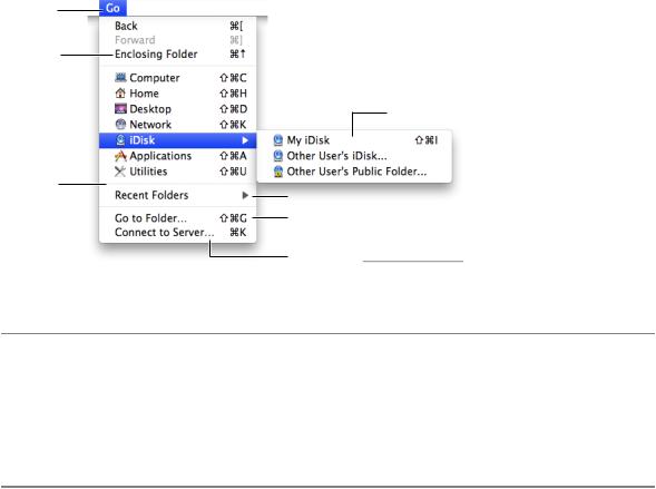
You may use icons in menu items if the icon is something the user can learn to associate with specific functionality in your application or if the icon represents something unique. For example, as shown in Figure 13-5, the Finder uses icons in the Go menu because users can associate them with the icons they see in the Sidebar.
Figure 13-5 Icons in the Finder Go menu
Safari also makes use of the standard icons displayed with some webpages to allow users to make the connection between the webpage and the menu item for that webpage, as shown in Figure 13-6.
Designing the Elements of Menus |
165 |
2008-06-09 | © 1992, 2001-2003, 2008 Apple Inc. All Rights Reserved.
![](/html/2706/180/html_UUKAsPLy1g.Wf7w/htmlconvd-2rDWZ2166x1.jpg)
C H A P T E R 1 3
Menus
Figure 13-6 Icons in the Safari History menu
If you do include icons in your menus, include them only for menu items for which they add significant value; don’t include them for every menu item. A menu that includes too many icons (or poorly designed ones) can appear cluttered and be hard to read.
Using Symbols in Menus
There are a few standard symbols you can use to indicate additional information in menus. These are listed in Table 13-1 and discussed in the following text. Don’t use other, arbitrary symbols in menus, because they add visual clutter and may confuse people.
|
Table 13-1 |
Acceptable characters for use in menus |
|
Character |
Meaning |
|
|
The active document in the Window menu; in other menus, a setting that applies to the entire |
|
|
selection |
|
|
A setting that applies to only part of the selection |
|
|
A window with unsaved changes |
|
|
In the Window menu, a document that is currently minimized in the Dock |
|
In the Window menu, a checkmark should appear next to the active document’s name. Checkmarks can also |
|
|
be used in other menus to indicate that the setting applies to the entire selection. You can use checkmarks |
|
|
for mutually exclusive attribute groups (the user can select only one item in the group, such as font size) or |
|
|
accumulating attribute groups (more than one item can be selected at once, such as Bold and Italic). |
|
166 |
Designing the Elements of Menus |
2008-06-09 | © 1992, 2001-2003, 2008 Apple Inc. All Rights Reserved.
![](/html/2706/180/html_UUKAsPLy1g.Wf7w/htmlconvd-2rDWZ2167x1.jpg)
C H A P T E R 1 3
Menus
Use a dash to indicate that an attribute applies to only part of the selection. For example, if selected text has twostylesappliedtoit,putadashnexttoeachstylename. Whenit’sappropriate,youcancombinecheckmarks and dashes in the same menu. See “Toggled Menu Items” (page 168) for more information on how to use checkmarks and dashes in menus.
Note: Include a menu command, such as Plain, for removing all formatting from mixed-state text.
Use a bullet next to a document with unsaved changes and a diamond for a document the user has minimized into the Dock. A minimized document with unsaved changes should have a diamond only. If the active window has unsaved changes, the checkmark should override the bullet in the Window menu.
Figure 13-7 and Figure 13-8 show some examples of how to use and how not to use symbols in menus.
Figure 13-7 Symbols in menus
Dashes are used to indicate that the selection represents a mixed state (both bold and italic are used).
A diamond indicates that the window has been minimized into the Dock.
A checkmark indicates the active window.
A bullet indicates that the document has unsaved changes.
Figure 13-8 Don’t use arbitrary symbols in menus
Designing the Elements of Menus |
167 |
2008-06-09 | © 1992, 2001-2003, 2008 Apple Inc. All Rights Reserved.