- •Contents
- •Figures and Tables
- •The Design Process
- •Involving Users in the Design Process
- •Know Your Audience
- •Analyze User Tasks
- •Build Prototypes
- •Observe Users
- •Guidelines for Conducting User Observations
- •Making Design Decisions
- •Avoid Feature Cascade
- •Apply the 80 Percent Solution
- •Characteristics of Great Software
- •High Performance
- •Ease of Use
- •Attractive Appearance
- •Reliability
- •Adaptability
- •Interoperability
- •Mobility
- •Human Interface Design
- •Human Interface Design Principles
- •Metaphors
- •Reflect the User’s Mental Model
- •Explicit and Implied Actions
- •Direct Manipulation
- •User Control
- •Feedback and Communication
- •Consistency
- •WYSIWYG (What You See Is What You Get)
- •Forgiveness
- •Perceived Stability
- •Aesthetic Integrity
- •Modelessness
- •Managing Complexity in Your Software
- •Keep Your Users in Mind
- •Worldwide Compatibility
- •Cultural Values
- •Language Differences
- •Text Display and Text Editing
- •Resources
- •Universal Accessibility
- •Visual Disabilities
- •Hearing Disabilities
- •Physical Disabilities
- •Extending the Interface
- •Build on the Existing Interface
- •Don’t Assign New Behaviors to Existing Objects
- •Create a New Interface Element Cautiously
- •Prioritizing Design Decisions
- •Meet Minimum Requirements
- •Deliver the Features Users Expect
- •Differentiate Your Application
- •The Mac OS X Environment
- •The Always-On Environment
- •Displays
- •The Dock
- •Conveying Information in the Dock
- •Clicking in the Dock
- •The Finder
- •File Formats and Filename Extensions
- •Internationalization
- •Multiple User Issues
- •Resource Management
- •Threads
- •Using Mac OS X Technologies
- •Address Book
- •Animation
- •Automator
- •Bonjour
- •Colors
- •Dashboard
- •High-Level Design Guidelines for Widgets
- •User-Interface Design Guidelines for Widgets
- •Fonts
- •Preferences
- •Printing
- •Security
- •Speech
- •Spotlight
- •User Assistance
- •Apple Help
- •Help Tags
- •Software Installation and Software Updates
- •Packaging
- •Identify System Requirements
- •Bundle Your Software
- •Installation
- •Use Internet-Enabled Disk Images
- •Drag-and-Drop Installation
- •Installation Packages
- •General Installer Guidelines
- •Setup Assistants
- •Updating Installed Applications
- •User Input
- •The Mouse and Other Pointing Devices
- •Clicking
- •Double-Clicking
- •Pressing and Holding
- •Dragging
- •The Keyboard
- •The Functions of Specific Keys
- •Character Keys
- •Modifier Keys
- •Arrow Keys
- •Function Keys
- •Keyboard Shortcuts
- •Reserved Keyboard Shortcuts
- •Creating Your Own Keyboard Shortcuts
- •User-Defined Keyboard Shortcuts
- •Keyboard Focus and Navigation
- •Type-Ahead and Key-Repeat
- •Selecting
- •Selection Methods
- •Selection by Clicking
- •Selection by Dragging
- •Changing a Selection
- •Selections in Text
- •Selecting With the Mouse
- •What Constitutes a Word
- •Selecting Text With the Arrow Keys
- •Selections in Spreadsheets
- •Selections in Graphics
- •Editing Text
- •Inserting Text
- •Deleting Text
- •Replacing a Selection
- •Intelligent Cut and Paste
- •Editing Text Fields
- •Entering Passwords
- •Drag and Drop
- •Drag-and-Drop Overview
- •Drag-and-Drop Semantics
- •Move Versus Copy
- •When to Check the Option Key State
- •Selection Feedback
- •Single-Gesture Selection and Dragging
- •Background Selections
- •Drag Feedback
- •Destination Feedback
- •Windows
- •Text
- •Lists
- •Multiple Dragged Items
- •Automatic Scrolling
- •Using the Trash as a Destination
- •Drop Feedback
- •Finder Icons
- •Graphics
- •Text
- •Transferring a Selection
- •Feedback for an Invalid Drop
- •Clippings
- •Text
- •Fonts
- •Style
- •Inserting Spaces Between Sentences
- •Using the Ellipsis Character
- •Using the Colon Character
- •Labels for Interface Elements
- •Capitalization of Interface Element Labels and Text
- •Using Contractions in the Interface
- •Using Abbreviations and Acronyms in the Interface
- •Developer Terms and User Terms
- •Icons
- •Icon Genres and Families
- •Application Icons
- •User Application Icons
- •Viewer, Player, and Accessory Icons
- •Utility Icons
- •Document Icons
- •Toolbar Icons
- •Icons for Plug-ins, Hardware, and Removable Media
- •Icon Perspectives and Materials
- •Creating Icons
- •Tips for Designing Icons
- •A Suggested Process for Creating Icons
- •Creating Icons for Mac OS X v10.5 and Later
- •Scaling Your Artwork
- •Designing Toolbar Icons
- •Designing Icons for Icon Buttons
- •Designing Icons for Capsule-Style Toolbar Controls
- •Designing Icons for Rectangular-Style Toolbar Controls
- •System-Provided Images
- •System-Provided Images for Use in Controls
- •System-Provided Images for Use as Standalone Buttons
- •System-Provided Images for Use as Toolbar Items
- •System-Provided Images that Indicate Privileges
- •A System-Provided Drag Image
- •Cursors
- •Standard Cursors
- •Designing Your Own Cursors
- •Menus
- •Menu Behavior
- •Designing the Elements of Menus
- •Titling Menus
- •Naming Menu Items
- •Using Icons in Menus
- •Using Symbols in Menus
- •Toggled Menu Items
- •Grouping Items in Menus
- •Hierarchical Menus (Submenus)
- •The Menu Bar and Its Menus
- •The Apple Menu
- •The Application Menu
- •The Application Menu Title
- •The Application Menu Contents
- •The File Menu
- •The Edit Menu
- •The Format Menu
- •The View Menu
- •Application-Specific Menus
- •The Window Menu
- •The Help Menu
- •Menu Bar Extras
- •Contextual Menus
- •Dock Menus
- •Windows
- •Types of Windows
- •Window Appearance
- •Window Elements
- •The Title Bar
- •The Window Title
- •Title Bar Buttons
- •Indicating Changes with the Close Button
- •The Proxy Icon
- •Toolbars
- •Toolbar Appearance and Behavior
- •Designing a Toolbar
- •Scope Bars
- •Scope Bar Appearance and Behavior
- •Designing a Scope Bar
- •Source Lists
- •Source List Behavior and Appearance
- •Designing a Source List
- •Bottom Bars
- •Bottom Bar Appearance and Behavior
- •Designing a Bottom Bar
- •Drawers
- •When to Use Drawers
- •Drawer Behavior
- •Window Behavior
- •Opening Windows
- •Naming New Windows
- •Positioning Windows
- •Moving Windows
- •Resizing and Zooming Windows
- •Minimizing and Expanding Windows
- •Closing Windows
- •Window Layering
- •Main, Key, and Inactive Windows
- •Click-Through
- •Scrolling Windows
- •Automatic Scrolling
- •Panels
- •Inspector Windows
- •Transparent Panels
- •When to Use Transparent Panels
- •Designing a Transparent Panel
- •Fonts Window and Colors Window
- •About Windows
- •Dialogs
- •Types of Dialogs and When to Use Them
- •Sheets (Document-Modal Dialogs)
- •Alerts
- •Dialog Appearance and Behavior
- •Accepting Changes
- •Dismissing Dialogs
- •Providing an Apply Button in a Dialog
- •Expanding Dialogs
- •Find Windows
- •Preferences Windows
- •The Open Dialog
- •Dialogs for Saving, Closing, and Quitting
- •Save Dialogs
- •Closing a Document With Unsaved Changes
- •Attempting to Save a Locked or Read-Only Document
- •Saving Documents During a Quit Operation
- •The Choose Dialog
- •The Print Dialog
- •Print Dialog
- •Page Setup Dialog
- •Controls
- •Window-Frame Controls
- •Rectangular-Style Toolbar Controls
- •Rectangular-Style Toolbar Control Usage
- •Rectangular-Style Toolbar Control Contents and Labeling
- •Rectangular-Style Toolbar Control Specifications
- •Rectangular-Style Toolbar Control Implementation
- •Capsule-Style Toolbar Controls
- •Capsule-Style Toolbar Control Usage
- •Capsule-Style Toolbar Control Contents and Labeling
- •Capsule-Style Toolbar Control Specifications
- •Capsule-Style Toolbar Control Implementation
- •Legacy Toolbar Controls
- •Buttons
- •Push Buttons
- •Push Button Usage
- •Push Button Contents and Labeling
- •Push Button Specifications
- •Push Button Implementation
- •Icon Buttons
- •Icon Button Usage
- •Icon Button Contents and Labeling
- •Icon Button Specifications
- •Icon Button Implementation
- •Scope Buttons
- •Scope Button Usage
- •Scope Button Contents and Labeling
- •Scope Button Specifications
- •Scope Button Implementation
- •Gradient Buttons
- •Gradient Button Usage
- •Gradient Button Contents and Labeling
- •Gradient Button Specifications
- •Gradient Button Implementation
- •The Help Button
- •Bevel Buttons
- •Bevel Button Usage
- •Bevel Button Contents and Labeling
- •Bevel Button Specifications
- •Bevel Button Implementation
- •Round Buttons
- •Round Button Usage
- •Round Button Contents and Labeling
- •Round Button Specifications
- •Round Button Implementation
- •Selection Controls
- •Radio Buttons
- •Radio Button Usage
- •Radio Button Contents and Labeling
- •Radio Button Specifications
- •Radio Button Implementation
- •Checkboxes
- •Checkbox Usage
- •Checkbox Contents and Labeling
- •Checkbox Specifications
- •Checkbox Implementation
- •Segmented Controls
- •Segmented Control Usage
- •Segmented Control Contents and Labeling
- •Segmented Control Specifications
- •Segmented Control Implementation
- •Icon Buttons and Bevel Buttons with Pop-Up Menus
- •Pop-Up Menus
- •Pop-Up Menu Usage
- •Pop-Up Menu Contents and Labeling
- •Pop-Up Menu Specifications
- •Pop-Up Menu Implementation
- •Action Menus
- •Action Menu Usage
- •Action Menu Contents and Labeling
- •Action Menu Specifications
- •Action Menu Implementation
- •Combination Boxes
- •Combo Box Usage
- •Combo Box Contents and Labeling
- •Combo Box Specifications
- •Combo Box Implementation
- •Path Controls
- •Path Control Usage
- •Path Control Contents and Labeling
- •Path Control Specifications
- •Path Control Implementation
- •Color Wells
- •Image Wells
- •Date Pickers
- •Date Picker Usage
- •Date Picker Implementation
- •Command Pop-Down Menus
- •Command Pop-Down Menu Usage
- •Command Pop-Down Menu Contents and Labeling
- •Command Pop-Down Menu Specifications
- •Command Pop-Down Implementation
- •Sliders
- •Slider Usage
- •Slider Contents and Labeling
- •Slider Control Specifications
- •Slider Control Implementation
- •The Stepper Control (Little Arrows)
- •Stepper Control Specifications
- •Placards
- •Indicators
- •Progress Indicators
- •Determinate Progress Bars
- •Indeterminate Progress Bars
- •Asynchronous Progress Indicators
- •Level Indicators
- •Capacity Indicators
- •Rating Indicators
- •Relevance Indicators
- •Text Controls
- •Static Text Fields
- •Text Input Fields
- •Text Input Field Usage
- •Text Input Field Contents and Labeling
- •Text Input Field Specifications
- •Text Input Field Implementation
- •Token Fields
- •Token Field Usage
- •Token Field Specifications
- •Token Field Implementation
- •Search Fields
- •Search Field Usage
- •Search Field Contents and Labeling
- •Search Field Specifications
- •Search Field Implementation
- •Scrolling Lists
- •Scrolling List Usage
- •Scrolling List Contents and Labeling
- •Scrolling List Specifications
- •Scrolling List Implementation
- •View Controls
- •Disclosure Triangles
- •Disclosure Triangle Usage
- •Disclosure Triangle Contents and Labeling
- •Disclosure Triangle Specifications
- •Disclosure Triangle Implementation
- •Disclosure Buttons
- •Disclosure Button Usage
- •Disclosure Button Contents and Labeling
- •Disclosure Button Specifications
- •Disclosure Button Implementation
- •List Views
- •List View Usage
- •List View Contents and Labeling
- •List View Implementation
- •Column Views
- •Column View Usage
- •Column View Contents and Labeling
- •Column View Implementation
- •Split Views
- •Split View Usage
- •Split View Specifications
- •Split View Implementation
- •Tab Views
- •Tab View Usage
- •Tab View Contents and Labeling
- •Tab View Specifications
- •Tab View Implementation
- •Grouping Controls
- •Separators
- •Separator Usage
- •Separator Labeling
- •Separator Specifications
- •Separator Implementation
- •Group Boxes
- •Group Box Usage
- •Group Box Contents and Labeling
- •Group Box Specifications
- •Group Box Implementation
- •Layout Guidelines
- •Positioning Regular-Size Controls in a Window Body
- •A Simple Preferences Window
- •A Tabbed Window
- •A Standard Alert
- •Positioning Small and Mini Controls in a Window Body
- •Layout Example for Small Controls
- •Layout Example for Mini Controls
- •Grouping Controls in a Window Body
- •Grouping with White Space
- •Grouping with Separators
- •Grouping with Group Boxes
- •Positioning Text and Controls in a Bottom Bar
- •Glossary
- •Index
C H A P T E R 1 4
Windows
Figure 14-6 A scope bar in an application window
Scope bar
The Title Bar
All windows should have a title bar even if the window doesn’t have a title (which should be a very rare exception). In Mac OS X v10.5 and later, all windows display the title bar unified with the toolbar, if a toolbar is present. The following sections describe the components of the title bar.
The Window Title
A document window should display the name of the document being viewed. Application windows display the application name. Panels display a descriptive title appropriate for that window. If the contents of the window can change, it might be appropriate to change the title to reflect the current context. For example, in the Keynote inspector panel, the title of the window changes to reflect which pane has been selected.
If you need to display more than one item in the title, separate the items with an em dash (—) with space on either side. For example, the main viewer window of Mail displays the currently selected message mailbox and the selected folder, if any. When a message is viewed in its own window, the message title is displayed.
Don’t display pathnames in window titles. When displaying document titles, use the display name and show the extension if the user has elected to show extensions. If you need to display a path in the body of a window you can use the path control, described in “Path Controls” (page 289).
The only controls that belong in a title bar are the close, minimize, and zoom buttons. If a title bar is combined with a toolbar, the unified area can contain the toolbar control and the toolbar customization contextual menu (these controls are described in “Title Bar Buttons” (page 194)). Do not place other controls in a title bar.
Window Elements |
193 |
2008-06-09 | © 1992, 2001-2003, 2008 Apple Inc. All Rights Reserved.
C H A P T E R 1 4
Windows
Title Bar Buttons
Document and application windows always display active close and minimize buttons. (See “Closing Windows” (page 216) and “Minimizing and Expanding Windows” (page 216) for details on what the close and minimize buttons do.) Include the zoom button if the window can be adjusted in size. Information on how the zoom button works is in “Resizing and Zooming Windows” (page 215).
Panels always display an active close button but never an active minimize button.
If buttons are not active, they should at least all be present in an inactive state. The exception is in panels, where it is acceptable to display only one button, the close button. For more information on panels, including information on their title bar buttons, see “Panels” (page 222).
Alerts and modal dialogs do not display any of these buttons.
The title bar should include a toolbar control if a toolbar is present in the window (see “Toolbars” (page 196)). Figure 14-7 shows the appropriate configurations of title bar buttons for standard windows (and alerts and modal dialogs); Figure 14-39 (page 224) shows appropriate title bar button configurations for panels.
Figure 14-7 Title bar buttons for standard windows
Alerts and modal dialogs only
194 |
Window Elements |
2008-06-09 | © 1992, 2001-2003, 2008 Apple Inc. All Rights Reserved.
C H A P T E R 1 4
Windows
Indicating Changes with the Close Button
When a document has unsaved changes, the close button should display a dot, as shown in Figure 14-8.
Figure 14-8 The close button in its unsaved changes state
The dot indicates that this document has unsaved changes.
The Proxy Icon
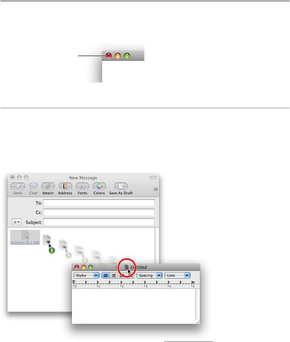
Document windows can include a proxy icon in the title bar after the content is saved for the first time. After pressing a proxy icon for a brief period, users can manipulate it as if they were manipulating the corresponding file-system object. For example, you can attach a document to an email message by dragging its proxy icon into the email message, as shown in Figure 14-9.
Figure 14-9 A proxy icon being dragged to another application
A proxy icon appears in its normal state as long as the state of the document and the file-system object are the same. When a document has unsaved changes, its proxy icon appears dimmed. Note the difference between the proxy icon in the document with unsaved changes versus the document with saved changes in Figure 14-10.
Window Elements |
195 |
2008-06-09 | © 1992, 2001-2003, 2008 Apple Inc. All Rights Reserved.