![](/user_photo/2706_HbeT2.jpg)
- •Contents
- •Figures and Tables
- •The Design Process
- •Involving Users in the Design Process
- •Know Your Audience
- •Analyze User Tasks
- •Build Prototypes
- •Observe Users
- •Guidelines for Conducting User Observations
- •Making Design Decisions
- •Avoid Feature Cascade
- •Apply the 80 Percent Solution
- •Characteristics of Great Software
- •High Performance
- •Ease of Use
- •Attractive Appearance
- •Reliability
- •Adaptability
- •Interoperability
- •Mobility
- •Human Interface Design
- •Human Interface Design Principles
- •Metaphors
- •Reflect the User’s Mental Model
- •Explicit and Implied Actions
- •Direct Manipulation
- •User Control
- •Feedback and Communication
- •Consistency
- •WYSIWYG (What You See Is What You Get)
- •Forgiveness
- •Perceived Stability
- •Aesthetic Integrity
- •Modelessness
- •Managing Complexity in Your Software
- •Keep Your Users in Mind
- •Worldwide Compatibility
- •Cultural Values
- •Language Differences
- •Text Display and Text Editing
- •Resources
- •Universal Accessibility
- •Visual Disabilities
- •Hearing Disabilities
- •Physical Disabilities
- •Extending the Interface
- •Build on the Existing Interface
- •Don’t Assign New Behaviors to Existing Objects
- •Create a New Interface Element Cautiously
- •Prioritizing Design Decisions
- •Meet Minimum Requirements
- •Deliver the Features Users Expect
- •Differentiate Your Application
- •The Mac OS X Environment
- •The Always-On Environment
- •Displays
- •The Dock
- •Conveying Information in the Dock
- •Clicking in the Dock
- •The Finder
- •File Formats and Filename Extensions
- •Internationalization
- •Multiple User Issues
- •Resource Management
- •Threads
- •Using Mac OS X Technologies
- •Address Book
- •Animation
- •Automator
- •Bonjour
- •Colors
- •Dashboard
- •High-Level Design Guidelines for Widgets
- •User-Interface Design Guidelines for Widgets
- •Fonts
- •Preferences
- •Printing
- •Security
- •Speech
- •Spotlight
- •User Assistance
- •Apple Help
- •Help Tags
- •Software Installation and Software Updates
- •Packaging
- •Identify System Requirements
- •Bundle Your Software
- •Installation
- •Use Internet-Enabled Disk Images
- •Drag-and-Drop Installation
- •Installation Packages
- •General Installer Guidelines
- •Setup Assistants
- •Updating Installed Applications
- •User Input
- •The Mouse and Other Pointing Devices
- •Clicking
- •Double-Clicking
- •Pressing and Holding
- •Dragging
- •The Keyboard
- •The Functions of Specific Keys
- •Character Keys
- •Modifier Keys
- •Arrow Keys
- •Function Keys
- •Keyboard Shortcuts
- •Reserved Keyboard Shortcuts
- •Creating Your Own Keyboard Shortcuts
- •User-Defined Keyboard Shortcuts
- •Keyboard Focus and Navigation
- •Type-Ahead and Key-Repeat
- •Selecting
- •Selection Methods
- •Selection by Clicking
- •Selection by Dragging
- •Changing a Selection
- •Selections in Text
- •Selecting With the Mouse
- •What Constitutes a Word
- •Selecting Text With the Arrow Keys
- •Selections in Spreadsheets
- •Selections in Graphics
- •Editing Text
- •Inserting Text
- •Deleting Text
- •Replacing a Selection
- •Intelligent Cut and Paste
- •Editing Text Fields
- •Entering Passwords
- •Drag and Drop
- •Drag-and-Drop Overview
- •Drag-and-Drop Semantics
- •Move Versus Copy
- •When to Check the Option Key State
- •Selection Feedback
- •Single-Gesture Selection and Dragging
- •Background Selections
- •Drag Feedback
- •Destination Feedback
- •Windows
- •Text
- •Lists
- •Multiple Dragged Items
- •Automatic Scrolling
- •Using the Trash as a Destination
- •Drop Feedback
- •Finder Icons
- •Graphics
- •Text
- •Transferring a Selection
- •Feedback for an Invalid Drop
- •Clippings
- •Text
- •Fonts
- •Style
- •Inserting Spaces Between Sentences
- •Using the Ellipsis Character
- •Using the Colon Character
- •Labels for Interface Elements
- •Capitalization of Interface Element Labels and Text
- •Using Contractions in the Interface
- •Using Abbreviations and Acronyms in the Interface
- •Developer Terms and User Terms
- •Icons
- •Icon Genres and Families
- •Application Icons
- •User Application Icons
- •Viewer, Player, and Accessory Icons
- •Utility Icons
- •Document Icons
- •Toolbar Icons
- •Icons for Plug-ins, Hardware, and Removable Media
- •Icon Perspectives and Materials
- •Creating Icons
- •Tips for Designing Icons
- •A Suggested Process for Creating Icons
- •Creating Icons for Mac OS X v10.5 and Later
- •Scaling Your Artwork
- •Designing Toolbar Icons
- •Designing Icons for Icon Buttons
- •Designing Icons for Capsule-Style Toolbar Controls
- •Designing Icons for Rectangular-Style Toolbar Controls
- •System-Provided Images
- •System-Provided Images for Use in Controls
- •System-Provided Images for Use as Standalone Buttons
- •System-Provided Images for Use as Toolbar Items
- •System-Provided Images that Indicate Privileges
- •A System-Provided Drag Image
- •Cursors
- •Standard Cursors
- •Designing Your Own Cursors
- •Menus
- •Menu Behavior
- •Designing the Elements of Menus
- •Titling Menus
- •Naming Menu Items
- •Using Icons in Menus
- •Using Symbols in Menus
- •Toggled Menu Items
- •Grouping Items in Menus
- •Hierarchical Menus (Submenus)
- •The Menu Bar and Its Menus
- •The Apple Menu
- •The Application Menu
- •The Application Menu Title
- •The Application Menu Contents
- •The File Menu
- •The Edit Menu
- •The Format Menu
- •The View Menu
- •Application-Specific Menus
- •The Window Menu
- •The Help Menu
- •Menu Bar Extras
- •Contextual Menus
- •Dock Menus
- •Windows
- •Types of Windows
- •Window Appearance
- •Window Elements
- •The Title Bar
- •The Window Title
- •Title Bar Buttons
- •Indicating Changes with the Close Button
- •The Proxy Icon
- •Toolbars
- •Toolbar Appearance and Behavior
- •Designing a Toolbar
- •Scope Bars
- •Scope Bar Appearance and Behavior
- •Designing a Scope Bar
- •Source Lists
- •Source List Behavior and Appearance
- •Designing a Source List
- •Bottom Bars
- •Bottom Bar Appearance and Behavior
- •Designing a Bottom Bar
- •Drawers
- •When to Use Drawers
- •Drawer Behavior
- •Window Behavior
- •Opening Windows
- •Naming New Windows
- •Positioning Windows
- •Moving Windows
- •Resizing and Zooming Windows
- •Minimizing and Expanding Windows
- •Closing Windows
- •Window Layering
- •Main, Key, and Inactive Windows
- •Click-Through
- •Scrolling Windows
- •Automatic Scrolling
- •Panels
- •Inspector Windows
- •Transparent Panels
- •When to Use Transparent Panels
- •Designing a Transparent Panel
- •Fonts Window and Colors Window
- •About Windows
- •Dialogs
- •Types of Dialogs and When to Use Them
- •Sheets (Document-Modal Dialogs)
- •Alerts
- •Dialog Appearance and Behavior
- •Accepting Changes
- •Dismissing Dialogs
- •Providing an Apply Button in a Dialog
- •Expanding Dialogs
- •Find Windows
- •Preferences Windows
- •The Open Dialog
- •Dialogs for Saving, Closing, and Quitting
- •Save Dialogs
- •Closing a Document With Unsaved Changes
- •Attempting to Save a Locked or Read-Only Document
- •Saving Documents During a Quit Operation
- •The Choose Dialog
- •The Print Dialog
- •Print Dialog
- •Page Setup Dialog
- •Controls
- •Window-Frame Controls
- •Rectangular-Style Toolbar Controls
- •Rectangular-Style Toolbar Control Usage
- •Rectangular-Style Toolbar Control Contents and Labeling
- •Rectangular-Style Toolbar Control Specifications
- •Rectangular-Style Toolbar Control Implementation
- •Capsule-Style Toolbar Controls
- •Capsule-Style Toolbar Control Usage
- •Capsule-Style Toolbar Control Contents and Labeling
- •Capsule-Style Toolbar Control Specifications
- •Capsule-Style Toolbar Control Implementation
- •Legacy Toolbar Controls
- •Buttons
- •Push Buttons
- •Push Button Usage
- •Push Button Contents and Labeling
- •Push Button Specifications
- •Push Button Implementation
- •Icon Buttons
- •Icon Button Usage
- •Icon Button Contents and Labeling
- •Icon Button Specifications
- •Icon Button Implementation
- •Scope Buttons
- •Scope Button Usage
- •Scope Button Contents and Labeling
- •Scope Button Specifications
- •Scope Button Implementation
- •Gradient Buttons
- •Gradient Button Usage
- •Gradient Button Contents and Labeling
- •Gradient Button Specifications
- •Gradient Button Implementation
- •The Help Button
- •Bevel Buttons
- •Bevel Button Usage
- •Bevel Button Contents and Labeling
- •Bevel Button Specifications
- •Bevel Button Implementation
- •Round Buttons
- •Round Button Usage
- •Round Button Contents and Labeling
- •Round Button Specifications
- •Round Button Implementation
- •Selection Controls
- •Radio Buttons
- •Radio Button Usage
- •Radio Button Contents and Labeling
- •Radio Button Specifications
- •Radio Button Implementation
- •Checkboxes
- •Checkbox Usage
- •Checkbox Contents and Labeling
- •Checkbox Specifications
- •Checkbox Implementation
- •Segmented Controls
- •Segmented Control Usage
- •Segmented Control Contents and Labeling
- •Segmented Control Specifications
- •Segmented Control Implementation
- •Icon Buttons and Bevel Buttons with Pop-Up Menus
- •Pop-Up Menus
- •Pop-Up Menu Usage
- •Pop-Up Menu Contents and Labeling
- •Pop-Up Menu Specifications
- •Pop-Up Menu Implementation
- •Action Menus
- •Action Menu Usage
- •Action Menu Contents and Labeling
- •Action Menu Specifications
- •Action Menu Implementation
- •Combination Boxes
- •Combo Box Usage
- •Combo Box Contents and Labeling
- •Combo Box Specifications
- •Combo Box Implementation
- •Path Controls
- •Path Control Usage
- •Path Control Contents and Labeling
- •Path Control Specifications
- •Path Control Implementation
- •Color Wells
- •Image Wells
- •Date Pickers
- •Date Picker Usage
- •Date Picker Implementation
- •Command Pop-Down Menus
- •Command Pop-Down Menu Usage
- •Command Pop-Down Menu Contents and Labeling
- •Command Pop-Down Menu Specifications
- •Command Pop-Down Implementation
- •Sliders
- •Slider Usage
- •Slider Contents and Labeling
- •Slider Control Specifications
- •Slider Control Implementation
- •The Stepper Control (Little Arrows)
- •Stepper Control Specifications
- •Placards
- •Indicators
- •Progress Indicators
- •Determinate Progress Bars
- •Indeterminate Progress Bars
- •Asynchronous Progress Indicators
- •Level Indicators
- •Capacity Indicators
- •Rating Indicators
- •Relevance Indicators
- •Text Controls
- •Static Text Fields
- •Text Input Fields
- •Text Input Field Usage
- •Text Input Field Contents and Labeling
- •Text Input Field Specifications
- •Text Input Field Implementation
- •Token Fields
- •Token Field Usage
- •Token Field Specifications
- •Token Field Implementation
- •Search Fields
- •Search Field Usage
- •Search Field Contents and Labeling
- •Search Field Specifications
- •Search Field Implementation
- •Scrolling Lists
- •Scrolling List Usage
- •Scrolling List Contents and Labeling
- •Scrolling List Specifications
- •Scrolling List Implementation
- •View Controls
- •Disclosure Triangles
- •Disclosure Triangle Usage
- •Disclosure Triangle Contents and Labeling
- •Disclosure Triangle Specifications
- •Disclosure Triangle Implementation
- •Disclosure Buttons
- •Disclosure Button Usage
- •Disclosure Button Contents and Labeling
- •Disclosure Button Specifications
- •Disclosure Button Implementation
- •List Views
- •List View Usage
- •List View Contents and Labeling
- •List View Implementation
- •Column Views
- •Column View Usage
- •Column View Contents and Labeling
- •Column View Implementation
- •Split Views
- •Split View Usage
- •Split View Specifications
- •Split View Implementation
- •Tab Views
- •Tab View Usage
- •Tab View Contents and Labeling
- •Tab View Specifications
- •Tab View Implementation
- •Grouping Controls
- •Separators
- •Separator Usage
- •Separator Labeling
- •Separator Specifications
- •Separator Implementation
- •Group Boxes
- •Group Box Usage
- •Group Box Contents and Labeling
- •Group Box Specifications
- •Group Box Implementation
- •Layout Guidelines
- •Positioning Regular-Size Controls in a Window Body
- •A Simple Preferences Window
- •A Tabbed Window
- •A Standard Alert
- •Positioning Small and Mini Controls in a Window Body
- •Layout Example for Small Controls
- •Layout Example for Mini Controls
- •Grouping Controls in a Window Body
- •Grouping with White Space
- •Grouping with Separators
- •Grouping with Group Boxes
- •Positioning Text and Controls in a Bottom Bar
- •Glossary
- •Index
![](/html/2706/180/html_UUKAsPLy1g.Wf7w/htmlconvd-2rDWZ2250x1.jpg)
C H A P T E R 1 5
Controls
Of the controls that are designed for use in the window body, there are three that can also be used in window-frame areas:
■Icon buttons (including icon buttons that contain a pop-up menu)—see “Icon Buttons” (page 261) and “Icon Buttons and Bevel Buttons With Pop-Up Menus” (page 279) for more information.
■Action menus—see “Action Menus” (page 284) for more information.
■Search fields—see “Search Fields” (page 317) for more information.
This section describes the controls that are designed solely for use in the window-frame areas. If your window contains a toolbar or bottom bar, be sure to use only the controls that are appropriate for each area, including icon buttons, Action menus, and search fields, as needed.
Rectangular-Style Toolbar Controls
The rectangular-style toolbar control can be used in both the toolbar and the bottom bar. (The capsule-style toolbar control, described in “Capsule-Style Toolbar Controls” (page 254), should be used in toolbars only.) The rectangular-style toolbar control is a very versatile control that can behave as a push button, a toggle button, a segmented control, or a pop-up menu. Figure 15-1 shows some variations of the rectangular-style toolbar control in Address Book.
Figure 15-1 Variations of the rectangular-style toolbar control
Rectangular-style toolbar controls
Rectangular-Style Toolbar Control Usage
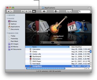
In a toolbar, use rectangular-style toolbar controls to give users access to frequently used commands and objects (for guidelines on designing the contents of a toolbar, see “Designing a Toolbar” (page 199)). For example, the Finder uses a combination of rectangular-style toolbar buttons and segmented controls to allow users to preview an item with Quick Look, choose a view style, see the path of an item’s location, navigatethroughpreviouslyvieweditems,andperformanactiononanitem. Figure15-2showstherectangular toolbar buttons and segmented controls the Finder uses.
250 |
Window-Frame Controls |
2008-06-09 | © 1992, 2001-2003, 2008 Apple Inc. All Rights Reserved.
![](/html/2706/180/html_UUKAsPLy1g.Wf7w/htmlconvd-2rDWZ2251x1.jpg)
C H A P T E R 1 5
Controls
Figure 15-2 Rectangular-style toolbar controls in a toolbar
Rectangular-style toolbar controls in a toolbar
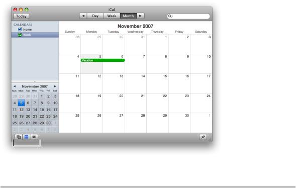
In a bottom bar, use rectangular-style toolbar controls when you need to provide controls that directly affect the contents or organization of the window body. In general, controls in the bottom bar are important, but they are less frequently used than controls in the toolbar (see “Bottom Bars” (page 207) for guidelines on designing the contents of a bottom bar). For example, the rectangular-style toolbar controls in the iCal bottom bar include a segmented control that allows users to add calendars and change the items displayed in the source list, and a button that shows or hides the to-do list, as shown in Figure 15-3.
Window-Frame Controls |
251 |
2008-06-09 | © 1992, 2001-2003, 2008 Apple Inc. All Rights Reserved.
![](/html/2706/180/html_UUKAsPLy1g.Wf7w/htmlconvd-2rDWZ2252x1.jpg)
C H A P T E R 1 5
Controls
Figure 15-3 Rectangular-style toolbar controls in a bottom bar
Rectangular-style toolbar controls in a bottom bar
Rectangular-Style Toolbar Control Contents and Labeling
A rectangular-style toolbar button can contain either text or icons. In addition, this button can contain a downward-pointing arrow that indicates the presence of a pop-up menu. A rectangular-style toolbar segmented control can also contain either text or icons, but should not contain a mix of text and icons.
If you display an icon in a rectangular toolbar control, be sure the meaning of the image is clear and unambiguous (see “Cultural Values” (page 47) for some advice on choosing appropriate imagery). In Mac OS X v10.5 and later, Interface Builder makes it easy to add to a control one of the system-provided images, such as the plus sign, the accounts symbol, or the locked symbol. You can see some of these symbols in the controls in the Finder toolbar, shown in Figure 15-2 (page 251). See “System-Provided Images” (page 151) for more information on standard images available in Mac OS X v10.5 and later. If you need to design your own image,see “DesigningIconsforRectangular-StyleToolbarControls” (page 150)forsomemetricsandguidelines.
If you want to display text in a rectangular-style toolbar control, be sure it is either a noun (or noun phrase) that describes an object, setting, or state, or that it is a verb (or verb phrase) that describes an action. For example, the nouns used in the iCal toolbar controls clearly indicate the function of the controls. Text in rectangular-style toolbar controls should have title-style capitalization (see “Capitalization of Interface Element Labels and Text” (page 131) for more on this style).
If you use a rectangular-style toolbar control that behaves like a checkbox or a toggle button in a toolbar or bottom bar, you may be able to benefit from the automatic highlighting that signifies the on state of the button. If you do this, however, be very sure the control clearly indicates the correct state in the correct situation. Also, if you put such a control in a toolbar, you should provide two descriptive labels that can be displayed below the control. One label should describe the on (or pressed) state and one should describe the off (or unpressed) state. Finally, be sure to describe both of the states in the control’s help tag, whether the control appears in a toolbar or a bottom bar. To learn more about the on-state appearance, see “Rectangular-Style Toolbar Control Implementation” (page 254).
252 |
Window-Frame Controls |
2008-06-09 | © 1992, 2001-2003, 2008 Apple Inc. All Rights Reserved.
![](/html/2706/180/html_UUKAsPLy1g.Wf7w/htmlconvd-2rDWZ2253x1.jpg)
C H A P T E R 1 5
Controls
For example, iCal offers toggle controls in its bottom bar that allow users to show or hide various views. When one of these views is visible, the associated toggle control is highlighted; when the view is hidden, the highlighting disappears. Figure 15-4 shows the iCal bottom bar, along with a help tag that describes both states.
Figure 15-4 Toggle controls in the iCal bottom bar clearly indicate their current state
Important: You must supply a descriptive label for each rectangular-style toolbar control you place in a toolbar so that users can customize the toolbar to display both images and text. This is the external label users see when they select the Icon & Text or Text Only display options in the Customize Toolbar dialog.
Rectangular style toolbar controls used in a bottom bar do not need external descriptive labels.
Rectangular-Style Toolbar Control Specifications
Control sizes: Rectangular-style toolbar controls are available in regular, small, and mini sizes. In a toolbar, display the regular size by default, but be sure to supply the small size to allow users to customize the toolbar.
In a bottom bar, you can use either the regular or the small size, depending on the dimensions of the bottom bar. See “Designing a Bottom Bar” (page 208) for guidelines on how to create and lay out a bottom bar.
Labelspacingandfonts: Labels for rectangular-style toolbar controls should be in the system font appropriate for the size of the control (these fonts are automatically supplied by Interface Builder):
■Regular size: System font.
■Small: Small system font.
Window-Frame Controls |
253 |
2008-06-09 | © 1992, 2001-2003, 2008 Apple Inc. All Rights Reserved.