- •Contents
- •Figures and Tables
- •The Design Process
- •Involving Users in the Design Process
- •Know Your Audience
- •Analyze User Tasks
- •Build Prototypes
- •Observe Users
- •Guidelines for Conducting User Observations
- •Making Design Decisions
- •Avoid Feature Cascade
- •Apply the 80 Percent Solution
- •Characteristics of Great Software
- •High Performance
- •Ease of Use
- •Attractive Appearance
- •Reliability
- •Adaptability
- •Interoperability
- •Mobility
- •Human Interface Design
- •Human Interface Design Principles
- •Metaphors
- •Reflect the User’s Mental Model
- •Explicit and Implied Actions
- •Direct Manipulation
- •User Control
- •Feedback and Communication
- •Consistency
- •WYSIWYG (What You See Is What You Get)
- •Forgiveness
- •Perceived Stability
- •Aesthetic Integrity
- •Modelessness
- •Managing Complexity in Your Software
- •Keep Your Users in Mind
- •Worldwide Compatibility
- •Cultural Values
- •Language Differences
- •Text Display and Text Editing
- •Resources
- •Universal Accessibility
- •Visual Disabilities
- •Hearing Disabilities
- •Physical Disabilities
- •Extending the Interface
- •Build on the Existing Interface
- •Don’t Assign New Behaviors to Existing Objects
- •Create a New Interface Element Cautiously
- •Prioritizing Design Decisions
- •Meet Minimum Requirements
- •Deliver the Features Users Expect
- •Differentiate Your Application
- •The Mac OS X Environment
- •The Always-On Environment
- •Displays
- •The Dock
- •Conveying Information in the Dock
- •Clicking in the Dock
- •The Finder
- •File Formats and Filename Extensions
- •Internationalization
- •Multiple User Issues
- •Resource Management
- •Threads
- •Using Mac OS X Technologies
- •Address Book
- •Animation
- •Automator
- •Bonjour
- •Colors
- •Dashboard
- •High-Level Design Guidelines for Widgets
- •User-Interface Design Guidelines for Widgets
- •Fonts
- •Preferences
- •Printing
- •Security
- •Speech
- •Spotlight
- •User Assistance
- •Apple Help
- •Help Tags
- •Software Installation and Software Updates
- •Packaging
- •Identify System Requirements
- •Bundle Your Software
- •Installation
- •Use Internet-Enabled Disk Images
- •Drag-and-Drop Installation
- •Installation Packages
- •General Installer Guidelines
- •Setup Assistants
- •Updating Installed Applications
- •User Input
- •The Mouse and Other Pointing Devices
- •Clicking
- •Double-Clicking
- •Pressing and Holding
- •Dragging
- •The Keyboard
- •The Functions of Specific Keys
- •Character Keys
- •Modifier Keys
- •Arrow Keys
- •Function Keys
- •Keyboard Shortcuts
- •Reserved Keyboard Shortcuts
- •Creating Your Own Keyboard Shortcuts
- •User-Defined Keyboard Shortcuts
- •Keyboard Focus and Navigation
- •Type-Ahead and Key-Repeat
- •Selecting
- •Selection Methods
- •Selection by Clicking
- •Selection by Dragging
- •Changing a Selection
- •Selections in Text
- •Selecting With the Mouse
- •What Constitutes a Word
- •Selecting Text With the Arrow Keys
- •Selections in Spreadsheets
- •Selections in Graphics
- •Editing Text
- •Inserting Text
- •Deleting Text
- •Replacing a Selection
- •Intelligent Cut and Paste
- •Editing Text Fields
- •Entering Passwords
- •Drag and Drop
- •Drag-and-Drop Overview
- •Drag-and-Drop Semantics
- •Move Versus Copy
- •When to Check the Option Key State
- •Selection Feedback
- •Single-Gesture Selection and Dragging
- •Background Selections
- •Drag Feedback
- •Destination Feedback
- •Windows
- •Text
- •Lists
- •Multiple Dragged Items
- •Automatic Scrolling
- •Using the Trash as a Destination
- •Drop Feedback
- •Finder Icons
- •Graphics
- •Text
- •Transferring a Selection
- •Feedback for an Invalid Drop
- •Clippings
- •Text
- •Fonts
- •Style
- •Inserting Spaces Between Sentences
- •Using the Ellipsis Character
- •Using the Colon Character
- •Labels for Interface Elements
- •Capitalization of Interface Element Labels and Text
- •Using Contractions in the Interface
- •Using Abbreviations and Acronyms in the Interface
- •Developer Terms and User Terms
- •Icons
- •Icon Genres and Families
- •Application Icons
- •User Application Icons
- •Viewer, Player, and Accessory Icons
- •Utility Icons
- •Document Icons
- •Toolbar Icons
- •Icons for Plug-ins, Hardware, and Removable Media
- •Icon Perspectives and Materials
- •Creating Icons
- •Tips for Designing Icons
- •A Suggested Process for Creating Icons
- •Creating Icons for Mac OS X v10.5 and Later
- •Scaling Your Artwork
- •Designing Toolbar Icons
- •Designing Icons for Icon Buttons
- •Designing Icons for Capsule-Style Toolbar Controls
- •Designing Icons for Rectangular-Style Toolbar Controls
- •System-Provided Images
- •System-Provided Images for Use in Controls
- •System-Provided Images for Use as Standalone Buttons
- •System-Provided Images for Use as Toolbar Items
- •System-Provided Images that Indicate Privileges
- •A System-Provided Drag Image
- •Cursors
- •Standard Cursors
- •Designing Your Own Cursors
- •Menus
- •Menu Behavior
- •Designing the Elements of Menus
- •Titling Menus
- •Naming Menu Items
- •Using Icons in Menus
- •Using Symbols in Menus
- •Toggled Menu Items
- •Grouping Items in Menus
- •Hierarchical Menus (Submenus)
- •The Menu Bar and Its Menus
- •The Apple Menu
- •The Application Menu
- •The Application Menu Title
- •The Application Menu Contents
- •The File Menu
- •The Edit Menu
- •The Format Menu
- •The View Menu
- •Application-Specific Menus
- •The Window Menu
- •The Help Menu
- •Menu Bar Extras
- •Contextual Menus
- •Dock Menus
- •Windows
- •Types of Windows
- •Window Appearance
- •Window Elements
- •The Title Bar
- •The Window Title
- •Title Bar Buttons
- •Indicating Changes with the Close Button
- •The Proxy Icon
- •Toolbars
- •Toolbar Appearance and Behavior
- •Designing a Toolbar
- •Scope Bars
- •Scope Bar Appearance and Behavior
- •Designing a Scope Bar
- •Source Lists
- •Source List Behavior and Appearance
- •Designing a Source List
- •Bottom Bars
- •Bottom Bar Appearance and Behavior
- •Designing a Bottom Bar
- •Drawers
- •When to Use Drawers
- •Drawer Behavior
- •Window Behavior
- •Opening Windows
- •Naming New Windows
- •Positioning Windows
- •Moving Windows
- •Resizing and Zooming Windows
- •Minimizing and Expanding Windows
- •Closing Windows
- •Window Layering
- •Main, Key, and Inactive Windows
- •Click-Through
- •Scrolling Windows
- •Automatic Scrolling
- •Panels
- •Inspector Windows
- •Transparent Panels
- •When to Use Transparent Panels
- •Designing a Transparent Panel
- •Fonts Window and Colors Window
- •About Windows
- •Dialogs
- •Types of Dialogs and When to Use Them
- •Sheets (Document-Modal Dialogs)
- •Alerts
- •Dialog Appearance and Behavior
- •Accepting Changes
- •Dismissing Dialogs
- •Providing an Apply Button in a Dialog
- •Expanding Dialogs
- •Find Windows
- •Preferences Windows
- •The Open Dialog
- •Dialogs for Saving, Closing, and Quitting
- •Save Dialogs
- •Closing a Document With Unsaved Changes
- •Attempting to Save a Locked or Read-Only Document
- •Saving Documents During a Quit Operation
- •The Choose Dialog
- •The Print Dialog
- •Print Dialog
- •Page Setup Dialog
- •Controls
- •Window-Frame Controls
- •Rectangular-Style Toolbar Controls
- •Rectangular-Style Toolbar Control Usage
- •Rectangular-Style Toolbar Control Contents and Labeling
- •Rectangular-Style Toolbar Control Specifications
- •Rectangular-Style Toolbar Control Implementation
- •Capsule-Style Toolbar Controls
- •Capsule-Style Toolbar Control Usage
- •Capsule-Style Toolbar Control Contents and Labeling
- •Capsule-Style Toolbar Control Specifications
- •Capsule-Style Toolbar Control Implementation
- •Legacy Toolbar Controls
- •Buttons
- •Push Buttons
- •Push Button Usage
- •Push Button Contents and Labeling
- •Push Button Specifications
- •Push Button Implementation
- •Icon Buttons
- •Icon Button Usage
- •Icon Button Contents and Labeling
- •Icon Button Specifications
- •Icon Button Implementation
- •Scope Buttons
- •Scope Button Usage
- •Scope Button Contents and Labeling
- •Scope Button Specifications
- •Scope Button Implementation
- •Gradient Buttons
- •Gradient Button Usage
- •Gradient Button Contents and Labeling
- •Gradient Button Specifications
- •Gradient Button Implementation
- •The Help Button
- •Bevel Buttons
- •Bevel Button Usage
- •Bevel Button Contents and Labeling
- •Bevel Button Specifications
- •Bevel Button Implementation
- •Round Buttons
- •Round Button Usage
- •Round Button Contents and Labeling
- •Round Button Specifications
- •Round Button Implementation
- •Selection Controls
- •Radio Buttons
- •Radio Button Usage
- •Radio Button Contents and Labeling
- •Radio Button Specifications
- •Radio Button Implementation
- •Checkboxes
- •Checkbox Usage
- •Checkbox Contents and Labeling
- •Checkbox Specifications
- •Checkbox Implementation
- •Segmented Controls
- •Segmented Control Usage
- •Segmented Control Contents and Labeling
- •Segmented Control Specifications
- •Segmented Control Implementation
- •Icon Buttons and Bevel Buttons with Pop-Up Menus
- •Pop-Up Menus
- •Pop-Up Menu Usage
- •Pop-Up Menu Contents and Labeling
- •Pop-Up Menu Specifications
- •Pop-Up Menu Implementation
- •Action Menus
- •Action Menu Usage
- •Action Menu Contents and Labeling
- •Action Menu Specifications
- •Action Menu Implementation
- •Combination Boxes
- •Combo Box Usage
- •Combo Box Contents and Labeling
- •Combo Box Specifications
- •Combo Box Implementation
- •Path Controls
- •Path Control Usage
- •Path Control Contents and Labeling
- •Path Control Specifications
- •Path Control Implementation
- •Color Wells
- •Image Wells
- •Date Pickers
- •Date Picker Usage
- •Date Picker Implementation
- •Command Pop-Down Menus
- •Command Pop-Down Menu Usage
- •Command Pop-Down Menu Contents and Labeling
- •Command Pop-Down Menu Specifications
- •Command Pop-Down Implementation
- •Sliders
- •Slider Usage
- •Slider Contents and Labeling
- •Slider Control Specifications
- •Slider Control Implementation
- •The Stepper Control (Little Arrows)
- •Stepper Control Specifications
- •Placards
- •Indicators
- •Progress Indicators
- •Determinate Progress Bars
- •Indeterminate Progress Bars
- •Asynchronous Progress Indicators
- •Level Indicators
- •Capacity Indicators
- •Rating Indicators
- •Relevance Indicators
- •Text Controls
- •Static Text Fields
- •Text Input Fields
- •Text Input Field Usage
- •Text Input Field Contents and Labeling
- •Text Input Field Specifications
- •Text Input Field Implementation
- •Token Fields
- •Token Field Usage
- •Token Field Specifications
- •Token Field Implementation
- •Search Fields
- •Search Field Usage
- •Search Field Contents and Labeling
- •Search Field Specifications
- •Search Field Implementation
- •Scrolling Lists
- •Scrolling List Usage
- •Scrolling List Contents and Labeling
- •Scrolling List Specifications
- •Scrolling List Implementation
- •View Controls
- •Disclosure Triangles
- •Disclosure Triangle Usage
- •Disclosure Triangle Contents and Labeling
- •Disclosure Triangle Specifications
- •Disclosure Triangle Implementation
- •Disclosure Buttons
- •Disclosure Button Usage
- •Disclosure Button Contents and Labeling
- •Disclosure Button Specifications
- •Disclosure Button Implementation
- •List Views
- •List View Usage
- •List View Contents and Labeling
- •List View Implementation
- •Column Views
- •Column View Usage
- •Column View Contents and Labeling
- •Column View Implementation
- •Split Views
- •Split View Usage
- •Split View Specifications
- •Split View Implementation
- •Tab Views
- •Tab View Usage
- •Tab View Contents and Labeling
- •Tab View Specifications
- •Tab View Implementation
- •Grouping Controls
- •Separators
- •Separator Usage
- •Separator Labeling
- •Separator Specifications
- •Separator Implementation
- •Group Boxes
- •Group Box Usage
- •Group Box Contents and Labeling
- •Group Box Specifications
- •Group Box Implementation
- •Layout Guidelines
- •Positioning Regular-Size Controls in a Window Body
- •A Simple Preferences Window
- •A Tabbed Window
- •A Standard Alert
- •Positioning Small and Mini Controls in a Window Body
- •Layout Example for Small Controls
- •Layout Example for Mini Controls
- •Grouping Controls in a Window Body
- •Grouping with White Space
- •Grouping with Separators
- •Grouping with Group Boxes
- •Positioning Text and Controls in a Bottom Bar
- •Glossary
- •Index
C H A P T E R 1 1
Icons
Figure 11-19 Materials: Transparency used to convey meaning
Creating Icons
Gorgeous, artistic icons are an important part of the Mac OS X user experience. Users expect beautiful icons that tell an application’s story in a clear and memorable way.
This section provides tips and a suggested icon-creation process you can follow as you design and create an icon. Then, it describes additional guidelines that help you design and create icons for applications running in Mac OS X v10.5 and later.
If you need to create toolbar icons, you should read this section first for general guidance, because many of the techniques and guidelines apply to both application icons and toolbar icons. Then, read “Designing Toolbar Icons” (page 148) for specific advice on creating icons for use in a toolbar.
Tips for Designing Icons
Many of the suggestions listed here also apply to other graphics you develop for your application—for example, to augment a label or list item.
■For great-looking icons, have a professional graphic designer create them.
■Perspective and shadows are the most important components of making good icons. Use a single light source with the light coming from above the icon.
■Use universal imagery that people will easily recognize. Avoid focusing on a secondary aspect of an element. For example, for a mail icon, a rural mailbox would be less recognizable than a postage stamp.
■Strive for simplicity. Try to use a single object that captures the icon’s action or represents the control. Start with a basic shape.
■Use color judiciously to help the icon tell its story; don’t add color just to make the icon more colorful. Smooth gradients typically work better than sharp delineations of color.
■Avoid using Aqua interface elements in your icons; they could be confused with the actual interface.
■Don’t use replicas of Apple hardware products in your icons. These symbols are copyrighted, and hardware designs change frequently.
■Don’t reuse Mac OS X system icons in your interface; it can be confusing to users to see the same icon used to mean slightly different things in multiple locations.
A Suggested Process for Creating Icons
When you create an icon, you need to provide at least the following files:
Creating Icons |
143 |
2008-06-09 | © 1992, 2001-2003, 2008 Apple Inc. All Rights Reserved.
C H A P T E R 1 1
Icons
■A 128 x 128 pixel image (for Finder icons in all versions of Mac OS X)
■A 512 x 512 pixel image (for Finder icons in Mac OS X v10.5 and later)
■A mask that defines the image’s edges so that the operating system can determine which regions are clickable
Icons that display in the Finder are viewed at different sizes: They can be magnified in the Dock, they can be previewed at full size, and users can specify a preferred size. For the best-looking icons at all sizes, you should also provide custom image files (“hints”) at two other sizes: 32 x 32 pixels, and 16 x 16 pixels. Although the Dock doesn’t use hints (it uses a sophisticated algorithm on the 128 x 128 pixel version), hints are important for preserving crucial details in Finder icons.
If you are creating an icon that will never change size—on a bevel button, for example—you can supply the image in the actual size only.
Here are the suggested steps for creating an icon:
1.Sketch the icon.
Work out the concept and details of your design on paper, not with software. You should be ready to execute the idea by the time you open an image-design application.
2.Create a software illustration of the icon.
Although you may want the final icon to look like a photograph, in most cases it’s not advisable to start with an actual photograph. An illustration provides much more flexibility for conveying a concept in a very small space. An illustration also gives you necessary control over details, perspective, light and shadow, texture, and so on.
3.Add detail and color.
For each enhancement you make to a larger-version icon, consider whether it is truly adding something to the icon’s usability or whether it is just adding complexity or clutter.
4.Add shadows.
Shadows give objects dimensionality and realism. They also help tie the elements of an icon together so it doesn’t look like a collage. The light source should be above and slightly in front of the object. The resulting shadow should create the sense that the icon is resting on a surface.
5.In an image-editing program, manipulate the image to get precise effects and create the icon mask. (See “Scaling Your Artwork” (page 147) for some tips that can help you successfully scale your artwork.)
6.Convert the icon to a .icns file.You can complete this step with Icon Composer, included with the Xcode Tools, a set of tools for developers that are included in Mac OS X. There are also several third-party tools available for completing this step.
144 |
Creating Icons |
2008-06-09 | © 1992, 2001-2003, 2008 Apple Inc. All Rights Reserved.
C H A P T E R 1 1
Icons
Creating Icons for Mac OS X v10.5 and Later
If you’re designing an application icon for Mac OS X v10.5 and later, you should supply a 512 x 512 pixel version of the image. When you do this, be sure to treat the 512 x 512 pixel version as its own resource; that is, don’t create it by blowing up each pixel of the 128 x 128 pixel version of the icon. For example, the 512 x 512 pixel version of the icon should not have thick strokes or look “vectorized.“ In general, the larger icon should be a higher quality rendition of the 128 x 128 pixel resource, which exhibits:
■Richer texture
■More details
■Greater realism
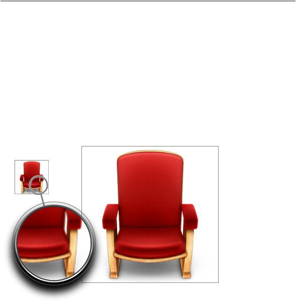
For example, the 512 x 512 pixel version of the Front Row application icon (shown in Figure 11-20) reveals more detail in the wood grain of the chair frame and the velvet of the upholstery than in the 128 x 128 pixel version, resulting in a more realistic image.
Figure 11-20 A 512 x 512 pixel icon should not be a scaled-up 128 x 128 pixel icon
Simply enlarging a smaller icon to make a larger icon will not provide the sharpness and detail required.
You also need to be aware of how the Cover Flow view in Finder displays your application icon. In Cover Flow, icons are displayed against a black background, set above a highly reflective surface. Because of this, you may need to adjust your icon in the following ways:
■If your icon includes a drop shadow, be sure to make the shadow fully black.
If the drop shadow contains any gray tones, the gray will show up against the black background and make the shadow look more like a glow.
■If your icon is very dark or has black edges, consider adding a slight inner glow just inside the edges to make the icon stand out against the black background.
Creating Icons |
145 |
2008-06-09 | © 1992, 2001-2003, 2008 Apple Inc. All Rights Reserved.
C H A P T E R 1 1
Icons
If you don’t add a glow to make the edges of your icon prominent, it might appear to dissolve into the black background of the Cover Flow view.
■Avoid giving important parts of your icon high alpha levels (that is, lots of transparency), especially in the lower half of the icon. Areas with too much alpha may get clipped.
In Cover Flow view, the Finder positions icons so that they appear to be on the same plane. To do this, the Finder begins examining an icon at the bottom edge, looking for pixels that are opaque enough to use for alignment. If there is significant transparency in the lower area of your icon, the Finder ignores the transparent pixels in favor of the first opaque pixel it finds. The Finder uses the opaque pixel to determine the icon’s alignment with respect to the plane and may clip the transparent pixels below it.
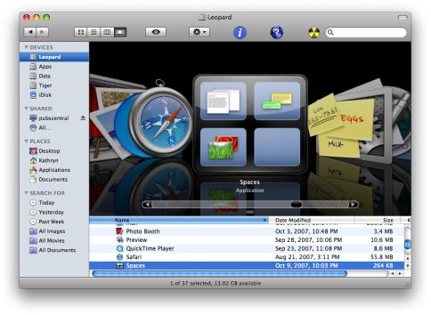
Toseewhysomeoftheseadjustmentsmightbenecessary,youcanexaminethestandardMacOSXapplication icons in a computer running Mac OS X v10.5 or later. For example, in Figure 11-21, the Spaces icon includes a subtle glow inside the edge of the black frame, which makes it more visible on the black background.
Figure 11-21 An icon with black edges can include an inner glow to look good in Cover Flow
The Mail icon, on the other hand, includes a cancellation mark that extends past the bottom edge of the stamp image (you can see this icon in Figure 11-2 (page 136)). Because this area of the icon has high alpha levels, the Finder uses an opaque pixel at the bottom left corner of the stamp image to align the icon, clipping some of the cancellation mark, as shown in Figure 11-22.
146 |
Creating Icons |
2008-06-09 | © 1992, 2001-2003, 2008 Apple Inc. All Rights Reserved.