

- •Understanding Why Communication Matters
- •Communicating as a Professional
- •Exploring the Communication Process
- •Committing to Ethical Communication
- •Communicating in a World of Diversity
- •Using Technology to Improve Business Communication
- •Chapter Review and Activities
- •Test Your Knowledge
- •Apply Your Knowledge
- •Practice Your Skills
- •Expand Your Skills
- •References
- •Understanding the Three-Step Writing Process
- •Analyzing the Situation
- •Gathering Information
- •Selecting the Right Medium
- •Organizing Your Message
- •Chapter Review and Activities
- •Test Your Knowledge
- •Apply Your Knowledge
- •Practice Your Skills
- •Expand Your Skills
- •References
- •Adapting to Your Audience: Building Strong Relationships
- •Adapting to Your Audience: Controlling Your Style and Tone
- •Composing Your Message: Choosing Powerful Words
- •Composing Your Message: Creating Effective Sentences
- •Composing Your Message: Crafting Coherent Paragraphs
- •Using Technology to Compose and Shape Your Messages
- •Chapter Review and Activities
- •Test Your Knowledge
- •Apply Your Knowledge
- •Practice Your Skills
- •Expand Your Skills
- •References
- •Revising Your Message: Evaluating the First Draft
- •Revising to Improve Readability
- •Editing for Clarity and Conciseness
- •Using Technology to Revise Your Message
- •Producing Your Message
- •Proofreading Your Message
- •Distributing Your Message
- •Chapter Review and Activities
- •Test Your Knowledge
- •Apply Your Knowledge
- •Practice Your Skills
- •Expand Your Skills
- •References
- •Electronic Media for Business Communication
- •Social Networks
- •Information and Media Sharing Sites
- •Instant Messaging and Text Messaging
- •Blogging
- •Podcasting
- •Chapter Review and Activities
- •Test Your Knowledge
- •Apply Your Knowledge
- •Practice Your Skills
- •Expand Your Skills
- •References
- •Strategy for Routine Requests
- •Common Examples of Routine Requests
- •Strategy for Routine Replies and Positive Messages
- •Common Examples of Routine Replies and Positive Messages
- •Chapter Review and Activities
- •Test Your Knowledge
- •Apply Your Knowledge
- •Practice Your Skills
- •Expand Your Skills
- •References
- •Using the Three-Step Writing Process for Negative Messages
- •Using the Direct Approach for Negative Messages
- •Using the Indirect Approach for Negative Messages
- •Sending Negative Messages on Routine Business Matters
- •Sending Negative Employment Messages
- •Sending Negative Organizational News
- •Responding to Negative Information in a Social Media Environment
- •Chapter Review and Activities
- •Test Your Knowledge
- •Apply Your Knowledge
- •Practice Your Skills
- •Expand Your Skills
- •References
- •Using the Three-Step Writing Process for Persuasive Messages
- •Developing Persuasive Business Messages
- •Common Examples of Persuasive Business Messages
- •Developing Marketing and Sales Messages
- •Chapter Review and Activities
- •Test Your Knowledge
- •Apply Your Knowledge
- •Practice Your Skills
- •Expand Your Skills
- •References
- •Applying the Three-Step Writing Process to Reports and Proposals
- •Supporting Your Messages with Reliable Information
- •Conducting Secondary Research
- •Conducting Primary Research
- •Planning Informational Reports
- •Planning Analytical Reports
- •Planning Proposals
- •Chapter Review and Activities
- •Test Your Knowledge
- •Apply Your Knowledge
- •Practice Your Skills
- •Expand Your Skills
- •References
- •Writing Reports and Proposals
- •Writing for Websites and Wikis
- •Illustrating Your Reports with Effective Visuals
- •Completing Reports and Proposals
- •Chapter Review and Activities
- •Test Your Knowledge
- •Apply Your Knowledge
- •Practice Your Skills
- •Expand Your Skills
- •References
- •Finding the Ideal Opportunity in Today’s Job Market
- •Planning Your Résumé
- •Writing Your Résumé
- •Completing Your Résumé
- •Chapter Review and Activities
- •Test Your Knowledge
- •Apply Your Knowledge
- •Practice Your Skills
- •Expand Your Skills
- •References
- •Submitting Your Résumé
- •Understanding the Interviewing Process
- •Preparing for a Job Interview
- •Interviewing for Success
- •Following Up After an Interview
- •Chapter Review and Activities
- •Test Your Knowledge
- •Apply Your Knowledge
- •Practice Your Skills
- •Expand Your Skills
- •References
- •Index

282 Unit 4: Longer Business Messages
Drafting Proposal Content
In an unsolicited proposal, your introduction needs to convince readers that a problem or an opportunity exists.
Readers understand that a proposal is a persuasive message, so they’re willing to accommodate a degree of promotional emphasis in your writ- ing—as long as it is professional and focused on their needs.
All of the guidelines for writing reports apply to proposals as well, but these persuasive messages also have some unique considerations. As Chapter 10 notes, the most important factor is whether the proposal is solicited or unsolicited, because this can affect your organization, content, and tone.
The general purpose of any proposal is to persuade readers to do something, so your writing approach should be similar to that used for persuasive messages, perhaps including the use of the AIDA model to gain attention, build interest, create desire, and motivate action. Here are some additional strategies to strengthen your argument:2
■Demonstrate your knowledge.
■Provide concrete information and examples.
■Research the competition so you know what other proposals your audience is likely to read.
■Demonstrate that your proposal is appropriate and feasible for your audience.
■Relate your product, service, or personnel to the reader’s unique needs.
Moreover, make sure your proposal is error-free, visually inviting, and easy to read. Readers will prejudge the quality of your products, services, or capabilities by the quality of your proposal. Errors, omissions, and inconsistencies will work against you—and might even cost you important career and business opportunities.
In addition to the productivity tools listed on page 117, consider using proposal-writing software if you and your company need to submit proposals as a routine part of doing business. These programs can automatically personalize proposals, ensure proper structure (making sure you don’t forget any sections, for instance), organize storage of all your boilerplate text, integrate contact information from sales databases, scan RFPs to identify questions (and even assign them to content experts), and fill in preliminary answers to common questions from a centralized knowledge base.3
See Table 11.1 for a summary of the content to include in reports and proposals.
2 LEARNING OBJECTIVE
Identify six guidelines for drafting effective website content, and offer guidelines for becoming a valuable wiki contributor.
Readers don’t approach websites and online reports in the same way they approach printed documents, so your approach as a writer needs to change as well.
Writing for Websites and Wikis
In addition to standalone reports and proposals, you may be asked to write in-depth content for websites or to collaborate on a wiki. The basic principles of report writing apply to both formats, but each has some unique considerations as well.
Drafting Website Content
Major sections on websites, particularly those that are fairly static (unlike, say, a blog) function in much the same way as reports. The skills you’ve developed for report writing adapt easily to this environment, as long as you keep a few points in mind:
■Because readers can be skeptical of online content, take special care to build trust with your intended audiences. Make sure your content is accurate, current, complete, and authoritative.
■As much as possible, adapt your content for a global audience. Translating content is expensive, so some companies compromise by localizing the homepage while keeping the deeper, more detailed content in its original language.
■In an environment that presents many reading challenges, compelling, reader-oriented content is a key to success.4 Wherever you can, use the inverted pyramid style, in which you cover the most important information briefly at first and then gradually reveal successive layers of detail—letting readers choose to see those additional layers if they want to.
■Present your information in a concise, skimmable format (see Figure 11.2). Effective websites use a variety of means to help readers skim pages quickly, including lists, use of color and boldface, informative headings, and helpful summaries that give readers the option of learning more if they choose to do so.

Chapter 11: Writing and Completing Reports and Proposals |
283 |
The left-hand navigation choices offer access to major topics related to composing and sending email messages; these are the topics that all readers are likely to be interested in.
The information is divided  into “essentials” and “extras,”
allowing readers to get the most important information in a matter of seconds.
Figure 11.2 Writing for the Web
This page from the Google Help feature for Gmail demonstrates several important points about effective web writing.
Source: Google, Inc.
 The choices on the right side of the screen are supplemental topics that may be of interest to some readers.
■Write effective links that serve for both site navigation and content skimming. Above all, clearly identify where a link will take readers. Don’t rely on cute wordplay that obscures the content, and don’t force readers to click through and try to figure out where they’re going.
■Make your website a “living” document by regularly adding fresh content and deleting content that is out of date or no longer relevant to your target audience. Over time, web-
sites can accumulate many pages of outdated information that get in the way and send a negative message about the company’s efforts to stay on top of user needs.5
Collaborating on Wikis
As Chapter 2 points out, using wikis is a great way for teams and other groups to collaborate on writing projects, from brief articles to long reports and reference works. Although wikis have many benefits, they do require a unique approach to writing. To be a valuable wiki contributor, keep these points in mind:6
■ Let go of traditional expectations of authorship, including individual recognition Effective collaboration on wikis
and control. |
requires a unique approach |
|
to writing. |
||
|
■Encourage all team members to improve each other’s work.
■Use page templates and other formatting options to make sure your content matches the rest of the wiki.
■Use the separate editing and discussion capabilities appropriately.
■Take advantage of the sandbox, if available; this is a “safe,” nonpublished section of the wiki where team members can practice editing and writing.
Wikis usually have guidelines to help new contributors integrate their work into the group’s ongoing effort. Be sure to read and understand these guidelines, and don’t be afraid to ask for help.
If you are creating a new wiki, think through your long-term purpose carefully, just as you would with a new blog or podcast channel. Doing so will help you craft appropriate guidelines, editorial oversight, and security policies. For instance, the PlayStation development team at Sony uses a wiki to keep top managers up to date on new products; because this information is highly confidential, access to the wiki is tightly controlled.7

284 Unit 4: Longer Business Messages
Before you add new pages to a wikis, figure out how the material fits with the existing content.
If you are adding a page or an article to an existing wiki, figure out how this new material fits in with the existing organization. Also, learn the wiki’s preferred style for handling incomplete articles. For example, on the wiki that contains the user documentation for the popular WordPress blogging software, contributors are discouraged from adding new pages until the content is “fairly complete and accurate.”8
If you are revising or updating an existing wiki article, use the checklist on page 107 in Chapter 5 to evaluate the content before you make changes. If you don’t agree with published content and plan to revise it, you can use the wiki’s discussion facility to share your concerns with other contributors. The wiki environment should encourage discussions and even robust disagreements, as long as everyone remains civil and respectful.
3 LEARNING OBJECTIVE
Discuss six principles of graphic design that can improve the quality of your visuals, and identify the major types of business visuals.
Visual literacy is the ability to create effective images and to interpret images correctly.
Illustrating Your Reports with Effective Visuals
Well-designed visual elements can enhance the communication power of textual messages and, in some instances, even replace textual messages. Generally speaking, in a given amount of time, effective images can convey much more information than text.9 Using pictures is also a helpful way to communicate with multilingual audiences.
Given the importance of visuals in today’s business environment, visual literacy—the ability (as a sender) to create effective images and (as a receiver) to correctly interpret visual messages—has become a key business skill.10 Even without any formal training in design, being aware of the following six principles will help you be a more effective visual communicator:
■ |
Consistency. Think of consistency as visual parallelism, similar to textual parallelism |
|
Pay close attention to consistency, |
that helps audiences understand and compare a series of ideas.11 You can achieve visual |
|
contrast, balance, emphasis, conven- |
||
tion, and simplicity. |
parallelism through the consistent use of color, shape, size, texture, position, scale, or |
|
|
typeface. |
|
■ Contrast. To emphasize differences, depict items in contrasting colors, such as red and |
||
|
blue or black and white. To emphasize similarities, make color differences more subtle. |
|
■ |
Balance. Visual balance can be either formal, in which the elements in the images are |
|
|
arranged symmetrically around a central point or axis, or informal, in which elements |
|
|
are not distributed evenly, but stronger and weaker elements are arranged in a way that |
|
|
achieves an overall effect of balance.12 Formal balance tends to feel calming and serious, |
|
|
whereas informal balance tends to feel dynamic and engaging (which is why most ad- |
|
|
vertising uses this approach, for example). |
|
■ Emphasis. Audiences usually assume that the dominant element in a design is the most |
||
|
important, so make sure that the visually dominant element really does represent the |
|
|
most important information. |
|
■ Convention. Just as written communication is guided by spelling, grammar, punctua- |
||
|
tion, and usage conventions, visual communication is guided by generally accepted rules |
|
|
|
or conventions that dictate virtually every aspect of design.13 |
|
|
In every culture, for instance, certain colors and shapes have |
REAL-TIME UPDATES |
specific meanings. |
|
Learn More by Watching This Video
The beauty of data visualization
Information designer David McCandless discusses the power of data visualization tools and techniques. Go to http://real-timeupdates.com/bce6 and click on Learn More. If you are using MyBCommLab, you can access Real-Time Updates within each chapter or under Student Study Tools.
■Simplicity. When you’re designing graphics for your documents, limit the number of colors and design elements and take care to avoid chartjunk—decorative
elements that clutter documents without adding any relevant information.14 Think carefully about using some of the chart features available in your software, too. Many
of these features can actually get in the way of effective visual communication.15 For example, three-dimensional bar charts, cones, and pyramids can look appealing, but
the third dimension usually adds no additional information and can be visually deceiving as well.16
Chapter 11: Writing and Completing Reports and Proposals |
285 |
Choosing the Right Visual for the Job
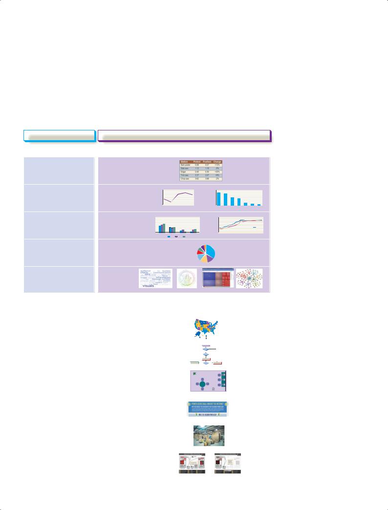
After you’ve identified which points would benefit most from visual presentation, your next decision is to choose the types of visuals to use. As you can see in Figure 11.3, you have many choices for business graphics. For certain kinds of information, the decision is usually obvious. If you want to present a large set of numeric values or detailed textual information, for example, a table is the obvious choice in most cases. Also, certain visuals are commonly used for certain applications; so, for example, your audience is likely to expect line charts and bar charts to show trends. (Note that chart and graph are used interchangeably for most of the display formats discussed here.)
You have many types of visuals to choose from, and each is best suited to particular communication tasks.
Communication Challenge |
|
Effective Visual Choice |
|
|
|
Presenting Data
To present individual, |
Table |
exact values |
|
To show trends in one or |
Line chart, |
|
4,250 |
Operating Revenue |
|
|
|
90% |
|
|
|
|
CommuniCo Staff Computer Skills |
|
|
|
|
|
|
||||||||||
|
|
|
4,500 |
|
|
|
|
100% |
|
|
|
|
|
|
|
|
|
|
|
|
|
|
|
|
|
|
|
|
|
more variables, or the |
bar chart |
|
4,000 |
|
|
|
|
|
80% |
|
|
|
|
|
|
|
|
|
|
|
|
|
|
|
|
|
|
|
|
|
|
|
|
|
|
|
50% |
|
|
|
|
|
|
|
|
|
|
|
|
|
|
|
|
|
|
|
|
||
|
|
$ |
3,750 |
|
|
|
|
|
70% |
|
|
|
|
|
|
|
|
|
|
|
|
|
|
|
|
|
|
|
|
|
|
Million |
3,500 |
|
|
|
|
|
60% |
|
|
|
|
|
|
|
|
|
|
|
|
|
|
|
|
|
|
|
|
relationship between those |
|
3,250 |
|
|
|
|
|
40% |
|
|
|
|
|
|
|
|
|
|
|
|
|
|
|
|
|
|
|
|
|
|
|
3,000 |
|
|
|
|
|
20% |
|
|
|
|
|
|
|
|
|
|
|
|
|
|
|
|
|
|
|
|
|
|
|
|
|
|
|
|
|
|
30% |
|
|
|
|
|
|
|
|
|
|
|
|
|
|
|
|
|
|
|
|
|
|
|
2,750 |
|
|
|
|
|
|
|
|
|
|
|
|
|
|
|
|
|
|
|
|
|
|
|
|
|
|
variables, over time |
|
|
2,500 |
|
|
|
|
|
10% |
|
Messaging |
|
|
|
|
|
|
|
Publishing |
Development Programming |
|||||||||
|
|
0 |
|
|
|
|
|
0 |
|
|
|
|
|
|
|
|
|||||||||||||
|
|
|
2001 |
2002 |
2003 |
2004 |
2005 |
|
|
Instant |
|
Graphics |
Sreadsheets |
Desktop |
Database |
HTML/XML |
|||||||||||||
To compare two or more |
Bar chart, |
90% |
|
Worldwide Market Share |
|
|
|
|
|
|
|
Average Kiln Temperatures, North Island Facility, Day Shift |
|
|
|
||||||||||||||
|
|
100% |
|
|
|
|
|
|
2500 |
|
|
|
|
|
|
|
|
|
|
|
|
|
|
|
|
|
|
|
|
sets of data |
line chart |
80% |
|
|
|
|
|
|
2000 |
|
|
|
|
|
|
|
|
|
|
|
|
|
|
|
|
|
|
|
|
50% |
|
|
|
|
|
|
|
|
|
|
|
|
|
|
|
|
|
|
|
|
|
|
|
|
|
|
|
||
|
|
70% |
|
|
|
|
|
˚F |
|
|
|
|
|
|
|
|
|
|
|
|
|
|
|
|
|
|
|
|
|
|
|
60% |
|
|
|
|
|
Temperature |
1500 |
|
|
|
|
|
|
|
|
|
|
|
|
|
|
|
|
|
|
|
|
|
|
40% |
|
|
|
|
|
1000 |
|
|
|
|
|
|
|
|
|
|
|
|
|
|
|
|
|
Kiln B |
|
||
|
|
30% |
|
|
|
|
|
|
|
|
|
|
|
|
|
|
|
|
|
|
|
|
|
|
|
|
Kiln A |
|
|
|
|
20% |
|
|
|
|
|
|
500 |
|
|
|
|
|
|
|
|
|
|
|
|
|
|
|
|
|
|
|
|
|
|
10% |
|
|
|
|
|
|
|
|
|
|
|
|
|
|
|
|
|
|
|
|
|
|
|
|
|
|
|
|
|
0 |
North America |
Central/ |
Asis/Pacific |
Europe/Africa/ |
|
0 |
|
|
|
|
|
|
|
|
|
|
|
|
|
|
|
|
|
|
|
|
|
|
|
|
|
South America |
2004 |
2005 |
Middle East |
|
8:00 |
AM |
AM |
AM |
AM |
AM |
AM |
AM |
AM |
AM |
|
AM |
AM |
AM |
AM |
AM |
AM |
AM |
AM |
AM |
AM |
|
|
|
|
2003 |
|
|
8:30 |
9:00 |
9:30 |
10:00 |
10:30 |
11:00 |
11:30 |
12:00 |
12: |
30 |
1:00 |
1:30 |
2:00 |
2:30 |
3:00 |
3:30 |
4:00 |
4:30 |
5:00 |
|
|||
To show frequency or |
Pie chart |
Year-End Head Count by Function |
|
Executives, 8 |
Assemblers, 67 |
||
|
|
Accounting, 14 |
|
distribution of parts in a |
|
Facilities, 14 |
|
|
Shipping, 17 |
|
|
whole |
|
Admin support, 25 |
|
|
|
|
|
|
|
|
Engineers, 27 |
|
|
Marketing/sales, 28 |
|
To show massive data sets , |
Data |
|
|
complex quantities, or |
visualization |
|
|
dynamic data |
|
|
|
Figure 11.3 Selecting the Best Visual
You often have more than one option for communicating data and information visually; choose the best visual for each situation based on audience needs, the medium you’ll use for your report, and your graphics capabilities.
Presenting Information, Concepts, and Ideas
To show geographic |
|
Map |
||||||
relationships or comparisons |
|
|
|
|
|
|
|
|
To illustrate processes or |
|
Flowchart, |
||||||
procedures |
|
diagram |
||||||
|
|
|
|
|
|
|
||
|
|
|
|
|
|
|
|
|
|
|
|
|
|
|
|
||
To show conceptual or |
|
Drawing |
||||||
spatial relationships |
|
|
|
|
|
|
|
|
(simplified) |
|
|
|
|
|
|
|
|
To tell a data-driven |
|
Infographic |
||||||
story visually |
|
|
|
|
|
|
|
|
To show spatial relationships |
|
Photograph |
||||||
(realistic) |
|
|
|
|
|
|
|
|
To show processes, |
|
Animation, |
||||||
transformations, and other |
|
video |
||||||
activities |
|
|
|
|
|
|
|
|
|
|
|
|
|
|
|
|
|

286 Unit 4: Longer Business Messages
MyBCommLab Apply
Figure 11.4’s key concepts. Go to mybcommlab.com and follow this path: Course Content Chapter 11
DOCUMENT MAKEOVERS
Printed tables can display extensive amounts of data, but tables for online display and electronic presentations need to be simpler.
Line charts are commonly used to show trends over time or the relationship between two variables.
|
|
Multicolumn Heading |
|
Single-Column |
|
|
|
|
|
|
Column Subheading |
Column Subheading |
Column Subheading |
Heading |
|
|
|||
|
|
|
|
|
Row Heading |
xxx |
xxx |
xxx |
xxx |
|
|
|
|
|
Row Heading |
xxx |
xxx |
xxx |
xxx |
|
|
|
|
|
Row Subheading |
xxx |
xxx |
xxx |
xxx |
|
|
|
|
|
Row Subheading |
xxx |
xxx |
xxx |
xxx |
|
|
|
|
|
Row Heading |
xxx |
xxx |
xxx |
xxx |
|
|
|
|
|
Row Heading |
xxx |
xxx |
xxx |
xxx |
|
|
|
|
|
TOTALS |
xxx |
xxx |
xxx |
xxx |
|
|
|
|
|
Figure 11.4 Parts of a Table
Here are the standard parts of a table. No matter which design you choose, make sure the layout is clear and the individual rows and columns are easy to follow.
Tables
When you need to present detailed, specific information, choose a table, a systematic arrangement of data in columns and rows. Tables are ideal when your audience needs information that would be either difficult or tedious to handle in the main text. Most tables contain the standard parts illustrated in Figure 11.4. Follow these guidelines to create clear, effective tables:
■Use common, understandable units and clearly identify them: dollars, percentages, price per ton, and so on.
■Express all items in a column in the same unit and round off for simplicity, if doing so doesn’t distort the meaning.
■Label column headings clearly and use subheads if necessary.
■Separate columns or rows with lines, extra space, or colors to make the table easy to follow. Make sure the intended reading direction—down the columns or across the rows—is obvious, too.
■Keep online tables small enough to read comfortably on screen.
■Document the source of data using the same format as a text footnote (see Appendix B).
Line Charts and Surface Charts
A line chart (see Figure 11.5) illustrates trends over time or plots the relationship of two variables. In line charts that show trends, the vertical, or y, axis shows the amount, and the horizontal, or x, axis shows the time or other quantity against which the amount is being measured. You can plot just a single line or overlay multiple lines to compare different entities.
Average Kiln Temperatures, North Island Facility, Day Shift
|
2,500 |
|
|
|
|
|
|
|
|
|
|
|
|
|
|
|
|
|
|
|
|
2,000 |
|
|
|
|
|
|
|
|
|
|
|
|
|
|
|
|
|
|
|
˚F |
|
|
|
|
|
|
|
|
|
|
|
|
|
|
|
|
|
|
|
|
Temperature |
1,500 |
|
|
|
|
|
|
|
|
|
|
|
|
|
|
|
|
|
|
|
1,000 |
|
|
|
|
|
|
|
|
|
|
|
|
|
|
|
|
Kiln A |
|
||
|
|
|
|
|
|
|
|
|
|
|
|
|
|
|
|
|
|
|||
|
|
|
|
|
|
|
|
|
|
|
|
|
|
|
|
|
Kiln B |
|
|
|
|
|
|
|
|
|
|
|
|
|
|
|
|
|
|
|
|
|
|
|
|
|
500 |
|
|
|
|
|
|
|
|
|
|
|
|
|
|
|
|
|
|
|
|
0 |
|
|
|
|
|
|
|
|
|
|
|
|
|
|
|
|
|
|
|
|
|
AM |
AM |
AM |
AM |
AM |
AM |
AM |
AM |
PM |
PM |
PM |
PM |
PM |
PM |
PM |
PM |
PM |
PM |
PM |
|
8:00 |
8:30 |
9:00 |
9:30 |
10:00 |
10:30 |
11:00 |
11:30 |
12:00 |
12:30 |
1:00 |
1:30 |
2:00 |
2:30 |
3:00 |
3:30 |
4:00 |
4:30 |
5:00 |
|
Figure 11.5 |
Line Chart |
|
|
|
|
|
|
|
|
|
|
|
|
|
|
|
|
|||
This two-line chart compares the temperatures measured inside two cement kilns from 8:00 A.M. to 5:00 P.M.
Chapter 11: Writing and Completing Reports and Proposals |
287 |
Home Game Ticket Sales
|
90,000 |
|
|
|
|
|
|
|
80,000 |
|
|
|
|
|
|
Game |
70,000 |
|
|
|
|
|
|
60,000 |
|
|
|
|
|
|
|
|
|
|
|
|
|
|
|
per |
50,000 |
|
|
|
|
|
|
|
|
|
|
|
|
|
|
Average |
40,000 |
|
|
|
|
|
|
30,000 |
|
|
|
|
|
|
|
20,000 |
|
|
|
|
|
|
|
|
|
|
|
|
|
|
|
|
10,000 |
|
|
|
|
|
|
|
0 |
|
|
|
|
|
|
|
2006 |
2007 |
2008 |
2009 |
2010 |
2011 |
2012 |
|
Other |
|
Families |
|
Staff |
|
|
|
|||
|
Students |
|
Alumni |
|
|
|
|
|
|
Figure 11.6 Surface Chart
Surface or area charts can show a combination of trends over time and the individual contributions of the components of a whole.
A surface chart, also called an area chart, is a form of line chart that shows a cumulative effect; all the lines add up to the top line, which represents the total (see Figure 11.6). This type of chart helps you illustrate changes in the composition of something over time. When preparing a surface chart, put the most significant line at the bottom and move up toward the least significant.
Bar Charts and Pie Charts
A bar chart portrays numbers with the height or length of its rectangular bars, making a series of numbers easy to grasp quickly. Bars can be oriented horizontally or vertically (in which case they are sometimes referred to as column charts). Bar charts are particularly valuable when you want to show or compare quantities over time. As the charts in Figure 11.7 suggest, bar charts can appear in various forms. Specialized bar charts such as timelines and Gantt charts are used often in project management, for example.
A pie chart is a commonly used tool for showing how the parts of a whole are distributed. Although pie charts are popular and can quickly highlight the dominant parts of a whole, they are often not as effective as bar charts or tables. For example, comparing percentages accurately is often difficult with a pie chart but can be fairly easy with a bar chart (see Figure 11.8 on page 289). Making pie charts easier to read with accuracy can require labeling each slice with data values, in which case a table might serve the purpose more effectively.17
Bar charts can show a variety of relationships among two or more variables.
Pie charts are used frequently in business reports, but in many instances they are not as helpful to readers as bar charts and other types of visuals would be.
(a) CommuniCo Staff Computer Skills
100% |
|
|
|
|
|
|
90% |
|
|
|
|
|
|
80% |
|
|
|
|
|
|
70% |
|
|
|
|
|
|
60% |
|
|
|
|
|
|
50% |
|
|
|
|
|
|
40% |
|
|
|
|
|
|
30% |
|
|
|
|
|
|
20% |
|
|
|
|
|
|
10% |
|
|
|
|
|
|
0 |
|
|
|
|
|
|
Instant |
Graphics |
Blogging |
Desktop |
Podcasting |
HTML/XML |
|
|
Messaging |
|
|
Publishing |
|
Programming |
(continued)
Figure 11.7 The Versatile Bar Chart
Here are six of the dozens of variations possible with bar charts: singular (11.7a), grouped (11.7b), deviation (11.7c), segmented (11.7d), combination (11.7e), and paired (11.7f).

288 |
Unit 4: Longer Business Messages |
|
|
|
|
|
|
(b) Worldwide Market Share |
|
|
|
100% |
|
|
|
|
|
90% |
|
|
|
|
|
80% |
|
|
|
|
|
70% |
|
|
|
|
|
60% |
|
|
|
|
|
50% |
|
|
|
|
|
40% |
|
|
|
|
|
30% |
|
|
|
|
|
20% |
|
|
|
|
|
10% |
|
|
|
|
|
0 |
|
|
|
|
|
|
North America |
Central/ |
Asia/Pacific |
Europe/Africa/ |
|
|
|
South America |
|
|
Middle East |
|
|
2011 |
2012 |
2013 |
|
(c) CommuniCo Stock Price
$50.00
high $45.00  close
close
$40.00
open
$35.00
low
$30.00
12/5 |
12/6 |
12/7 |
12/8 |
12/9 |
(d) CommuniCo Preferred Communication Media
100%
90%
80%
70%
60%
50%
40%
30%
20%
10%
0
|
|
Sales |
Engineering |
Admin |
||
|
IM |
Telephone |
Text Messaging |
Face-to-Face |
||
|
||||||
(e) CommuniCo Employee Training Costs
|
16,000 |
|
|
|
|
8 |
|
|
14,000 |
|
|
|
|
7 |
millions) ($ Costs Training |
|
12,000 |
|
|
|
|
6 |
|
Headcount |
10,000 |
|
|
|
|
5 |
|
8,000 |
|
|
|
|
4 |
||
6,000 |
|
|
|
|
3 |
||
4,000 |
|
|
|
|
2 |
||
2,000 |
|
|
|
|
1 |
||
|
|
|
|
|
|
||
|
0 |
|
|
|
|
0 |
|
|
2008 |
2009 |
2010 |
2011 |
2012 |
2013 |
|
Headcount |
|
Training Costs |
|
Figure 11.7 (continued)
|
|
|
|
|
|
|
|
Chapter 11: Writing and Completing Reports and Proposals 289 |
|
|
(f) Conference Attendance by Gender |
|
|||||
|
|
Women in |
Men in |
|
||||
|
|
Attendance |
Attendance |
|
||||
|
|
|
|
|
|
|
|
San Diego Conference |
|
750 |
|
600 |
|
|
|
||
|
|
|
|
|
|
|
|
Las Vegas Conference |
|
|
|
|
|
|
|
|
|
|
|
590 |
|
800 |
|
|
||
|
|
|
|
|
|
|
|
Miami Conference |
|
|
|
|
|
|
|
|
|
|
950 |
|
450 |
|
|
|
||
|
|
|
|
|
|
|
|
|
Figure 11.7 (continued)
Year-End Head Count by Function |
|
|
|
Year-End Head Count by Function |
|
|
||||||||||
Executives, 8 |
|
Executives |
|
|
|
|
|
|
|
|
|
|
|
|
|
|
|
|
|
8 |
|
|
|
|
|
|
|
|
|
|
|
||
|
|
|
|
|
|
|
|
|
|
|
|
|
|
|||
Accounting, 14 |
|
|
|
|
|
|
|
|
|
|
|
|
|
|
||
Assemblers, 67 |
|
|
|
|
|
|
|
|
|
|
|
|
|
|
|
|
|
|
|
|
|
|
|
|
|
|
|
|
|
|
|
|
|
Facilities, 14 |
|
Accounting |
|
|
|
14 |
|
|
|
|
|
|
|
|
|
|
|
Facilities |
|
|
|
14 |
|
|
|
|
|
|
|
|
|
||
|
|
|
|
|
|
|
|
|
|
|
|
|
|
|||
Shipping, 17 |
|
Shipping |
|
|
|
|
17 |
|
|
|
|
|
|
|
|
|
|
|
|
|
|
|
|
|
|
|
|
|
|
|
|||
|
Admin |
|
|
|
|
|
25 |
|
|
|
|
|
|
|||
|
|
|
|
|
|
|
|
|
|
|
|
|
||||
|
|
Engineers |
|
|
|
|
|
|
27 |
|
|
|
|
|
|
|
|
|
|
|
|
|
|
|
|
|
|
|
|
|
|||
Admin, 25 |
|
Sales |
|
|
|
|
|
|
|
28 |
|
|
|
|
|
|
|
|
|
|
|
|
|
|
|
|
|
|
|
|
|||
|
|
Assemblers |
|
|
|
|
|
|
|
|
|
|
|
67 |
|
|
|
|
|
|
|
|
|
|
|
|
|
|
|
|
|
||
|
Sales, 28 |
|
|
|
|
|
|
|
|
|
|
|
|
|
|
|
Engineers, 27 |
|
|
0 |
10 |
20 |
30 |
40 |
50 |
60 |
70 |
80 |
|||||
Figure 11.8 Pie Charts Versus Bar Charts
Pie charts are used frequently, but they aren’t necessarily the best choice for many data presentations. This pie chart does make it easy to see that assemblers are the largest employee category, but other comparisons of slice sizes (such as Sales, Engineers, and Admin) are not as easy to make and require a numerical rather than a visual comparison. In contrast, the bar chart gives a quick visual comparison of every data point.
Data Visualization
Conventional charts and graphs are limited in several ways: Most types can show only a limited number of data points before becoming too cluttered to interpret, they often can’t show complex relationships among data points, and they can represent only numeric data. As computer technologies continue to generate massive amounts of data that can be combined and connected in endless ways, a diverse class of display capabilities known as data visualization works to overcome all these drawbacks.
Unlike conventional charts and graphs, data visualization is less about clarifying individual data points and more about extracting broad meaning from giant masses of data or putting the data in context.18 For instance, the Facebook “friend wheel” in Figure 11.9b on the next page offers a visual sense of this particular Facebook user’s network by showing which of his friends are friends of each other and thereby indicating “clustering” within the network (work friends, social friends, and so on). The diagram doesn’t attempt to show quantities but rather the overall nature of the network.
In addition to displaying large data sets and linkages within data sets, other kinds of visualization tools combine data with textual information to communicate complex or dynamic data much faster than conventional presentations can. For example, a tag cloud shows the relative frequency of terms, or tags (user-applied content labels), in an article, a blog, a website, survey data, or another collection of text.19 Figure 11.9 shows a few of the many data visualization tools now available.
Many of these tools are also interactive, meaning you can perform such tasks as zooming in on specific areas, changing the orientation of a display to view it from different angles, or exploring the connections of particular elements within the data set. Also, as you explore and experiment with data
Data visualization tools can overcome the limitations of conventional charts and other display types.
Unlike conventional charts, data visualization tools are more about uncovering broad meaning and finding hidden connections.

290 Unit 4: Longer Business Messages
(a) Website Linkage Map. This interactive network diagram shows the most active links to and from Apple’s homepage (www.apple.com). Website linkage map by TouchGraph.com
(c) Tag Cloud. This interactive “word chart” shows the relative frequency of the 50 most-used words in this chapter on visual communication (other than common words such as and, or, and the).
(b) Facebook Friend Wheel. This network diagram shows how the connections of Barry Graubart (an executive with an e-commerce company) are connected with
one another.
(d) Interactive Data Display. This interactive display conveys two company performance variables at once (sales and profits) for a large data set by using the size and color of the individual blocks.
Figure 11.9 Data Visualization
The range of data visualization displays is virtually endless; here are a few of the many ways to display complex sets of data.
Source: (a) Copyright © 2011 by TouchGraph, LLC. Reprinted with permission. (b) Copyright © 2012 by Facebook. Reprinted with permission. (d) Used with permission from Microsoft®. Microsoft Dynamics NAV 2009 can be accessed at: www.microsoft.com/presspass/gallery.
Be aware that there is a formal symbolic “language” in flowcharting; each shape has a specific meaning.
visualization tools, keep in mind that, like all tools, they can be used to good effect or misused to bad effect. Visualizations that might look dazzling at first can actually have little or no practical communication value. In fact, some data visualizations are intended to be works of art more than practical tools.
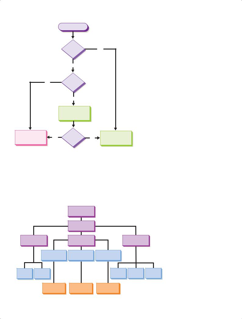
Flowcharts and Organization Charts
A flowchart (see Figure 11.10) illustrates a sequence of events from start to finish; it is indispensable when illustrating processes, procedures, and sequential relationships. For general business purposes, you don’t need to be too concerned about the specific shapes on a flowchart; just be sure to use them consistently. However, you should be aware that there is a formal flowchart “language,” in which each shape has a specific meaning (diamonds are decision points, rectangles are process steps, and so on). If you’re communicating with computer programmers and others who are accustomed to formal flowcharting, make sure you use the correct symbols to avoid confusion.
As the name implies, an organization chart illustrates the positions, units, or functions in an organization and the ways they interrelate (see Figure 11.11). Organization charts can be used to portray almost any hierarchy, in fact, including the topics, subtopics, and supporting points you need to organize for a report.
Chapter 11: Writing and Completing Reports and Proposals |
291 |
Receive invoice
Valid
purchase No order?
Yes
Amount
Yes within
PO limit?
No
Verify overage with requesting dept.
Submit to accounts |
Yes |
Accepted? |
No |
Return invoice |
|
payable |
to vendor |
||||
|
|
|
Figure 11.10 Flowchart
Flowcharts show sequences of events and are most valuable when the process or procedure has a number of decision points and variable paths.
Maps, Drawings, Diagrams, Infographics, and Photographs
Maps can show location, distance, points of interest (such as competitive retail outlets), and geographic distribution of data, such as sales by region or population by state. In addition to presenting facts and figures, maps are useful for showing market territories, distribution
Use maps to represent statistics by geographic area and to show spatial relationships.
Administration and Faculty of Atlantic College
|
|
Board of Trustees |
|
|
|
|
|
President |
|
|
|
Dean of |
Dean of the |
|
Dean of |
|
|
Administration |
College |
|
Students |
|
|
|
Dean of Technical |
Dean of General |
Dean of Continuing |
|
|
|
Education Division |
Education Division |
Education Division |
|
|
Business |
Personnel |
|
Admissions |
Counselor |
Registrar |
Manager |
Manager |
|
Director |
||
|
|
|
|||
|
Technical |
General Education |
Continuing |
|
|
|
Education |
Education |
|
|
|
|
Division Faculty |
|
|
||
|
Division Faculty |
Division Faculty |
|
|
|
|
|
|
|
||
Figure 11.11 Organization Chart
An organization chart is the expected way to illustrate the hierarchy of positions in an organization.

292 Unit 4: Longer Business Messages
Drawings are sometimes better than photographs because they let you focus on the most important details.
routes, and facilities locations. When combined with databases and aerial or satellite photography in geographic information systems (GIS), maps become extremely powerful visual reporting tools.
Drawings and diagrams can show an endless variety of business concepts, such as the network of suppliers in an industry, the flow of funds through a company, or the process for completing payroll each week. More complex diagrams can convey technical topics such as the operation of a machine or repair procedures.
Diagrams that contain enough visual and textual information to function as independent documents are sometimes called infographics. Infographics have become
extremely popular on websites and blogs, partly because their eye-catching appeal attracts visitors, click-throughs, and social sharing. The best use of an infographic is to help readers make connections between fragmented pieces of information (see Figure 11.12), rather than simply dressing up basic data charts with design elements that might be attractive but add little to understanding.20
Photographs offer both functional and decorative value, and nothing can top a photograph when you need to show exact appearances. However, in some situations, a photograph can show too much detail, which is one reason repair manuals frequently use drawings instead of photos, for instance. Because audiences expect photographs to show literal visual truths, you must take care when using imageprocessing tools such as Adobe Photoshop.
Animation and Video
Computer animation and video can offer unparalleled visual impact when they offer appropriate content in a wellproduced package. At a simple level, you can animate shapes and text within electronic presentations (see Chapter 14). At a more sophisticated level, software such as Adobe Flash en-
ables the creation of multimedia files that include computer animation, digital video, and other elements.
The combination of simple digital video recording and video-sharing websites such as YouTube has spurred a revolution in business video applications in recent years. Product demonstrations, company overviews, promotional presentations, and training seminars are among the most popular applications of business video. Branded channels on YouTube, such as the Lie-Nielsen example presented on page 139 in Chapter 6, allow companies to present their videos as an integrated collection in a customized user interface.
To tie visuals to the text, introduce them in the text and place them near the points they illustrate.
Designing Effective Visuals
Computers make it easy to create visuals, but they also make it easy to create ineffective visuals. However, by following the design principles discussed on page 113, you can create basic visuals that are attractive and effective. If possible, have a professional designer set up a template for the various types of visuals you and your colleagues need to create. By specifying color palettes, typeface selections, slide layouts, and other choices, design templates have three important benefits: They help ensure better designs, they promote consistency across the organization, and they save everyone time by eliminating repetitive decision making.
Remember that the style and quality of your visuals communicate a subtle message about your relationship with the audience. A simple sketch might be fine for a working meeting but inappropriate for a formal presentation or report. On the other hand, elaborate, full-color visuals may be viewed as extravagant for an informal report but may be entirely appropriate for a message to top management or influential outsiders.
In addition to being well designed, visuals need to be well integrated with text. First, try to position your visuals so that your audience won’t have to flip back and forth (in printed documents) or scroll (on screen) between visuals and the text that discusses them.

Chapter 11: Writing and Completing Reports and Proposals |
293 |
Figure 11.12 Infographics
Well-designed infographics tell a story by showing readers how the various pieces of a picture fit together. To see this entire infographic, visit http://real-timeupdats.com/bce6 and click on Learn More.
Source: “Power Users Shall Inherit the Internet.” Copyright © Demandforce, Inc. in partnership with Column Five Media. Reprinted with permission.