

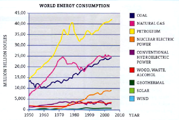
Appendix 5 graph
The graph in shows how much energy from different sources was used between 1950 and 2005. We can see that over this period the amount of energy used increased sharply and the largest amount of energy came from petroleum. In 1950 just over 13,000 million billion Joules was used but this figure rose sharply to reach a peak of roughly 40,000 million billion Joules in 1978. There was a dramatic fall to just over 30,000 million billion in the following five years before rising rapidly to reach 42,000 million billion Joules by 2005. The second and third largest sources of energy were natural gas and coal, which each accounted for about 25,000 million billion Joules in 2005. The graph shows that insignificant amounts of energy came from renewable sources during this time, but there was a growth in the amount of nuclear electric power after 1970, reaching approximately 8,000 million billion Joules in 2005. The fall in energy consumption in the years around 1980 was probably due to the world oil crisis.
Pie chart
The pie charts compare the use of different modes of passenger and cargo transportation in Croatia. It can be seen that more than half of all passengers choose to travel by road, accounting for 58%, while just under half of all cargo is carried by road. About a third of all passengers use rail transport but only 11 % of Croatia's cargo goes by rail. Croatia has a long coastline and just under a third of Croatia's cargo is transported by sea. However, only 9% of passengers use this form of transport. This is probably because sea transport is cheaper for cargo but too slow for passengers. Pipeline and inland water transportation account for 8% and 1 % of cargo transportation respectively.

Appendix 6 reading and interpreting graphs
Graphs are used in newspapers, magazines, history books, and science texts. Graphs are a great way to show a lot of information. But reading and interpreting graphs can be confusing. Answering questions about graphs can be harder still. Generally, when people make mistakes reading and interpreting graphs it is for the two following reasons.
Common Mistake 1
The most common mistake made seems to be trying to interpret the graph before really understanding the graph. Maybe it’s because students just want to get to the questions and get the work done, that make them skip the step of actively reading the graph. Graphs can be read just like you read the words in a story. Look at the title, the words describing the X and Y axis (the bottom and side of the graph), and the information that is presented. As you read the graph, think about whether the information makes sense. If it is a graph about the number of sunny days per month in each state, think about how much sun you usually get in your state in each month. Does the information seem to make sense with what you know? If it does, it is likely that you are reading the graph correctly. If it doesn’t make sense, try to figure out why it is not making sense before you try to answer the questions!
Common Mistake 2
The second mistake people make when reading and interpreting graphs is not understanding the questions. Break down each question to make sure you understand it. For example, if you are asked to compare the marriage and divorce rate between 1950 and 1998, you know that you will have to look at the difference between the numbers of marriages and divorces in those two years. If you are asked to describe a trend based on information in a graph, you will have to notice how the amounts increase or decrease over the time shown.
We’ll use the following bar graph as an example.
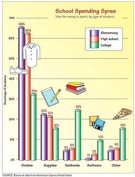
This is a bar graph with a lot of information. Our first priority is to look at the title and the categories. The title School Spending Spree, tells us that this graph has information about money spent on school. Hopefully this makes you think about the shopping you did before school started. A look at the categories listed in the bottom of the chart (the X axis) will help us to see what kinds of things money was spent on. The categories of clothes, supplies, textbooks, and software sound like typical ways to spend money for school. There is nothing unexpected like bubble gum or costumes.
Now that we know what the graph will tell us about, we need to look at the key and the writing on the left side of the graph. This left side of the graph is the Y axis. The key shows three colors: purple, red, and green. Purple represents elementary students, red is for high school students, and green stands for college students. The Y axis tells us that the information is being presented in percentages. In other words, if you added up all the purple percentages, it would equal 100%. The same is true for the red and the green.
Take a minute to think about what you would expect those different types of students to spend. Students who are growing the most would probably spend the most on clothing, while college students would probably spend the most on textbooks and software. A quick glance at the graph confirms these predictions. Before you try to answer any questions about the graph, read it carefully. See if there is any surprising information in it. This will help you to see if the information makes sense.
Answering questions about this graph could be tricky since it shows spending in five categories by three different age groups of students. Make sure as you answer the questions, you think about that.
Let’s try some questions about this graph.
What do college students typically spend the most on for school?
Look at all of the green bars. Which one shows the largest percentage by it? You will notice that the clothes category is 33%. That is more than the percentages spent on supplies, or textbooks, or software or the other category.
What is the difference in spending on clothing between elementary students and high school students?
The key to answering this question is to understand what the question is asking. If they are asking for the difference between two categories, you will need to subtract. You will be able to easily find the percentage of spending on clothing for elementary students (the purple bar in the clothes category) and for high school (the red bar in the clothes category). From there, it is a simple matter of subtraction.
66% – 63% = 3%
What do elementary students spend the least on for school?
This is one of the easiest questions to answer. Make sure you are looking at the purple bars. Which one is the smallest and shows the smallest percentage? Software, at 1% of the total expenditure is clearly the least.
What is the total expenditure on school supplies for high school and college students?
To answer this question, you must first make sure you understand what you are being asked. The word total helps you to know that you are going to be adding some numbers together. The category that you will look at is school supplies. The next step is to find the colors that correspond to high school and college. Add together the green and red columns.
Which category of student is likely to spend the most on miscellaneous expenditures?
You will notice that there is no category for miscellaneous items. There is only one possible category to which this can refer. The last column in this graph is labeled as other. It also shows a slice of pizza above it. The green bar is clearly the largest, so college students must spend the most on miscellaneous items.