

Chapter 4 Desktop Development
SourceAssembly refers to resource dictionaries that are included within your application. In our project, we need to have a themes folder where WPF will look for our style definitions.
WPF Startup
Moving on to App.xaml, this file is the starting point of our application. You’ll notice that it consists of two files, App.xaml and App.xaml.cs. The xaml file and the code behind code file are both the same partial class. When compiling, the XAML code gets transformed into C# code; this is very important to know because if you change the namespace or class name in the code behind, you’ll also need to change it on the XAML side of things.
Listing 4-10. Default App.xaml in WPF
<Application x:Class="Dotnet6WpfDemo.App" xmlns="http://schemas.microsoft.com/winfx/2006/xaml/ presentation" xmlns:x="http://schemas.microsoft.com/winfx/2006/xaml" xmlns:local="clr-namespace:Dotnet6WpfDemo" StartupUri="MainWindow.xaml">
<Application.Resources>
</Application.Resources>
</Application>
Listing 4-10 shows the XAML part of App.xaml. The important part here is the StartupUri; this property sets the first window to show when launching the application. You’ll notice that the code behind of App.xaml is quite empty. That is because the bootstrapping and launching of the WPF application is done in the generated App class that combines both the XAML and the code parts. You can inspect this file by going to your project in Windows Explorer and take a look in the obj folder.
93
Chapter 4 Desktop Development
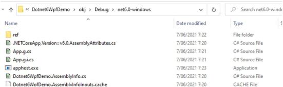
Figure 4-21. Generated files on disk
Every file in this folder that has .g. in its filename has been generated by the compiler. Listing 4-11 shows the generated App.g.cs file, the actual starting point of the application.
Listing 4-11. Generated application startup code
public partial class App : System.Windows.Application {
///<summary>
///InitializeComponent
///</summary>
[System.Diagnostics.DebuggerNonUserCodeAttribute()]
[System.CodeDom.Compiler.GeneratedCodeAttribute("PresentationBuild Tasks", "6.0.0.0")]
public void InitializeComponent() {
#line 5 "..\..\..\App.xaml"
this.StartupUri = new System.Uri("MainWindow.xaml", System. UriKind.Relative);
#line default #line hidden
}
94
Chapter 4 Desktop Development
///<summary>
///Application Entry Point.
///</summary>
[System.STAThreadAttribute()]
[System.Diagnostics.DebuggerNonUserCodeAttribute()]
[System.CodeDom.Compiler.GeneratedCodeAttribute("PresentationBuild Tasks", "6.0.0.0")]
public static void Main() {
Dotnet6WpfDemo.App app = new Dotnet6WpfDemo.App(); app.InitializeComponent();
app.Run();
}
}
Even in the generated startup code, there is not a lot going on; you will notice the StartupUri property being set to the value that was defined in App.xaml. Next to that there is the Main method that every application in .NET 6 has as a starting point. Main initializes our App class and calls its Run method; that method is part of WPF’s
Application base class. It contains the logic for creating the window wrapper and creates the first window to be shown. The application base class also contains some virtual methods that can be overridden for configuring lifecycle events; some examples of these methods are OnActivated, OnDeactivated, OnLoadCompleted, OnExit, OnStartup, OnSessionEnding, and OnNavigated.
XAML Layout
Moving on to MainWindow. MainWindow also consists of two files, just like the App class. Building your UI in a WPF application can be done quite similar to WinForms; WPF also has a graphical designer, for example. Visual Studio by default shows the XAML editor when opening a XAML file. We can switch to the designer by pressing shift-F7 or selecting Design on the bottom left of Visual Studio.
95
Chapter 4 Desktop Development
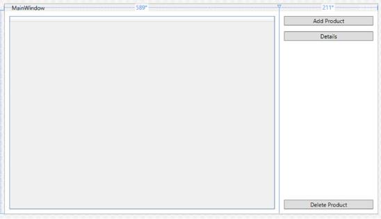
Figure 4-22. WPF graphical designer
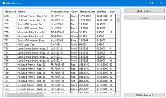
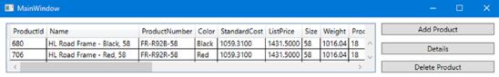
As you can see in Figure 4-22, it allows us to drag and drop controls from the toolbox and position them in a very graphical way, just like with WinForms. Figure 4-23 shows the running application; don’t worry about the logic to get data in the datagrid; we’re only looking at the design in this example.
96
Chapter 4 Desktop Development
Figure 4-23. The application
It really does look very similar to the WinForms version, so why does WPF even exist if it’s just a copy of WinForms? Because it really is not a copy of WinForms. The designer was created to make it easier for WinForms developers to cross over to WPF, but if you blindly follow the way you are used to doing things, you will not get very performant generated code. That brings us to another big difference between WinForms and WPF, the WinForms designer generated C# or Visual Basic code, and the WPF designer generates XAML code. XAML is an XML-based language that allows us to define layouts in a nested way, similar to HTML. Listing 4-12 shows the XAML code that was generated by using the designer.
Listing 4-12. Generated XAML code
<Window
x:Class="Dotnet6WpfDemo.MainWindow"
xmlns="http://schemas.microsoft.com/winfx/2006/xaml/presentation"
xmlns:x="http://schemas.microsoft.com/winfx/2006/xaml"
xmlns:d="http://schemas.microsoft.com/expression/blend/2008" xmlns:mc="http://schemas.openxmlformats.org/markup-compatibility/2006"
97
Chapter 4 Desktop Development
Title="MainWindow"
Width="800"
Height="450"
mc:Ignorable="d">
<Grid>
<Grid.ColumnDefinitions> <ColumnDefinition Width="589*" /> <ColumnDefinition Width="211*" />
</Grid.ColumnDefinitions>
<DataGrid x:Name="ProductsDataGrid" Margin="10,10,10,10" /> <Button
Grid.Column="1"
Width="191"
Margin="0,10,0,0"
HorizontalAlignment="Center"
VerticalAlignment="Top" Content="Add Product" />
<Button
Grid.Column="1"
Width="191"
Margin="0,43,0,0"
HorizontalAlignment="Center"
VerticalAlignment="Top" Content="Details" />
<Button
Grid.Column="1"
Width="191"
Margin="0,404,0,0"
HorizontalAlignment="Center"
VerticalAlignment="Top" Content="Delete Product" />
<Button
Grid.Column="1"
Width="0"
Margin="350,228,0,0"
98
Chapter 4 Desktop Development
HorizontalAlignment="Left"
VerticalAlignment="Top"
Content="Button" />
</Grid>
</Window>
XAML works with layout containers; one of those is the grid. A grid can get divided into rows and columns; elements in a grid get placed in a certain row and a certain column. The height of the rows and the width of the columns can be set in three ways. We can hardcode it in pixels, for example, <ColumnDefinition Width="150" /> creates a column that is 150 pixels wide. We can make the column size itself automatically by using <ColumnDefinition Width="Auto" />. Or we can use star notation to make a column by either taking up all available space or dividing all available space over a set of columns relatively as shown in Listing 4-13.
Listing 4-13. Relative sizing of columns
<Grid.ColumnDefinitions> <ColumnDefinition Width="1*" /> <ColumnDefinition Width="2*" />
</Grid.ColumnDefinitions>
In Listing 4-13, we see two columns defined using star notation. In total we get 3, meaning that the available space will be divided into three equal parts. The first column will get one part, hence 1*. The second column will get two parts, hence 2*.
If we go back to Listing 4-12, we will see that the columns of that grid are defined as 589* and 211*. That is because of the designer; I have created those columns by clicking in the designer. What happens is that the grid is divided up into 800 columns, 589 for the first column and 211 for the second column. This can be greatly simplified by changing the column definitions to Listing 4-14. Keep in mind that this will change the width ratio between the different columns. Always verify the result when changing values in XAML.
Listing 4-14. Simplified columndefinitions
<Grid.ColumnDefinitions> <ColumnDefinition Width="3*" /> <ColumnDefinition Width="1*" />
</Grid.ColumnDefinitions>
99
Chapter 4 Desktop Development
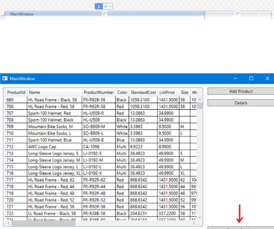
This can also be done from the designer; if you select the grid, its sizings become visible and can be adjusted as shown in Figure 4-24.
Figure 4-24. Changing grid layout from the designer
The next optimalization is easily spotted if we try to resize the form; notice what happens to the delete button.
Figure 4-25. Delete button is not responsive
As you can see, the button does not respond nicely to resizing the form. Listing 4-15 shows the XAML for this specific button.
Listing 4-15. XAML for the delete button
<Button
Grid.Column="1"
Width="191"
Margin="0,404,0,0"
100
Chapter 4 Desktop Development
HorizontalAlignment="Center"
VerticalAlignment="Top"
Content="Delete Product" />
The button is vertically aligned to the top, meaning that it will appear as close to the top of its parent as it is allowed. The margin property pushed the button down from the top. Margin takes four values, respectively, left, top, right, and bottom. Do take care not to mix this order up with the order in CSS, which is different! By setting the
VerticalAligment to Bottom, we can force the button down; by using the bottom margin, we can push it back up a bit to align with the datagrid. Figure 4-26 shows the improved responsiveness.
Figure 4-26. Delete button stays in relative place after resizing
Listing 4-16 shows the new XAML.
Listing 4-16. Improved XAML for the button
<Button
Grid.Column="1"
Margin="10"
HorizontalAlignment="Stretch"
VerticalAlignment="Bottom" Content="Delete Product" />
One last thing to improve is the XAML for the other two buttons; just like with the delete product button, their positioning is done with absolute values. What we could do is use a StackPanel within our Grid. A StackPanel is a container that will take all its
children and stack them in a vertical or horizontal list, giving the exact outcome we need for the two top buttons. However, every time you think of nesting containers, think twice. WPF has a layouting cycle; the grid will start calculating the size of every row, every column. If we place a StackPanel in Row index 0, column index 1, it will start calculating the sizing of the grid; if it reaches the StackPanel, it will need to do a new layout cycle
101
Chapter 4 Desktop Development
on the Grid because of the relative sizing of the panel, resulting in lower performance of the application. In other words, try to prevent nesting of layout containers as much as possible, even if it means more manual XAML work. The problem we’re facing can be fixed easily by adding extra rows to our grid. Listing 4-17 shows the full XAML code for the grid.
Listing 4-17. Full responsive XAML
<Grid>
<Grid.ColumnDefinitions> <ColumnDefinition Width="3*" /> <ColumnDefinition />
</Grid.ColumnDefinitions>
<Grid.RowDefinitions> <RowDefinition Height="Auto" /> <RowDefinition Height="Auto" /> <RowDefinition Height="*" />
</Grid.RowDefinitions>
<DataGrid
x:Name="ProductsDataGrid"
Grid.Row="0"
Grid.RowSpan="3"
Grid.Column="0" Margin="10,10,0,10" />
<Button
Grid.Row="0"
Grid.Column="1"
Margin="10"
HorizontalAlignment="Stretch"
VerticalAlignment="Top" Content="Add Product" />
<Button
Grid.Row="1"
Grid.Column="1"
Margin="10"
102