

Chapter 4 Desktop Development
SetCompatibleTextRenderingDefault method was introduced, and when the bool value is set to true, all text will be rendered using the old Graphics class in the GDI+ library. The default WinForms template passes false as parameter so that text in our applications is rendered using TextRenderer in GDI instead of Graphic in GDI+. The only time this parameter needs to be true is when you’re migrating an old .NET Framework 1.0 or 1.1 app to a newer version, and even then it might be worth seeing how many controls and logic need to be changed to just make the app run on GDI.
The Message Loop
The final call before our application appears on screen is Application.Run(new Form1()).
The Run method starts what’s called the message loop. A Windows desktop application needs a loop where it handles user events. The application exits once the loop exits, and this can be done programmatically by calling Exit() to terminate the application or ExitThread() to terminate the current thread, which will exit the
application only if no other foreground threads are running. Applications can be exited manually by the user clicking the close button, pressing ALT-F4 or any other way to close an application on Windows. The Run method takes in a form as parameter; this form will be the startup form of the application. The message loop will end once this form is closed, effectively exiting the application.
The Form Designer
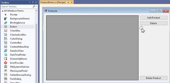
Building a form is usually done through the form designer. The designer is a visual canvas where controls can be dropped from the toolbox and laid out. Doing this visually makes for a powerful and fast developer loop. Figure 4-13 shows dropping a button from the toolbox onto the designer surface.
82
Chapter 4 Desktop Development
Figure 4-13. Dropping a button onto the designer
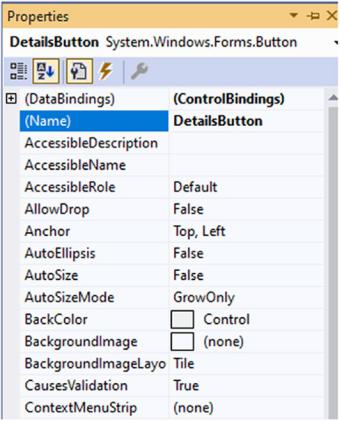
Feel free to double-click a form to open the designer and play around with the toolbox. Drop some components, move some controls around, and have a look at the properties. You’ll notice that the designer tries to help you by snapping the controls to align with the margins of the other controls to make for a consistent layout. Once a control is placed, we can use the properties window (F4 is the shortcut key to open the properties for the selected control) to set different properties and hook up event handlers. For example, click on the dropdown for BackColor and try some different values. You will notice that the designer reacts immediately to your changes.
83
Chapter 4 Desktop Development
Figure 4-14. Properties window
Responding toEvents
There are a few different ways to make a button react to a click. The fastest way is to double click on the button in the designer; this will generate a click event handler in the code behind of the form. Double-clicking any control will hook up an event handler to the default event for that control; click event for buttons, textchanged for textboxes, selectionchanged for combobox, and so on. Should we want to hook up another event, we can do this through the events pane in the properties window, found behind the lightning icon that can be seen in Figure 4-14. Look for the event you need and doubleclick the space beside it, as shown in Figure 4-15.
84

Chapter 4 Desktop Development
Figure 4-15. Hooking up an event through the properties window
Another way is to do programmatically as shown in Listing 4-6.
Listing 4-6. Programmatically reacting to a button getting focus
public ProductForm()
{
InitializeComponent();
DetailsButton.DragOver += DetailsButton_DragOver;
}
private void DetailsButton_DragOver(object sender, EventArgs e)
{
}
Once our design looks good in the designer, it’s time to see what it actually looks like on screen. The first results are very good, until we resize the window.
85
Chapter 4 Desktop Development
Figure 4-16. Resized window
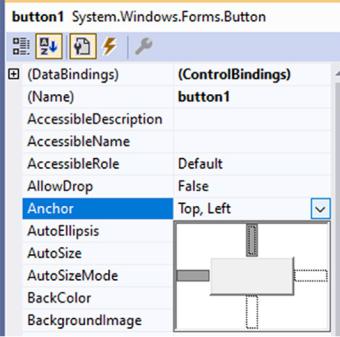
Looks like our application is not very responsive yet. Making controls resized in WinForms is done through anchors; anchor is a property set on every control that determines what border is anchored to the side of the form.
86
Chapter 4 Desktop Development
Figure 4-17. Anchoring a button to the left and top
After applying the correct anchor points, which is all anchor points in this case, we can make the form behave like Figure 4-18.
87
Chapter 4 Desktop Development
Figure 4-18. Form that resizes using anchor points
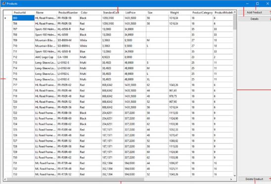
Figure 4-19 shows the used anchor points for every control.
88
Chapter 4 Desktop Development
Figure 4-19. Anchor points on the form
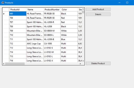
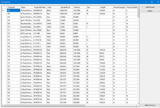
The grid that is on the form in Figures 4-18 and 4-19 is the DataGridView. The classic DataGrid control has not been ported from .NET Framework; DataGridView is based on DataGrid and extends it, for example, in the data sources it accepts. Listing 4-7 shows a simple example of setting data to the DataGridView named ProductsDataGrid.
Listing 4-7. Setting data to a DataGridView
private async void ProductForm_Load(object sender, EventArgs e)
{
var ctx = new AdventureWorksContext();
var products = await ctx.Products.ToListAsync(); ProductsDataGrid.DataSource = products;
}
We’re using an Entity Framework datacontext to easily get to our data. Once data is loaded, we assign it to the DataGridView’s DataSource property, and that is all that’s needed to show the data in the grid.
89
Chapter 4 Desktop Development
Let’s add the possibility to add new products to the dataset; Listing 4-8 shows a first attempt at this.
Listing 4-8. Add new products to the dataset
public partial class ProductForm : Form
{
private List<Product> _products;
public ProductForm()
{
InitializeComponent();
}
private async void ProductForm_Load(object sender, EventArgs e)
{
AdventureWorksContext ctx = new (); _products = await ctx.Products.ToListAsync(); ProductsDataGrid.DataSource = _products;
}
private void AddProductButton_Click(object sender, EventArgs e)
{
_products.Add(new Product());
}
}
The click event handler is triggered when the Add Product button is clicked; nothing seems to happen however. Should you set a breakpoint in the event handler, you’ll notice that the event is triggered and new products are added to the list but that change is not reflected in the UI. That is because in WinForms the UI is not reactive; it does not monitor every property to see if it might need to update; instead, it waits for an event that tells it what property has changed. Listing 4-9 shows a working example.
90
Chapter 4 Desktop Development
Listing 4-9. Working databinding
public partial class ProductForm : Form
{
private BindingList<Product> _products;
public ProductForm()
{
InitializeComponent();
}
private async void ProductForm_Load(object sender, EventArgs e)
{
AdventureWorksContext ctx = new();
List<Product> products = await ctx.Products.ToListAsync();
_products = new BindingList<Product>(products);
ProductsDataGrid.DataSource = _products;
}
private void AddProductButton_Click(object sender, EventArgs e)
{
_products.Add(new Product());
}
}
Only one thing changed; the List<Product> has changed into a BindingList<Product>; a BindingList triggers an event whenever the data in the list changes, allowing our UI to respond to that change.
WPF
Windows Presentation Foundation, WPF for short, is the spiritual successor of WinForms. It was known under the codename “Avalon” and was announced in .NET Framework 3.0 timeframe. WPF relies on DirectX for its rendering, compared to WinForm’s GDI. The biggest difference between WinForms and WPF is the UI, while there still is a graphical designer, it no longer generates C# code to build its UI but instead generates eXtended Application Markup Language, or XAML.
91
Chapter 4 Desktop Development
WPF was ported from the classic .NET Framework to .NET Core 3.0. After the initial port, a new visual designer was created and has evolved with every release of .NET.
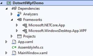
After creating a new WPF project with .NET 6, we end with the solution as shown in Figure 4-20.
Figure 4-20. A blank WPF project
That is a very lightweight project structure; it contains only three files! And we can even remove AssemblyInfo should we want to. AssemblyInfo contains theming information for our WPF application. It sets the ThemeInfo assembly attribute; this
attribute specifies if there is an assembly containing resource definitions for the controls used in your application. Resource definitions include templates, styles, and colors. The ThemeInfoattribute takes two parameters, a theme-specific dictionary location and a generic dictionary location. Resource dictionaries in XAML are comparable to CSS files in web development; they contain style definitions, converters, and so on. The ThemeInfo resource dictionary locations can be set to one of three values.
•\ ExternalAssembly
•\ None
•\ SourceAssembly
External assemblies live outside of your code base. WPF will search for assemblies according to a naming convention. For example, take an application called DotnetSixWpf. If we want to place theming in a separate assembly, we can name that assembly, or assemblies, DotnetSixWpf.Dark.dll or DotnetSixWpf.Light.dll, for example, to define dark and light themes. The names of your themes are whatever you want them to be, but the naming of the assembly needs to be <assembly>.<themename>.
92