

aswath_damodaran-investment_philosophies_2012
.pdf480 |
INVESTMENT PHILOSOPHIES |
While hype indicators, of all nonfinancial indicators, offer the most promise as predictors of the market, they do suffer from several limitations. For instance, defining what constitutes abnormal can be tricky in a world where standards and tastes are shifting—a high rating for CNBC may indicate too much hype or may be just reflecting the fact that viewers find financial markets to be both more entertaining and less predictable than a typical soap opera. Even if we decide that there is an abnormally high interest in the market today and you conclude (based on the hype indicators) that stocks are overvalued, there is no guarantee that stocks will not get more overvalued before the correction occurs. In other words, hype indicators may tell you that a market is overvalued, but they don’t tell you when the correction will occur.
M a r k e t T i m i n g B a s e d o n T e c h n i c a l I n d i c a t o r s
In Chapter 7, we examined a number of chart patterns and technical indicators used by analysts to differentiate between undervalued and overvalued stocks. Many of these indicators are also used by analysts to determine whether and by how much the entire market is underor overvalued. In this section, we consider some of these indicators.
P a s t P r i c e s We looked at evidence of price patterns in individual company stock prices in Chapter 7: reversals in very short time periods, momentum in the medium term, and reversals in the long term. Studies do not seem to find similar evidence when it comes to the overall market. If markets have gone up significantly in the most recent years, there is no evidence that market returns in future years will be negative. If we consolidate stock returns from 1871 to 2011 into five-year periods, we find a mild positive correlation of 0.1323 between five-year period returns; in other words, positive returns on stocks over the past five years are slightly more likely to be followed by positive returns than negative returns in the next five years.
N U M B E R W A T C H
Returns for U.S. market: Take a look at annual returns for the U.S. stock market from 1871 to today.
In Table 12.1, we report on the probabilities of an up year and a down year following a series of scenarios, ranging from two down years in a


482 |
INVESTMENT PHILOSOPHIES |
accompanied by heavy volume. At the same time, very heavy volume can also indicate turning points in markets. For instance, a drop in the index with very heavy trading volume is called a selling climax and may be viewed as a sign that the market has hit bottom. This supposedly removes most of the bearish investors from the mix, opening the market up presumably to more optimistic investors. On the other hand, an increase in the index accompanied by heavy trading volume may be viewed as a sign that market has topped out.
Another widely used indicator looks at the trading volume on puts as a ratio of the trading volume on calls. This ratio, which is called the put-call ratio, is often used as a contrarian indicator. When investors become more bearish, they buy more puts, and this (as the contrarian argument goes) is a good sign for the future of the market.
Technical analysts also use money flow, which is the difference between uptick volume and downtick volume, as a predictor of market movements. An increase in the money flow is viewed as a positive signal for future market movements whereas a decrease is viewed as a bearish signal. Using daily money flows from July 1997 to June 1998, Bennett and Sias find that money flow is highly correlated with returns in the same period, which is not surprising.11 While they find no predictive ability with short-period returns—five-day returns are not correlated with money flow in the previous five days—they do find some predictive ability for longer periods. With 40-day returns and money flow over the prior 40 days, for instance, there is a link between high money flow in the first 40 days and positive stock returns in the next 40 days.
Chan, Hameed, and Tong extend this analysis to global equity markets. They find that equity markets show momentum: markets that have done well in the recent past are more likely to continue doing well, whereas markets that have done badly remain poor performers. They also find that the momentum effect is stronger for equity markets that have high trading volume and weaker in markets with low trading volume.12
V o l a t i l i t y In recent years, a number of studies have uncovered a relationship between changes in market volatility and future returns. One study by Haugen, Talmor, and Torous found that increases in market volatility cause
11J. A. Bennett and R. W. Sias, “Can Money Flows Predict Stock Returns?” Financial Analysts Journal 57 (2001).
12K. Chan, A. Hameed, and W. Tong, “Profitability of Momentum Strategies in the International Equity Markets,” Journal of Financial and Quantitative Analysis 35 (2000): 153–172.
The Impossible Dream? Timing the Market |
483 |
2.00% |
|
1.50% |
|
1.00% |
|
0.50% |
|
0.00% |
|
−0.50% |
|
−1.00% |
|
−1.50% |
Volatility Increases |
|
|
−2.00% |
Volatility Decreases |
−2.50% |
|
−3.00% |
|
In Period of Change |
In Period after Change |
Return on Market
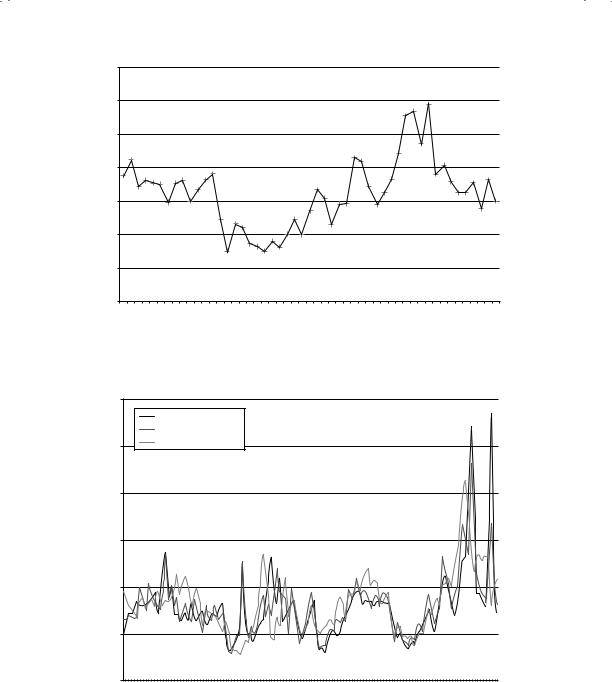
F I G U R E 1 2 . 1 Returns around Volatility Changes
Source: R. A. Haugen, E. Talmor, and W. N. Torous, “The Effect of Volatility Changes on the Level of Stock Prices and Subsequent Expected Returns,” Journal of Finance 46 (1991): 985–1007.
an immediate drop in stock prices but that stock returns increase in subsequent periods.13 They examined daily price volatility from 1897 through 1988 and looked for time periods where the volatility has increased or decreased significantly, relative to prior periods.14 They then looked at returns both at the time of the volatility change and in the weeks following for both volatility increases and decreases, and their results are summarized in Figure 12.1.
Note that volatility increases cause stock prices to drop but that stock prices increase in the following four weeks. With volatility decreases, stock prices increase at the time of the volatility change, and they continue to increase in the weeks after, albeit at a slower pace.
13R. A. Haugen, E. Talmor, and W. N. Torous, “The Effect of Volatility Changes on the Level of Stock Prices and Subsequent Expected Returns,” Journal of Finance
46(1991): 985–1007.
14Daily price volatility is estimated over four week windows. If the volatility in any four week window exceeds (falls below) the volatility in the previous four-week window (at a statistical significance level of 99%), it is categorized as an increase (decrease) in volatility.


The Impossible Dream? Timing the Market |
485 |
will make only a short mention of some of these indicators in this section, categorized into price and sentiment indicators:
Price indicators include many of the pricing patterns that we discussed in Chapter 7. Just as support and resistance lines and trend lines are used to determine when to move in and out of individual stocks, they are also used to decide when to move in and out of the stock market.
Sentiment indicators try to measure the mood of the market. One widely used measure is the confidence index, which is defined as the ratio of the yield on BBB-rated bonds to the yield on AAA-rated bonds. If this ratio increases, investors are becoming more risk averse or at least demanding a higher price for taking on risk, which is negative for stocks. An indicator that is viewed as bullish for stocks is aggregate insider buying of stocks. When this measure increases, according to its proponents, stocks are more likely to go up.16 Other sentiment indicators include mutual fund cash positions and the degree of bullishness among investment advisers and newsletters. These are often used as contrarian indicators—an increase in cash in the hands of mutual funds and more bearish market views among mutual funds are viewed as bullish signs for stock prices.17
While many of these indicators are used widely, they are mostly backed with anecdotal rather than empirical evidence.
M a r k e t T i m i n g B a s e d o n N o r m a l R a n g e s ( M e a n R e v e r s i o n ) There are many investors who believe that prices tend to revert back to what can be called normal levels after extended periods in which they might deviate from these norms. With the equity market, the normal range is usually defined in terms of price-earnings (P/E) ratios, whereas with the bond market a normal range of interest rates is used to justify betting on market direction.
16M. Chowdhury, J. S. Howe, and J. C. Lin, “The Relation between Aggregate Insider Transactions and Stock Market Returns,” Journal of Financial and Quantitative Analysis 28 (1993): 431–437. They find a positive correlation between aggregate insider buying and market returns but report that a strategy based upon the indicator would not earn enough to cover transaction costs.
17K. L. Fisher and M. Statman, “Investor Sentiment and Stock Returns,” Financial Analysts Journal 56 (2000): 16–23. They examined three sentiment indicators—the views of Wall Street strategists, investment newsletters and individual investors—and concluded that there is indeed evidence supporting a contrarian investment strategy.


488 |
INVESTMENT PHILOSOPHIES |
The limitations of this approach should be obvious. In addition to trusting history to repeat itself, you are making two other assumptions. The first is that you can identify a normal trading range by looking at historical data. As you can see from the graph, you will not get any consensus—someone else looking at this graph might end up with a different band for P/E, using a different time period and a different confidence interval. The second assumption is that the fundamentals have not shifted significantly over time. If interest rates are much lower today than they have been historically, you would expect stocks to trade at much higher P/E ratios than they have historically. How much higher? We will look at this question in more detail in the later parts of this chapter.
Normal Range of Interest Rates Some analysts hypothesize that market interest rates move within a normal range. Under this hypothesis, when interest rates approach the high end of the range, they are more likely to decrease, and when they approach the low end of the range, they are more likely to increase. This hypothesis is corroborated by two pieces of evidence:
1.Slope of the yield curve. The yield curve, which reflects future expectations about interest rates, is more likely to be downward sloping when interest rates are high than when they are low. Thus, investors are more likely to expect interest rates to come down if they are high now and go up if they are low now. Table 12.2 summarizes the frequency of downward-sloping yield curves as a function of the level of interest rates.
This evidence is consistent with the hypothesis that maintains that interest rates move within a normal range; when they approach the upper end of the normal range, the yield curve is more likely to be downward sloping, and when rates approach the lower end of the normal range, the curve is more likely to be upward sloping.
2.Interest rate level and expected change. More significantly, investors’ expectations about future interest rate movements seem to be borne out by actual changes in interest rates. When changes in interest rates are
T A B L E 1 2 . 2 |
Yield Curves and the Level of Interest Rates |
|
|
|
Period |
1-Year T-Bill Rate |
Upward |
Flat |
Downward |
|
|
|
|
|
|
4.40% |
0 |
0 |
20 |
1900–1970 |
3.25–4.4% |
10 |
10 |
5 |
|
3.25% |
26 |
0 |
0 |
1971–2010 |
8% |
4 |
1 |
3 |
|
8% |
20 |
10 |
2 |
|
|
|
|
|

The Impossible Dream? Timing the Market |
489 |
regressed against the current level of interest rates, there is a negative and significant relationship between the level of the rates and the change in rates in subsequent periods; that is, there is a much greater likelihood of a drop in interest rates next period if interest rates are high in this one, and a much greater chance of rates increasing in future periods if interest rates are low in this one. For instance, using Treasury bond rates from 1927 to 2010 and regressing the change in interest rates ( Interest ratet) in each year against the level of rates at the end of the prior year (Interest ratet–1), we arrive at the following results:
Interest ratet = 0.0032 − 0.0622 Interest ratet−1 R2 = 0.0309 [1.40] [1.60]
This regression suggests two things. One is that the change in interest rates in this period is negatively correlated with the level of rates at the end of the prior year; if rates were high, they were more likely to decrease (if low, they would increase). Second, for every one percent increase in the level of current rates, the expected drop in interest rates in the next period increases by 0.0622 percent.
This evidence has to be considered with some caveats. The first is that the proportion of interest rate changes in future periods explained by the current level of rates is relatively small (about 3.09 percent); there are clearly a large number of other factors, most of which are unpredictable, that affect interest rate changes. The second is that the normal range of interest rates, which is based on past experience, might shift if the underlying expectations of inflation change dramatically as they did in the 1970s in the United States. Consequently, many firms that delayed borrowing in the early part of that decade, because they thought that interest rates were at the high end of the range, found themselves facing higher and higher rates in each of the following years. Similarly, firms that borrowed large amounts in 2007, thinking that interest rates were at historic lows, found that they went down further in the next few years.
H I N D S I G H T I S 2 0 / 2 0
Market timing always seems simple when you look back in time. After
the fact, you can always find obvious signals of market reversals—bull markets turning to bear markets or vice versa. Thus, in 2001 there
(continued)