

Robert I. Kabacoff - R in action
.pdf56 |
CHAPTER 3 Getting started with graphs |
|
60 |
|
|
|
|
|
40 |
|
|
|
|
|
50 |
|
|
|
|
|
35 |
|
|
|
|
drugA |
40 |
|
|
|
|
drugB |
25 30 |
|
|
|
|
|
30 |
|
|
|
|
|
|
|
|
|
|
|
|
|
|
|
|
|
20 |
|
|
|
|
|
20 |
|
|
|
|
|
|
|
|
|
|
|
|
|
|
|
|
|
15 |
|
|
|
|
|
20 |
30 |
40 |
50 |
60 |
|
20 |
30 |
40 |
50 |
60 |
|
|
|
dose |
|
|
|
|
|
dose |
|
|
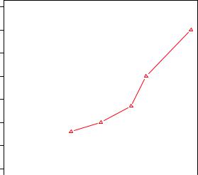
Figure 3.7 Line plot of dose vs. response for both drug A and drug B
In the next section, we’ll turn to the customization of text annotations (such as titles and labels) and axes. For more information on the graphical parameters that are available, take a look at help(par).
3.4Adding text, customized axes, and legends
Many high-level plotting functions (for example, plot, hist, boxplot) allow you to include axis and text options, as well as graphical parameters. For example, the following adds a title (main), subtitle (sub), axis labels (xlab, ylab), and axis ranges (xlim, ylim). The results are presented in figure 3.8:
plot(dose, drugA, type="b", col="red", lty=2, pch=2, lwd=2,
main="Clinical Trials for Drug A", sub="This is hypothetical data", xlab="Dosage", ylab="Drug Response", xlim=c(0, 60), ylim=c(0, 70))
Again, not all functions allow you to add these options. See the help for the function of interest to see what options are accepted. For finer control and for modularization, you can use the functions described in the remainder of this section to control titles, axes, legends, and text annotations.
NOTE Some high-level plotting functions include default titles and labels. You can remove them by adding ann=FALSE in the plot() statement or in a separate par() statement.
Adding text, customized axes, and legends |
57 |
Clinical Trials for Drug A
|
70 |
|
60 |
|
50 |
Response |
40 |
Drug |
30 |
|
20 |
|
10 |
|
0 |
|
|
|
|
|
|
|
|
|
|
|
|
|
|
|
|
|
|
|
|
Figure 3.8 Line plot of dose |
|
|
|
|
|
|
|
|
|
|
|
|
|
|
|
|
|
|
|
|
|
0 |
10 |
20 |
30 |
40 |
50 |
60 |
versus response for drug |
|||||||||||||
|
|
|
|
|
|
|
|
Dosage |
|
|
|
|
|
|
|
|
|
A with title, subtitle, and |
||
|
|
|
|
|
|
|
|
|
|
|
|
|
|
|
|
|
modified axes |
|||
|
|
|
|
|
|
This is hypothetical data |
|
|
|
|
|
|
||||||||
3.4.1Titles
Use the title() function to add title and axis labels to a plot. The format is
title(main="main title", sub="sub-title", xlab="x-axis label", ylab="y-axis label")
Graphical parameters (such as text size, font, rotation, and color) can also be specified in the title() function. For example, the following produces a red title and a blue subtitle, and creates green x and y labels that are 25 percent smaller than the default text size:
title(main="My Title", col.main="red", sub="My Sub-title", col.sub="blue", xlab="My X label", ylab="My Y label", col.lab="green", cex.lab=0.75)
3.4.2Axes
Rather than using R’s default axes, you can create custom axes with the axis() function. The format is
axis(side, at=, labels=, pos=, lty=, col=, las=, tck=, ...)
where each parameter is described in table 3.7.
When creating a custom axis, you should suppress the axis automatically generated by the high-level plotting function. The option axes=FALSE suppresses all axes (including all axis frame lines, unless you add the option frame.plot=TRUE). The options xaxt=”n” and yaxt=”n” suppress the x- and y-axis, respectively (leaving the frame

58 |
|
CHAPTER 3 Getting started with graphs |
|
Table 3.7 Axis options |
|
|
|
|
|
Option |
Description |
|
|
|
|
side |
An integer indicating the side of the graph to draw the axis |
|
|
(1=bottom, 2=left, 3=top, 4=right). |
|
at |
A numeric vector indicating where tick marks should be drawn. |
|
labels |
A character vector of labels to be placed at the tick marks |
|
|
(if NULL, the at values will be used). |
|
pos |
The coordinate at which the axis line is to be drawn |
|
|
(that is, the value on the other axis where it crosses). |
|
lty |
Line type. |
|
col |
The line and tick mark color. |
|
las |
Labels are parallel (=0) or perpendicular (=2) to the axis. |
|
tck |
Length of tick mark as a fraction of the plotting region (a negative number is |
|
|
outside the graph, a positive number is inside, 0 suppresses ticks, 1 creates |
|
|
gridlines); the default is –0.01. |
(...) |
Other graphical parameters. |
|
|
|
|
lines, without ticks). The following listing is a somewhat silly and overblown example that demonstrates each of the features we’ve discussed so far. The resulting graph is presented in figure 3.9.
|
10 |
|
|
|
|
|
|
|
9 |
|
|
|
8 |
|
|
|
|
||
|
7 |
|
|
|
|
||
Y=X |
6 |
|
|
|
|||
5 |
|
||
|
|
||
|
4 |
|
|
|
|
||
|
3 |
|
|
|
|
||
|
2 |
|
|
|
|
||
|
1 |
|
|
|
|
||
|
|
|
|
|
|
|
|
An Example of Creative Axes
10
y=10/x
5
3.33
2.5
2
1.67
1.43
1.25
1.11
1
2 |
4 |
6 |
8 |
10 |
X values
Figure 3.9 A demonstration of axis options

Adding text, customized axes, and legends |
59 |
|||||||
|
|
|
|
|
|
|
|
|
Listing 3.2 An example of custom axes |
|
|
|
|
|
|
||
x <- c(1:10) |
|
|
Specify data |
|
||||
|
|
|||||||
y <- x |
|
|
|
|
|
|
||
z <- 10/x |
|
|
|
|
|
|
||
opar <- par(no.readonly=TRUE) |
|
|
|
|
|
|
||
par(mar=c(5, 4, 4, 8) + 0.1) |
|
|
Increase margins |
|
||||
|
|
|
||||||
plot(x, y, type="b", |
|
|
|
|
Plot x versus y |
|
||
|
|
|
|
|
||||
pch=21, col="red", |
|
|
|
|
|
|
||
yaxt="n", lty=3, ann=FALSE) |
|
|
|
|
|
|
||
|
|
|
|
Add x versus |
|
|
|
|
|||
lines(x, z, type="b", pch=22, col="blue", lty=2) |
|
|
|
1/x line |
|
|
|
||||
axis(2, at=x, labels=x, col.axis="red", las=2) |
|
|
Draw your axes |
||
|
|||||
axis(4, at=z, labels=round(z, digits=2), |
|
|
|
||
col.axis="blue", las=2, cex.axis=0.7, tck=-.01) |
|
|
|
||
mtext("y=1/x", side=4, line=3, cex.lab=1, las=2, col="blue") |
|
|
Add titles |
||
|
|
||||
title("An Example of Creative Axes", |
|
|
and text |
||
|
|
|
|||
xlab="X values", |
|
|
|
||
ylab="Y=X") |
|
|
|
||
par(opar)
At this point, we’ve covered everything in listing 3.2 except for the line()and the mtext() statements. A plot() statement starts a new graph. By using the line() statement instead, you can add new graph elements to an existing graph. You’ll use it again when you plot the response of drug A and drug B on the same graph in section 3.4.4. The mtext() function is used to add text to the margins of the plot. The mtext()function is covered in section 3.4.5, and the line() function is covered more fully in chapter 11.
MINOR TICK MARKS
Notice that each of the graphs you’ve created so far have major tick marks but not minor tick marks. To create minor tick marks, you’ll need the minor.tick() function in the Hmisc package. If you don’t already have Hmisc installed, be sure to install it first (see chapter 1, section 1.4.2). You can add minor tick marks with the code
library(Hmisc)
minor.tick(nx=n, ny=n, tick.ratio=n)
where nx and ny specify the number of intervals in which to divide the area between major tick marks on the x-axis and y-axis, respectively. tick.ratio is the size of the minor tick mark relative to the major tick mark. The current length of the major tick mark can be retrieved using par("tck"). For example, the following statement will add one tick mark between each major tick mark on the x-axis and two tick marks between each major tick mark on the y-axis:

60 |
CHAPTER 3 Getting started with graphs |
minor.tick(nx=2, ny=3, tick.ratio=0.5)
The length of the tick marks will be 50 percent as long as the major tick marks. An example of minor tick marks is given in the next section (listing 3.3 and figure 3.10).
3.4.3Reference lines
The abline() function is used to add reference lines to our graph. The format is
abline(h=yvalues, v=xvalues)
Other graphical parameters (such as line type, color, and width) can also be specified in the abline() function. For example:
abline(h=c(1,5,7))
adds solid horizontal lines at y = 1, 5, and 7, whereas the code
abline(v=seq(1, 10, 2), lty=2, col="blue")
adds dashed blue vertical lines at x = 1, 3, 5, 7, and 9. Listing 3.3 creates a reference line for our drug example at y = 30. The resulting graph is displayed in figure 3.10.
3.4.4Legend
When more than one set of data or group is incorporated into a graph, a legend can help you to identify what’s being represented by each bar, pie slice, or line. A legend can be added (not surprisingly) with the legend() function. The format is
legend(location, title, legend, ...)
The common options are described in table 3.8.
Table 3.8 Legend options
Option |
Description |
|
|
location |
There are several ways to indicate the location of the legend. You can |
|
give an x,y coordinate for the upper-left corner of the legend. You can use |
|
locator(1), in which case you use the mouse to indicate the location of |
|
the legend. You can also use the keywords bottom, bottomleft, left, |
|
topleft, top, topright, right, bottomright, or center to place |
|
the legend in the graph. If you use one of these keywords, you can also use |
|
inset= to specify an amount to move the legend into the graph (as fraction |
|
of plot region). |
title |
A character string for the legend title (optional). |
legend |
A character vector with the labels. |
|
|

Adding text, customized axes, and legends |
61 |
Table 3.8 Legend options (continued )
Option |
Description |
|
|
... |
Other options. If the legend labels colored lines, specify col= and a |
|
vector of colors. If the legend labels point symbols, specify pch= and a |
|
vector of point symbols. If the legend labels line width or line style, use |
|
lwd= or lty= and a vector of widths or styles. To create colored boxes for |
|
the legend (common in bar, box, or pie char ts), use fill= and a vector of |
|
colors. |
|
|
Other common legend options include bty for box type, bg for background color, cex for size, and text.col for text color. Specifying horiz=TRUE sets the legend horizontally rather than vertically. For more on legends, see help(legend). The examples in the help file are particularly informative.
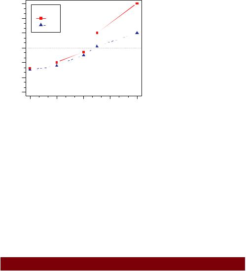
Let’s take a look at an example using our drug data (listing 3.3). Again, you’ll use a number of the features that we’ve covered up to this point. The resulting graph is presented in figure 3.10.
Listing 3.3 Comparing Drug A and Drug B response by dose
dose <- c(20, 30, 40, 45, 60) drugA <- c(16, 20, 27, 40, 60) drugB <- c(15, 18, 25, 31, 40)
opar <- par(no.readonly=TRUE)
par(lwd=2, cex=1.5, font.lab=2)
plot(dose, drugA, type="b",
pch=15, lty=1, col="red", ylim=c(0, 60), main="Drug A vs. Drug B",
xlab="Drug Dosage", ylab="Drug Response")
lines(dose, drugB, type="b", pch=17, lty=2, col="blue")
abline(h=c(30), lwd=1.5, lty=2, col="gray")
library(Hmisc)
minor.tick(nx=3, ny=3, tick.ratio=0.5)
legend("topleft", inset=.05, title="Drug Type", c("A","B"), lty=c(1, 2), pch=c(15, 17), col=c("red", "blue"))
Increase line, text, symbol, label size
Generate graph
Add minor tick marks
Add legend
par(opar)
62 |
CHAPTER 3 Getting started with graphs |
Drug A vs. Drug B
|
60 |
|
|
|
|
|
50 |
Drug Type |
|
|
|
|
20 30 40 |
A |
|
|
|
Drug Response |
B |
|
|
|
|
|
|
|
|
||
|
10 |
|
|
|
|
|
0 |
|
|
|
|
|
20 |
30 |
40 |
50 |
60 |
Drug Dosage
Figure 3.10 An annotated comparison of Drug A and Drug B
Almost all aspects of the graph in figure 3.10 can be modified using the options discussed in this chapter. Additionally, there are many ways to specify the options desired. The final annotation to consider is the addition of text to the plot itself. This topic is covered in the next section.
3.4.5Text annotations
Text can be added to graphs using the text() and mtext() functions. text() places text within the graph whereas mtext() places text in one of the four margins. The formats are
text(location, "text to place", pos, ...) mtext("text to place", side, line=n, ...)
and the common options are described in table 3.9.
Table 3.9 Options for the text() and mtext() functions
Option |
Description |
|
|
location |
Location can be an x,y coordinate. Alternatively, the text can be placed |
|
interactively via mouse by specifying location as locator(1). |
pos |
Position relative to location. 1 = below, 2 = left, 3 = above, 4 = right. If you |
|
specify pos, you can specify offset= in percent of character width. |
side |
Which margin to place text in, where 1 = bottom, 2 = left, 3 = top, 4 = right. |
|
You can specify line= to indicate the line in the margin star ting with 0 (closest |
|
to the plot area) and moving out. You can also specify adj=0 for left/bottom |
|
alignment or adj=1 for top/right alignment. |
|
|
Adding text, customized axes, and legends |
63 |
Other common options are cex, col, and font (for size, color, and font style, respectively).
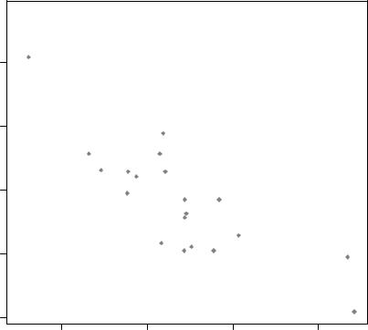
The text() function is typically used for labeling points as well as for adding other text annotations. Specify location as a set of x, y coordinates and specify the text to place as a vector of labels. The x, y, and label vectors should all be the same length. An example is given next and the resulting graph is shown in figure 3.11.
attach(mtcars) plot(wt, mpg,
main="Mileage vs. Car Weight", xlab="Weight", ylab="Mileage", pch=18, col="blue")
text(wt, mpg, row.names(mtcars), cex=0.6, pos=4, col="red")
detach(mtcars)
30
25
Mileage 20
15
10
Mileage vs. Car Weight
 Toyota Corolla
 Fiat 128
 LotusHondaEuropaCivic
 Fiat X1−9
 Porsche 914−2
|
Merc 240D |
Datsun 710 |
Merc 230 |
Toyota Corona |
Hornet 4 Drive |
Volvo 142E |
 Mazda RX4Mazda RX4 Wag
Ferrari Dino
Merc 280 Pontiac Firebird
 Hornet Sportabout
Valiant
Merc 280C
 Merc 450SL
Merc 450SE
Ford Pantera L
Dodge Challenger
AMC JavelinMerc 450SLC
 Maserati Bora Chrys
 Duster 360
 Camaro Z28
 CadillacLin
2 |
3 |
4 |
5 |
Weight
Figure 3.11 Example of a scatter plot (car weight vs. mileage) with labeled points (car make)

64 |
CHAPTER 3 Getting started with graphs |
Here we’ve plotted car mileage versus car weight for the 32 automobile makes provided in the mtcars data frame. The text() function is used to add the car makes to the right of each data point. The point labels are shrunk by 40 percent and presented in red.
As a second example, the following code can be used to display font families:
opar <- par(no.readonly=TRUE) par(cex=1.5) plot(1:7,1:7,type="n") text(3,3,"Example of default text")
text(4,4,family="mono","Example of mono-spaced text") text(5,5,family="serif","Example of serif text") par(opar)
The results, produced on a Windows platform, are shown in figure 3.12. Here the par() function was used to increase the font size to produce a better display.
The resulting plot will differ from platform to platform, because plain, mono, and serif text are mapped to different font families on different systems. What does it look like on yours?
MATH ANNOTATIONS
Finally, you can add mathematical symbols and formulas to a graph using TEX-like rules. See help(plotmath) for details and examples. You can also try demo(plotmath) to see this in action. A portion of the results is presented infigure 3.13. The plotmath() function can be used to add mathematical symbols to titles, axis labels, or text annotation in the body or margins of the graph.
You can often gain greater insight into your data by comparing several graphs at one time. So, we’ll end this chapter by looking at ways to combine more than one graph into a single image.
|
7 |
|
6 |
|
5 |
1:7 |
4 |
|
3 |
Example of serif text
Example of mono−spaced text
Example of default text
1 2
1 |
2 |
3 |
4 |
5 |
6 |
7 |
1:7 |
Figure 3.12 Examples of font |
families on a Windows platform |

|
|
|
|
Combining graphs |
65 |
|
|
|
|
|
|
|
|
|
Arithmetic Operators |
|
Radicals |
|
|
|
|
|
|
|
|
|
|
|
x + y |
x +y |
|
sqrt(x) |
x |
|
|
|
|
|
|
|
|
|
x − y |
x −y |
|
sqrt(x, y) |
y x |
|
|
x * y |
xy |
|
Relations |
|
|
|
|
|
|
|
|
|
|
x/y |
x y |
|
x == y |
x = y |
|
|
|
|
|
|
|
|
|
x %+−% y |
x ±y |
|
x != y |
x ↑y |
|
|
|
|
|
|
|
|
|
x%/%y |
x √y |
|
x < y |
x < y |
|
|
|
|
|
|
|
|
|
x %*% y |
x ×y |
|
x <= y |
x ʺ y |
|
|
|
|
|
|
|
|
|
x %.% y |
x y |
|
x > y |
x > y |
|
|
|
|
|
|
|
|
|
−x |
−x |
|
x >= y |
x ≥ y |
|
|
|
|
|
|
|
|
|
+x |
+x |
|
x %~~% y |
x y |
|
|
|
|
|
|
|
|
|
Sub/Superscripts |
|
x %=~% y |
x y |
|
|
|
|
|
|
|
|
|
|
x[i] |
xi |
|
x %==% y |
x ≡ y |
|
|
x^2 |
x2 |
|
x %prop% y |
x y |
|
|
Juxtaposition |
|
Typeface |
|
|
|
|
|
|
|
|
|
|
|
x * y |
xy |
|
plain(x) |
x |
|
|
|
|
|
|
|
|
|
paste(x, y, z) |
xyz |
|
italic(x) |
x |
|
|
|
|
|
|
|
|
|
|
Lists |
|
bold(x) |
x |
|
|
|
|
|
|
|
|
|
list(x, y, z) |
x, y, z |
|
bolditalic(x) |
x |
|
|
|
|
|
|
|
|
|
|
|
|
underline(x) |
x |
|
Figure 3.13 Partial results from |
|
|
|
|
||
demo(plotmath) |
|
|
||||
3.5Combining graphs
R makes it easy to combine several graphs into one overall graph, using either the par() or layout() function. At this point, don’t worry about the specific types of graphs being combined; our focus here is on the general methods used to combine them. The creation and interpretation of each graph type is covered in later chapters.
With the par() function, you can include the graphical parameter mfrow=c(nrows, ncols) to create a matrix of nrows x ncols plots that are filled in by row. Alternatively, you can use mfcol=c(nrows, ncols) to fill the matrix by columns.
For example, the following code creates four plots and arranges them into two rows and two columns:
attach(mtcars)
opar <- par(no.readonly=TRUE) par(mfrow=c(2,2))
plot(wt,mpg, main="Scatterplot of wt vs. mpg") plot(wt,disp, main="Scatterplot of wt vs disp") hist(wt, main="Histogram of wt")