

Robert I. Kabacoff - R in action
.pdf196 |
CHAPTER 8 Regression |
As you can see, the errors follow a normal distribution quite well, with the exception of a large outlier. Although the Q-Q plot is probably more informative, I’ve always found it easier to gauge the skew of a distribution from a histogram or density plot than from a probability plot. Why not use both?
INDEPENDENCE OF ERRORS
As indicated earlier, the best way to assess whether the dependent variable values (and thus the residuals) are independent is from your knowledge of how the data were collected. For example, time series data will often display autocorrelation—observations collected closer in time will be more correlated with each other than with observations distant in time. The car package provides a function for the Durbin–Watson test to detect such serially correlated errors. You can apply the Durbin–Watson test to the multiple regression problem with the following code:
> durbinWatsonTest(fit) |
|
|
lag |
Autocorrelation D-W |
Statistic p-value |
1 |
-0.201 |
2.32 0.282 |
Alternative hypothesis: |
rho != 0 |
|
The nonsignificant p-value (p=0.282) suggests a lack of autocorrelation, and conversely an independence of errors. The lag value (1 in this case) indicates that each observation is being compared with the one next to it in the dataset. Although appropriate for time-dependent data, the test is less applicable for data that isn’t clustered in this fashion. Note that the durbinWatsonTest() function uses bootstrapping (seechapter 12) to derive p-values. Unless you add the option simulate=FALSE, you’ll get a slightly different value each time you run the test.
LINEARITY
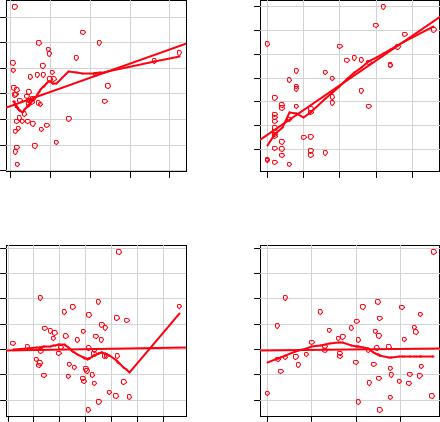
You can look for evidence of nonlinearity in the relationship between the dependent variable and the independent variables by using component plus residual plots (also known as partial residual plots). The plot is produced by crPlots() function in the car package. You’re looking for any systematic departure from the linear model that you’ve specified.
|
To create a component plus residual plot for variable Xj , you plot the points |
|
ε |
, where the residuals ε |
are based on the full model, and i =1…n. The |
straight line in each graph is given by |
. Loess fit lines are described in |
|
chapter 11. The code to produce these plots is as follows:
>library(car)
>crPlots(fit)
The resulting plots are provided in figure 8.11. Nonlinearity in any of these plots suggests that you may not have adequately modeled the functional form of that predictor in the regression. If so, you may need to add curvilinear components such as polynomial terms, transform one or more variables (for example, use log(X) instead of X), or abandon linear regression in favor of some other regression variant. Transformations are discussed later in this chapter.
Regression diagnostics |
197 |
Component + Residual Plots
|
|
|
|
|
|
8 |
Component+Residual(Murder) |
−4 −2 0 2 4 6 |
|
|
|
Component+Residual(Murder) |
−4 −2 0 2 4 6 |
|
−6 |
|
|
|
|
|
|
0 |
5000 |
10000 |
15000 |
20000 |
|
|
|
|
Population |
|
|
|
|
8 |
|
|
|
|
8 |
Component+Residual(Murder) |
−4 −2 0 2 4 6 |
|
|
|
Component+Residual(Murder) |
−4 −2 0 2 4 6 |
|
3000 |
4000 |
5000 |
6000 |
|
|
|
|
|
Income |
|
|
|
0.5 |
1.0 |
1.5 |
2.0 |
2.5 |
|
|
Illiteracy |
|
|
0 |
50 |
100 |
150 |
|
|
Frost |
|
Figure 8.11 Component plus residual plots for the regression of murder rate on state characteristics
The component plus residual plots confirm that you’ve met the linearity assumption. The form of the linear model seems to be appropriate for this dataset.
HOMOSCEDASTICITY
The car package also provides two useful functions for identifying non-constant error variance. The ncvTest() function produces a score test of the hypothesis of constant error variance against the alternative that the error variance changes with the level of the fitted values. A significant result suggests heteroscedasticity (nonconstant error variance).
The spreadLevelPlot() function creates a scatter plot of the absolute standardized residuals versus the fitted values, and superimposes a line of best fit. Both functions are demonstrated in listing 8.7.

198 |
CHAPTER 8 Regression |
Listing 8.7 Assessing homoscedasticity
>library(car)
>ncvTest(fit)
Non-constant Variance Score Test
Variance formula: ~ fitted.values
Chisquare=1.7 Df=1 p=0.19
> spreadLevelPlot(fit)
Suggested power transformation: 1.2
The score test is nonsignificant (p = 0.19), suggesting that you’ve met the constant variance assumption. You can also see this in the spread-level plot (figure 8.12). The points form a random horizontal band around a horizontal line of best fit. If you’d violated the assumption, you’d expect to see a nonhorizontal line. The suggested power transformation in listing 8.7 is the suggested power p (Y p) that would stabilize the nonconstant error variance. For example, if the plot showed a nonhorizontal trend and the suggested power transformation was 0.5, then using Y rather than Y in the regression equation might lead to a model that satisfies homoscedasticity. If the suggested power was 0, you’d use a log transformation. In the current example, there’s no evidence of heteroscedasticity and the suggested power is close to 1 (no transformation required).
Spread−Level Plot for fit
|
2.00 |
Absolute Studentized Residuals |
0.10 0.20 0.50 1.00 |
|
0.05 |
4 |
6 |
8 |
10 |
12 |
14 |
Figure 8.12 Spread-level |
|||||||||||
plot for assessing constant |
|||||||||||||||||
|
|
|
|
Fitted Values |
|
|
|
|
|
|
|
|
|
||||
|
|
|
|
|
|
|
|
|
|
|
|
|
error variance |
||||

Regression diagnostics |
199 |
8.3.3Global validation of linear model assumption
Finally, let’s examine the gvlma() function in the gvlma package. Written by Pena and Slate (2006), the gvlma() function performs a global validation of linear model assumptions as well as separate evaluations of skewness, kurtosis, and heteroscedasticity. In other words, it provides a single omnibus (go/no go) test of model assumptions. The following listing applies the test to the states data.
Listing 8.8 Global test of linear model assumptions
>library(gvlma)
>gvmodel <- gvlma(fit)
>summary(gvmodel)
ASSESSMENT OF THE LINEAR MODEL ASSUMPTIONS
USING THE GLOBAL TEST ON 4 DEGREES-OF-FREEDOM:
Level of Significance= 0.05
Call:
gvlma(x=fit) |
|
|
|
|
Value p-value |
Decision |
|
Global Stat |
2.773 |
0.597 |
Assumptions acceptable. |
Skewness |
1.537 |
0.215 |
Assumptions acceptable. |
Kurtosis |
0.638 |
0.425 |
Assumptions acceptable. |
Link Function |
0.115 |
0.734 |
Assumptions acceptable. |
Heteroscedasticity 0.482 |
0.487 |
Assumptions acceptable. |
|
You can see from the printout (the Global Stat line) that the data meet all the statistical assumptions that go with the OLS regression model (p = 0.597). If the decision line had indicated that the assumptions were violated (say, p < 0.05), you’d have had to explore the data using the previous methods discussed in this section to determine which assumptions were the culprit.
8.3.4Multicollinearity
Before leaving this section on regression diagnostics, let’s focus on a problem that’s not directly related to statistical assumptions but is important in allowing you to interpret multiple regression results.
Imagine you’re conducting a study of grip strength. Your independent variables include date of birth (DOB) and age. You regress grip strength on DOB and age and find a significant overall F test at p < .001. But when you look at the individual regression coefficients for DOB and age, you find that they’re both nonsignificant (that is, there’s no evidence that either is related to grip strength). What happened?
The problem is that DOB and age are perfectly correlated within rounding error. A regression coefficient measures the impact of one predictor variable on the response variable, holding all other predictor variables constant. This amounts to looking at the relationship of grip strength and age, holding age constant. The problem is called multicollinearity. It leads to large confidence intervals for your model parameters and makes the interpretation of individual coefficients difficult.

200 |
CHAPTER 8 Regression |
Multicollinearity can be detected using a statistic called the variance inflation factor (VIF). For any predictor variable, the square root of the VIF indicates the degree to which the confidence interval for that variable’s regression parameter is expanded relative to a model with uncorrelated predictors (hence the name). VIF values are provided by the vif() function in the car package. As a general rule, vif > 2 indicates a multicollinearity problem. The code is provided in the following listing. The results indicate that multicollinearity isn’t a problem with our predictor variables.
Listing 8.9 Evaluating multicollinearity
>library(car) > vif(fit)
Population Illiteracy |
Income |
Frost |
|
1.2 |
2.2 |
1.3 |
2.1 |
> sqrt(vif(fit)) > 2 # problem? |
|
||
Population Illiteracy |
Income |
Frost |
|
FALSE |
FALSE |
FALSE |
FALSE |
8.4Unusual observations
A comprehensive regression analysis will also include a screening for unusual observations—namely outliers, high-leverage observations, and influential observations. These are data points that warrant further investigation, either because they’re different than other observations in some way, or because they exert a disproportionate amount of influence on the results. Let’s look at each in turn.
8.4.1Outliers
Outliers are observations that aren’t predicted well by the model. They have either
unusually large positive or negative residuals ( n ). Positive residuals indicate that
Yi –Yi
the model is underestimating the response value, while negative residuals indicate an overestimation.
You’ve already seen one way to identify outliers. Points in the Q-Q plot of figure 8.9 that lie outside the confidence band are considered outliers. A rough rule of thumb is that standardized residuals that are larger than 2 or less than –2 are worth attention.
The car package also provides a statistical test for outliers. The outlierTest() function reports the Bonferroni adjusted p-value for the largest absolute studentized residual:
>library(car)
>outlierTest(fit)
|
rstudent |
unadjusted p-value |
Bonferonni p |
Nevada |
3.5 |
0.00095 |
0.048 |
Here, you see that Nevada is identified as an outlier (p = 0.048). Note that this function tests the single largest (positive or negative) residual for significance as an outlier. If it

Unusual observations |
201 |
isn’t significant, there are no outliers in the dataset. If it is significant, you must delete it and rerun the test to see if others are present.
8.4.2High leverage points
Observations that have high leverage are outliers with regard to the other predictors. In other words, they have an unusual combination of predictor values. The response value isn’t involved in determining leverage.
Observations with high leverage are identified through the hat statistic. For a given dataset, the average hat value is p/n, where p is the number of parameters estimated in the model (including the intercept) and n is the sample size. Roughly speaking, an observation with a hat value greater than 2 or 3 times the average hat value should be examined. The code that follows plots the hat values:
hat.plot <- function(fit) {
p <- length(coefficients(fit)) n <- length(fitted(fit))
plot(hatvalues(fit), main="Index Plot of Hat Values") abline(h=c(2,3)*p/n, col="red", lty=2)
identify(1:n, hatvalues(fit), names(hatvalues(fit)))
}
hat.plot(fit)
The resulting graph is shown in figure 8.13.
Index Plot of Hat Values
|
|
Alaska |
|
|
|
|
|
|
0.4 |
|
|
|
|
|
|
|
|
California |
|
|
|
|
|
hatvalues(fit) |
0.3 |
|
|
|
|
|
|
0.2 |
Hawaii |
|
|
New Yo rk |
|
|
|
|
|
|
|
Washington |
|
|
|
|
|
|
|
|
|
|
|
|
0.1 |
|
|
|
|
|
|
|
|
|
|
|
|
|
Figure 8.13 Index plot of |
|
0 |
10 |
20 |
30 |
40 |
50 |
hat values for assessing |
|
observations with high |
||||||
|
|
|
|
|
|
|
|
|
|
|
|
Index |
|
|
leverage |

202 |
CHAPTER 8 Regression |
Horizontal lines are drawn at 2 and 3 times the average hat value. The locator function places the graph in interactive mode. Clicking on points of interest labels them until the user presses Esc, selects Stop from the graph drop-down menu, or right-clicks on the graph. Here you see that Alaska and California are particularly unusual when it comes to their predictor values. Alaska has a much higher income than other states, while having a lower population and temperature. California has a much higher population than other states, while having a higher income and higher temperature. These states are atypical compared with the other 48 observations.
High leverage observations may or may not be influential observations. That will depend on whether they’re also outliers.
8.4.3Influential observations
Influential observations are observations that have a disproportionate impact on the values of the model parameters. Imagine finding that your model changes dramatically with the removal of a single observation. It’s this concern that leads you to examine your data for influential points.
There are two methods for identifying influential observations: Cook’s distance, or D statistic and added variable plots. Roughly speaking, Cook’s D values greater than 4/(n-k-1), where n is the sample size and k is the number of predictor variables, indicate influential observations. You can create a Cook’s D plot (figure 8.14) with the following code:
cutoff <- 4/(nrow(states)-length(fit$coefficients)-2) plot(fit, which=4, cook.levels=cutoff) abline(h=cutoff, lty=2, col="red")
The graph identifies Alaska, Hawaii, and Nevada as influential observations. Deleting these states will have a notable impact on the values of the intercept and slopes in the
|
0.5 |
|
|
|
|
|
|
|
|
|
|
|
|
|
|
|
|
|
|
|
Cook’s distance |
|
|
|
|
|
|
|
|
|
|
||||||||||||||||
|
|
|
|
|
Alaska |
|
|
|
|
|
|
|
|
|
|
|
|
|
|
|
|
|
|
|
|
|
|
|
|
|
|
|
|
|
|
|
|
|
|
|
|
|
|
||||
|
0.4 |
|
|
|
|
|
|
|
|
|
|
|
|
|
|
|
|
|
|
|
|
|
|
|
|
|
|
|
|
|
|
|
|
|
|
|
|
|
|
|
|
|
|
|
|
|
|
|
|
|
|
|
|
|
|
|
|
|
|
|
|
|
|
|
|
|
|
|
|
|
|
|
|
|
|
|
|
|
|
|
|
|
|
|
|
|
|
|
|
|
|
|
|
|
|
distance |
0.3 |
|
|
|
|
|
|
|
|
|
|
|
|
|
|
|
|
|
|
|
|
|
|
|
|
|
|
|
|
|
|
|
|
|
|
|
|
|
|
|
|
|
|
|
|
|
|
|
|
|
|
|
|
|
|
|
|
|
|
|
|
|
|
|
|
|
|
|
|
|
|
|
|
|
|
|
|
|
|
|
|
|
|
|
|
|
|
|
|
|
|
|
|
||
Cook’s |
0.2 |
|
|
|
|
|
|
|
|
|
|
|
|
|
|
|
|
|
|
|
|
|
|
|
|
|
|
|
Nevada |
|
|
|
|
|
|
|
|
|
|
||||||||
|
|
|
|
|
|
|
|
|
|
|
|
|
|
|
|
|
|
|
|
|
|
|
|
|
|
|
|
|
|
|
|
|
|
|
|
|
|
|
|||||||||
|
|
|
|
|
|
|
|
|
|
|
|
Hawaii |
|
|
|
|
|
|
|
|
|
|
|
|
|
|
|
|
|
|
|
|
|
|
|
|
|
|
|
|
|
|
|||||
|
|
|
|
|
|
|
|
|
|
|
|
|
|
|
|
|
|
|
|
|
|
|
|
|
|
|
|
|
|
|
|
|
|
|
|
|
|
|
|
|
|
||||||
|
0.1 |
|
|
|
|
|
|
|
|
|
|
|
|
|
|
|
|
|
|
|
|
|
|
|
|
|
|
|
|
|
|
|
|
|
|
|
|
|
|
|
|
|
|
|
|
|
|
|
|
|
|
|
|
|
|
|
|
|
|
|
|
|
|
|
|
|
|
|
|
|
|
|
|
|
|
|
|
|
|
|
|
|
|
|
|
|
|
|
|
|
|
|
|
|
|
|
0.0 |
|
|
|
|
|
|
|
|
|
|
|
|
|
|
|
|
|
|
|
|
|
|
|
|
|
|
|
|
|
|
|
|
|
|
|
|
|
|
|
|
|
|
|
|
|
|
|
|
|
|
|
|
|
|
|
|
|
|
|
|
|
|
|
|
|
|
|
|
|
|
|
|
|
|
|
|
|
|
|
|
|
|
|
|
|
|
|
|
|
|
|
|
|
|
|
|
|
|
|
|
|
|
|
|
|
|
|
|
|
|
|
|
|
|
|
|
|
|
|
|
|
|
|
|
|
|
|
|
|
|
|
|
|
|
|
|
|
|
|
|
|
|
|
|
|
|
|
|
|
|
|
|
|
|
|
|
|
|
|
|
|
|
|
|
|
|
|
|
|
|
|
|
|
|
|
|
|
|
|
|
|
|
|
|
|
|
|
|
||
|
0 |
|
|
|
|
10 |
|
|
|
20 |
30 |
|
|
|
|
|
40 |
|
|
50 |
|||||||||||||||||||||||||||
|
|
|
|
|
|
|
|
|
|
|
|
|
|
|
|
|
|
|
|
|
|
|
Obs. number |
|
|
|
|
|
|
|
|
|
|
||||||||||||||
|
|
|
|
|
|
|
|
|
|
lm(Murder ~ Population + Illiteracy + Income + Frost) |
|
|
|
|
|||||||||||||||||||||||||||||||||
Figure 8.14 Cook’s D plot for identifying influential observations
Unusual observations |
203 |
regression model. Note that although it’s useful to cast a wide net when searching for influential observations, I tend to find a cutoff of 1 more generally useful than 4/ (n-k-1). Given a criterion of D=1, none of the observations in the dataset would appear to be influential.
Cook’s D plots can help identify influential observations, but they don’t provide information on how these observations affect the model. Added-variable plots can help in this regard. For one response variable and k predictor variables, you’d create k added-variable plots as follows.
For each predictor Xk , plot the residuals from regressing the response variable on the other k-1 predictors versus the residuals from regressing Xk on the other k-1 predictors. Added-variable plots can be created using the avPlots() function in the car package:
library(car)
avPlots(fit, ask=FALSE, onepage=TRUE, id.method="identify")
The resulting graphs are provided in figure 8.15. The graphs are produced one at a time, and users can click on points to identify them. Press Esc, choose Stop from the graph’s menu, or right-click to move on to the next plot. Here, I’ve identified Alaska in the bottom-left plot.
|
6 |
others |
4 |
2 |
|
Murder | |
2 0 |
|
− |
|
−4 |
|
8 |
|
6 |
| others |
2 4 |
Murder |
0 |
|
−2 |
|
−4 |
Added−Variable Plots
|
|
|
8 |
|
|
|
|
|
|
6 |
|
|
|
|
|
others |
4 |
|
|
|
|
|
| |
2 |
|
|
|
|
|
Murder |
0 |
|
|
|
|
|
|
−2 |
|
|
|
|
|
|
−4 |
|
|
|
−5000 |
0 5000 |
10000 |
−1.0 |
−0.5 0.0 |
0.5 |
1.0 |
|
Population | others |
|
Illiteracy | others |
|
||
|
|
|
8 |
|
|
|
|
|
|
6 |
|
|
|
|
|
Alaska |
2 4 |
|
|
|
|
|
|others |
|
|
|
|
|
|
Murder |
0 |
|
|
|
|
|
|
−2 |
|
|
|
|
|
|
−4 |
|
|
|
−500 |
0 500 |
1500 |
−100 |
−50 |
0 |
50 |
|
Income | others |
|
|
Frost | others |
|
|
Figure 8.15 Added-variable plots for assessing the impact of influential observations
204 |
CHAPTER 8 Regression |
The straight line in each plot is the actual regression coefficient for that predictor variable. You can see the impact of influential observations by imagining how the line would change if the point representing that observation was deleted. For example, look at the graph of Murder | others versus Income | others in the lower-left corner. You can see that eliminating the point labeled Alaska would move the line in a negative direction. In fact, deleting Alaska changes the regression coefficient for Income from positive (.00006) to negative (–.00085).
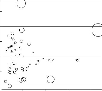
You can combine the information from outlier, leverage, and influence plots into one highly informative plot using the influencePlot() function from the car package:
library(car)
influencePlot(fit, id.method="identify", main="Influence Plot", sub="Circle size is proportional to Cook’s distance")
The resulting plot (figure 8.16) shows that Nevada and Rhode Island are outliers; New York, California, Hawaii, and Washington have high leverage; and Nevada, Alaska, and Hawaii are influential observations.
