

Robert I. Kabacoff - R in action
.pdf116 |
CHAPTER 5 Advanced data management |
“long format” resembling table 5.9 when analyzing repeated measures data (data where multiple measures are recorded for each observation). See section 9.6 for an example.
5.7Summary
This chapter reviewed dozens of mathematical, statistical, and probability functions that are useful for manipulating data. We saw how to apply these functions to a wide range of data objects, including vectors, matrices, and data frames. We learned to use control-flow constructs for looping and branching to execute some statements repetitively and execute other statements only when certain conditions are met. You then had a chance to write your own functions and apply them to data. Finally, we explored ways of collapsing, aggregating, and restructuring your data.
Now that you’ve gathered the tools you need to get your data into shape (no pun intended), we’re ready to bid part 1 goodbye and enter the exciting world of data analysis! In upcoming chapters, we’ll begin to explore the many statistical and graphical methods available for turning data into information.

Part 2
Basic methods
In part 1, we explored the R environment and discussed how to input data from a wide variety of sources, combine and transform it, and prepare it for further analyses. Once your data has been input and cleaned up, the next step is typically to explore each variable one at a time. This provides you with information about the distribution of each variable, which is useful in understanding the characteristics of the sample, identifying unexpected or problematic values, and selecting appropriate statistical methods. Next, a subset of variables is typically studied two at a time. This step can help you to uncover basic relationships among variables, and is a useful first step in developing more complex models.
Part 2 focuses on graphical and statistical techniques for obtaining basic information about data. Chapter 6 describes methods for visualizing the distribution of individual variables. For categorical variables, this includes bar plots, pie charts, and the newer fan plot. For numeric variables, this includes histograms, density plots, box plots, dot plots, and the less well-known violin plot. Each type of graph is useful for understanding the distribution of a single variable.
Chapter 7 describes statistical methods for summarizing individual variables and bivariate relationships. This chapter starts with coverage of descriptive statistics for numerical data based on the dataset as a whole, and on subgroups of interest. Next, the use of frequency tables and cross-tabulations for summarizing categorical data is described. The chapter ends with coverage of basic inferential methods for understanding relationships between two variables at a time, including bivariate correlations, chi-square tests, t-tests, and nonparametric methods.
When you have finished part 2, you will be able to use basic graphical and statistical methods available in R to describe your data, explore group differences, and identify significant relationships among variables.
Basic6graphs
This chapter covers
■Bar, box, and dot plots
■Pie and fan char ts
■Histograms and kernel density plots
Whenever we analyze data, the first thing that we should do is look at it. For each variable, what are the most common values? How much variability is present? Are there any unusual observations? R provides a wealth of functions for visualizing data. In this chapter, we’ll look at graphs that help you understand a single categorical or continuous variable. This topic includes
■Visualizing the distribution of variable
■Comparing groups on an outcome variable
In both cases, the variable could be continuous (for example, car mileage as miles per gallon) or categorical (for example, treatment outcome as none, some, or marked). In later chapters, we’ll explore graphs that display bivariate and multivariate relationships among variables.
In the following sections, we’ll explore the use of bar plots, pie charts, fan charts, histograms, kernel density plots, box plots, violin plots, and dot plots. Some of these may be familiar to you, whereas others (such as fan plots or violin plots) may be new
119

120 |
CHAPTER 6 Basic graphs |
to you. Our goal, as always, is to understand your data better and to communicate this understanding to others.
Let’s start with bar plots.
6.1Bar plots
Bar plots display the distribution (frequencies) of a categorical variable through vertical or horizontal bars. In its simplest form, the format of the barplot() function is
barplot(height)
where height is a vector or matrix.
In the following examples, we’ll plot the outcome of a study investigating a new treatment for rheumatoid arthritis. The data are contained in the Arthritis data frame distributed with the vcd package. Because the vcd package isn’t included in the default R installation, be sure to download and install it before first use (install. packages("vcd")).
Note that the vcd package isn’t needed to create bar plots. We’re loading it in order to gain access to the Arthritis dataset. But we’ll need the vcd package when creating spinogram, which are described in section 6.1.5.
6.1.1Simple bar plots
If height is a vector, the values determine the heights of the bars in the plot and a vertical bar plot is produced. Including the option horiz=TRUE produces a horizontal bar chart instead. You can also add annotating options. The main option adds a plot title, whereas the xlab and ylab options add x-axis and y-axis labels, respectively.
In the Arthritis study, the variable Improved records the patient outcomes for individuals receiving a placebo or drug.
>library(vcd)
>counts <- table(Arthritis$Improved)
>counts
None Some Marked
42 14 28
Here, we see that 28 patients showed marked improvement, 14 showed some improvement, and 42 showed no improvement. We’ll discuss the use of the table() function to obtain cell counts more fully in chapter 7.
You can graph the variable counts using a vertical or horizontal bar plot. The code is provided in the following listing and the resulting graphs are displayed in figure 6.1.
Listing 6.1 Simple bar plots
barplot(counts, |
|
Simple bar plot |
|
|
|||
main="Simple Bar Plot", |
|
|
|
xlab="Improvement", ylab="Frequency") |
|
|
|
barplot(counts, |
|
|
Horizontal |
|
|
||
main="Horizontal Bar Plot", |
|
bar plot |
|
xlab="Frequency", ylab="Improvement", |
|
|
|
horiz=TRUE) |
|
|
|

|
|
|
|
|
|
|
|
Bar plots |
|
121 |
|||||||||
|
|
|
|
Simple Bar Plot |
|
|
Horizontal Bar Plot |
||||||||||||
Frequency |
20 30 40 |
|
|
|
|
|
|
|
|
Improvement |
Some Marked |
|
|
|
|
|
|
|
|
|
|
|
|
|
|
|
|
|
|
|
|
|
|
|
|
||||
|
|
|
|
|
|
|
|
|
|
|
|
|
|
|
|||||
|
|
|
|
|
|
|
|
||||||||||||
|
|
|
|
|
|
|
|
|
|
|
|
|
|
|
|||||
|
|
|
|
|
|
||||||||||||||
|
|
|
|
|
|
|
|
|
|
|
|
|
|
|
|||||
|
|
|
|
|
|
|
|
||||||||||||
10 |
|
|
|
|
|
|
|
|
None |
|
|
|
|
|
|
|
|
||
|
|
|
|
|
|
|
|
|
|
|
|
|
|
|
|
|
|
||
|
|
|
|
|
|
|
|
|
|
||||||||||
|
0 |
|
|
|
|
|
|
|
|
|
|
|
|
|
|
|
|
|
|
|
|
|
|
|
|
|
|
|
|
|
|
|
|
|
|
|
|
|
|
|
|
|
|
|
|
|
|
|
|
|
|
|
|
|
|
|
|
||
|
|
|
|
|
|
|
|
|
|
|
|
|
|
|
|
|
|
|
|
None |
Some |
Marked |
0 |
10 |
20 |
30 |
40 |
|
Improvement |
|
Frequency |
|
|||
Figure 6.1 Simple vertical and horizontal bar charts |
|
|
|
|
|
||
TIP If the categorical |
variable to be |
plotted is |
a factor |
or |
ordered |
factor, |
|
you can create a vertical bar plot quickly with the plot() function. Because
Arthritis$Improved is a factor, the code
plot(Arthritis$Improved, main="Simple Bar Plot", xlab="Improved", ylab="Frequency")
plot(Arthritis$Improved, horiz=TRUE, main="Horizontal Bar Plot", xlab="Frequency", ylab="Improved")
will generate the same bar plots as those in listing 6.1, but without the need to tabulate values with the table() function.
What happens if you have long labels? In section 6.1.4, you’ll see how to tweak labels so that they don’t overlap.
6.1.2Stacked and grouped bar plots
If height is a matrix rather than a vector, the resulting graph will be a stacked or grouped bar plot. If beside=FALSE (the default), then each column of the matrix produces a bar in the plot, with the values in the column giving the heights of stacked “sub-bars.” If beside=TRUE, each column of the matrix represents a group, and the values in each column are juxtaposed rather than stacked.
Consider the cross-tabulation of treatment type and improvement status:
>library(vcd)
>counts <- table(Arthritis$Improved, Arthritis$Treatment)
>counts
Treatment
122 |
|
CHAPTER 6 Basic graphs |
Improved Placebo Treated |
||
None |
29 |
13 |
Some |
7 |
7 |
Marked |
7 |
21 |
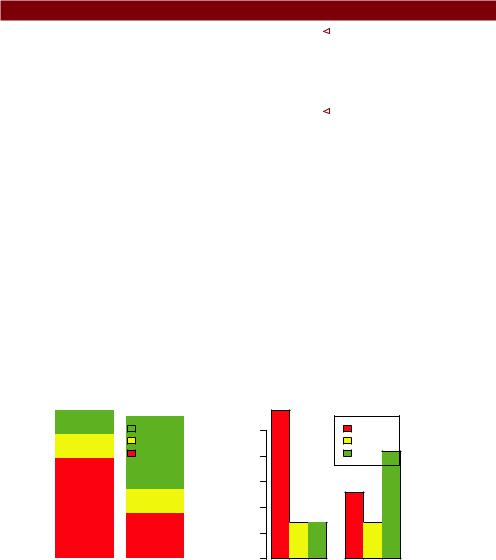
You can graph the results as either a stacked or a grouped bar plot (see the next listing). The resulting graphs are displayed in figure 6.2.
Listing 6.2 Stacked and grouped bar plotsw
barplot(counts, |
|
|
Stacked bar plot |
|
|
||
main="Stacked Bar |
Plot", |
||
xlab="Treatment", |
ylab="Frequency", |
||
col=c("red", "yellow","green"), |
|||
legend=rownames(counts)) |
|||
barplot(counts, |
|
|
Grouped bar plot |
|
|
||
main="Grouped Bar |
Plot", |
||
xlab="Treatment", |
ylab="Frequency", |
||
col=c("red", "yellow", "green"), legend=rownames(counts), beside=TRUE)
The first barplot function produces a stacked bar plot, whereas the second produces a grouped bar plot. We’ve also added the col option to add color to the bars plotted. The legend.text parameter provides bar labels for the legend (which are only useful when height is a matrix).
In chapter 3, we covered ways to format and place the legend to maximum benefit. See if you can rearrange the legend to avoid overlap with the bars.
6.1.3Mean bar plots
Bar plots needn’t be based on counts or frequencies. You can create bar plots that represent means, medians, standard deviations, and so forth by using the aggregate
Stacked Bar Plot
|
40 |
|
|
|
|
|
|
|
|
|
|
|
|
|
|
|
Marked |
|
|
25 |
|
|
20 30 |
|
|
|
|
|
Some |
|
|
|
Frequency |
|
|
|
|
|
None |
|
10 15 20 |
||
|
|
|
|
|
|
Frequency |
||||
|
|
|
|
|
|
|
||||
|
|
|
|
|
||||||
|
|
|
|
|
|
|
||||
|
10 |
|
|
|
|
|
|
|
|
5 |
|
|
|
|
|
|
|
|
|
||
|
|
|
|
|
|
|
|
|
|
|
|
0 |
|
|
|
|
|
|
|
|
0 |
|
|
|
|
Placebo |
|
|
Treated |
|
||
|
|
|
|
Treatment |
|
|||||
Figure 6.2 Stacked and grouped bar plots
Grouped Bar Plot
None
Some
Marked
Placebo Treated
Treatment
Bar plots |
123 |
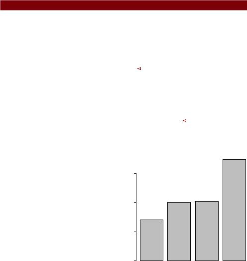
function and passing the results to the barplot() function. The following listing shows an example, which is displayed in figure 6.3.
Listing 6.3 Bar plot for sorted mean values
>states <- data.frame(state.region, state.x77)
>means <- aggregate(states$Illiteracy, by=list(state.region), FUN=mean)
>means
Group.1 x
1Northeast 1.00
2South 1.74
3North Central 0.70
4West 1.02
> means <- means[order(means$x),] |
|
Means sorted |
||||
> means |
|
|
smallest to |
|||
|
Group.1 |
x |
. largest |
|||
3 |
North Central 0.70 |
|
|
|
|
|
1 |
Northeast 1.00 |
|
|
|
|
|
4 |
West 1.02 |
|
|
|
|
|
2 |
South 1.74 |
|
|
|
|
|
> barplot(means$x, names.arg=means$Group.1) |
|
|
|
3 Title added |
||
> title("Mean Illiteracy Rate") |
|
|
|
|||
|
|
|
||||
Listing 6.3 sorts the means from smallest to largest .. Also note that use of the title() function 3 is equivalent to adding the main option in the plot call. means$x is the vector containing the heights of the bars, and the option names.arg=means$Group.1 is added to provide labels.
You can take this example further. The bars can be connected with straight line segments using the lines() function. You can also create mean bar plots with superimposed confidence intervals using the barplot2() function in the gplots package. See “barplot2: Enhanced Bar Plots” on the R Graph Gallery website (http://addictedtor.free.fr/graphiques) for an example.
Mean Illiteracy Rate
0.0 0.5 1.0 1.5
North Central |
Northeast |
West |
South |
Figure 6.3 Bar plot of mean illiteracy rates for US regions sorted by rate
6.1.4Tweaking bar plots
There are several ways to tweak the appearance of a bar plot. For example, with many bars, bar labels may start to overlap. You can decrease the font size using the cex. names option. Specifying values smaller than 1 will shrink the size of the labels. Optionally, the names.arg argument allows you to specify a character vector of names used to label the bars. You can also use graphical parameters to help text spacing. An example is given in the following listing with the output displayed in figure 6.4.

124 |
CHAPTER 6 Basic graphs |
Treatment Outcome
Marked Improvement
Some Improvement
No Improvement
0 |
10 |
20 |
30 |
40 |
Figure 6.4 Horizontal bar plot with tweaked labels
Listing 6.4 Fitting labels in a bar plot
par(mar=c(5,8,4,2))
par(las=2)
counts <- table(Arthritis$Improved)
barplot(counts,
main="Treatment Outcome", horiz=TRUE, cex.names=0.8,
names.arg=c("No Improvement", "Some Improvement", "Marked Improvement"))
In this example, we’ve rotated the bar labels (with las=2), changed the label text, and both increased the size of the y margin (with mar) and decreased the font size in order to fit the labels comfortably (using cex.names=0.8). The par() function allows you to make extensive modifications to the graphs that R produces by default. See chapter 3 for more details.
6.1.5Spinograms
Before finishing our discussion of bar plots, let’s take a look at a specialized version called a spinogram. In a spinogram, a stacked bar plot is rescaled so that the height of each bar is 1 and the segment heights represent proportions. Spinograms are created through the spine() function of the vcd package. The following code produces a simple spinogram:
library(vcd)
attach(Arthritis)
counts <- table(Treatment, Improved) spine(counts, main="Spinogram Example") detach(Arthritis)
Pie charts |
125 |
Spinogram Example
Some Marked
None
Improved
Placebo |
Treated |
Treatment
Figure 6.5 Spinogram of arthritis treatment outcome
1
0.8
0.6
0.4
0.2
0
The output is provided in figure 6.5. The larger percentage of patients with marked improvement in the Treated condition is quite evident when compared with the Placebo condition.
In addition to bar plots, pie charts are a popular vehicle for displaying the distribution of a categorical variable. We consider them next.
6.2Pie charts
Whereas pie charts are ubiquitous in the business world, they’re denigrated by most statisticians, including the authors of the R documentation. They recommend bar or dot plots over pie charts because people are able to judge length more accurately than volume. Perhaps for this reason, the pie chart options in R are quite limited when compared with other statistical software.
Pie charts are created with the function
pie(x, labels)
where x is a non-negative numeric vector indicating the area of each slice and labels provides a character vector of slice labels. Four examples are given in the next listing; the resulting plots are provided in figure 6.6.