

Robert I. Kabacoff - R in action
.pdf126 |
CHAPTER 6 |
Basic graphs |
|
Simple Pie Chart |
Pie Chart with Percentages |
|
UK |
UK 24% |
|
US |
US 20% |
|
Australia |
Australia 8% |
|
France |
France 16% |
|
Germany |
Germany 32% |
3D Pie Chart |
Pie Chart from a Table |
|
(with sample sizes) |
||
|
UK
US
Australia
 France
Germany
South
16Northeast 9
North Central |
West |
12 |
13 |
Figure 6.6 Pie chart examples
Listing 6.5 Pie charts
par(mfrow=c(2, 2))
slices <- c(10, 12,4, 16, 8)
lbls <- c("US", "UK", "Australia", "Germany", "France")
pie(slices, labels = lbls, main="Simple Pie Chart")
pct <- round(slices/sum(slices)*100)
lbls2 <- paste(lbls, " ", pct, "%", sep="") pie(slices, labels=lbls2, col=rainbow(length(lbls2)),
main="Pie Chart with Percentages")
library(plotrix)
pie3D(slices, labels=lbls,explode=0.1, main="3D Pie Chart ")
mytable <- table(state.region)
lbls3 <- paste(names(mytable), "\n", mytable, sep="") pie(mytable, labels = lbls3,
main="Pie Chart from a Table\n (with sample sizes)")
.
3
$
Combine four graphs into one
Add percentages to pie chart
Create chart from table
Pie charts |
127 |
First you set up the plot so that four graphs are combined into one .. (Combining multiple graphs is covered in chapter 3.) Then you input the data that will be used for the first three graphs.
For the second pie chart 3, you convert the sample sizes to percentages and add the information to the slice labels. The second pie chart also defines the colors of the slices using the rainbow() function, described in chapter 3. Here rainbow(length(lbls2)) resolves to rainbow(5), providing five colors for the graph.
The third pie chart is a 3D chart created using the pie3D() function from the plotrix package. Be sure to download and install this package before using it for the first time. If statisticians dislike pie charts, they positively despise 3D pie charts (although they may secretly find them pretty). This is because the 3D effect adds no additional insight into the data and is considered distracting eye candy.
The fourth pie chart demonstrates how to create a chart from a table $. In this case, you count the number of states by US region, and append the information to the labels before producing the plot.
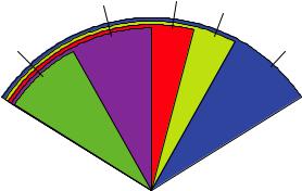
Pie charts make it difficult to compare the values of the slices (unless the values are appended to the labels). For example, looking at the simple pie chart, can you tell how the US compares to Germany? (If you can, you’re more perceptive than I am.) In an attempt to improve on this situation, a variation of the pie chart, called a fan plot, has been developed. The fan plot (Lemon & Tyagi, 2009) provides the user with a way to display both relative quantities and differences. In R, it’s implemented through the fan.plot() function in the plotrix package.
Consider the following code and the resulting graph (figure 6.7):
library(plotrix)
slices <- c(10, 12,4, 16, 8)
lbls <- c("US", "UK", "Australia", "Germany", "France") fan.plot(slices, labels = lbls, main="Fan Plot")
In a fan plot, the slices are rearranged to overlap each other and the radii have been modified so that each slice is visible. Here you can see that Germany is the largest slice
|
|
Fan Plot |
|
France |
US |
|
UK |
|
|
|
|
Australia |
|
Germany |
Figure 6.7 A fan plot of the country data

128 |
CHAPTER 6 Basic graphs |
and that the US slice is roughly 60 percent as large. France appears to be half as large as Germany and twice as large as Australia. Remember that the width of the slice and not the radius is what’s important here.
As you can see, it’s much easier to determine the relative sizes of the slice in a fan plot than in a pie chart. Fan plots haven’t caught on yet, but they’re new. Now that we’ve covered pie and fan charts, let’s move on to histograms. Unlike bar plots and pie charts, histograms describe the distribution of a continuous variable.
6.3Histograms
Histograms display the distribution of a continuous variable by dividing up the range of scores into a specified number of bins on the x-axis and displaying the frequency of scores in each bin on the y-axis. You can create histograms with the function
hist(x)
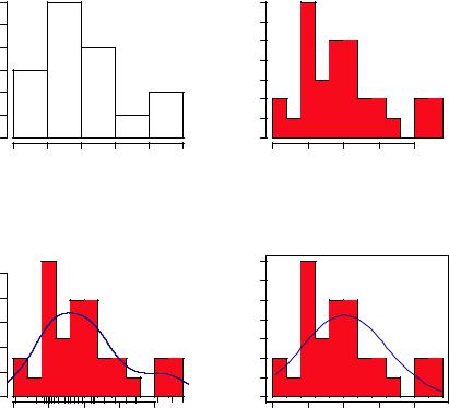
where x is a numeric vector of values. The option freq=FALSE creates a plot based on probability densities rather than frequencies. The breaks option controls the number of bins. The default produces equally spaced breaks when defining the cells of the histogram. Listing 6.6 provides the code for four variations of a histogram; the results are plotted in figure 6.8.
Listing 6.6 Histograms
par(mfrow=c(2,2))
hist(mtcars$mpg) |
|
. Simple histogram |
|
hist(mtcars$mpg, breaks=12, col="red",
xlab="Miles Per Gallon", main="Colored histogram with 12 bins")
hist(mtcars$mpg, freq=FALSE, breaks=12, col="red",
xlab="Miles Per Gallon",
main="Histogram, rug plot, density curve") rug(jitter(mtcars$mpg)) lines(density(mtcars$mpg), col="blue", lwd=2)
x <- mtcars$mpg h<-hist(x,
breaks=12,
col="red",
xlab="Miles Per Gallon",
main="Histogram with normal curve and box") xfit<-seq(min(x), max(x), length=40) yfit<-dnorm(xfit, mean=mean(x), sd=sd(x))
yfit <- yfit*diff(h$mids[1:2])*length(x) lines(xfit, yfit, col="blue", lwd=2) box()

 With specified 3bins and color

 With rug plot $ and frame
Histograms |
129 |
The first histogram . demonstrates the default plot when no options are specified. In this case, five bins are created, and the default axis labels and titles are printed. For the second histogram 3, you’ve specified 12 bins, a red fill for the bars, and more attractive and informative labels and title.
The third histogram $ maintains the colors, bins, labels, and titles as the previous plot, but adds a density curve and rug plot overlay. The density curve is a kernel density estimate and is described in the next section. It provides a smoother description of the distribution of scores. You use the lines() function to overlay this curve in a blue color and a width that’s twice the default thickness for lines. Finally, a rug plot is a onedimensional representation of the actual data values. If there are many tied values, you can jitter the data on the rug plot using code like the following:
rug(jitter(mtcars$mpag, amount=0.01))
This will add a small random value to each data point (a uniform random variate between ±amount), in order to avoid overlapping points.
|
|
Histogram of mtcars$mpg |
|
|
Colored histogram with 12 bins |
|||||||
|
12 |
|
|
|
|
|
|
7 |
|
|
|
|
|
10 |
|
|
|
|
|
|
6 |
|
|
|
|
Frequency |
4 6 8 |
|
|
|
|
|
Frequency |
5 |
|
|
|
|
|
|
|
|
|
3 4 |
|
|
|
|
|||
|
|
|
|
|
|
|
|
2 |
|
|
|
|
|
2 |
|
|
|
|
|
|
1 |
|
|
|
|
|
0 |
|
|
|
|
|
|
0 |
|
|
|
|
|
10 |
15 |
20 |
25 |
30 |
35 |
|
10 |
15 |
20 |
25 |
30 |
|
|
|
mtcars$mpg |
|
|
|
|
|
Miles Per Gallon |
|
||
|
Histogram, rug plot, density curve |
|
Histogram with normal curve and box |
|||||||||
|
|
|
|
|
|
|
|
7 |
|
|
|
|
|
|
|
|
|
|
|
|
6 |
|
|
|
|
Density |
0.04 0.08 |
|
|
|
|
|
Frequency |
2 3 4 5 |
|
|
|
|
|
|
|
|
|
|
|
|
1 |
|
|
|
|
|
0.00 |
|
|
|
|
|
|
0 |
|
|
|
|
|
10 |
15 |
20 |
25 |
30 |
|
|
10 |
15 |
20 |
25 |
30 |
|
|
|
Miles Per Gallon |
|
|
|
|
|
Miles Per Gallon |
|
||
Figure 6.8 Histograms examples

130 |
CHAPTER 6 Basic graphs |
The fourth histogram / is similar to the second but has a superimposed normal curve and a box around the figure. The code for superimposing the normal curve comes from a suggestion posted to the R-help mailing list by Peter Dalgaard. The surrounding box is produced by the box() function.
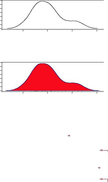
6.4Kernel density plots
In the previous section, you saw a kernel density plot superimposed on a histogram. Technically, kernel density estimation is a nonparametric method for estimating the probability density function of a random variable. Although the mathematics are beyond the scope of this text, in general kernel density plots can be an effective way to view the distribution of a continuous variable. The format for a density plot (that’s not being superimposed on another graph) is
plot(density(x))
where x is a numeric vector. Because the plot() function begins a new graph, use the lines() function (listing 6.6) when superimposing a density curve on an existing graph.
Two kernel density examples are given in the next listing, and the results are plotted in figure 6.9.
Listing 6.7 Kernel density plots
par(mfrow=c(2,1))
d <- density(mtcars$mpg)
plot(d)
d <- density(mtcars$mpg)
plot(d, main="Kernel Density of Miles Per Gallon") polygon(d, col="red", border="blue") rug(mtcars$mpg, col="brown")
In the first plot, you see the minimal graph created with all the defaults in place. In the second plot, you add a title, color the curve blue, fill the area under the curve with solid red, and add a brown rug. The polygon() function draws a polygon whose vertices are given by x and y (provided by the density() function in this case).
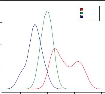
Kernel density plots can be used to compare groups. This is a highly underutilized approach, probably due to a general lack of easily accessible software. Fortunately, the sm package fills this gap nicely.
The sm.density.compare() function in the sm package allows you to superimpose the kernel density plots of two or more groups. The format is
sm.density.compare(x, factor)
where x is a numeric vector and factor is a grouping variable. Be sure to install the sm package before first use. An example comparing the mpg of cars with 4, 6, or 8 cylinders is provided in listing 6.8.
Kernel density plots |
131 |
density.default(x = mtcars$mpg)
|
0.06 |
|
|
|
Density |
0.03 |
|
|
|
|
0.00 |
|
|
|
|
10 |
20 |
30 |
40 |
|
|
N = 32 Bandwidth = 2.477 |
|
|
Kernel Density of Miles Per Gallon
|
0.06 |
|
|
|
Density |
0.03 |
|
|
|
|
0.00 |
|
|
|
|
10 |
20 |
30 |
40 |
|
|
N = 32 Bandwidth = 2.477 |
|
|
Figure 6.9 Kernel density plots
Listing 6.8 Comparative kernel density plots |
|
|
|
par(lwd=2) |
|
Double width of |
|
|
|||
library(sm) |
|
|
|
. plotted lines |
|||
attach(mtcars) |
|||
|
|
||
cyl.f <- factor(cyl, levels= c(4,6,8),
labels = c("4 cylinder", "6 cylinder", "8 cylinder"))
sm.density.compare(mpg, cyl, xlab="Miles Per Gallon") title(main="MPG Distribution by Car Cylinders")
colfill<-c(2:(1+length(levels(cyl.f)))) legend(locator(1), levels(cyl.f), fill=colfill)
3 Createfactor grouping
|
$ |
Plot densities |
|
Add legend via / mouse click
detach(mtcars)
The par() function is used to double the width of the plotted lines (lwd=2) so that they’d be more readable in this book .. The sm packages is loaded and the mtcars data frame is attached.
132 |
CHAPTER 6 Basic graphs |
In the mtcars data frame 3, the variable cyl is a numeric variable coded 4, 6, or 8. cyl is transformed into a factor, named cyl.f, in order to provide value labels for the plot. The sm.density.compare() function creates the plot $ and a title() statement adds a main title.
Finally, you add a legend to improve interpretability /. (Legends are covered in chapter 3.) First, a vector of colors is created. Here colfill is c(2,3,4). Then a legend is added to the plot via the legend() function. The locator(1) option indicates that you’ll place the legend interactively by clicking on the graph where you want the legend to appear. The second option provides a character vector of the labels. The third option assigns a color from the vector colfill to each level of cyl.f. The results are displayed in figure 6.10.
As you can see, overlapping kernel density plots can be a powerful way to compare groups of observations on an outcome variable. Here you can see both the shapes of the distribution of scores for each group and the amount of overlap between groups. (The moral of the story is that my next car will have four cylinders—or a battery.)
Box plots are also a wonderful (and more commonly used) graphical approach to visualizing distributions and differences among groups. We’ll discuss them next.
MPG Distribution by Car Cylinders
|
0.20 |
|
|
|
|
|
|
|
|
|
|
|
|
|
|
4 cylinder |
|
|
|
|
|
|
|
|
6 cylinder |
|
|
|
|
|
|
|
|
8 cylinder |
|
|
0.15 |
|
|
|
|
|
|
|
Density |
0.10 |
|
|
|
|
|
|
|
|
0.05 |
|
|
|
|
|
|
|
|
0.00 |
|
|
|
|
|
|
|
|
5 |
10 |
15 |
20 |
25 |
30 |
35 |
40 |
Miles Per Gallon
Figure 6.10 Kernel density plots of mpg by number of cylinders
Box plots |
133 |
6.5Box plots
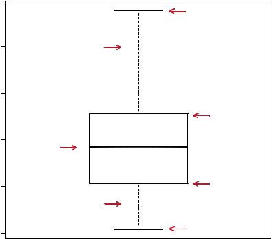
A “box-and-whiskers” plot describes the distribution of a continuous variable by plotting its five-number summary: the minimum, lower quartile (25th percentile), median (50th percentile), upper quartile (75th percentile), and maximum. It can also display observations that may be outliers (values outside the range of ± 1.5*IQR, where IQR is the interquartile range defined as the upper quartile minus the lower quartile). For example:
boxplot(mtcars$mpg, main="Box plot", ylab="Miles per Gallon")
produces the plot shown in figure 6.11. I added annotations by hand to illustrate the components.
By default, each whisker extends to the most extreme data point, which is no more than the 1.5 times the interquartile range for the box. Values outside this range are depicted as dots (not shown here).
For example, in our sample of cars the median mpg is 19.2, 50 percent of the scores fall between 15.3 and 22.8, the smallest value is 10.4, and the largest value is 33.9. How did I read this so precisely from the graph? Issuing boxplot.stats(mtcars$mpg)
B ox plo t
Miles Per Gallon
0 |
W hisker |
3 |
|
5
2
0 |
|
2 |
M edian |
|
5
1
W hisker
0
1
Upper hinge
Upper quartile
Lower quartile
Lower hinge
Figure 6.11 Box plot with annotations added by hand
134 |
CHAPTER 6 Basic graphs |
prints the statistics used to build the graph (in other words, I cheated). There doesn’t appear to be any outliers, and there is a mild positive skew (the upper whisker is longer than the lower whisker).
6.5.1Using parallel box plots to compare groups
Box plots can be created for individual variables or for variables by group. The format is
boxplot(formula, data=dataframe)
where formula is a formula and dataframe denotes the data frame (or list) providing the data. An example of a formula is y ~ A, where a separate box plot for numeric variable y is generated for each value of categorical variable A. The formula y ~ A*B would produce a box plot of numeric variable y, for each combination of levels in categorical variables A and B.
Adding the option varwidth=TRUE will make the box plot widths proportional to the square root of their sample sizes. Add horizontal=TRUE to reverse the axis orientation.
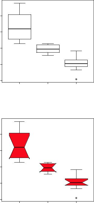
In the following code, we revisit the impact of four, six, and eight cylinders on auto mpg with parallel box plots. The plot is provided in figure 6.12.
boxplot(mpg ~ cyl, data=mtcars, main="Car Mileage Data", xlab="Number of Cylinders", ylab="Miles Per Gallon")
You can see in figure 6.12 that there’s a good separation of groups based on gas mileage. You can also see that the distribution of mpg for six-cylinder cars is more symmetrical than for the other two car types. Cars with four cylinders show the greatest spread (and positive skew) of mpg scores, when compared with sixand eight-cylinder cars. There’s also an outlier in the eight-cylinder group.
Box plots are very versatile. By adding notch=TRUE, you get notched box plots. If two boxes’ notches don’t overlap, there’s strong evidence that their medians differ (Chambers et al., 1983, p. 62). The following code will create notched box plots for our mpg example:
boxplot(mpg ~ cyl, data=mtcars, notch=TRUE, varwidth=TRUE, col="red",
main="Car Mileage Data", xlab="Number of Cylinders", ylab="Miles Per Gallon")
The col option fills the box plots with a red color, and varwidth=TRUE produces box plots with widths that are proportional to their sample sizes.
You can see in figure 6.13 that the median car mileage for four-, six-, and eightcylinder cars differ. Mileage clearly decreases with number of cylinders.
Box plots |
135 |
Car Milage Data
|
30 |
Gallon |
25 |
Miles Per |
20 |
|
15 |
|
10 |
4 |
6 |
8 |
Figure 6.12 Box plots |
|
of car mileage versus |
||||
|
|
|
||
|
Number of Cylinders |
|
number of cylinders |
Car Mileage Data
|
30 |
|
|
Gallon |
25 |
|
|
Miles Per |
20 |
|
|
|
15 |
|
|
|
10 |
|
|
|
4 |
6 |
8 |
Number of Cylinders
Figure 6.13 Notched box plots for car mileage versus number of cylinders