

Robert I. Kabacoff - R in action
.pdf46 |
CHAPTER 3 Getting started with graphs |
In this chapter, we’ll review general methods for working with graphs. We’ll start with how to create and save graphs. Then we’ll look at how to modify the features that are found in any graph. These features include graph titles, axes, labels, colors, lines, symbols, and text annotations. Our focus will be on generic techniques that apply across graphs. (In later chapters, we’ll focus on specific types of graphs.) Finally, we’ll investigate ways to combine multiple graphs into one overall graph.
3.1Working with graphs
R is an amazing platform for building graphs. I’m using the term “building” intentionally. In a typical interactive session, you build a graph one statement at a time, adding features, until you have what you want.
Consider the following five lines:
attach(mtcars) plot(wt, mpg) abline(lm(mpg~wt))
title("Regression of MPG on Weight") detach(mtcars)
The first statement attaches the data frame mtcars. The second statement opens a graphics window and generates a scatter plot between automobile weight on the horizontal axis and miles per gallon on the vertical axis. The third statement adds a line of best fit. The fourth statement adds a title. The final statement detaches the data frame. In R, graphs are typically created in this interactive fashion (see figure 3.1).
You can save your graphs via code or through GUI menus. To save a graph via code, sandwich the statements that produce the graph between a statement that sets a destination and a statement that closes that destination. For example, the following
Figure 3.1 Creating a graph
Working with graphs |
47 |
will save the graph as a PDF document named mygraph.pdf in the current working directory:
pdf("mygraph.pdf")
attach(mtcars) plot(wt, mpg) abline(lm(mpg~wt))
title("Regression of MPG on Weight") detach(mtcars)
dev.off()
In addition to pdf(), you can use the functions win.metafile(), png(), jpeg(), bmp(), tiff(), xfig(), and postscript() to save graphs in other formats. (Note: The Windows metafile format is only available on Windows platforms.) See chapter 1, section 1.3.4 for more details on sending graphic output to files.
Saving graphs via the GUI will be platform specific. On a Windows platform, select File > Save As from the graphics window, and choose the format and location desired in the resulting dialog. On a Mac, choose File > Save As from the menu bar when the Quartz graphics window is highlighted. The only output format provided is PDF. On a Unix platform, the graphs must be saved via code. In appendix A, we’ll consider alternative GUIs for each platform that will give you more options.
Creating a new graph by issuing a high-level plotting command such as plot(), hist() (for histograms), or boxplot() will typically overwrite a previous graph. How can you create more than one graph and still have access to each? There are several methods.
First, you can open a new graph window before creating a new graph:
dev.new()
statements to create graph 1 dev.new()
statements to create a graph 2 etc.
Each new graph will appear in the most recently opened window.
Second, you can access multiple graphs via the GUI. On a Mac platform, you can step through the graphs at any time using Back and Forward on the Quartz menu. On a Windows platform, you must use a two-step process. After opening the first graph window, choose History > Recording. Then use the Previous and Next menu items to step through the graphs that are created.
Third and finally, you can use the functions dev.new(), dev.next(), dev.prev(), dev.set(), and dev.off() to have multiple graph windows open at one time and choose which output are sent to which windows. This approach works on any platform. See help(dev.cur) for details on this approach.
R will create attractive graphs with a minimum of input on our part. But you can also use graphical parameters to specify fonts, colors, line styles, axes, reference lines, and annotations. This flexibility allows for a wide degree of customization.

48 |
CHAPTER 3 Getting started with graphs |
In this chapter, we’ll start with a simple graph and explore the ways you can modify and enhance it to meet your needs. Then we’ll look at more complex examples that illustrate additional customization methods. The focus will be on techniques that you can apply to a wide range of the graphs that you’ll create in R. The methods discussed here will work on all the graphs described in this book, with the exception of those created with the lattice package in chapter 16. (The lattice package has its own methods for customizing a graph’s appearance.) In other chapters, we’ll explore each specific type of graph and discuss where and when they’re most useful.
3.2A simple example
Let’s start with the simple fictitious dataset given in table 3.1. It describes patient response to two drugs at five dosage levels.
Table 3.1 Patient response to two drugs at five dosage levels
Dosage |
Response to Drug A |
Response to Drug B |
|
|
|
20 |
16 |
15 |
30 |
20 |
18 |
40 |
27 |
25 |
45 |
40 |
31 |
60 |
60 |
40 |
|
|
|
You can input this data using this code:
dose <- c(20, 30, 40, 45, 60) drugA <- c(16, 20, 27, 40, 60) drugB <- c(15, 18, 25, 31, 40)
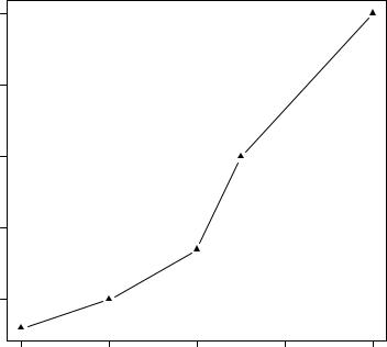
A simple line graph relating dose to response for drug A can be created using
plot(dose, drugA, type="b")
plot() is a generic function that plots objects in R (its output will vary according to the type of object being plotted). In this case, plot(x, y, type="b") places x on the horizontal axis and y on the vertical axis, plots the (x, y) data points, and connects them with line segments. The option type="b" indicates that both points and lines should be plotted. Use help(plot) to view other options. The graph is displayed in figure 3.2.
Line plots are covered in detail in chapter 11. Now let’s modify the appearance of this graph.

Graphical parameters |
49 |
|
60 |
|
|
|
|
|
50 |
|
|
|
|
drugA |
40 |
|
|
|
|
|
30 |
|
|
|
|
|
20 |
|
|
|
|
|
20 |
30 |
40 |
50 |
60 |
|
|
|
dose |
|
|
Figure 3.2 Line plot of dose vs. response for drug A
3.3Graphical parameters
You can customize many features of a graph (fonts, colors, axes, titles) through options called graphical parameters.
One way is to specify these options through the par() function. Values set in this manner will be in effect for the rest of the session or until they’re changed. The format is par(optionname=value, optionname=value, ...). Specifying par() without parameters produces a list of the current graphical settings. Adding the no.readonly=TRUE option produces a list of current graphical settings that can be modified.
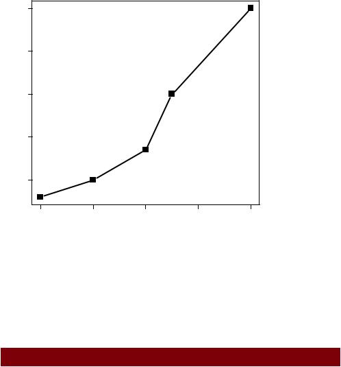
Continuing our example, let’s say that you’d like to use a solid triangle rather than an open circle as your plotting symbol, and connect points using a dashed line rather than a solid line. You can do so with the following code:
opar <- par(no.readonly=TRUE) par(lty=2, pch=17)
plot(dose, drugA, type="b") par(opar)
The resulting graph is shown in figure 3.3.
The first statement makes a copy of the current settings. The second statement changes the default line type to dashed (lty=2) and the default symbol for plotting
50 |
CHAPTER 3 Getting started with graphs |
|
60 |
|
|
|
|
|
50 |
|
|
|
|
drugA |
40 |
|
|
|
|
|
30 |
|
|
|
|
|
20 |
|
|
|
|
|
20 |
30 |
40 |
50 |
60 |
|
|
|
dose |
|
|
Figure 3.3 Line plot of dose vs. response for drug A with modified line type and symbol
points to a solid triangle (pch=17). You then generate the plot and restore the original settings. Line types and symbols are covered in section 3.3.1.
You can have as many par() functions as desired, so par(lty=2, pch=17) could also have been written as
par(lty=2)
par(pch=17)
A second way to specify graphical parameters is by providing the optionname=value pairs directly to a high-level plotting function. In this case, the options are only in effect for that specific graph. You could’ve generated the same graph with the code
plot(dose, drugA, type="b", lty=2, pch=17)
Not all high-level plotting functions allow you to specify all possible graphical parameters. See the help for a specific plotting function (such as ?plot, ?hist, or ?boxplot) to determine which graphical parameters can be set in this way. The remainder of section 3.3 describes many of the important graphical parameters that you can set.
3.3.1Symbols and lines
As you’ve seen, you can use graphical parameters to specify the plotting symbols and
lines used in your graphs. The relevant parameters are shown in table 3.2.
|
Graphical parameters |
51 |
Table 3.2 Parameters for specifying symbols and lines |
|
|
|
|
|
Parameter |
Description |
|
|
|
|
pch |
Specifies the symbol to use when plotting points (see figure 3.4). |
|
cex |
Specifies the symbol size. cex is a number indicating the amount by which |
|
|
plotting symbols should be scaled relative to the default. 1=default, 1.5 is 50% |
|
|
larger, 0.5 is 50% smaller, and so for th. |
|
lty |
Specifies the line type (see figure 3.5). |
|
lwd |
Specifies the line width. lwd is expressed relative to the default (default=1). |
|
|
For example, lwd=2 generates a line twice as wide as the default. |
|
|
|
|
The pch= option specifies the symbols to use when plotting points. Possible values are shown in figure 3.4.
For symbols 21 through 25 you can also specify the border (col=) and fill (bg=) colors.
Use lty= to specify the type of line desired. The option values are shown in figure 3.5.
Taking these options together, the code
plot(dose, drugA, type="b", lty=3, lwd=3, pch=15, cex=2)
would produce a plot with a dotted line that was three times wider than the default width, connecting points displayed as filled squares that are twice as large as the default symbol size. The results are displayed in figure 3.6.
Next, let’s look at specifying colors.
plot symbols: pch=

 0
0  5
5  10
10  15
15  20
20 25
25
 1
1  6
6  11
11  16
16  21
21
 2
2  7
7  12
12 17
17 
 22
22
 3
3  8
8  13
13  18
18 23
23
 4
4  9
9  14
14  19
19 24
24
Figure 3.4 Plotting symbols specified with the pch parameter
line types: lty=
6
5
4
3
2
1
Figure 3.5 Line types specified with the lty parameter
52 |
CHAPTER 3 Getting started with graphs |
|
60 |
|
|
|
|
|
50 |
|
|
|
|
drugA |
40 |
|
|
|
|
|
30 |
|
|
|
|
|
20 |
|
|
|
|
|
20 |
30 |
40 |
50 |
60 |
|
|
|
dose |
|
|
Figure 3.6 Line plot of dose vs. response for drug A with modified line type, line width, symbol, and symbol width
3.3.2Colors
There are several color-related parameters in R. Table 3.3 shows some of the common ones.
Table 3.3 Parameters for specifying color
Parameter |
Description |
|
|
col |
Default plotting color. Some functions (such as lines and pie) accept a vector |
|
of values that are recycled. For example, if col=c(“red”, “blue”)and |
|
three lines are plotted, the first line will be red, the second blue, and the |
|
third red. |
col.axis |
Color for axis text. |
col.lab |
Color for axis labels. |
col.main |
Color for titles. |
col.sub |
Color for subtitles. |
fg |
The plot’s foreground color. |
bg |
The plot’s background color. |
|
|

Graphical parameters |
53 |
You can specify colors in R by index, name, hexadecimal, RGB, or HSV. For example, col=1, col="white", col="#FFFFFF", col=rgb(1,1,1), and col=hsv(0,0,1) are equivalent ways of specifying the color white. The function rgb()creates colors based on red-green-blue values, whereas hsv() creates colors based on hue-saturation values. See the help feature on these functions for more details.
The function colors() returns all available color names. Earl F. Glynn has created an excellent online chart of R colors, available at http://research.stowers-institute. org/efg/R/Color/Chart. R also has a number of functions that can be used to create vectors of contiguous colors. These include rainbow(), heat.colors(), terrain. colors(), topo.colors(), and cm.colors(). For example, rainbow(10) produces 10 contiguous “rainbow" colors. Gray levels are generated with the gray() function. In this case, you specify gray levels as a vector of numbers between 0 and 1. gray(0:10/10) would produce 10 gray levels. Try the code
n <- 10
mycolors <- rainbow(n)
pie(rep(1, n), labels=mycolors, col=mycolors) mygrays <- gray(0:n/n)
pie(rep(1, n), labels=mygrays, col=mygrays)
to see how this works. You’ll see examples that use color parameters throughout this chapter.
3.3.3Text characteristics
Graphic parameters are also used to specify text size, font, and style. Parameters controlling text size are explained in table 3.4. Font family and style can be controlled with font options (see table 3.5).
Table 3.4 Parameters specifying text size
Parameter |
Description |
|
|
cex |
Number indicating the amount by which plotted text should be scaled relative |
|
to the default. 1=default, 1.5 is 50% larger, 0.5 is 50% smaller, etc. |
cex.axis |
Magnification of axis text relative to cex. |
cex.lab |
Magnification of axis labels relative to cex. |
cex.main |
Magnification of titles relative to cex. |
cex.sub |
Magnification of subtitles relative to cex. |
|
|
For example, all graphs created after the statement
par(font.lab=3, cex.lab=1.5, font.main=4, cex.main=2)
will have italic axis labels that are 1.5 times the default text size, and bold italic titles that are twice the default text size.

54 |
|
CHAPTER 3 Getting started with graphs |
|
Table 3.5 Parameters specifying font family, size, and style |
|
|
|
|
|
Parameter |
Description |
|
|
|
|
font |
Integer specifying font to use for plotted text.. 1=plain, 2=bold, 3=italic, |
|
|
4=bold italic, 5=symbol (in Adobe symbol encoding). |
|
font.axis |
Font for axis text. |
|
font.lab |
Font for axis labels. |
|
font.main |
Font for titles. |
|
font.sub |
Font for subtitles. |
|
ps |
Font point size (roughly 1/72 inch). |
|
|
The text size = ps*cex. |
|
family |
Font family for drawing text. Standard values are serif, sans, and mono. |
|
|
|
Whereas font size and style are easily set, font family is a bit more complicated. This is because the mapping of serif, sans, and mono are device dependent. For example, on Windows platforms, mono is mapped to TT Courier New, serif is mapped to TT Times New Roman, and sans is mapped to TT Arial (TT stands for True Type). If you’re satisfied with this mapping, you can use parameters like family="serif" to get the results you want. If not, you need to create a new mapping. On Windows, you can create this mapping via the windowsFont() function. For example, after issuing the statement
windowsFonts( A=windowsFont("Arial Black"),
B=windowsFont("Bookman Old Style"), C=windowsFont("Comic Sans MS")
)
you can use A, B, and C as family values. In this case, par(family="A") will specify an Arial Black font. (Listing 3.2 in section 3.4.2 provides an example of modifying text parameters.) Note that the windowsFont() function only works for Windows. On a Mac, use quartzFonts() instead.
If graphs will be output in PDF or PostScript format, changing the font family is relatively straightforward. For PDFs, use names(pdfFonts())to find out which fonts are available on your system and pdf(file="myplot.pdf", family="fontname") to generate the plots. For graphs that are output in PostScript format, use names(postscriptFonts()) and postscript(file="myplot.ps", family="fontname"). See the online help for more information.
3.3.4Graph and margin dimensions
Finally, you can control the plot dimensions and margin sizes using the parameters listed in table 3.6.

|
Graphical parameters |
55 |
Table 3.6 Parameters for graph and margin dimensions |
|
|
|
|
|
Parameter |
Description |
|
|
|
|
pin |
Plot dimensions (width, height) in inches. |
|
mai |
Numerical vector indicating margin size where c(bottom, left, top, right) is |
|
|
expressed in inches. |
|
mar |
Numerical vector indicating margin size where c(bottom, left, top, right) is |
|
|
expressed in lines. The default is c(5, 4, 4, 2) + 0.1. |
|
|
|
|
The code
par(pin=c(4,3), mai=c(1,.5, 1, .2))
produces graphs that are 4 inches wide by 3 inches tall, with a 1-inch margin on the bottom and top, a 0.5-inch margin on the left, and a 0.2-inch margin on the right. For a complete tutorial on margins, see Earl F. Glynn’s comprehensive online tutorial (http://research.stowers-institute.org/efg/R/Graphics/Basics/mar-oma/).
Let’s use the options we’ve covered so far to enhance our simple example. The code in the following listing produces the graphs in figure 3.7.
Listing 3.1 Using graphical parameters to control graph appearance
dose <- c(20, 30, 40, 45, 60) drugA <- c(16, 20, 27, 40, 60) drugB <- c(15, 18, 25, 31, 40) opar <- par(no.readonly=TRUE) par(pin=c(2, 3))
par(lwd=2, cex=1.5) par(cex.axis=.75, font.axis=3)
plot(dose, drugA, type="b", pch=19, lty=2, col="red")
plot(dose, drugB, type="b", pch=23, lty=6, col="blue", bg="green") par(opar)
First you enter your data as vectors, then save the current graphical parameter settings (so that you can restore them later). You modify the default graphical parameters so that graphs will be 2 inches wide by 3 inches tall. Additionally, lines will be twice the default width and symbols will be 1.5 times the default size. Axis text will be set to italic and scaled to 75 percent of the default. The first plot is then created using filled red circles and dashed lines. The second plot is created using filled green filled diamonds and a blue border and blue dashed lines. Finally, you restore the original graphical parameter settings.
Note that parameters set with the par() function apply to both graphs, whereas parameters specified in the plot functions only apply to that specific graph. Looking at figure 3.7 you can see some limitations in your presentation. The graphs lack titles and the vertical axes are not on the same scale, limiting your ability to compare the two drugs directly. The axis labels could also be more informative.