

III Make up a plan of the text.
IV Translate the paragraphs in italics in a written form.
V Questions for discussion:
1. Was Charles Frederick Worth the first to employ the principles of design?
2. Who were the clients of Worth?
3. What was Worth’s childhood like?
4. What idea did he introduce in Paris?
5. How were dresses made before Worth’s career?
6. How did he become the court designer?
7. What fabrics did Frederick Worth use for his dresses?
8. What were his contributions to design?
9. How did Worth make high fashion more available?
10. What attitude did he have to ready-to-wear clothing?
VI Render the text in brief in a written form.
TEXT C
I Mind the following words and word-combinations:
1. fashion trend – модна тенденція
2. nobleman – дворянин
3. doll – лялька
4. fashion plate – сторінка мод
5. Parisian printer – паризький друкар
6. engraving – гравюра
II Listen to the text. Decide if the statements are true or false:
1. Fashion trends were set up by the middle class.
2. Tailors went round the country with life-sized dolls to spread new trends.
3. The first fashion magazines appeared in London.
4. Fashion plates are illustrations of the latest clothing.
5. Nowadays fashion magazines are not so popular as they were in the seventeenth century.
III Listen to the text again and be ready to answer the questions:
1. How were fashion trends spread around the country in the seventeenth century?
2. What are fashion plates?
Unit 5 Principles and elements of design
Text A
I Listen and remember the following words:
-
to contain – містити в собі
-
to apply – застосовувати
-
to divide – ділити
-
to determine – визначати
-
tranquillity – спокій
-
surface – поверхня
-
edge – край
-
juxtaposition – розташування
-
whereas – в той час як
-
oblique – косий
II Read and remember the following phrases:
-
creating a work of art – створення витвору мистецтва
-
surface quality – якість поверхні
-
linear perspective – лінійна перспектива
-
satisfying effect – задовільний ефект
-
adjacent colours – суміжні кольори
-
to benefit from – вигравати
Principles and elements of design
The elements and principles of design are the building blocks used to create a work of art. The elements of design are the things that make up a painting, drawing, design etc. Good or bad - all paintings will contain most of or even all the seven elements of design. How we apply the principles of design determines how successful we are in creating a work of art.
The elements of design are line, shape, direction, size, texture, coloor, and value. Lines are used to divide space, direct the eye, and create forms. At the most basic level, straight lines are found in layouts to separate content, such as in magazine, newspaper, and website designs. This can, of course, go much further with curved, dotted, and zigzag lines used as the defining elements on a page and as the basis for illustrations and graphics.
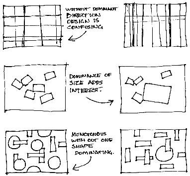
A shape is a self contained defined area of geometric or organic form. A positive shape in a painting automatically creates a negative shape. They are used to establish layouts, create patterns, and build countless elements on the page. All lines have direction – horizontal, vertical or oblique. Horizontal direction suggests calmness, stability and tranquillity. Vertical gives a feeling of balance, formality and alertness, where as oblique suggests movement and action.
Size is simply the relationship of the area occupied by one shape to that of another. Texture is the surface quality of a shape - rough, smooth, soft hard glossy etc. Texture can be physical (tactile) or visual.
Colour is an interesting element of graphic design because it can be applied to any other element, changing it dramatically. Graphic designers should combine their experience with colour with an understanding of colour theory.
Value is the lightness or darkness of a colour. Value is also called tone.
There are several principles of design, which include balance, gradation, repetition, contrast, harmony, dominance, and unity.
Balance in design is similar to balance in physics.
 A large shape close to the centre can be balanced by a small shape
close to the edge. A large light toned shape will be balanced by a
small dark toned shape (the darker the shape the heavier it appears
to be).
A large shape close to the centre can be balanced by a small shape
close to the edge. A large light toned shape will be balanced by a
small dark toned shape (the darker the shape the heavier it appears
to be).
Gradation of size and direction produces linear perspective. Gradation of colour from warm to cool and tone from dark to light produce aerial perspective. Gradation can add interest and movement to a shape. A gradation from dark to light will cause the eye to move along a shape.

Repetition with variation is interesting, without variation repetition can become monotonous. Contrast is the juxtaposition of opposing elements, for example opposite colours on the colour wheel - red / green, blue / orange etc. Contrast in tone or value - light / dark. Contrast in direction - horizontal / vertical.
The major contrast in a painting should be located at the centre of interest. Too much contrast scattered throughout a painting can destroy unity and make a work difficult to look at.
Harmony in painting is the visually satisfying effect of combining similar, related elements, for example, adjacent colours on the colour wheel, similar shapes etc. Dominance gives a painting interest, counteracting confusion and monotony. Dominance can be applied to one or more of the elements to give emphasis.
Unity in a painting also refers to the visual linking of various elements of the work. For example a painting with an active aggressive subject would work better with a dominant oblique direction, course, rough texture, angular lines etc. whereas a quiet passive subject would benefit from horizontal lines, soft texture and less tonal contrast.