

1manly_b_f_j_statistics_for_environmental_science_and_managem
.pdf146 Statistics for Environmental Science and Management, Second Edition
Y
10 Points
30
25
10 Points |
10 Points |
20
15
10 Points
10
5
5 |
10 |
15 |
20 |
25 |
30 |
|
|
|
X |
|
|
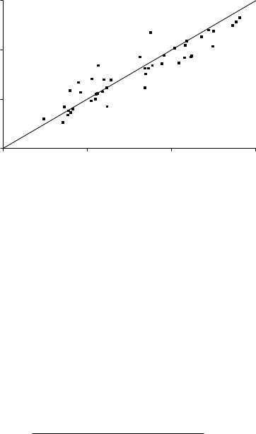
Figure 5.11
Test for a change of shape in a distribution by counting points around a shifted line.
with 1 degree of freedom (df). This is significantly large at the 1% level, giving clear evidence of a shift in the general level of observations. Because most plotted points are above the 45 degree line, the observations tend to be higher at the second sample time than at the first sample time.
For the second test, the line at 45 degrees is shifted upward or downward so that an equal number of points are above and below it. Counts are then made of the number of points in four quadrats, as shown in Figure 5.11. The counts then form a 2 × 2 contingency table, and the contingency table chisquared test (Appendix 1, Section A1.4) can be used to see whether the counts above and below the line are significantly different. A significant result indicates a change in shape of the distribution from one time period to the next. In Figure 5.11 the observed counts are
10 10 10 10
These are exactly equal to the expected counts on the assumption that the probability of a point plotting above the line is the same for high and low observations, leading to a chi-squared value of zero with 1 df. There is, therefore, no evidence of a change in shape of the distribution from this test.
Finally, the third test involves dividing the points into quartiles, as shown in Figure 5.12. The counts in the different parts of the plot now make a 4 × 2 contingency table for which a significant chi-squared statistic again indicates a change in distribution. The contingency table from Figure 5.12 is shown in

Environmental Monitoring |
147 |
Y
30
25
20
15
10
5
5
4 Points
6 Points
5 Points
6 Points
5 Points
4 Points
5 Points
5 Points
10 |
15 |
20 |
25 |
30 |
|
|
X |
|
|
Figure 5.12
Extension of the test for a change in the shape of a distribution with more division of points.
Table 5.7
Counts of Points above and below the Shifted 45 Degree Line Shown in Figure 5.12
|
|
Quartile of the Distribution |
|||
|
1 |
2 |
3 |
4 |
Total |
|
|
|
|
|
|
Above line |
5 |
5 |
6 |
4 |
20 |
Below line |
5 |
5 |
4 |
6 |
20 |
|
|
|
|
|
|
Total |
10 |
10 |
10 |
10 |
40 |
|
|
|
|
|
|
Table 5.7. The chi-squared statistic is 0.80 with 3 df, again giving no evidence of a change in the shape of the distribution.
In carrying out these tests, it will usually be simplest to count the points based on drawing graphs like those shown in Figures 5.10 to 5.12 very accurately, with points on lines omitted from the counts.
Example 5.4: The pH for Norwegian Lakes in 1976 and 1978
Figure 5.13 shows the 1978 pH values plotted against the 1976 values for the 44 lakes shown in Table 5.3 for which observations are available for both years. For the first of Stehman and Overton’s (1994) tests, it is found that there are 13 points that plot above, and 31 that plot below the 45 degree line. The chi-square statistic is therefore
(13 − 22)²/22 + (31 − 22)²/22 = 7.36
148 Statistics for Environmental Science and Management, Second Edition
7
6
Y
5
4
4 |
5 |
6 |
7 |
X
Figure 5.13
Plot of 1978 pH values (Y) against 1976 pH values (X) for 44 Norwegian lakes, for use with Stehman and Overton’s (1994) tests.
with 1 df. Because this is significant at the 1% level, there is clear evidence of a shift (downward) in the distribution.
For the second of Stehman and Overton’s (1994) tests, the counts above and below a shifted line are found to be
15 7 7 15
The chi-squared statistic for this 2 × 2 contingency table is 5.82 with 1 df. This is significant at the 5% level, giving some evidence of a change in the shape of the distribution. The nature of the changes is that there seems to have been a tendency for low values to increase and high values to decrease between 1976 and 1978.
For the third test, the counts are given in Table 5.8. The expected count in each cell is 5.5, and the contingency table chi-squared test comparing
Table 5.8
Counts of Points above and below the Shifted 45 Degree Line for the Comparison between pH Levels of Lakes in 1976 and 1978
|
|
Quartile of the Distribution |
|||
|
1 |
2 |
3 |
4 |
Total |
|
|
|
|
|
|
Above line |
7 |
8 |
5 |
2 |
22 |
Below line |
4 |
3 |
6 |
9 |
22 |
|
|
|
|
|
|
Total |
11 |
11 |
11 |
11 |
44 |
|
|
|
|
|
|

Environmental Monitoring |
149 |
observed and expected frequencies gives a test statistic of 7.64 with 3 df. This is not quite significantly large at the 5% level, so that at this level of detail the evidence for a change in distribution is not strong.
Overall, the three chi-squared tests suggest that there has been a shift in the distribution toward lower pH values, with some reduction in variation as well.
5.10 Chapter Summary
•A number of monitoring schemes are set up around the world to detect changes and trends in environmental variables, at scales ranging from whole countries to small local areas. Monitoring sites may be purposely chosen to be representative and meet other criteria, be chosen using special sampling designs incorporating both fixed sites and changing sites, or based on some optimization principle.
•If repeated measurements are taken at a set of sites over a region, then one approach to testing for time changes is to use two-factor analysis of variance. The first factor is then the site and the second factor is the sample time. This type of analysis is illustrated using pH data from Norwegian lakes.
•Control charts are widely used to monitor industrial processes, and can be used equally well to monitor environmental variables. With Shewhart’s (1931) method, there is one chart to monitor the process mean and a second chart to monitor the variability. The construction of these charts is described and illustrated using pH data from rivers in the South Island of New Zealand.
•Cumulative sum (CUSUM) charts are an alternative to the Shewhart control chart for the mean. They involve plotting accumulating sums of deviations from a target value for a mean, rather than sample means. This type of chart may be able to detect small changes in the mean more effectively than the Shewhart chart, but is more complicated to set up.
•A variation on the usual CUSUM idea can be used to detect systematic changes with time in situations where a number of sampling stations are sampled at several points in time. This procedure incorporates randomization tests to detect changes, and is illustrated using the pH data from Norwegian lakes.
•A method for detecting changes in a distribution using chi-squared tests is described. With this test, the same randomly selected sample units are measured at two times, and the second measurement (y) is plotted against the first measurement (x). Based on the positions of the

150 Statistics for Environmental Science and Management, Second Edition
plotted points, it is possible to test for a change in the mean of the distribution, followed by tests for changes in the shape of the distribution.
Exercises
Exercise 5.1
Table 5.9 shows the annual ring widths (mm) measured for samples of five Andean alders taken each year from 1964 to 1989 from a site on Taficillo Ridge, Tucuman, Argentina, which was the topic of Example 1.5. Construct control charts for the sample means and ranges and comment
Table 5.9
Tree-Ring Widths (mm) of Andean Alders (Alnus acuminata)
|
1 |
2 |
3 |
4 |
5 |
|
|
|
|
|
|
1964 |
3.0 |
5.0 |
7.2 |
6.0 |
5.1 |
1965 |
5.1 |
4.1 |
8.2 |
3.5 |
5.3 |
1966 |
2.9 |
6.6 |
6.8 |
7.5 |
4.3 |
1967 |
7.3 |
7.0 |
5.2 |
5.0 |
3.3 |
1968 |
3.3 |
5.7 |
10.1 |
4.8 |
4.0 |
1969 |
4.4 |
1.3 |
4.3 |
2.6 |
9.2 |
1970 |
1.9 |
4.3 |
3.3 |
5.2 |
1.4 |
1971 |
7.3 |
2.6 |
4.7 |
3.2 |
2.7 |
1972 |
2.2 |
4.4 |
3.1 |
4.7 |
0.5 |
1973 |
1.6 |
4.5 |
1.3 |
1.8 |
1.1 |
1974 |
3.2 |
2.3 |
2.0 |
1.9 |
0.8 |
1975 |
1.4 |
0.5 |
1.5 |
1.3 |
1.5 |
1976 |
1.7 |
5.4 |
4.1 |
0.2 |
1.6 |
1977 |
2.1 |
2.4 |
4.6 |
4.5 |
2.5 |
1978 |
2.9 |
4.3 |
5.2 |
3.0 |
4.1 |
1979 |
7.3 |
2.6 |
2.6 |
3.4 |
1.0 |
1980 |
1.7 |
1.5 |
2.1 |
2.1 |
0.6 |
1981 |
1.8 |
4.6 |
1.1 |
1.6 |
0.9 |
1982 |
0.3 |
1.0 |
2.0 |
2.8 |
1.8 |
1983 |
0.5 |
0.9 |
1.0 |
1.4 |
0.2 |
1984 |
0.2 |
0.3 |
0.2 |
0.8 |
0.3 |
1985 |
1.3 |
0.8 |
0.5 |
0.5 |
0.8 |
1986 |
1.0 |
0.3 |
2.0 |
1.5 |
0.6 |
1987 |
0.2 |
0.8 |
1.2 |
0.1 |
0.1 |
1988 |
3.7 |
0.8 |
1.4 |
0.5 |
0.3 |
1989 |
0.1 |
0.3 |
1.7 |
1.0 |
0.2 |
Note: In each year, five ring widths were measured.
Source: As measured by Dr. Alfredo Grau on the Taficillo Ridge,
Tucuman, Argentina.
Environmental Monitoring |
151 |
on whether the distribution of tree-ring widths appears to have been constant over the sampled period. The control chart for the mean should have 1 in 20 warning limits at the mean ±1.96 SÊ(x) and 1 in 500 action limits at the mean ±3.09 SÊ(x). The control chart for the range should be set up using the factors in Table 5.5.
Exercise 5.2
Use Stehman and Overton’s chi-squared tests as described in Section 5.9 to see whether the distribution of SO4 levels of Norwegian lakes seems to have changed from 1978 to 1981 and, if so, describe the nature of the apparent change. The data are in Table 1.1. It is simplest to plot the data, draw on the lines by hand, and count the points for this example.

6
Impact Assessment
6.1 Introduction
The before–after-control-impact (BACI) sampling design is often used to assess the effects of an environmental change made at a known point in time, and was called the optimal impact study design by Green (1979). The basic idea is that one or more potentially impacted sites are sampled both before and after the time of the impact, and one or more control sites that cannot receive any impact are sampled at the same time. The assumption is that any naturally occurring changes will be about the same at the two types of sites, so that any extreme changes at the potentially impacted sites can be attributed to the impact. An example of this type of study is given in Example 1.4, where the chlorophyll concentration and other variables were measured on two lakes on a number of occasions from June 1984 to August 1986, with one of the lakes receiving a large experimental manipulation in the piscivore and planktivore composition in May 1985.
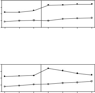
Figure 6.1illustratesasituationwheretherearethreeobservationtimesbefore the impact and four observation times after the impact. Evidence for an impact is provided by a statistically significant change in the difference between the control and impact sites before and after the impact time. On the other hand, if the time plots for the two types of sites remain approximately parallel, then there is no evidence that the impact had an effect. Confidence in the existence of a lasting effect is also gained if the time plots are approximately parallel before the impact time, and then approximately parallel after the impact time, but with the difference between them either increased or decreased.
It is possible, of course, for an impact to have an effect that increases or decreases with time. Figure 6.2 illustrates the latter situation, where the impacted site apparently returns to its usual state by about two time periods after the impact.
As emphasized by Underwood (1994), it is desirable to have more than one control site to compare with the potentially impacted site, and where possible, these should be randomly selected from a population of sites that are physically similar to the impact site. It is also important to compare control sites
153
154 Statistics for Environmental Science and Management, Second Edition
|
12 |
|
|
|
|
|
|
|
Observation |
10 |
Impact Site |
|
|
|
|
|
|
8 |
|
|
|
|
|
|||
|
|
|
|
|
|
|
||
6 |
Control Site |
|
|
|
|
|
||
|
4 |
1 |
2 |
3 |
4 |
5 |
6 |
7 |
|
|
|||||||
|
|
|
|
|
Time |
|
|
|
Figure 6.1
A BACI study with three samples before and four samples after the impact, which occurs between times 3 and 4.
|
12 |
|
|
|
|
|
|
|
Observation |
10 |
Impact Site |
|
|
|
|
|
|
8 |
|
|
|
|
|
|||
|
|
|
|
|
|
|
||
6 |
Control Site |
|
|
|
|
|
||
|
4 |
1 |
2 |
3 |
4 |
5 |
6 |
7 |
|
|
|||||||
|
|
|
|
|
Time |
|
|
|
Figure 6.2
A situation where the effect of an impact between times 3 and 4 becomes negligible after four time periods.
to each other in order to be able to claim that the changes in the control sites reflect the changes that would be present in the impact site if there were no effect of the impact.
In experimental situations, there may be several impact sites as well as several control sites. Clearly, the evidence of an impact from some treatment is improved if about the same effect is observed when the treatment is applied independently in several different locations.
The analysis of BACI and other types of studies to assess the impact of an event may be quite complicated because there are usually repeated measurements taken over time at one or more sites (Stewart-Oaten and Bence 2001). The repeated measurements at one site will then often be correlated, with those that are close in time tending to be more similar than those that are further apart in time. If this correlation exists but is not taken into account in the analysis of data, then the design has pseudoreplication (Section 4.8), with the likely result being that the estimated effects appear to be more statistically significant than they should be.
When there are several control sites and several impact sites, each measured several times before and several times after the time of the impact, then one possibility is to use a repeated-measures analysis of variance. The

Impact Assessment |
155 |
Table 6.1
The Form of Results from a BACI Experiment with Three Observations before and Four Observations after the Impact Time
|
Before the Impact |
|
|
After the Impact |
|
|||
Site |
Time 1 |
Time 2 |
Time 3 |
|
Time 4 |
Time 5 |
Time 6 |
Time 7 |
|
|
|
|
|
|
|
|
|
Control 1 |
X |
X |
X |
|
X |
X |
X |
X |
Control 2 |
X |
X |
X |
|
X |
X |
X |
X |
Control 3 |
X |
X |
X |
|
X |
X |
X |
X |
Impact 1 |
X |
X |
X |
|
X |
X |
X |
X |
Impact 2 |
X |
X |
X |
|
X |
X |
X |
X |
Impact 3 |
X |
X |
X |
|
X |
X |
X |
X |
Note: Observations are indicated by X.
form of the data would be as shown in Table 6.1, which is for the case of three control and three impact sites, three samples before the impact, and four samples after the impact. For a repeated-measures analysis of variance, the two groups of sites give a single treatment factor at two levels (control and impact), and one within-site factor, which is the time relative to the impact, again at two levels (before and after). The repeated measurements are the observations at different times within the levels before and after, for one site. Interest is in the interaction between treatment factor and the time relative to the impact factor, because an impact will change the observations at the impact sites but not the control sites.
There are other analyses that can be carried out on data of the form shown in Table 6.1 that make different assumptions and may be more appropriate, depending on the circumstances (Von Ende 1993). Sometimes the data are obviously not normally distributed, or for some other reason a generalized- linear-model approach as discussed in Section 3.6 is needed rather than an analysis of variance. This is likely to be the case, for example, if the observations are counts or proportions. There are so many possibilities that it is not possible to cover them all here, and expert advice should be sought unless the appropriate analysis is very clear.
Various analyses have been proposed for the situation where there is only one control and one impact site (Manly 1992, chap. 6; Rasmussen et al. 1993). In the next section, a relatively straightforward approach is described that may properly allow for serial correlation in the observations from one site.
6.2 The Simple Difference Analysis with BACI Designs
Hurlbert (1984) highlighted the potential problem of pseudoreplication with BACI designs due to the use of repeated observations from sites. To