

Micro-Cap v7.1.6 / RM
.PDFPanning the plot
Panning means to change the plot view without changing the scale. It is usually employed after zooming in. There are two ways to pan the plot:
Keyboard:
Use CTRL + LEFT ARROW to pan the plot to the left. Use CTRL + RIGHT ARROW to pan the plot to the right. Use CTRL + UP ARROW to pan the plot up.
Use CTRL + DOWN ARROW to pan the plot down.
Keyboard panning is available from any mode.
Mouse:
Cursor mode: Press and hold the CTRL key down. Place the mouse in the plot window and drag the right mouse button in the desired direction.
Other modes: Place the mouse in the plot window and drag the right mouse button in the desired direction.
Panning moves only the curves in the selected plot group. Click in another plot group, click on a plot expression in another plot group, or use the Tab key to select a different plot group.
197

Scaling the plot
Scaling means to shrink or magnify the analysis plot after the analysis is complete. Magnifying enlarges a small region of the plot for inspection. Shrinking brings the plot scale back to a smaller size for a more global view of the plot. There are several scaling commands:
Auto Scale: (F6) This command immediately scales the selected plot group. The selected group is the plot group containing the selected or underlined curve.
Restore Limit Scales: (CTRL + Home) This command draws all plots using the existing scale ranges from the Analysis Limits dialog box.
Zoom-Out: (CTRL + Numeric pad -) This command shrinks the image size of the selected plot group. Zoom-Out  does the same thing.
Zoom-In: (CTRL + Numeric pad +) This command enlarges the image size of the selected plot group. Zoom-In  does the same thing.
Mouse:
Scale mode: Place the mouse near one corner of the region to be magnified and drag the left mouse button to the other corner.
Cursor mode: Press and hold the CTRL key. Place the mouse near one corner of the region to be magnified and drag the left mouse button to the other corner. This is the same as in Scale mode, but with the CTRL key held down during the drag.
Other modes: There is no mouse scaling for all other modes.
Properties dialog box: (F10) This dialog box controls the characteristics of the front window. When the front window is an analysis plot, the dialog box contains a Scales and Format panel which lets you change the scales of individual curves after the analysis run.
Undo: (CTRL + Z) This command restores the prior scale.
Redo: (CTRL + Y) This command undoes the last scale undo.
198 Chapter 13: Scope
Tagging the plot
Tagging is a way of both measuring and documenting a data point or difference between two data points. Tagging can be done on a single curve, between two points on a single curve, or between two points on two curves. There are three tagging modes:
Point Tag mode: This mode lets you tag a data point on a curve. It shows the X expression and Y expression values at the data point. This mode is very useful for measuring or documenting the exact time of a digital event, or the peak or valley of an analog curve.
Vertical Tag mode: This mode lets you drag a tag between two data points on one or two curves. It shows the vertical difference between the Y values at the two data points.
Horizontal Tag mode: This mode lets you drag a tag between two data points on a single curve or two different curves. It shows the horizontal difference between the X expression values at two data points. It is most useful for measuring the time difference between two digital events such as the width of a pulse or the time delay between two events.
There are also several immediate commands for tagging the data points at the numeric cursors.
•Tag Left Cursor: (CTRL + L) This command attaches a tag to the left cursor data point on the selected curve.
•Tag Right Cursor: (CTRL + R) This command attaches a tag to the right cursor data point on the selected curve.
•Tag Horizontal: (SHIFT + CTRL + H) This command attaches a horizontal tag from the left to the right cursor, showing the difference between the two X expression values.
•Tag Vertical: (SHIFT + CTRL + V) This command attaches a vertical tag from the left to the right cursor, showing the difference between the two Y expression values.
The numeric format of the tag numbers is determined by the numeric format set at Options / Preferences / Format / Analysis Plot Tags.
199

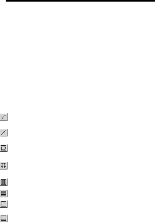
Adding graphics to the plot
You can add graphic symbols to the analysis plot when in the Graphics mode. To invoke the Graphics mode, click on the graphics button, and select one of the objects from the menu that pops up. To add one of the graphic objects, click and drag in the plot area. The objects are:
Rectangle
Line
Ellipse
Diamond
Arc
Pie
Polygon
Each of these objects can be edited after creation by double-clicking on them. This invokes a dialog box that lets you change their border and fill characteristics.
The polygon object allows direct numerical editing of the polygon vertices. It is intended as a design template, a region describing the area that a curve or curve may occupy and still be within specification. The filter designer adds a polygon to the AC plot to indicate the acceptable region for the Bode plot from the user's filter specs. You can use the constants MIN and MAX to specify the plot minimum and maximum coordinates easily.
To see an example of a design polygon, create a filter circuit using the active or passive filter functions from the Design menu and run an AC analysis. Enter Select mode and then double-click on the yellow polygon to see its properties, including its border, fill, and vertex structure.
200 Chapter 13: Scope
Scope menu
The Scope menu provides these options:
•Delete All Objects: This command removes all objects (shapes, tags, or text) from the analysis plot. To delete an object, select it by clicking on it, then press CTRL + X or the DELETE key. To delete all objects use CTRL + A to select all objects, then press CTRL + X or the DELETE key.
•Auto Scale: This command scales the plot group containing the selected curve. F6 may also be used. The selected curve is the one whose Y expression isunderlined.
•Restore Limit Scales: This command restores the range scales to the values in the Analysis Limits dialog box. CTRL + HOME may also be used.
•View: The view options only affect the display of simulation results, so
you may change these after a run and the screen is redrawn accordingly. These options may also be accessed through Tool bar icons shown below.
•Data Points: This marks the actual points calculated by the program on the curve plot. All other values are linearly interpolated.
•Tokens: This adds tokens to each curve plot. Tokens are small graphic symbols that help identify the curves.
•Ruler: This substitutes ruler tick marks for the normal full screen X and Y axis grid lines.
•Plus Mark: This replaces continuous grids with "+" marks at the intersection of the X and Y grids.
• Horizontal Axis Grids: This adds grids to the horizontal axis.
•Vertical Axis Grids: This adds grids to the vertical axis.
•Minor Log Grids: This adds minor log grid lines between the major grids to any axis which uses the log option.
• Baseline: This adds a plot of the value 0.0 for use as a reference.
201

• Horizontal Cursor:This adds a horizontal cursor intersecting each of the two vertical numeric cursors at their respective data point locations.
•Trackers:These options control the display of the cursor, intercept, and mouse trackers, which are little boxes containing the numeric values at the cursor data point, its X and Y intercepts, or at the current mouse position.
•Cursor Functions: These control the cursor positioning in Cursor mode. Cursor positioning is described in more detail in the User's Guide.
•Label Branches: This accesses a dialog box which lets you select from the automatic and user-specified X location method for labeling multiple branches of a curve. This option appears when multiple branches are created by Monte Carlo, parameter stepping, or temperature stepping.
•Label Data Points: This accesses a dialog box which lets you specify a set of time, frequency, or input sweep data points, in transient, AC, or DC analysis, respectively, which are to be labelled. This command is mostly used to label frequency data points on polar and Smith charts.
•Animate Options: This option displays the node voltages/states, and optionally, device currents, power, and operating conditions (ON, OFF, etc.), on the schematic as they change from one data point to the next. To use this
option, click on the  button, select one of the wait modes, then click on
the Tile Horizontal  button, or Tile Vertical
  button, then start the run. If the schematic is visible, MC7 prints the node voltages on analog nodes and the node states on digital nodes. To print device currents click on
  . To
. To
print device power click on  . To print the device conditions click on
  . It lets you see the evolution of states as the analysis proceeds. To restore a full screen plot, click on the
  button.
• Normalize at Cursor: (CTRL + N) This option normalizes the selected (underlined) curve at the current active cursor position. The active cursor is the last cursor moved, or if neither has been moved, then the left cursor.
Normalization divides each of the curve's Y values by the Y value of the curve at the current cursor position, producing a normalized value of 1.0 there. If the Y expression contains the dB operator and the X expression is F (Frequency), then the normalization subtracts the value of the Y expression at the current data point from each of the curve's data points, producing a value of 0.0 at the current cursor position.
202 Chapter 13: Scope

•Go to X: (SHIFT + CTRL + X) This command lets you move the left or right cursor to the next instance of a specific value of the X expression of the selected curve. It then reports the Y expression value at that data point.
•Go to Y: (SHIFT + CTRL + Y) This command lets you move the left or right cursor to the next instance of a specific value of the Y expression of the selected curve. It then reports the X expression value at that data point.
•Go to Performance: This command calculates performance function values on the Y expression of the selected curve. It also moves the cursors to the measurement points. For example, you can measure pulse widths and bandwidths, rise and fall times, delays, periods, and maxima and minima.
•Go to Branch: This command lets you select which branch of a curve to place the left and right cursors on. The left cursor branch is colored in the primary select color and the right cursor branch in the secondary select color.
•Tag Left Cursor: (CTRL + L) This command attaches a tag to the left cursor data point on the selected curve.
•Tag Right Cursor: (CTRL + R) This command attaches a tag to the right cursor data point on the selected curve.
•Tag Horizontal: (SHIFT + CTRL + H) This command places a horizontal tag between the left and the right cursor, showing the difference between the two X expression values.
•Tag Vertical: (SHIFT + CTRL + V) This command places a vertical tag between the left and the right cursor, showing the difference between the two Y expression values.
•Align Cursors: This option, available only in Cursor mode, forces the numeric cursors of different plot groups to stay on the same data point.
•Keep Cursors on Same Branch: When stepping produces multiple runs, one line is produced for each run for each plotted expression. These lines are called branches of the curve or expression. This option forces the left and right cursors to stay on the same branch of the selected curve when the UP ARROW and DOWN ARROW cursor keys are used to move the numeric cursors among the several branches. If this option is disabled the cursor keys will move only the left or right numeric cursors, not both, allowing them to occupy positions on different branches of the curve.
203

•Same Y Scales: This option forces all curves in a plot group to use the same Y scale. If the curves have different Y Range values, one or more Y scales will be drawn, which may lead to crowding of the plot with scales.
•Thumb Nail Plot: This option draws a small guide plot which gives a global view of where the current plot(s) are on the whole curve. You can also select different views by dragging a box over the curve. Dragging the cursors on the guide plot drags them on the main plot.
204 Chapter 13: Scope
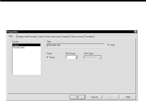
The Plot Properties dialog box
Curve display and format can be changed after the run with the Properties dialog box. It looks like this:
Figure 13-1 The Plot Properties dialog box
The Plot Properties dialog box lets you control the analysis plot window. It can be used for controlling curve display after or even before the plot. Before a plot exists, you can access the dialog box by clicking on the Properties button in the Analysis Limits dialog box. The dialog box provides the following choices:
• Plot
Curves: This lets you select the curve that Plot and Graph fields apply to.
Title: This lets you specify what the plot title is to be. If the Auto button is checked, the title is automatically created from the circuit name and analysis run details.
Curve: This check box controls the plotting of the selected curve. To hide the curve, remove the check mark by clicking in the box.
Plot Group: This controls the plot group number.
Plot Type: This controls the plot type, rectangular, polar, or Smith chart. The latter two are available only on AC analysis.
205
• Scales and Formats
Curves: This lets you select the curve that the other fields apply to.
X:This group includes:
Range Low: This is the low value of the X range used to plot the selected curve.
Range High: This is the high value of the X range used to plot the selected curve.
Grid Spacing: This is the distance between X grids.
Bold Grid Spacing: This is the distance between bold X grids.
Scale Format: This lets you specify the numeric format used to print the X axis scale.
Value Format: This lets you specify the numeric format used to print the X value in the table below the plot in Cursor mode and in the tracker boxes.
Auto Scale: This command scales the X Range and places the numbers into the Range Low and Range High fields. The effect on the plot can be seen by clicking the Apply button.
Log: If checked this makes the X scale log.
Y: This group provides complementary commands for the Y axis group:
Range Low: This is the low value of the Y range used to plot the selected curve.
Range High: This is the high value of the Y range used to plot the selected curve.
Grid Spacing: This is the distance between Y grids.
Bold Grid Spacing: This is the distance between bold Y grids.
Scale Format: This is the numeric format used to print the Y axisscale.
206 Chapter 13: Scope