

Twitter Bootstrap Web Development How-To
6.Below this line are Bootstrap's JavaScript plugins, each in a separate file. Our Bootstrap download, by contrast, includes all plugins compiled together into one file. You'll find it in the js folder—bootstrap.js and its minified version, bootstrap. min.js. We need only to link to one of these files. Let's use the minified version, as it will load faster in our users' browsers.
7.Edit one of the Bootstrap JavaScript links so that it reads as follows:
<script src="js/bootstrap.min.js"></script>
8.Delete the links to the other Bootstrap plugins, as we have them all rolled into one file.
9.Your resulting JavaScript links should look something like this:
<script src="js/jquery-1.7.2.min.js"></script> <script src="js/bootstrap.min.js"></script>
That's it. Just two lines!
10.Save the file and refresh the page in your browser. The navbar should now drop down when you click on the button.
11.Now it's time to fix the JavaScript links in our other pages. Copy your new JavaScript links from index.html and use them to update the links in about.html, portfolio.html, and products.html.
12.Save the files, open them in your browser, and test to make sure that the drop-down menu works in all pages.
Adding drop-down lists (Should know)
While we're working on the navbar we should add a drop-down list. As drop-down functionality draws upon the same Bootstrap JavaScript plugins we connected in the previous recipe, everything is in place to make it work. We just need to add the markup.
31 
www.it-ebooks.info
Twitter Bootstrap Web Development How-To
Getting ready
1.Open index.html in your editor.
2.Scroll down to the <div class="navbar …"> just after the opening <body> tag.
We're ready to start to work.
How to do it…
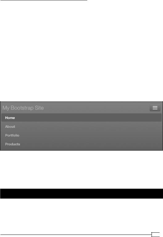
1.Within the div class="navbar …", find div class="nav-collapse". This is the region of the navbar which collapses when the viewport width is narrower than 980 px.
2.Within this, find the unordered list ul class="nav". This is where we created our custom links to our site pages.
3.We're going to create a new unordered list, ul class="nav" right next to this one, immediately after it and before the closing tag </div><!--/.nav-collapse -->.
4.Add a new <ul class="nav"> and its closing </ul> tag.
5.Nested inside of this, we'll add a special list item whose purpose will be to contain the drop-down menu: <li class="dropdown"> and its closing </li> tag. As the text for this list item, put Your Account.
Your result should look like this so far:
<ul class="nav">
<li class="dropdown"> Your Account
</li>
</ul>
6.Now to insert our drop-down items, create a new unordered list with the class of "dropdown-menu", nested within the li class="dropdown" like this:
<ul class="nav">
<li class="dropdown"> Your Account
<ul class="dropdown-menu"> <li><a href="#">Login</a></li>
<li><a href="#">Profile</a></li> <li><a href="#">Cart</a></li>
</ul>
</li>
<ul>
We're almost there. What remains is to add the tag structure needed to make "Your Account" function as a drop-down trigger.
 32
32
www.it-ebooks.info

Twitter Bootstrap Web Development How-To
7.Wrap the text Your Account in a link tag with a # for its href value.
The # for the href value is essential to the functioning of our drop-down menu.
<a href="#">Your Account</a>
8.We need to add a special class and a data-attribute to turn this link into a drop-down toggle. Let's add those:
<a href="#" class="dropdown-toggle" data-toggle="dropdown">Your Account</a>
Save the file. Refresh the page in your browser. Click on our link and you'll see that the drop-down menu now works!
9.To add a visual cue for our users to identify the menu item as a drop-down, Bootstrap uses a b tag with a special class. Just after Your Account and before the closing </ a> tag, add this. Notice we'll leave a space before the <b.
Your Account <b class="caret"></b>
It should now do this for you!
10.Finally, let's move our new dropdown menu to the right-hand end of the navbar. Bootstrap has a built-in class for this—pull-right. Add that class like this:
<ul class="nav pull-right">
<li class="dropdown">
...
Save, refresh, and your dropdown menu should now be positioned at the right end of the navbar.
11.Copy your new dropdown menu to your other pages!
33 
www.it-ebooks.info
Twitter Bootstrap Web Development How-To
How it works…
If you consult the bootstrap.css file, you'll see how these components work. The dropdown-menu of the ul class is hidden (.dropdown-menu { … display: none; … } ) until the link of dropdown-toggle is clicked and the JavaScript adds the open class to the parent list item (.open .dropdown-menu { display: block }).
There's more…
Take time to read through Bootstrap's documentation on the navbar and drop-down lists.
You can find it here:
http://twitter.github.com/bootstrap/components.html#navbar
You'll find options for adding dividers, icons, and more!
Using tabs for switching content
(Should know)
We've been getting familiar with implementing Bootstrap's JavaScript behaviors. Let's keep it going by adding a tabbed content switcher, as follows:
These are great for allowing users to switch briskly between items within one bounded content area. Let's add one of these to our Products page!
How to do it…
In the following steps, we'll first prepare our content and then wrap it in the appropriate tag structure to present it in a tabbed form. First let's add the content.
1.Open products.html in your browser. Beneath the table, we're going to add a new row with a tabbed panel Options. To speed our progress, we'll duplicate the entire row that contains the table and replace the table with our new content.
2.Open products.html in your editor and scroll down to the opening tag for the div class row, which should be at line 73, approximately:
<!-- Example row of columns --> <div class="row">
 34
34
www.it-ebooks.info

Twitter Bootstrap Web Development How-To
Click to place your cursor on the line above these lines of code.
3.Now, using your mouse, scroll down past the table with its <td> and <tr> tags until you reach the <hr> and <footer> tags. Holding down the Shift key, click on the line in between those two tags. You should now have a selection that includes the entire row and its contents down through and including the <hr> tag. (If this didn't work, try to get that selection using your preferred method!)
4.Copy and then paste a duplicate of these lines just below the <hr> tag and above the <footer> tag. Save and refresh your browser to see if you've created an exact duplicate. Now we'll update the heading on the left and replace the second table with new content.
5.In your new second row, update the h2 heading, What we have to offer, to read simply Options.
6.Now inside the following <div class="span9"> select and delete the entire table, including the <table></table> tags and everything in between.
7.Now let's grab some content to fill the space left by the table. Copy the h2 heading and paragraph from <div class="span3"> and paste it where the table used to be.
8.Update the heading of the newly copied text to Option 1. Then update its enclosing tags from h2 to h3, as Option 1 is subordinate to Options.
9.Let's add a placeholder image after the heading and before the paragraph:
<img src="http://placehold.it/400x200" alt="placeholder" class="pull-right thumbnail" />
The pull-right class will float the image to the right. The thumbnail class will add a nice bit of padding and border around it.
Refresh to see your results.
10.Now make two additional copies of the h3 heading Option 1, the image, and paragraph, pasting them immediately below. Update the succeeding headings to Option 2 and Option 3. To make the content distinct for each, delete a line or two from the top of each succeeding paragraph, and modify the widths of the succeeding placehold.it images to 440 px and 480 px respectively.
Save the file. Refresh your browser, and you'll see the contents for what will become three switchable panes in our tabbed content switcher. To get the rest of the way there, we'll need to add some additional markup to demarcate three distinct panes of content and to supply the tabs to switch between them.
11.First, we need to wrap each of our three options and their content within a div of the tab-pane class. Before each h3 heading, add <div class="tab-pane">. Then close each of these tab-panes with a closing </div> tag after each corresponding paragraph.
35 
www.it-ebooks.info

Twitter Bootstrap Web Development How-To
12.For our switching tabs to work, each of these panes will need a distinct ID. Add an ID to Option 1's opening tag, so that it reads like this:
<div class="tab-pane" id="option1">
Do the same for the next two panes, giving them IDs as option2 and option3 respectively.
13.Next wrap these three panes together within a single containing <div class="tab-content"> , which should begin before option1's opening tag and then be closed with a </div> tag placed after option3's closing </div> tag.
14.Save the file. Refresh your browser and you'll see that all of the content disappears.
That's good! The panes of content are hidden until triggered by their respective tabs.
But of course we want the first pane to appear by default. We need to add a class of "active" to the first pane.
<div class="tab-pane active" id="option1">
Save and refresh again, and you'll see this pane return to view!
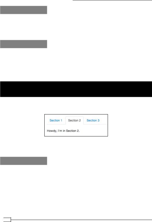
15.Now the tabs. These begin as a simple unordered list with two special classes—nav, which marks it as a navigation list, and nav-tabs, which will call in Bootstrap styles to render the list items to look like tabs. Add these lines immediately after <div class="span9"> and before <div class="tab-content">.
<ul class="nav nav-tabs "> <li>Option 1</li> <li>Option 2</li> <li>Option 3</li>
</ul>
16.These list items now need to be wrapped as page anchors, each linking to its respective tab pane's ID. Thus the first list item should be wrapped as follows:
<li><a href="#option1">Option 1</a></li>
Do the same with the others, using #option2 and #option3 for the href values. Save and refresh your browser. You'll see the tabs appear above the tab content, sort of. Notice that they don't really look like a tab until hovered over.
17.We need to mark the first tab as the active tab by default. Add the active class to its li tag, like this:
<li class="active"><a href="#option1 "…
Save, refresh, and you'll see it receives the styles of a current tab!
18.We're almost there. At present, our tabs do nothing when clicked. We need to tell Bootstrap's JavaScript to do its magic here. This requires adding a data attribute to each tab's link tag, like this:
<a href="#option1" data-toggle="tab">Option 1</a>
 36
36
www.it-ebooks.info