


Twitter Bootstrap Web Development How-To
There's more…
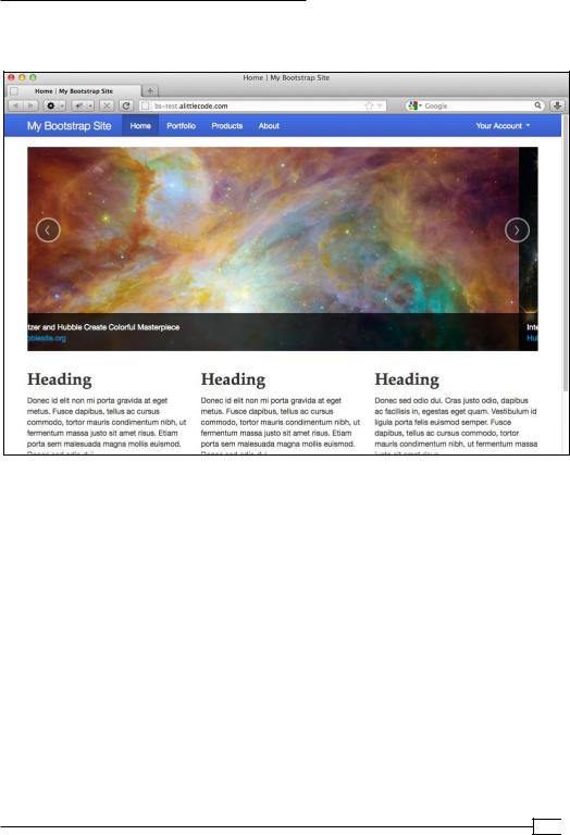
Be sure to consult Bootstrap's carousel documentation to learn more, including options for tweaking the settings. Feel free to experiment!
Having conquered drop-downs, tabs, and the carousel, you are ready to experiment with Bootstrap's other excellent plugins. Set aside a couple of hours, consult the excellent documentation and examples, and give them a try.
Optimizing and customizing (Should know)
It's almost time to take this website online. Let's get things ready by optimizing our files for better performance. While we're at it, we'll customize a few key design elements to begin making the design our own.
An optimized website loads faster. It reduces unnecessary load on your web server. And it helps improve your ranking in major search engines. We can't cover all aspects of site optimization in this brief book, but we can take two steps that will make a big difference:
ff
ff
Trimming down our CSS and JavaScript files by removing unused code Using the minified versions of the CSS and JavaScript files
Bootstrap provides a great tool to help us get this done.
It also provides options for quickly customizing several key design features. We'll take a moment to customize our headings' font and the color scheme of our navbar.
How to do it…
Let's begin by trimming out unused portions of our CSS and JavaScript. We could do it line by line, and there are tools that could help with that. But the Customize page in Bootstrap's documentation helps us do a respectable job with much greater time efficiency.
1.Go to Twitter Bootstrap's documentation, and navigate to the Customize page: http://twitter.github.com/bootstrap/customize.html.
41 
www.it-ebooks.info
Twitter Bootstrap Web Development How-To
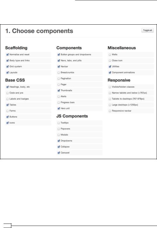
2.Note the subtitle of the section titled 1. Choose components This section allows us to select only the CSS modules we need. Uncheck the checkboxes for the features we are not using in our website. I've done this as follows:
Note that I have deselected all options under Responsive. The responsive layout styles we need are already provided in our originally downloaded bootstrapresponsive.css file. What we're building here is a new, trimmed-down version
of bootstrap.css.
 42
42
www.it-ebooks.info
Twitter Bootstrap Web Development How-To
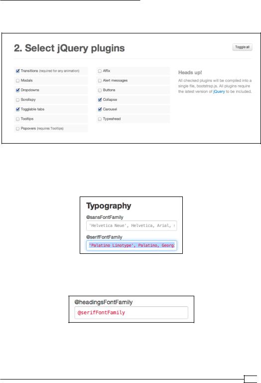
3.Moving on down the page, let's build a trimmed-down version of Bootstrap's
JavaScript file. Select the components, as shown in the following screenshot:
4.Now move down to the section labeled 3. Customize Variables. Here we'll take a moment to update a few key variables.
5.In the center column under Typography, update the @serifFontFamily variable to
a Palatino font family: 'Palatino Linotype', Palatino, Georgia, serif.
6.Now to make this the new font family for our headings, move down the same column to update the @headingsFontFamily variable to use the @serifFontFamily variable we've just specified:
43 
www.it-ebooks.info

Twitter Bootstrap Web Development How-To
Next to give your navbar a dark blue gradient. Under Navbar in the right-hand column, update the values for @navbarBackground, @navbarBackgroundHighlight, @navbarText, @navbarLinkColor, @navbarLinkColorHover, @
navbarLinkColorActive, and @navbarLinkBackgroundHover, as shown in the following screenshot. (These variables and their values control the background gradient, the navbar text color, the background color for hover states, and the background for the active nav item.)
7.Scroll down to the big Customize and Download button, and click on it. Your browser will download a new ZIP folder named bootstrap.zip. Extract the ZIP folder, which will give you a new folder named simply bootstrap. Change the folder name to bootstrap-custom to help you keep it straight.
 44
44
www.it-ebooks.info
Twitter Bootstrap Web Development How-To
8.Now move inside the newly downloaded folder. Delete the img folder, as the glyphicon files will be identical to what we already have.
9.Open the CSS folder to make sure that it does not contain the error.txt file.
If it does, an error in one of the values you entered in the Customize page caused the CSS files not to compile properly. This could include a missing quote mark, an unnecessary semicolon, or a typo. You'll have to find and correct that, then download the file again.
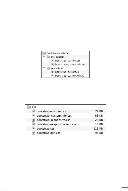
10.Rename the css folder to css-custom and the js folder to js-custom.
Then add "-custom" to the name of each file inside. Thus you'll have this new folder and file structure:
11.Copy your new custom files to the appropriate css and js folders in your Bootstrap site folder, so that they appear right alongside your current css and js files.
12.Copy your new custom CSS files to the css folder in your Bootstrap site. Compare the size of the new files against the originals. Here is what I found:
Notice that the new bootstrap-custom.min.css file is 35 percent smaller than the original bootstrap.min.css, promising much faster load times for the users.
45 
www.it-ebooks.info

Twitter Bootstrap Web Development How-To
13.Now turn to the js files. Copy your custom JavaScript files to the js folder in your Bootstrap site. Again, let's compare file size. Here is what I found:
The new bootstrap-custom.min.js is a mere 8 KB—less than one third the size of the original! Our customizing steps have made a big difference.
14.Now let's hook up our new files and see how they work. We're going to begin with our custom JavaScript file. Open index.html in your editor, and scroll down to near the closing </body> tag. You'll see that the current links point to the minified versions of our JavaScript files—both with jQuery and with Bootstrap's original JavaScript file. The ".min" in these files indicates the minified version.
<script src="js/jquery-1.7.2.min.js"></script> <script src="js/bootstrap.min.js"></script>
This is good, as minification reduces file sizes and speeds up browser processing. So let's update the second link to point to the minified version of our custom file, as follows:
<script src="js/bootstrap-custom.min.js"></script>
Save the file. Then refresh the homepage in your browser. Test the navbar drop-down item to make sure it works. If it does, then your custom Bootstrap plugin is doing its job!
15.Take a minute to open all of your HTML files and update their JavaScript links to point to your new custom file in just the same way. Make it simple by copying
and pasting the entire line from your index.html file to replace the corresponding line in each other file.
Leave your HTML files open for our next steps.
16.Now for the CSS! If you look at the stylesheet links in the head of our pages,
you'll see that they point to the unminified files: bootstrap.css and bootstrapresponsive.css. Edit these lines in all of your site's HTML files to link to the minified versions of your custom CSS and the responsive CSS.
Your stylesheet links should now read as follows:
<link href="css/bootstrap-custom.min.css" rel="stylesheet">
 46
46
www.it-ebooks.info

Twitter Bootstrap Web Development How-To
<link href="css/bootstrap-responsive.min.css" rel="stylesheet">
Update these same lines throughout all of your HTML files.
17.Let's test our CSS results. Refresh your pages. They should look basically the same, except for your headings! These should now be using the Palatino font family we specified.
18.What about changes we made to the navbar? As of Bootstrap version 2.1, the customizations we made are being overridden by the styles that come with the navbar-inverse class. This class converts the navbar to its current dark color scheme. We could opt at this point to edit the CSS file directly. But it's simpler to simply remove the unnecessary class.
In your index.html file, find the div class="navbar …" at or near line 35. You'll see it looks like this:
<div class="navbar navbar-inverse navbar-fixed-top">
Delete the class navbar-inverse, so that this line now looks like this:
<div class="navbar navbar-fixed-top">
Save the file, refresh it in your browser, and you should see your new color scheme!
19.Update this same line in your other HTML files.
20.Save your files, refresh them in your browser, and click through your site.
Not bad! The color scheme is not fully woven through the rest of your site.
You may want to update the color values for buttons and dropdowns, for example. You're now experienced and equipped. Have a go at it!
How it works…
One of the great things about Bootstrap is that it provides CSS styles and JavaScript behaviors for all of the things we need most often in our websites. And yet, covering all the bases requires a large code base. Thus it's important—and exciting—that we can use Bootstrap's customize page as a fast and friendly way to compile custom files, trimmed down to provide just the styles and behaviors we utilize in our sites.
Meanwhile, Bootstrap's CSS is built using some powerful variables than enable us to get a running start at customizing our Bootstrap site with its own distinctive look and feel.
47 
www.it-ebooks.info
Twitter Bootstrap Web Development How-To
There's more…
Though it's beyond the scope of this brief book, you may soon want to start adding your own custom styles. You might choose to edit your bootstrap-custom.css file directly or add a custom stylesheet of your own. Eventually, you may want to go the whole way, download all the Bootstrap source files, and work with Bootstrap's Less files to compile your own custom
CSS like a pro. The point of Bootstrap is not to lock you in. Quite the opposite, it provides many opportunities for you to bring your own creativity to bear. As with any framework, it takes some work to get familiar with the new workflow. But the effort has a payoff, as soon you'll be operating with greater efficiency and effectiveness!
Uploading, testing, and launching
(Must know)
Your first Bootstrap site is well underway. It sports a variety of content formats, laid out with a solid grid system, tied together with a user-friendly navbar, all in accord with current web standards and best practices. Custom design innovations are underway. CSS and JavaScript files have been optimized for site performance. These are signs of serious web development, and they're something to celebrate.
But before we celebrate, we need to upload and test!
Test? Isn't the point of Bootstrap to reduce headaches and conquer cross-browser compatibility issues? Do we still need to test?
Fair questions. Yes, Bootstrap's built to help. And yet, we still need to test. A communitysupported framework greatly reduces headaches, but trouble can creep in at any number of points. Each version of Bootstrap fixes certain problems, even as new features run into
trouble with some browsers under certain conditions. Other problems can stem from your own innovations on Bootstrap. A malformed tag may be forgiven by one browser but wreak havoc in another. Nothing can replace testing.
What's more, the right tools give us the opportunity to test Bootstrap's responsive grid and navbar, ensuring that they work as they should across devices of varying sizes, from handhelds to tablets to widescreens. Many of these tools require our site to be online.
So let's upload our site, run it through its paces, make adjustments if necessary, and then launch!
 48
48
www.it-ebooks.info
Twitter Bootstrap Web Development How-To
Getting ready
I'm going to assume you have web hosting with FTP access, an FTP client, and some experience putting files online. If you don't have these things or need some help with them, now would be a great time to get those arranged. Then come back!
In the testing phase, I'm going to reference two online services:
ff Adobe BrowserLab: This is free with an Adobe ID (registration required). Visit https://browserlab.adobe.com/.
ff BrowserStack: The free trial available (registration required)—a 30 minute limit, so don't sign up until ready! You can sign up for a free trial from http://www.
browserstack.com.
These services meet the present need well. Feel free to check them out for yourself. I'll reference them in what follows. If you are aware of better services, or have access to a physical lab of testing devices, feel free to use them!
How to do it…
1.Prior to taking it online, we need to double-check to ensure everything works as it should. From its current location on your local computer, open index.html in a browser and click through the site one more time to make sure everything is working.
2.This is optional. You might choose to create a robots.txt file to tell search engines not to pay attention to your test site. If search engines start indexing your test site, this can create hassles for tracking your website analytics later. If you'd like to protect against this, create a new file in your code editor. Save it in your main site directly, right next to your HTML files, with the filename robots.txt. Enter the following lines in the content of this file:
User-agent: * Disallow: /
The first line uses the wild card to address all search engines. The second line requests that the search engine avoid indexing any and all directories of the site.
Save the file.
3.Using your web hosting provider's panel tools or your FTP client, create a directory for testing your site. This might be a subfolder or subdomain of your main site's future location. Your might choose to name the location in
a relatively obscure way to reduce the chances that random users will stumble across it. (You could choose to password protect the directory, but this could make our testing steps more complicated.)
49 
www.it-ebooks.info

Twitter Bootstrap Web Development How-To
4.Using your FTP client, upload your site files to your test location. You might choose to exclude the _Carousel Images folder as we've moved our production images to the img folder. (If you created the robots.txt file, include it as well.)
Once the transfer is complete, you should see your files online in your FTP browser.
 50
50
www.it-ebooks.info
Twitter Bootstrap Web Development How-To
5.Now navigate to this directory in your browser. If you've gotten it right, you should be duly rewarded:
Congratulations! You're online! We're ready for testing.
There are many tools to help with testing major desktop browsers. One of these is Adobe's free Browser Lab, which requires a free registration. In your favorite browser, navigate to Adobe BrowserLab: http://browserlab.adobe.com/.
Click on Start using Adobe BrowserLab, sign in, and provide the URL for your test site. BrowserLab will start loading screenshots of how your site looks across major browsers and operating systems. Click through the options to see your results.
You may notice that many site elements look basically the same across various browsers, with some minor differences. Because Bootstrap follows the principle of progressive enhancement, you should find that major features of design and layout, JavaScript behaviors, and fundamental usability considerations remain consistent across browsers. A few fine details may change. Some older browsers, for example, will not render Bootstrap's CSS3 gradients
or rounded corners. Thus, the buttons, navbar, and carousel handles may look somewhat different across these browsers.
51 
www.it-ebooks.info
Twitter Bootstrap Web Development How-To
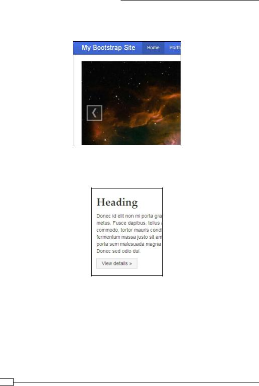
But these elements remain obvious and easy to use. For example, the handles for moving to the next and previous items in the slideshow are square (see the following screenshot), and yet they are clearly visible and usable.
Likewise, buttons lack rounded corners in Internet Explorer 8. Again, this is not a large loss. There is no impact upon fundamentals of usability. Our site works great in older browsers. It works even better in modern browsers. This is progressive enhancement in action.
If your results are like mine, you will see that your site performs well across major browsers in both OS X and Windows, including Internet Explorer 7. (Internet Explorer 6 is not supported.)
If you run into problems, you may want to double check your code, run W3 validation on your
HTML and CSS files (always a good idea anyway), and then consult resources such as those listed in the appendix in this book to see if anyone else is reporting a similar problem.
If your results are like mine, congratulations!
 52
52
www.it-ebooks.info
Twitter Bootstrap Web Development How-To
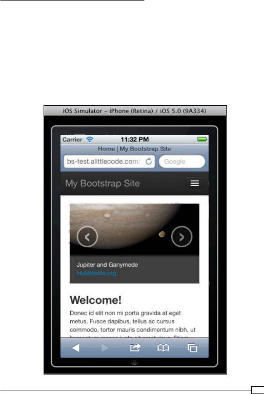
Time to test for mobile devices. If you're like me, you may own a phone, a tablet, and/or another mobile device. You may aspire to collect more devices, so that you may conduct adequate testing across major mobile platforms (iOS and Android as the current leaders), but you haven't yet accumulated very many. If that's your situation, you may want to try a service such as BrowserShots. Much like Adobe's service, BrowserShots provides the ability to discover how your site performs across many industry leading browsers. In the case of BrowserShots, this includes a plethora of mobile browsers and devices.
If you'd like to try it, set aside 30 minutes to work straight, sign up for a free BrowserShots trial, enter your URL and start testing! Again, I found that my site performed very well across all major devices.
53 
www.it-ebooks.info