

Twitter Bootstrap Web Development How-To
<td>Info</td>
<td>Info</td>
</tr>
</tbody>
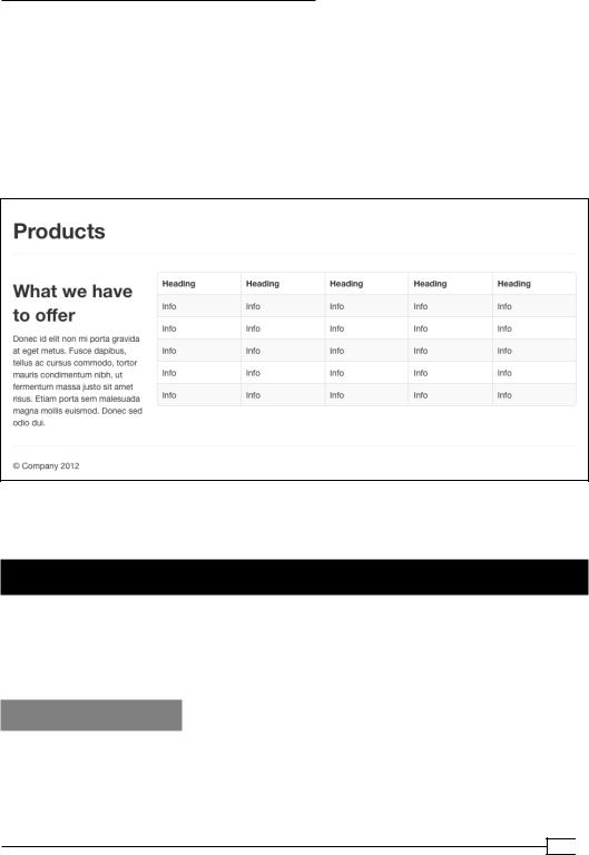
6.Copy the table row and its contained cells (everything including and between the tr tags), and make four additional copies directly beneath the first row and within the tbody tags.
7.Save the file and refresh your browser. My results look like this:
Thus, in short, you have a nice-looking table ready to be customized to your specific needs.
Customizing the navbar (Must know)
Twitter Bootstrap's main navigation is organized in the navbar. In this recipe, we'll begin our first steps in customizing the navbar by creating links to our new pages. For those of you experienced with HTML, this will not be difficult, but we can begin noting interesting features of the navbar along the way!
Getting ready
1.Open index.html in your editor.
2.Update the document title tag to read <title>Home | My Bootstrap Site</ title>.
27 
www.it-ebooks.info

Twitter Bootstrap Web Development How-To
3.Scroll down just below the opening body tag (line 35, approximately) where you'll find the markup for the navbar, which begins with the following tag:
<div class="navbar navbar-fixed-top">
You're there!
Take a moment to scan through approximately the next 18 lines of code, and you'll see that the navbar is composed of nested divs, links, and lists, with special classes.
These classes serve significant purposes, from positioning and styling to setting up the responsive navigation.
I'll briefly summarize the roles of these classes:
ff navbar provides the outside containing element for all contents of the navbar. ff navbar-inverse calls for a dark navbar background with light font color.
ff navbar-fixed-top fixes the navbar at the top of the window and lets page content scroll underneath it (this requires padding at the top of the body element. See it in the embedded style sheet in the head of the index.html file.)
ff navbar-inner provides height, padding, and background color and gradients.
ff container constrains the width of the navbar contents, centers them within a wide screen, and includes a clearfix so that it will contain floated child elements.
ff The link tag of class btn btn-navbar provides a button that is hidden via CSS in a wide viewport but which appears in narrower viewports, where it serves as a trigger for drop-down access to the main menu items.
ff The div of class nav-collapse serves as the containing element for the menu items which are dropped down in narrow-viewport navigation.
ff The ul tag of the nav class contains the main navigation links which take a user to various pages in a site. This is the region where we'll first start to work!
If you search for these classes in the bootstrap.css file, you'll find the corresponding stylesheet rules.
Now that you have the basic picture, let's start customizing.
How to do it…
1.Let's begin by creating the navbar link to our homepage. Look for the link <a class="brand" …> and update its href value and the link text as follows:
<a class="brand" href="index.html">My Bootstrap Site</a>
2.Update the list items inside of ul class="nav" so that they link to the pages in your site, adding an additional list item and link for the products page. The result should look as follows:
 28
28
www.it-ebooks.info

Twitter Bootstrap Web Development How-To
<ul class="nav">
<li class="active"><a href="index.html">Home</a></li> <li><a href="portfolio.html">Portfolio</a></li> <li><a href="products.html">Products</a></li>
<li><a href="about.html">About</a></li> </ul>
Note that class="active" on the Home navigation item provides the darkened background color which indicates the current page.
3.Save the file. Open index.html in your browser. The navbar should look like this:
Test the navigation links, and you should find that it takes you to the appropriate page!
You'll also find that you have to use your browser's Back button to get back. It's time to update the navbar in our other pages!
4.In index.html, select and copy everything from <a class="brand" … > through <!--/.nav-collapse -->. (This should be nine lines.)
5.Open the about.html file in your code editor. Select the corresponding section of code (everything from <a class="brand" … > through <!--/.nav-collapse -->). Paste the updated code from index.html over the top of it.
6.Cut and paste class="active" from the Home list item to the About list item. These two list items should now look as follows:
<li><a href="index.html">Home</a></li>
<li class="active"><a href="about.html">About</a></li>
7.Save about.html, and open it in your browser. You should see the updated navbar with About indicated as the current page, like this:
8.Repeat the same process with portfolio.html and products.html.
9.You should now be able to navigate back and forth between your site pages, and the proper page should be marked as current.
10.Take a celebratory coffee break! We're about to have some more fun.
29 
www.it-ebooks.info

Twitter Bootstrap Web Development How-To
Making it responsive (Should know)
One of the truly exciting things about Twitter Bootstrap is that since version 2.0, its navbar adjusts responsively to small viewports such as tablets and handheld devices. At these narrow widths, the navbar cleverly adjusts to allow users quick access to the main site content, while providing a button which triggers a drop-down panel containing the main navigation items.
Getting ready
If you're using a modern browser, you can see the responsive navbar in action on your computer. With one of the site pages open, drag the window width narrower. You'll see the transformation happen when the viewport shrinks below 980 pixels wide.
Assuming you've been following the above steps, you'll find that the navbar drop-down panel is not yet functional. Click on the right-hand side button to test it.
What we're lacking is the JavaScript necessary for the drop-down behavior. Now is a good time to get the JavaScript hooked up! (We'll soon be using other JavaScript touches that come with Twitter Bootstrap's JavaScript plugins as well.)
How to do it…
1.Open index.html in your editor.
2.Scroll down to the bottom of the page and look for the section of code that begins with this comment:
<!-- Le javascript
================================================== -->
3.Below that comment you'll see roughly 15 lines of code, including links to js/ jquery.js and a dozen other JavaScript files. Just as we had to update the links to the CSS files, we also need to update the links to the JavaScript files.
4.Let's start with the first, the link to jQuery. Notice that your js folder does not currently contain a file named jquery.js. Open a new browser window and navigate online to http://jquery.com. Find the Download button on the homepage and click on it. (Your browser window will fill with code—the file contents—or it may invite you to download the file.) Save the file (the file source only) to the js folder.
5.Update the jQuery link with the name of the downloaded jQuery file. In my case, it looks like this:
<script src="js/jquery-1.7.2.min.js"></script>
 30
30
www.it-ebooks.info