

The Essential Guide to UI Design
.pdf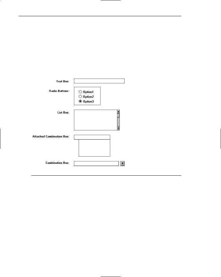
740Part 2: The User Interface Design Process
■Mixed controls
—Left-align vertically arrayed
•Text boxes.
•Radio buttons.
•Check boxes.
•Drop-down/pop-up list boxes.
•Spin boxes.
•Combination control boxes.
•List boxes.
—Captions may be leftor right-aligned.
Figure 13.17
Elements and information should be organized vertically (top to bottom) as well. Two, and sometimes three, columns of controls and fields may occasionally be created. When multiple columns are presented and no section borders are used, column separation and downward flow may be emphasized through line borders, as illustrated in Figure 13.18.
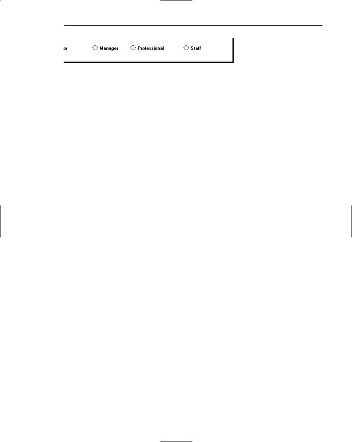
In some cases, window space constraints may dictate a horizontal orientation of controls, most noticeably radio buttons and check boxes. Again the pattern created must be consistent, predictable, and distinct.


Step 13: Organize and Layout Windows and Pages 743
Figure 13.24: Horizontally arrayed control items with inconsistent spacing and a false vertical orientation.
Figure 13.25: Horizontally arrayed control items possessing alignment and distinctiveness.
Figure 13.26: Horizontally arrayed control items with borders to improve readability.

Step 13: Organize and Layout Windows and Pages 745
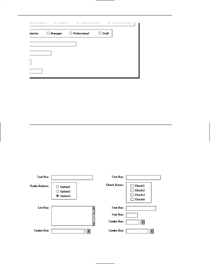
■Mixed text boxes and selection controls:
—Align by their tops:
•Text boxes.
•Radio buttons.
•If a control border exists, align by top border.
•Check boxes.
•If a control border exists, align by top border.
•Drop-down/pop-up list boxes.
•Spin boxes.
•Combination boxes.
•List boxes.
Arrangement of controls horizontally always consists of aligning them by their tops. Because controls may be of different heights, screen efficiency occasionally dictates that a control must be positioned in an area where it does not align horizontally with another control. When this occurs, attempt to align it horizontally with the bottom of an adjacent control, as illustrated by the list box and adjacent combo box in the previous example. Do not cramp a control, however, to achieve bottom alignment.
Section Alignment
■Align by their left side vertically arrayed groupings containing section borders.
■Align by their top horizontally arrayed groupings containing section borders.
Figure 13.29
Groupings with borders should also be aligned vertically by their left border and horizontally by their top border. Controls within a grouping will, of course, be aligned following the alignment principles previously discussed.
Balancing Elements
■General:
—Create balance by
•Equally distributing controls, spatially, within a window.
•Aligning borders whenever possible.

746Part 2: The User Interface Design Process
■Individual control borders:
—If more than one control with a border is incorporated within a column on a screen
•Align the controls following the guidelines for multiple-control alignment.
•Align the left and right borders of all groups.
•Establish the left and right border positions according to the spacing required for the widest element within the groups.
Figure 13.30
––With multiple groupings and multiple columns, create a balanced screen by
•Maintaining equal column widths as much as practical.
•Maintaining equal column heights as much as practical.
Figure 13.31
■Section borders:
—If more than one section with borders is incorporated within a column on a screen,
•Align the left and right borders of all groups.
•Establish the left and right border positions according to the spacing required by the widest element within the groups.

Step 13: Organize and Layout Windows and Pages 747
Figure 13.32
—With multiple groupings and multiple columns, create a balanced screen by
•Maintaining equal column widths as much as practical.
•Maintaining equal column heights as much as practical.
Figure 13.33
Screen balance should be attained as much as possible. Do not sacrifice screen functionality to achieve balance, however. Never rearrange controls to simply make the screen look nice. A meaningful order of elements is most important. The look will be the best that can be achieved within the limits imposed by functionality.

748 Part 2: The User Interface Design Process
One additional point about alignment: While these guidelines suggest aligning section, radio button, and check box borders on the right side as well as the left, a glance back at Figure 13.9 will reveal an instance where this was not done. The Justification and Contents borders were not right-aligned because the text boxes within that grouping created a ragged right edge. Aligning just these two controls would have served no purpose. So, all alignment and balancing must occur within the context of the whole screen.
Control Navigation
■Tab/arrow keys:
—Use the tab key to move between operable window controls, in the logical order of the controls.
•Do not tab to field captions/labels.
—Radio buttons:
•Use arrow keys to move through radio buttons within a single control.
—Check boxes:
•Use the Tab key to move between, when they are independent controls.
•Within a border or group box, use arrow keys to move between the check boxes since they appear as a logical group.
—List boxes:
•Use arrow keys to navigate within list box choices.
■Command buttons:
—For exiting or expanding/feature dialog command buttons,
•Tab to them at the end of the screen control tabbing sequence.
—For a command button with a contingent relationship to a control in the window body,
•Tab to it at the logical point in the tabbing sequence within the window.
■Keyboard equivalents:
—Use keyboard equivalents (mnemonics) for direct access to each control, whenever possible.
•Mnemonic designations must be unique within a window.
Use the tab key to move between operable window controls, in the logical order that the controls are organized. Do not tab to control captions but the control itself. For a grouping of radio buttons, use the arrow keys to move through an array of buttons. For check boxes, use the tab key to move between them when they are arrayed as independent controls. When check boxes are located within a border or group box, use the arrow keys to move between the boxes since they appear as a logical group. Always use arrow keys to navigate within a listing of choices.
Tab to exiting or expanding/feature dialog buttons at the end of the screen control tabbing sequence. If a button has a contingent relationship to a control in the window body, tab to it at the logical point in the tabbing sequence within the window.
Use keyboard equivalents (mnemonics) for direct access to each window control, whenever possible. Mnemonic designations must be unique within a window. The command buttons OK and Cancel are not typically assigned mnemonics, the Enter and Esc keys being used instead.

Step 13: Organize and Layout Windows and Pages 749
Window Guidelines
■Organization:
—Organize windows to support user tasks.
—Present related information in a single window whenever possible.
—Support the most common tasks in the most efficient sequence of steps.
—Use
•Primary windows to
•Begin an interaction and provide top-level context for dependent windows.
•Perform a major interaction.
•Secondary windows to
•Extend the interaction.
•Obtain or display supplemental information related to the primary window.
•Dialog boxes for
•Infrequently used or needed information.
•“Nice-to-know” information.
■Number:
—Minimize the number of windows needed to accomplish an objective.
■Size:
—Provide large enough windows to
•Present all relevant and expected information for the task.
•Prevent hiding important information.
•Prevent crowding or visual confusion.
•Minimize the need for scrolling.
•Occupy less than the full size of the entire screen.
—If a window is too large, determine
•Is all the information needed?
•Is all the information related?
These guidelines, and many others, are discussed in Step 5. In summary, always organize windows to support user tasks. Support the most common tasks in the most efficient sequence of steps. Minimize the number of windows needed to accomplish an objective. In general, present all related information in a single window whenever it is possible to do so. A window should be large enough to accommodate the amount of data a person would typically expect to see. The needed information can only be determined through thorough task analysis.
The necessity for window scrolling should also be avoided whenever possible. If all the relevant controls or data cannot be placed within the confines of a single window, place that which is less frequently needed on another window. Do not make the default size of a window the full screen. The option to maximize a window always exists.
Finally, use primary windows, secondary windows, and dialog boxes consistently and in the manner they are intended to be used.