The Essential Guide to UI Design
.pdf
730 Part 2: The User Interface Design Process
Creating Groupings
■General:
—Provide groupings of associated elements.
•Elements of a radio button or check box control.
•Two or more related fields or controls.
—Create groupings as close as possible to 5 degrees of visual angle.
■White space:
—Provide adequate separation of groupings through the liberal use of white space.
—Leave adequate space
•Around groups of related controls.
•Between groupings and window borders.
—The space between groupings should be greater than the space between fields within a grouping.
■Headings:
—Provide section headings and subsection headings for multiple control groupings.
—Provide headings that meaningfully and concisely describe the nature of the group of related fields.
■Borders:
—Enhance groupings through incorporation of borders around
•Elements of a single control.
•Groups of related controls or fields.
—Individual control borders should be visually differentiable from borders delineating groupings of fields or controls.
•Provide a border consisting of a thin line around single controls.
•Provide a border consisting of a slightly thicker line around groups of fields or controls.
—Do not place individual field or control borders around
•Single entry fields.
•Single list boxes.
•Single combination boxes.
•Single spin boxes.
•Single sliders.
–– Do not place borders around command buttons.
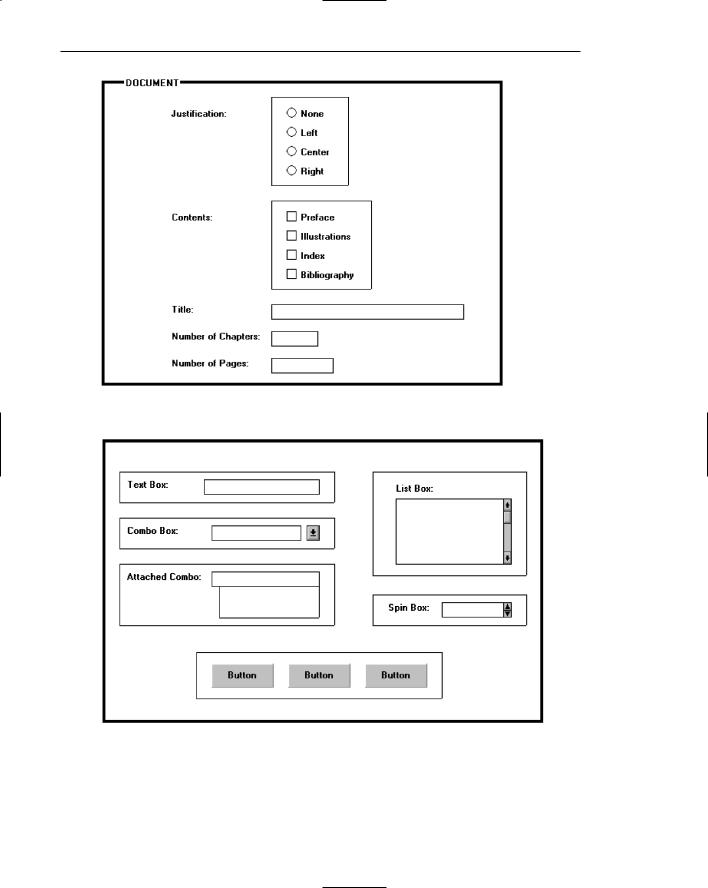
Individual controls with multiple parts, such as radio buttons or check boxes, should be identifiable as a single entity. A series of related controls should also be presented as related. Create groupings to do this as often as possible. Groupings aid learning and provide visual appeal. The optimum group size is 5 degrees of visual angle. At the normal viewing distance of a screen, this is a circle 1.67 inches in diameter. On a text-based screen this is equivalent to about six to seven lines at a width of 12 to 14 characters. Examples of groupings are illustrated in Figure 13.1.
732 Part 2: The User Interface Design Process
Figure 13.3: Groupings with section headings.
Borders
Groupings can be further enhanced through the use of borders. Inscribe line borders around elements of a single control such as a radio button or check box and/or groups of related controls or fields. Individual control borders should be visually differentiable from borders delineating groupings of fields or controls. Provide a border consisting of a thin line around single controls and a slightly thicker line around groups of fields or controls.
Control Borders
■Incorporate a thin single-line border around the elements of a selection control.
■For spacing,
—Vertically, leave one line space above and below the control elements.
—Horizontally:
•Leave at least two character positions between the border and the left side of the control elements.
•Leave at least two character positions between the border and the right side of the longest control element.
—Locate the control caption in the top border, indented one character position from the left border.
•Alternately, locate the caption at the upper left of the box.

Step 13: Organize and Layout Windows and Pages 733
Figure 13.4
—If the control caption exceeds the length of the choice descriptions, extend the border two character positions to the right of the caption.
Figure 13.5
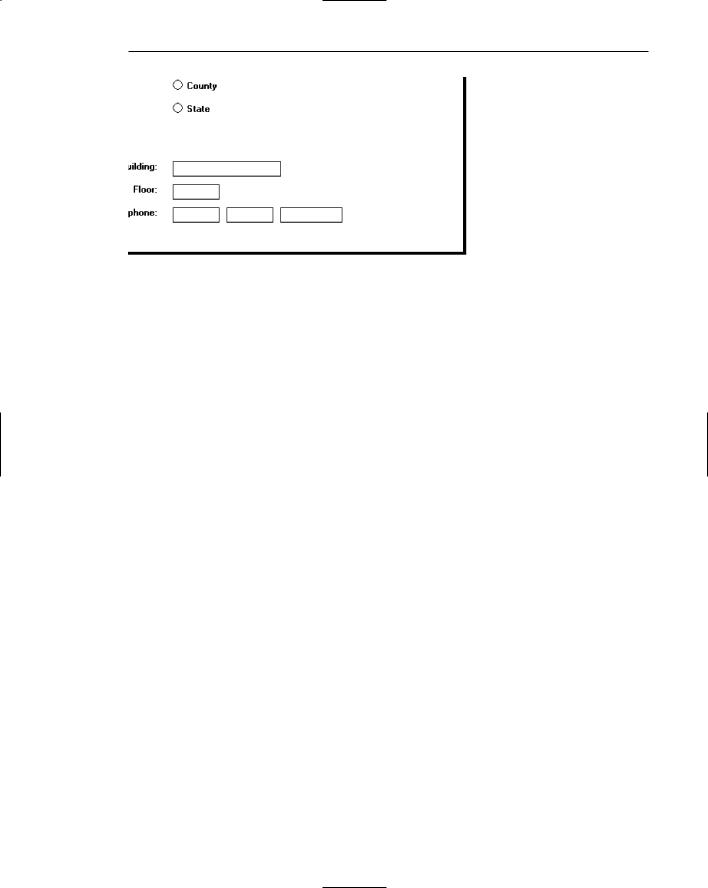
Thin line borders may be used to surround some boxed-in controls, particularly radio buttons and check boxes. Control captions should be located upper left within the border itself, or to the left of the box. The spacing guidelines are to prevent cramping the text within the border. Some examples of control borders are illustrated in Figures 13.6 and 13.7.
Section Borders
■Incorporate a thicker single-line border around groups of related entry or selection controls.
■For spacing,
—Vertically, leave one line space between the top and bottom row of the entry or selection control elements.
—Horizontally, leave at least four character positions to the left and right of the longest caption and/or entry field.
■Locate the section heading in the top border, indented two character positions from the left border.

Step 13: Organize and Layout Windows and Pages 735
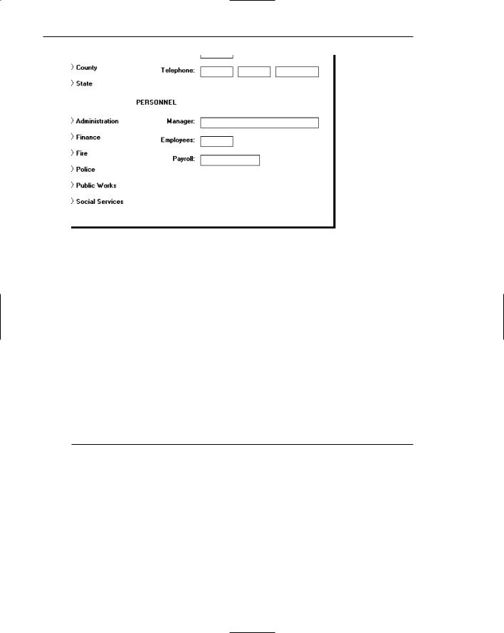
Line borders may be used to surround groupings of related controls. Section headings should be located at the upper left within the border itself. Display section headings in capital letters to differentiate them easily from individual control captions. The spacing guidelines are to prevent cramping the text within the border. Examples of section borders are illustrated in Figure 13.8.
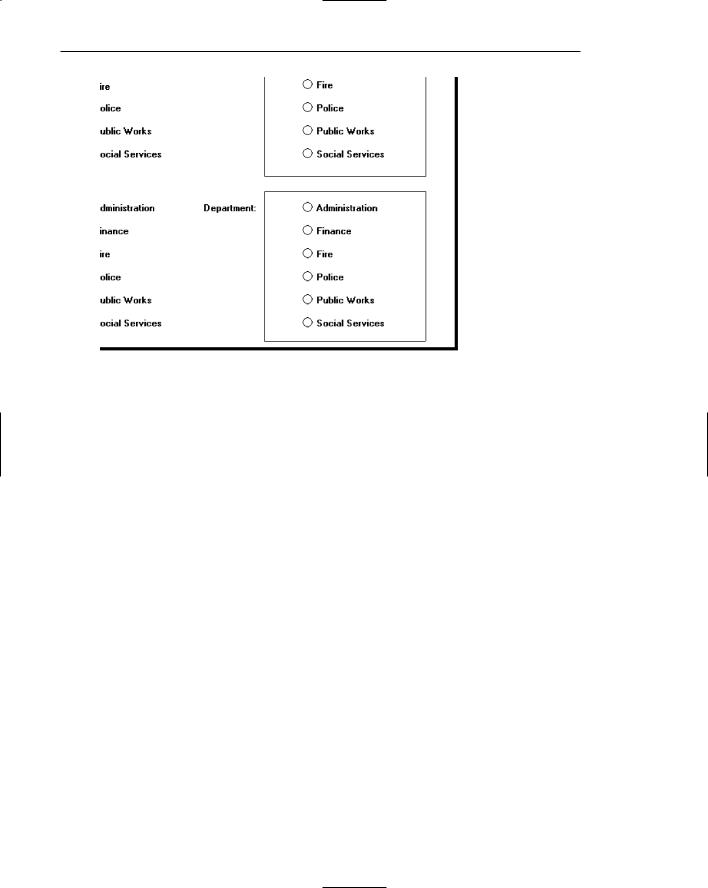
If both control borders and section borders are included on the same screen, make the section border slightly thicker, as illustrated in Figure 13.9.
Be conservative in the use of borders because too many can lead to screen clutter. Do not place individual field borders around the individual controls previously listed, and illustrated in Figure 13.10. The nature of their design provides them with a border. Also, because of the potential for clutter, do not place a border around groups of pushbuttons.
Figure 13.8: Grouping of sections using borders.

Step 13: Organize and Layout Windows and Pages 737
Dependent Controls
■Position a conditional control, or controls
— To the right of the control to which it relates.
Figure 13.11
— Alternately, position it below the control to which it relates.
Figure 13.12
■Either
—Display these conditional controls in a subdued or grayed out manner.
• When a control is relevant, return it to a normal intensity.
—Do not display a conditional control until the information to which it relates is set.
■Inscribe a filled-in arrow between the selected control and its dependent controls to visually relate them to each other.
In some circumstances, a control may be active only under certain conditions. Only when a particular response is made is this additional information needed. For example, a question such as “Do you have any children?” might necessitate knowing their names. If this question is answered affirmatively, a field requesting their names can be displayed at that point on the screen. If a “No” response is given, the tab will cause the cursor to move to the next field, and the children’s names field will not appear.
Locate a dependent or conditional control to the right of or below the field or choice that necessitates it. Exact positioning will depend upon the flow of eye movement through the screen and screen space constraints. The displayed arrow serves to tie the dependent control to the triggering control. The control field may either be shown in a grayed out or subdued manner, or not displayed at all until it is needed.
Displaying a control as grayed out or subdued allows the user to be aware of its existence but reduces the visual competition between it and other needed information on the screen. Not displaying dependent fields until they are triggered reduces screen clutter. Hiding their existence, however, does not give the screen user a full picture of all the possibly needed data and the relationships that may exist. Hiding them, then, may result in a slight learning price, depending upon the complexity of the needed data. The recommendation is to display them grayed out.
One caution: Place dependent controls within a window only when their frequency of use is moderate or high. Infrequently used dependent information is best located in