

C# ПІДРУЧНИКИ / c# / Premier Press - C# Professional Projects
.pdf
158 Project 1 CREATING A CUSTOMER MAINTENANCE PROJECT
When you click the New option on the File menu, a new form, Form2, is created for you. Similarly, you can write code for other options. Figure 8-12 displays the New option.
|
|
Y |
|
L |
|
|
F |
|
|
M |
|
A |
|
|
E |
|
|
T |
|
|
FIGURE 8-12 The New option
GroupBox Control
A GroupBox control is used to create a group of controls, such as RadioButton, CheckBox, TextBox controls, and so on. You can give a specific name to a GroupBox control that can be used to identify each item in the GroupBox control.
RadioButton Control
A RadioButton control is used to allow users to select an option from a group of two or more options. You can use a GroupBox control to group RadioButton controls. In the previous example of a Button control, when a user clicks the button, Form2 is displayed. However, in this case, if the user has the option of viewing more than one form, you can create a group of RadioButton controls. To do this, perform the following steps:
Team-Fly®

WINDOWS FORMS AND CONTROLS |
Chapter 8 |
|
159 |
|
|||
|
|
|
|
1.Drag a GroupBox control to the form.
2.Change the Text property of the GroupBox control to Forms.
3.Drag three RadioButton controls and place them within the GroupBox control.
4.In the Properties window, change the following properties of the RadioButton controls:
RadioButton1:
Name: btnForm1
Text: Form1
RadioButton2:
Name: btnForm2
Text: Form2
RadioButton3:
Name: btnForm3
Text: Form3
To make the radio buttons functional, write the code for the click events of the RadioButton controls.
1.Double-click on btnForm1 to open the code window.
2.Add the following code to the click event of btnForm1.
private void btnForm1_CheckedChanged(object sender, System.EventArgs e)
{
Form1 newForm = new Form1(); newForm.Show();
this.Hide();
}
The previous code creates an instance of Form1.The instance of Form1 is used to call the Show() method to display Form1. The this.Hide() statement is used to hide the current form.
Similarly, you can write the code for btnForm2 and btnForm3.
1. Double-click on btnForm2 to open the code window.

160 Project 1 CREATING A CUSTOMER MAINTENANCE PROJECT
2. Add the following code to the click event of btnForm2.
private void btnForm2_CheckedChanged(object sender, System.EventArgs e)
{
Form2 newForm = new Form2(); newForm.Show();
this.Hide();
}
3.Double-click on btnForm3 to open the code window.
4.Add the following code to the click event of btnForm3:
private void btnForm3_CheckedChanged(object sender, System.EventArgs e)
{
Form3 newForm = new Form3(); newForm.Show();
this.Hide();
}
5. Save the form by using the Save option on the File menu.
Figure 8-13 shows the GroupBox control with the three radio buttons.
FIGURE 8-13 RadioButton controls

WINDOWS FORMS AND CONTROLS |
Chapter 8 |
|
161 |
|
|||
|
|
|
|
CheckBox Control
A CheckBox control allows a user to select a state, which can be either True or False. A CheckBox control is similar to a RadioButton control; however, you can create a group of CheckBox controls that allow user to select more than one value. To select an option, a user needs to check the CheckBox control.
To determine whether a CheckBox control is selected or not, you can use the Checked property, which returns a Boolean value, True or False, depending on whether the user has selected the check box or not.
To make a CheckBox control functional, you need to add code to the control. You can use the CheckState property of the CheckBox control to specify the action to be performed, depending on whether the control is checked or not. The CheckState property returns a value of Checked or Unchecked.
ListBox Control
A ListBox control is used to allow users to select one or more options from a list of items. You can use the SelectionMode property to specify whether a user can select one or multiple options. For example, if you set the SelectionMode property to one, the user can select only one option. However, if the SelectionMode property is set to either MultiSimple or MultiExtended, the user can select multiple options.
To create a ListBox control that allow users to select only one option, perform the following steps:
1.Drag a ListBox control to the form.
2.In the Properties window, set the following properties of the control:
Name: listBox1
SelectionMode: One
The ListBox control is empty until now. To add values to the control, perform the following steps:
3.In the Properties window, select the Items property by clicking on the ellipsis button.
The String Collection Editor window is displayed.
162Project 1 CREATING A CUSTOMER MAINTENANCE PROJECT
4.Add values to the String Collection Editor window by typing each value in a single row.
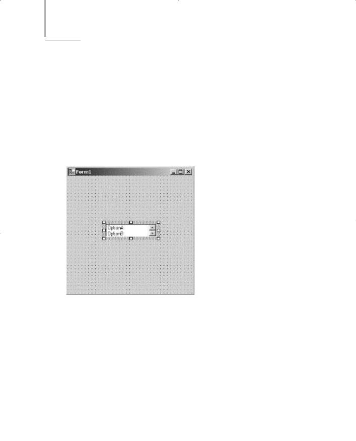
You can add values such as OptionA, OptionB, OptionC, OptionD, and
OptionE.
5.Click on the OK button to close the String Collection Editor window.
6.Click on the Save option on the File menu to save the form.
The values are displayed in the ListBox control. You can now resize the control according to your need. If the options require more space than that provided, a scroll bar appears. Figure 8-14 shows the ListBox control with values added to it.
FIGURE 8-14 ListBox control
ComboBox Control
A ComboBox control allows users to select an option from a list of options. In addition, you can type an option in the ComboBox control if you do not want to select any of the available options.

WINDOWS FORMS AND CONTROLS |
Chapter 8 |
163 |
|
|
|
To determine the option that a user selects, you can use the SelectedIndex property. The SelectedIndex property returns the index value of the item that is selected. However, if you do not select any option, the value returned by the SelectedIndex property is -1.
NOTE
Both the ListBox and ComboBox controls are used to allow users to select an option from the items list. However, a ListBox control does not allow a user to enter values. This implies that a user is restricted to selecting an option from the available list.
Alternatively, a ComboBox control provides the user with suggested options. The user may or may not select the options that are provided in the ComboBox control.
MonthCalendar Control
A MonthCalendar control allows users to select a date from a calendar that displays dates and months. By default, the current date is selected. However, a user is allowed to select any other date by clicking on the date value. The user can also change the month by clicking on the arrow buttons that appear at the top of the MonthCalendar control. A MonthCalendar control allows you to select multiple dates. The control also allows you to specify a range of dates that you can select.
DateTimePicker Control
A DateTimePicker control is used to allow users to select a single date from the calendar of dates that is displayed when a user clicks the Down Arrow button. A user can also type the date in the text box area of the DateTimePicker control. Unlike the MonthCalendar control, you can also specify the time in the DateTimePicker control.
When the user clicks the Down Arrow button, a MonthCalendar control is displayed, which allows you to select a date by clicking on the date in the MonthCalendar control.
Figure 8-15 shows a MonthCalendar control and a DateTimePicker control.

164 Project 1 CREATING A CUSTOMER MAINTENANCE PROJECT
FIGURE 8-15 MonthCalendar control and DateTimePicker control
Having learned about Windows applications in general, you can now apply the concepts to create a Windows application for the Customer Maintenance project.
Creating a Windows Application for the Customer Maintenance Project
As discussed earlier, you can create a Windows application by using the templates provided by Visual Studio .NET. Name the new project that you create Customer Maintenance Project. When you create the application, Visual Studio .NET creates a default form, Form1, for you. The following section describes adding controls to Form1.

WINDOWS FORMS AND CONTROLS |
Chapter 8 |
165 |
|
|
|
Creating an Interface for Form1
1.Drag a Label control from the Windows Forms toolbox to the form.
2.Click on the Label control to change its properties.
If the Properties window is not displayed, click on the Properties Window option on the View menu. Alternatively, you can click the F4 key to display the Properties window.
3.Change the following properties of the control:
Text: Customer Maintenance System
Font:
Name: Microsoft Sans Serif
Size: 25
4.Drag a MainMenu control from the Windows Forms toolbox to the form.
A menu item is added to the form.
5.Click on the text Type Here and type the name of the first menu item as
&Worker.
Similarly, you can add more menu items to the form by typing in the area containing the text Type Here. You can add menu items for Customer, Job Details, Reports, and Exit. After adding menu items to the form, you need to change the properties of the menu items.
6.Click on the Worker menu item to change its properties.
7.In the Properties window, change the following properties of the Worker menu item.
Text: &Worker
Shortcut: AltW
Similarly, you can change the properties for the rest of the menu items. Table 8-2 shows the menu items and their corresponding property values.

166 Project 1 CREATING A CUSTOMER MAINTENANCE PROJECT
Table 8-2 Menu Items and their Corresponding Property Values
Menu Item |
Property Value |
Worker |
Text: &Worker |
|
Shortcut: AltW |
Customer |
Text: &Customer |
|
Shortcut: AltC |
Job Details |
Text: &Job Details |
|
Shortcut: AltJ |
Reports |
Text: &Reports |
|
Shortcut: AltR |
Exit |
Text: E&xit |
|
Shortcut: AltX |
|
|
Figure 8-16 shows Form1 after the controls are added to it.
FIGURE 8-16 Form1 with the controls
Similarly, you can create an interface for the rest of the forms.

WINDOWS FORMS AND CONTROLS |
Chapter 8 |
167 |
|
|
|
Creating an Interface for WorkerForm
WorkerForm is used to display the records in the Worker table. You can also add, modify, or delete records from this table by using WorkerForm. However, before creating an interface for WorkerForm, you need to add another form to the project. To add another form, perform the following steps.
1.Right-click on Customer Maintenance Project in the Solution Explorer window and select the Add option.
2.From the list that is displayed, select the Add New Item option. The Add New Item dialog box is displayed.
3.In the Templates: pane of the Add New Item dialog box, select the Windows Form icon.
4.In the Name text box, type the name of the form as WorkerForm and click on the Open button.
Visual Studio .NET creates a blank form with the name WorkerForm. You can now add controls to the form. To do so, perform the following steps:
1.Add a Label control, DataGrid control, and four button controls to the form.
2.In the Properties window, change the following properties of the controls:
Label control:
Name: label1
Text: Click on the Edit Button to load the records.
Font:
Name: Arial
Size: 10
Bold: True
Button1 control:
Name: btnSave
Text: Save