

Genomics and Proteomics Engineering in Medicine and Biology - Metin Akay
.pdf114 ROBUST METHODS FOR MICROARRAY ANALYSIS
This algorithm is fast and has been observed [37] to produce much smaller but still representative versions of the original graph.
Once the initial graph G0 has been coarsened, we can draw the smaller version G1 using VxOrd 1.5 and then reverse our coarsening to obtain a layout of G0. In fact, we repeatedly apply the coarsening algorithm to get an even smaller graph. The algorithm that we use is as follows:
1.Apply the coarsening algorithm until we obtain a suitably small graph (say 50 nodes) or until the algorithm fails to make any more progress. We obtain a sequence of graphs G0, G1, . . . , Gm from this process.
2.Draw Gm using VxOrd.
3.Refine Gm to obtain Gm21. Place the additional nodes obtained by this refinement in the same positions as their counterparts (merged nodes in Gm) and adjust with VxOrd.
4.Repeat step 3 using Gm22, . . . , G0.
This algorithm requires additional adjustments in terms of the grid-based density calculations and the various parameters involved in the simulated annealing. With proper adjustments, however, we obtain better accuracy and stability with this algorithm (VxOrd 2.0) than with the previous version (VxOrd 1.5), as will be demonstrated in the following section.
4.3.3.2. Benchmarking VxOrd 2.0 We first benchmarked VxOrd 2.0 on the so-called swiss roll data set. Although this is not microarray data, it provides a useful example of the essential difference between VxOrd 2.0 and VxOrd 1.5. This data set was used in [38, 39] to test two different nonlinear dimensionality reduction algorithms. The data set is provided as points in three dimensions, which give a spiral embedding of a two-dimensional ribbon (see Fig. 4.7a). To test VxOrd, we considered each point to be a node in an abstract graph, and
FIGURE 4.7. The swiss roll is a two-dimensional manifold embedded nonlinearly in three dimensions: (a) actual data set; layouts of associated graph using (b) VxOrd 1.5 and (c) 2.0 VxOrd.

4.3. UNSUPERVISED METHODS |
115 |
we connected each node to its 20 nearest neighbors. In principle, VxOrd should draw the graph as a two-dimensional ribbon.
The swiss roll is a useful benchmark because it is very easy to visualize but hard enough so that it will confound (at a minimum) any linear algorithm (such as principal–component analysis). It also confounded the original VxOrd 1.5, as can be seen in Figure 4.7b. Looking closely at Figure 4.7b, we can see that VxOrd 1.5 did well on a local scale (i.e., the colors are together and in the correct order) but failed on a global scale (the ribbon is twisted). Once graph coarsening was added to VxOrd, however, the global structure was also ascertained correctly, as shown in Figure 4.7c. In our subsequent analysis we found a similar story: VxOrd 2.0 does well on large data sets on a global scale but otherwise does not improve VxOrd 1.5.
For our next benchmark, we again used the swiss roll data set, an adult leukemia data set provided by the University of New Mexico Cancer Research and Treatment Center, and the yeast microarray data set [6] used previously. In order to test the stability of our modification to VxOrd, we performed multiple runs of both VxOrd 1.5 and VxOrd 2.0 with different random starting conditions. We then compared the ordinations using a similarity metric obtained as a modification of a metric discussed in [40].
Our similarity metric is a function se (U, V ), where U, V are two VxOrd layouts of the same m-node data set x1, . . . , xn. The metric is computed by first constructing neighborhood incidence matrices NU,e and NV,e, where N*,e is an n n matrix N*,* ¼ (nij), with
nij ¼
1 if kxi xjk , e
0 otherwise
Now
NU,e NV,e
se(U, V) ¼ kNU,ekkNV,ek
where NU,e NV,e is the dot product of NU,e and NV,e when both matrices are considered to be vectors of length n2. Finally, we note that in order to make sure we can form reasonable e neighborhoods of a given node xi, we first scale both U and V to lie in the area [21,1] [21,1].
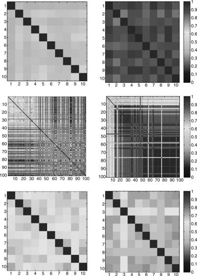
To see how we can use this metric to assess the stability of VxOrd 2.0, we first revisit the swiss roll data set. In the top row of Figure 4.8, we show an all-versus- all similarity matrix for 10 different random runs of both VxOrd 1.5 and VxOrd 2.0. This figure confirms the results from Figure 4.7 and shows that the metric is valid. In particular, we see that VxOrd 2.0 arrives at a consistent solution (indicated by higher similarities) while VxOrd 1.5 is less consistent.
Next we computed the same similarity matrices for the adult leukemia data set and for the yeast time-series data, as shown in the second and third rows of
116 ROBUST METHODS FOR MICROARRAY ANALYSIS
FIGURE 4.8. Comparison of the similarity matrices for random runs of VxOrd 1.5 and 2.0 using swiss roll, adult leukemia, and yeast data sets. On the left we show the runs produces by VxOrd 1.5, and on the right we see the runs produced by VxOrd 2.0. From top to bottom we have the swiss roll with 10 runs, the adult leukemia data set with 100 runs (10 runs for 10 different edge cutting parameters—more aggressive up and left), and the yeast data set with 10 runs. The color scale is shown on the right and is the same for all images. If we look at this figure as a whole, we see that the right-hand column has more red than the left-hand column and hence that VxOrd 2.0 (right column) is generally more stable than VxOrd 1.5 (left column).
|
|
4.4. SUPERVISED METHODS |
117 |
||
TABLE 4.1 Average Values (Excluding the Diagonal) |
|
||||
of the Similarity Matrices Shown in Figure 17 |
|
|
|
||
|
|
|
|
|
|
|
Swiss Roll |
AML |
Yeast |
|
|
|
|
|
|
|
|
VxOrd 1.5 |
0.43 |
0.33 |
0.62 |
|
|
VxOrd 2.0 |
0.87 |
0.80 |
0.69 |
|
|
|
|
|
|
|
|
Figure 4.8. We arrived at similar results in each case. We also computed the average similarity across the matrices (excluding the diagonal) for the different cases, shown in Table 4.1.
In the case of the adult leukemia data set, we also experimented with the edge cutting feature of VxOrd. In particular, we computed 10 random runs for each of the 10 most aggressive edge cuts. We found that even though VxOrd 2.0 was more consistent overall, it still was not consistent with the most aggressive cut.
The yeast data set was larger (6147 nodes compared to 170 nodes in the adult leukemia data set) and the results of both VxOrd 1.5 and 2.0 were fairly consistent. In particular this suggests VxOrd 1.5 still does well on larger data sets without an inherently gridlike structure (as in the swiss roll).
4.4. SUPERVISED METHODS
Clustering a microarray data set is typically only the first step in an analysis. While we have presented tools and techniques to help assure a reasonable and stable ordination, we have not yet discussed the most important part of the analysis: the steps necessary to determine the actual biological meaning of the proposed clusters. While we do not typically address the actual biology in a given analysis, we often provide the appropriate tools for such analysis. These tools must be both informative and accessible to the average biologist.
4.4.1. Using VxInsight to Analyze Microarray Data
As stated earlier, most of our work is built upon a database with a visual interface known as VxInsight [1]. VxInsight was originally developed for text mining but has been extended for the purpose of microarray analysis. Once an ordination has been obtained (using the methods described previously), the ordination is imported into VxInsight, along with any annotation or clinical information.
VxInsight uses a terrain metaphor for the data, which helps the analyst find and memorize many large-scale features in the data. The user can navigate through the terrain by zooming in and out, labeling peaks, displaying the underlying graph structure, and making queries into the annotation or clinical data. In short, VxInsight provides an intuitive visual interface that allows the user to quickly investigate and propose any number of hypotheses. Details about and applications of VxInsight can be found in [1, 20, 29, 32, 33].
118 ROBUST METHODS FOR MICROARRAY ANALYSIS
4.4.1.1. Typical Steps in Analysis Using VxInsight VxInsight is very useful for an initial sanity check of a data set. We will typically cluster the arrays to look for mistakes in the scanning or data processing which might have duplicated an array. A duplication will often be apparent in the experiment because the pair of duplicated arrays will cluster directly on top of each other and will typically be far from the other clusters. We have discovered that many data sets cluster more by the day the samples were processed, or even by the technician processing the samples, than because of biologically relevant factors. Further investigation is needed, for example, if almost 100% of a particular processing set clusters by itself. In one case we found a very stable ordination consisting of two groups. After much confusion we discovered that the groups were divided by experimental batch and that one of the groups consisted of patients whose samples contained only dead or dying cells (perhaps due to bad reagents or problems with the freezing process). When the experiments were redone, the original clusters dissolved into more biologically meaningful clusters.
One can often see the effect of confounding experimental conditions using this same method. For example, if a set of arrays is processed by the date they were collected and the date corresponds to separate individual studies, then the processing set (date) will be confounded with the study number. Well-designed studies control such confounding by randomizing the processing order or by carefully balancing the processing order. However, it is always wise to use these exploratory analysis methods to ensure that your main effect has not, somehow, been confounded.
A more interesting phase of analysis begins after obviously bad data have been culled and the remaining data have been reclustered. The data may be clustered in either of two ways. In one approach, the genes are clustered in an effort to identify possible functions for unstudied genes. See, for example, [29, 32].
In the other approach, which is often seen in clinical studies, we cluster the arrays (the patients) by their overall expression patterns. These clusters will hopefully correspond to some important differentiating characteristic, say, something in the clinical information. As the analysis proceeds, various hypotheses are created and tested. VxInsight has plotting features that are helpful here, including a browser page with various plots as well as links to external, Web-based information.
Although useful information can be gleaned by simply labeling different peaks in VxInsight, a more systematic method is even more informative. At the highest level, one may wish to select two clusters of arrays and ask: Which genes have significantly differential expressions between these two clusters? Given any method for identifying such genes, it is useful to display them within the context of the cluster-by- genes map. Sometimes the most strongly differentiating genes for the clusters of arrays may not have been previously studied. In this case, it can be very useful to find known genes that cluster around these unstudied genes using the cluster-by- genes map.
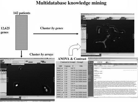
This process is illustrated in Figure 4.9, which shows the original table of array data, clustered both by arrays and by genes. The lower map represents the result after clustering by arrays and shows two highlighted clusters (colored white and green, respectively). The genes with strongly differential expressions between the groups
4.4. SUPERVISED METHODS |
119 |
FIGURE 4.9. Array of expression data for large number of experiments shown clustered by genes and by arrays. A list of genes with different expressions between two groups of arrays is shown. This list includes a short annotation and links to more extensive, Web-based annotations.
of arrays are shown to the right of this map. Note that the list is sorted by a statistical score and also contains links to the available Web-based annotations. A curved arrow in the figure suggests the path between the gene list and the cluster-by- genes image. That connection is implemented with sockets and forms the basis of a more general analysis tool, which allows an arbitrary gene list to be sent from the analysis of the arrays to the analysis of the genes.
4.4.1.2. Generating Gene Lists There are many methods for generating gene lists or finding genes which are expressed differently in different groups. As stated in the introduction, this process is known as supervised learning, since we are using known groups to learn about (and make predictions about) our data set. Finding gene lists in particular is known as feature or variable selection, where the features in this case are genes.
There are a wide variety of methods for feature selection, and we do not provide here an extensive survey of this area. We do, however, mention some of the methods developed specifically to select genes for microarray analysis. The method in [7] was one of the first gene selection methods proposed, the method in [41] applied feature selection for support vector machines to microarray data, and [42] discusses a variety of feature selection methods applied to microarray data.
120 ROBUST METHODS FOR MICROARRAY ANALYSIS
For our purposes, we use a simple statistical method for gene selection. A gene- by-gene comparison between two groups (1 and 2) can be accomplished with a simple t-test. However, we wanted to eventually support comparisons between more than two groups at a time, so we actually used analysis of variance (ANOVA). This processing results in an F-statistic for each gene. The list of genes is sorted to have decreasing F-scores, and then the top 0.01% of the entire list are reported in a Web page format, with links to the associated OMIM pages. The OMIM pages are then examined manually to hypothesize biological differences between the clusters.
4.4.1.3. Gene List Stability An analysis using the gene list feature of VxInsight typically progresses as follows. First, a question is posed within the VxInsight framework and a statistical contrast is computed for that question. The gene list is initially examined to see if any genes are recognized by their short descriptions, which, if available, are included with the genes. The plots are examined, and the OMIM annotations are read. If the gene appears to be important, the literature links and other relevant National Center for Biotechnology Information (NCBI) resources are studied. This analysis step is very labor and knowledge intensive; it requires the bulk of the time needed to make an analysis. As such, it is very important to not waste time following leads that are only weakly indicated. That is to say, before one invests a great deal of time studying the top genes on a list, it is important to know that those highly ranked genes would likely remain highly ranked if the experiment could be repeated or if slight variations or perturbations of the data had occurred.
The critical issue about any ordered list of genes is whether we can have any confidence that this list reflects a nonrandom trend. To be very concrete, suppose that My Favorite Gene (MFG) is at the top of the list in our ANOVA calculations, that is, MFG had the largest observed F-statistic from the ANOVA. What can we conclude about the observed ranking for MFG? Certainly, a naive use of the F-statistic has no support because we tested, say, 10,000 genes and found the very largest statistic from all of those tests. So, an F-value for p ¼ 0.001 would likely be exceeded about 10 times in our process, even if all the numbers were random. Hence, the reported F-statistic should only be considered to be an index for ordering the values.
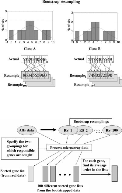
However, if we could repeat the experiment and if MFG was truly important, it should, on average, sort into order somewhere near the top of the gene list. We cannot actually repeat the experiment, but we can treat the values collected for a gene as a representative empirical distribution. If we accept that this distribution is representative, then we can draw a new set of values for each of the two groups by resampling the corresponding empirical distributions repeatedly (with replacement), as shown in Figure 4.10. This process is due to Efron and is known as bootstrapping [43].
Now consider Figure 4.11, where we resample for every gene across all of the arrays in the two groups to create, say, 100 new experiments. These experiments are then processed exactly the same way as the original measurements were processed. We compute ANOVA for each gene and then sort the genes by their F-value. As we construct these bootstrapped experiments, we accumulate the
4.4. SUPERVISED METHODS |
121 |
FIGURE 4.10. A bootstrap method uses the actual measured data as estimates for the underlying distribution from which the data were drawn. One can then sample from that estimated underlying distribution by resampling (with replacement) from the actual measurements.
FIGURE 4.11. Actual data are processed to create the gene list, shown at the bottom left. The actual data are then resampled to create several bootstrapped data sets. These data sets are processed exactly the same way as the real data to produce a set of gene lists. The average order and the confidence bands for that order can be estimated from this ensemble of bootstrapped gene lists.
122 ROBUST METHODS FOR MICROARRAY ANALYSIS
distribution of the location in the list where each gene is likely to appear. Using these bootstrap results one can determine, for each gene, its average order in the gene lists. Although the distributions for such order statistics are known, they are complex. On the other hand, the bootstrapped distributions are easily accumulated, and they are acceptable for our needs.
In addition to the average ranking, we count the 95% confidence bands for each gene’s ranking as estimated by the bootstraps. We report both the upper 95% confidence band and the centered 95% confidence interval for each of the genes. The lower limit of this upper 95% confidence band (LLUCB) is recorded for later use (note that 5% of the time we would observe a ranking below LLUCB by random chance, even when our hypothesis is false, given the two empirical distributions).
Next, we investigate the p-values for the observed rankings of these genes under the null hypothesis, H0, that there is no difference in gene expression between the two groups (1 and 2). In this case (when H0 is in fact true), the best empirical distribution would be the unordered combination of all the values without respect to their group labels. To test this hypothesis, we create, for example, 10,000 synthetic distributions by bootstrapping from this combined empirical distribution and process them exactly as we did the original data.
We are interested in what fraction of the time we observed a particular gene ranking higher in the bootstrapped results than the appropriate critical value. There are several reasonable choices for this critical value. We could use the actual observed ranking or the average ranking from the bootstraps under the assumption that H0 was false. Instead, we take an even more conservative stance and choose a critical value using a power analysis to control our chance of a type II error. We set b ¼ 0.05, or 5%.
If H0 were false (i.e., if the groups do have different means), then the earlier bootstrapping experiments suggest that one might randomly observe a ranking as low as LLUCB about 5% of the time. Hence, we examine the later bootstrap experiments (under H0 assumed true and thus no group differences) and find the fraction of the times that we observe a ranking at or above LLUCB. This value is reported, gene by gene, as the p-value for the actual rankings. In essence, we are saying that if H0 is true, then by random chance we would have seen the gene ranking above LLUCB with probability p. As LLUCB is much lower than the actual ranking, this p-value is very conservative for the actual ranking.
To investigate the meaning of the actual F-statistics used to index these gene lists, we computed another bootstrap experiment. We were interested in the effect of scaling the original expression values by their Savage-scored order statistics. As previously discussed, this scoring is felt to be more robust than taking logarithms. However, we were concerned that this might influence our p-values, so we developed a code to estimate the expected F-statistic for the mth ranked gene in a gene list from two groups (1 and 2) respectively having j and k arrays. This code computes a large bootstrap after randomizing the Savage scores within each of the j þ k arrays. The code then computes the ANOVA for each gene and eventually sorts the resulting genes into decreasing order by F-statistics. The final result is a p-value (by bootstrap) for the two groups with the specific number of arrays. This
4.4. SUPERVISED METHODS |
123 |
computation is rather intensive and should either be fully tabulated or run only as needed for genes uncovered by the earlier methods. We have not run extensive simulations of this code against the p-values or the list order distributions, but the limited checks did suggest that genes which always ranked near the top of the differentiating gene lists do have rare F-statistics based on the Savage-scored orders relative to the expected random distributions (data not shown).
4.4.1.4. Comparing Gene Lists As mentioned previously, the ANOVA plus bootstrap approach described above is only one way to find genes which may have important roles with respect to particular biological questions. Our collaborators, for example, have used support vector machine recursive feature elimination (SVM RFE) [41], a Bayesian network approach using a feature selection method known as TNoM [44], and a technique based on fuzzy-set theory as well as more classical techniques, such as discriminant analysis. By using several of these methods, one might hope to find a consensus list of genes. Our experience has shown that this is possible. While the lists from different methods are usually not exactly the same, they often have large intersections. However, the simultaneous comparison of multiple lists has been a difficult problem.
We have developed a number of methods which have helped us understand that the lists may be different in the details but still very similar biologically. This makes sense considering that different methods might identify different but closely related elements of regulation or interaction networks. In that case, the methods suggest the importance of the network and the particular region in that network, even though they do not identify exactly the same elements. This relatedness suggests something similar to the kind of “guilty-by-association” method that has been used to impute gene functions for unstudied genes that cluster near genes with known function, as in [29]. Indeed, something similar can be used to evaluate the similarity of multiple gene lists.
Figure 4.12a shows a VxInsight screen for clusters of genes. Highlighted across the clusters are genes identified by different methods (shown in different colors). In this particular case, one can see that the various methods do identify genes that are generally collocated, which suggests that gene regulations and interacting networks probably do play a strong role with respect to the question under consideration. Here, for example, the question was, “which genes are differentially expressed in two types of cancers [acute lymphoblastic/myeloid leukemia (ALL/AML)]?”.
However, multiple methods do not always produce such strong agreement, as shown in Figure 4.12b. In this case the question was, “which genes are predictive for patients who will ultimately have successful treatment outcomes (remission/ failure)?” Unfortunately, this question had no clear answer. Interestingly, the ANOVA-plus-bootstrap method suggests a very stable set of genes for the first question, while the list for the second question is not stable and has confidence bands spanning hundreds of rank-order positions (data not shown).
Finally, we have discovered that when two methods produce similar gene lists, the coherence may be due to the underlying similarity of the methods more than to any true biological significance. We discovered this fact using a visualization of the gene lists using principal-component analysis (PCA), a common technique used for