

- •Windows User Experience Interaction Guidelines
- •Guidelines
- •Design Principles
- •Windows User Experience Design Principles
- •How to Design a Great User Experience
- •Powerful and Simple
- •Designing with Windows Presentation Foundation
- •Controls
- •Balloons
- •Check Boxes
- •Command Buttons
- •Command Buttons vs. Links
- •Command Links
- •Drop-Down Lists and Combo Boxes
- •Group Boxes
- •Links
- •List Boxes
- •List Views
- •Progress Bars
- •Progressive Disclosure Controls
- •Radio Buttons
- •Search Boxes
- •Sliders
- •Spin Controls
- •Status Bars
- •Tabs
- •Text Boxes
- •Tooltips and Infotips
- •Tree Views
- •Commands
- •Menus
- •Menu Design Concepts
- •Toolbars
- •Ribbons
- •Program command patterns
- •Text
- •User Interface Text
- •Style and Tone
- •Messages
- •Error Messages
- •Warning Messages
- •Confirmations
- •Notifications
- •Interaction
- •Keyboard
- •Windows Keyboard Shortcut Keys
- •Mouse and Pointers
- •Touch
- •Accessibility
- •Windows
- •Window Management
- •Window Frames
- •Dialog Boxes
- •Dialog Box Design Concepts
- •Common Dialogs
- •Wizards
- •Property Windows
- •Property Window Design Concepts
- •Property Window Usage Patterns
- •Visuals
- •Layout
- •Layout Metrics
- •Fonts
- •Color
- •Icons
- •Standard Icons
- •Animations and Transitions
- •Graphic Elements
- •Sound
- •Experiences
- •Software Branding
- •Setup
- •First Experience
- •Printing
- •Windows Environment
- •Desktop
- •Start Menu
- •Taskbar
- •Notification Area
- •Windows Desktop Gadgets
- •Control Panels
- •Help
- •User Account Control
- •Visual Index
- •Glossary
Windows Desktop Gadgets
Use gadgets to give users fast access to personally relevant information and simple tasks. Great gadgets do a single, well-defined task very well.
Is this the right user interface?
Design concepts
Usage patterns
Guidelines
Controls
States
Interaction
Animation and sound
Options dialog boxes
Windows integration
Recommended sizing and spacing
Documentation
Gadgets are simple mini-applications that give users fast access to personally relevant information and simple tasks—without getting in the way. For example, the Weather Gadget provides real-time information that is available at a glance, and the CPU Meter Gadget provides system information that users are interested in monitoring. Gadgets are visually attractive and optimized to do a single task very well.
Gadgets are part of the desktop, like the Start button, taskbar, and notification area. Unlike normal windows, they aren't represented with a taskbar button.
In Windows Vista®, gadgets are normally hosted in the Sidebar, which is a region on the side of the desktop. Besides being attached to, or docked, in the Sidebar, gadgets can also be detached from the Sidebar to float anywhere on the desktop.
In Windows 7, there is no Sidebar, so gadgets can be moved freely to any location on the desktop that the user chooses. By default, they are snapped into place along the screen edge to keep them organized.
A gadget has two sizes: small and large. The small size is used to display the information concisely, whereas the large size displays the information in detail. In Windows Vista, these sizes correspond to whether they are docked or floating. When docked, they run in their small size, and when floating they run in their large size. By default in both Windows Vista and Windows 7, the gadget is added to the desktop in its concise, docked state.
These guidelines apply to both Windows Vista and Windows 7 gadgets. You can develop a single gadget that runs on both versions of Windows; however, there are some new features in Windows 7 that you should consider. One difference when designing for Windows 7 is that you should expect gadgets to be displayed in detailed states more often.
Gadgets can have flyouts that temporarily show more information. Flyouts are displayed by clicking the gadget, and dismissed by clicking anywhere outside the flyout. Flyouts work with either gadget size.
Finally, gadgets can have an options dialog box for settings and customization.
© 2010, Microsoft Corporation. All rights reserved. |
Page 794 of 882 |
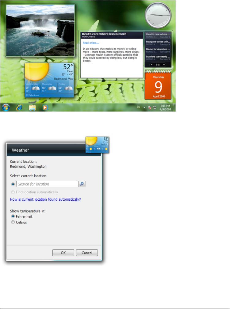
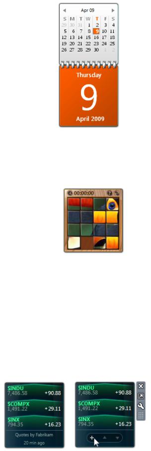
In this example, the Weather Gadget (lower left) shows weather information, and the RSS Gadget (center right) is shown with a blog headline flyout.
An example of an options dialog box.
Developers: You can learn how to create gadgets with the Gadget Development Overview.
Note: Guidelines related to the layout are presented in a separate article.
© 2010, Microsoft Corporation. All rights reserved. |
Page 795 of 882 |
Is this the right user interface?
To decide, consider these questions:
●Does the functionality always need to be readily available? Only the most frequently used functionality that users must access quickly should be put in gadgets.
●Is the functionality of great interest to your users? Users will only dedicate part of their screen to display information that they want to see quickly and often.
●Does the information change regularly? If not, users will not dedicate part of their screen for it.
●Is the purpose to launch a program or promote awareness of it? If so, use the Start menu instead. Gadgets are not for program launching, nor for program advertisements.
●Is the purpose to provide notifications? Use a notification instead.
●Is the purpose to show progress? Use a progress dialog instead.
Design concepts
There are several keys to a successful gadget.
A good gadget provides functionality that is useful all the time. If not, users are likely to close the gadget to make the most of their limited desktop space. Gadgets are especially useful for monitoring information, providing functionality that is used throughout the day, and for fun activities like puzzles.
An effective gadget works well in the periphery. Its functionality is easily accessible, but not distracting. Remember that gadgets are shown on the desktop all the time but aren't actively used all the time. You want users to stay focused on their main task. Users will learn where to find your gadget through visual and motor memory, and will be able to access it quickly when needed.
A great gadget does a single, well-defined task very well. Omit extraneous functionality, and make core functionality very easy to access. Use large fonts for the most important information and ensure that the most common activity requires very few clicks. It's better to have multiple gadgets optimized for a single task than one gadget that tries to do everything. By doing so, you give users more control over the functionality they use.
Incorrect:
Correct:
© 2010, Microsoft Corporation. All rights reserved. |
Page 796 of 882 |
In the incorrect example, the all-in-one gadget is trying to do several things, but it does none of them well. The single-task gadgets do their tasks better and also give users more control over the functionality they use.
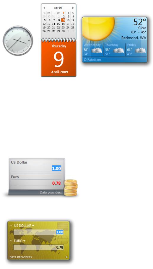
The best gadgets use a visual theme that suitably indicates their singular task. Avoid making the gadget look like a box with a label, an icon, and content. Use meaningful illustrations that convey important information. If your gadget has the functionality of a real appliance, design the gadget to look like or suggest that appliance. For example, make a clock gadget look like a real clock, and a calendar gadget like a real calendar.
When there isn't a direct mapping, try to use visual elements from a real world object that are closely related in a few key ways. For example, a CPU meter can look like a speedometer because they both indicate performance. A currency converter can look like a credit card because they both relate to currency and travel. While these loose analogies are sometimes hard to find, they can make your gadget visually stimulating and uniquely attractive.
Acceptable:
Better:
In the better example, the gadget uses a credit card metaphor to allude to currency and travel, with a world map background that supports this theme. It also uses uppercase text patterned after the text found on credit cards. By contrast, the first example gadget is a simple box with two fields. Although it displays the information, it is not as rich and compelling as the recommended example.
© 2010, Microsoft Corporation. All rights reserved. |
Page 797 of 882 |
If there is no suitable visual theme, you can use color and shape to demonstrate its purpose visually.
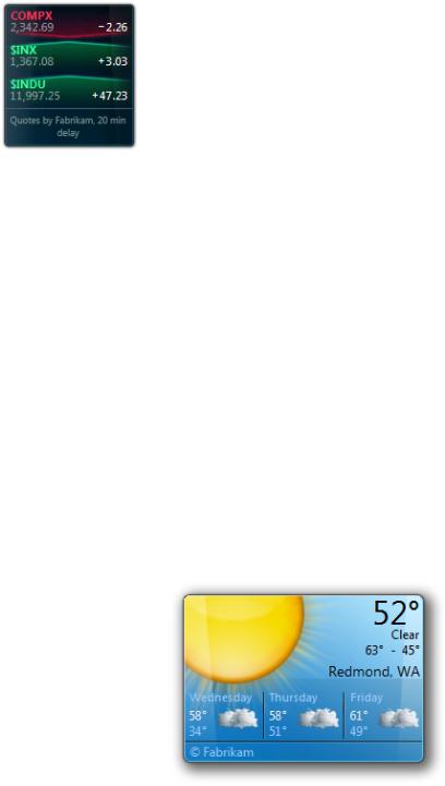
In this example, the gadget uses shapes and colors to indicate the direction in which stocks and market indices are moving.
Lastly, regardless of what visual styles you choose, make your gadget visually attractive. The desktop is prime screen space, and is often seen by users. If you can, work with a professional designer to find an appropriate visual theme and make your gadget look great.
Compared to other Microsoft® Windows® areas, gadgets are especially freeform. There isn't a fixed set of building blocks that can be combined to create a standard looking user interface. This flexibility makes it possible to create uniquely great gadgets, as well as not-so-great ones. Make your gadget unique through its functionality and visualization, but use standard Windows interactions.
If you do only five things...
1.Perform a single, well-defined task very well.
2.Provide functionality that is useful all the time.
3.Make sure the gadget works well in the periphery by being quickly accessible while not being distracting.
4.Use a visually attractive theme that indicates the gadget's singular task.
5.Make your gadget unique through its functionality and visualization, but use standard interactions.
Usage patterns
Gadgets have several usage patterns:
Information gadgets display timely, often aggregated information that changes throughout the day.
This gadget shows up-to-date weather conditions.
Utility gadgets
provide functionality that is useful throughout the day.
© 2010, Microsoft Corporation. All rights reserved. |
Page 798 of 882 |
Users can quickly view a calendar.
Fun gadgets
give users a fun way to pass time.
Fun gadgets are often more distracting than other types of gadgets. As a result, users are likely to change them more frequently.
This picture puzzle gadget is an example of a game to pass time.
It's important to keep these patterns separated. It's easy to imagine a fun utility gadget becoming tiresome after a couple weeks, or simply taking up more screen space than is justified.
Guidelines
Controls
●Have controls appear on hover. In the default state, show only what's necessary. Most controls can be hidden until users hover the pointer over the gadget. This way you can draw attention to the most important parts of the gadget for both states.
In this example, it's more important for users to read the data in the gadget's passive state. The controls at the bottom of the gadget are hidden until users interact with it.
● Use tooltips to display all control labels because there isn't enough space for labels. For more guidelines, see Tooltips.
© 2010, Microsoft Corporation. All rights reserved. |
Page 799 of 882 |
An example of a tooltip with a control label.
●Use controls that behave like common controls, but are themed appropriately for your gadget. Choose colors that match the visuals of your gadget. Due to size constraints, you may need to make controls smaller than the standard common control sizes.
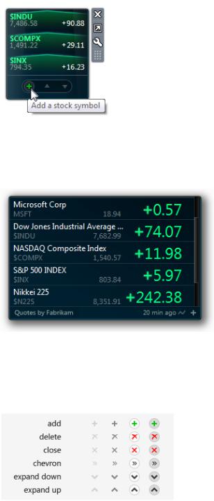
The Stocks Gadget uses a custom scrollbar that is smaller and has a color that matches the gadget.
●Use standard glyphs for commands. If a command isn't represented by a standard glyph, create an appropriate glyph that has
a consistent style. You may need to adjust the color and brightness of the glyphs depending on the gadget surface. All glyphs should have a rest, hover, and down state. They should commit on mouse up so that users can change their mind.
Examples of standard glyphs for common tasks in gadgets.
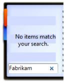
● Avoid using scrollbars by default. Instead, make default content fit comfortably within the gadget. For user customized content:If necessary, use vertical scrollbars.
Consider using pagination if space is at a premium and it's not important for users to have complete control over content position.
© 2010, Microsoft Corporation. All rights reserved. |
Page 800 of 882 |
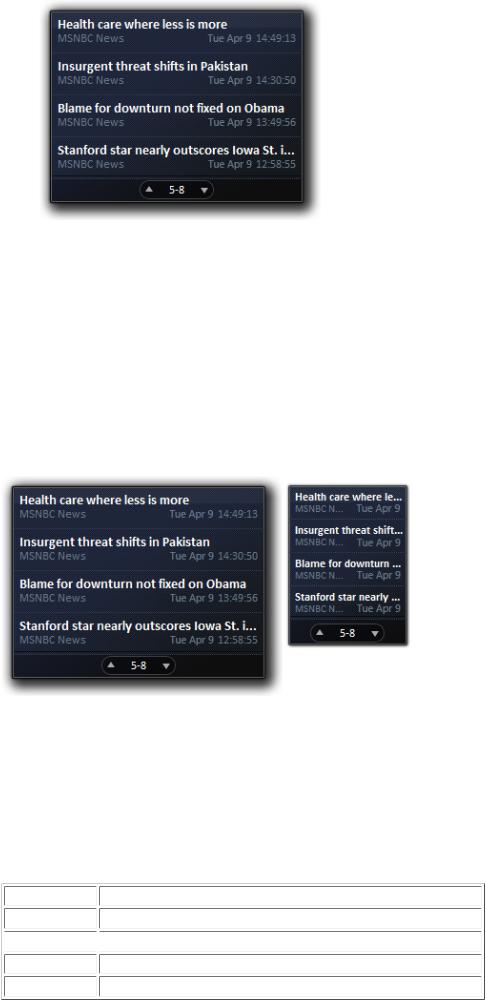
In this gadget, users can page through four headlines at a time.
Consider truncating content if doing so still provides useful information, such as the first few lines of an e-mail message. Show the complete content in a flyout or link to the associated application.
● Use Segoe UI, the Windows system font, for gadget text.
States
●Expose core functionality in the concise/docked state. Design gadgets assuming that they are always run in the concise/docked state. Consider the target audience, key scenarios, space constraints, and simplicity when determining core functionality.
●Use the detailed/floating state to provide extra functionality, but don't do so gratuitously. Link to your application or Web site for complex tasks that require full attention or are more time intensive, instead of trying to embed them in your gadget. If there is no need to add extra functionality, make the concise/docked and detailed/floating states the same.
In this example, the detailed/floating and concise/docked have the same functionality, but the detailed/floating gadget shows more content.
●Use the same drop shadow for both states to ensure that they align properly when placed along the screen edge.
●Use flyouts to display secondary information and functionality transiently. If the information and functionality always needs to
be available, put it directly on the gadget—don't put it in a flyout. Also, don't use flyouts for options; use an options dialog box instead.
The following table compares the appropriate functionality for concise/docked gadgets, detailed/floating gadgets, flyouts, and full applications:
State |
Appropriate functionality |
Concise/docked |
Core functionality that is always useful. |
 Detailed/floating
  Additional functionality that is always useful.
Flyout |
Secondary functionality that is sometimes useful. |
Full application |
Complex functionality that requires full attention or is more time intensive. |
© 2010, Microsoft Corporation. All rights reserved. |
Page 801 of 882 |
●Use similar appearance and interaction for the concise/docked and detailed/floating states. Users may be confused if the concise/docked and detailed/floating gadgets look and behave very differently. While the space constraints for the concise/docked state may require a more compact layout, try to keep the interactive components in roughly the same place. In both states, the same actions should have the same results.
●On installation, consider having the gadget perform an action that demonstrates its purpose. Doing so will make the gadget feel alive and self-explanatory. For example, a calendar gadget could turn the pages to today's date.
●Avoid initial gadget configuration. Choose the most likely or convenient default options. Requiring an initial configuration will make a gadget feel too heavy.
●Provide feedback for the loading and offline states. Let users know that your gadget is offline or loading.
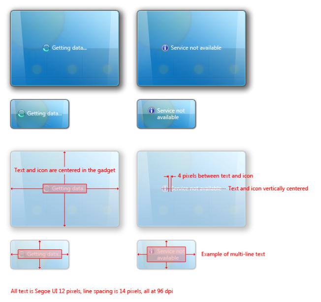
For the loading state, use an activity indicator with text that explains what is loading, such as "Getting data...".
For the offline state, use a 16x16 pixel information icon with "Service not available" or other appropriate text. If necessary, make the
gadget recognizable by showing faded placeholder content or cached data. Gadgets should activate automatically when a connection becomes available.
While gadgets may reflect loss of connectivity, they don't have to draw attention to it because users are likely to discover connectivity loss through traditional means, such as the network notification area icon or their Web browser.
These examples show offline and loading states.
●Maintain state across sessions. Users expect to find the gadget in the state they left it after last using their computer. For example, a partially solved puzzle should stay partially solved.
© 2010, Microsoft Corporation. All rights reserved. |
Page 802 of 882 |
Interaction
●Use the standard Windows pointer behavior. For example, use the hand pointer only for links.
●Don't automatically change a gadget's size. Automatic size changes confuse and annoy users, because changing one gadget's size causes the other gadgets either to move (with the Windows Vista Sidebar), or potentially to overlap or go off-screen (with Windows 7). Never change size on hover. When necessary, you can change size on click.
●To the best extent possible, design your gadget to eliminate the need for error handling and other types of messages. These messages are contrary to the lightweight feel of gadgets.
●If you must give an error, warning, or informational message, show the message in-place or as a different gadget state. Don't use dialog boxes for these messages. Show the message along with the appropriate 16x16 pixel standard icon for error and warning messages. Use no icon at all for minor user input problems.
In this example, the in-place user input problem needs no icon.
For more guidelines on error, warning, and information message icons, see Standard Icons.
● Don't provide Help for your gadget. Make sure the design is self-explanatory instead.
Animation and sound
●Use animation judiciously. Avoid gratuitous and distracting animation. The human eye is sensitive to motion, especially peripheral motion. When updating information, it is better to do it inconspicuously and wait for users to notice it at will. If you
use animation to draw attention to something, make sure that attention is well deserved and worthy of interrupting the user's train of thought. A transition, such as a cross fade, may make the update feel smoother, but it may also attract undue attention. Find the right balance between smoothness and impact by testing the gadget and tweaking variables such as animation speed and surface area. Animation that is triggered by a specific user action is encouraged. When used properly, it can make the gadget feel smooth and polished.
●Use sound judiciously. Don't distract users with sounds. Use sound sparingly and only on user interaction. For more guidelines, see Sound.
Options dialog boxes
●Use an options dialog box only if needed. Some gadgets don't need options. Useful options include personalization and feature customization, such as adding and removing content. Consider letting users adjust settings directly on the gadget if the
options dialog box would duplicate much of the gadget. For example, users may expect to reorder items directly in a list by using drag-and-drop. Providing this functionality in the options dialog box might duplicate much of the gadget while making it harder for users to visualize the end result.
●Don't provide options in flyouts.
●Provide access to the options dialog box through the Options button on the gadget.
© 2010, Microsoft Corporation. All rights reserved. |
Page 803 of 882 |
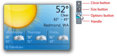
The options dialog box is accessed through the Options button in the upper-right corner of the gadget.
●Make the options dialog box look like property windows, but without tabs. Keep the options limited to a single page without a scroll bar. Follow the general layout guidelines for control placement in the dialog box.
Windows integration
● For Windows 7 programs that install gadgets:
Provide an option during program setup to install the gadget.Present the option unselected by default.
If users select the option, install only a single gadget.
If the gadget is useful only after the program has been run by the user, install the gadget after first run instead of at setup. For example, a gadget that shows the most recent mail isn't relevant until users set up their mail account.
● Consider extending your gadget to Windows SideShow.
Recommended sizing and spacing
●Gadgets in the concise/docked state are 130 pixels wide. Include 5 pixels of drop shadow, 2 pixels on the left side and 3 on the right.
●Gadgets in the concise/docked state should have a minimum height of 84 pixels and have a recommended maximum height of 200 pixels. A gadget that uses space efficiently is more likely to be used.
●Gadgets in the detailed/floating state should be no larger than 400x400 pixels.
© 2010, Microsoft Corporation. All rights reserved. |
Page 804 of 882 |
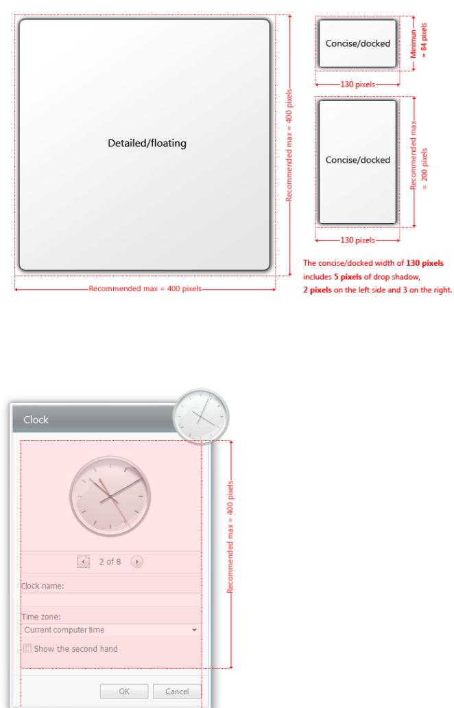
Recommended sizing for gadgets in the detailed/floating and concise/docked states.
●Options dialog boxes have a client area of 278 pixels wide and are no more than 400 pixels high. The height should be adjusted to accommodate its controls without exceeding 400 pixels.
●Options dialog box text is Segoe UI 12 pixels, with a line spacing of 14 pixels at 96 dpi.
© 2010, Microsoft Corporation. All rights reserved. |
Page 805 of 882 |
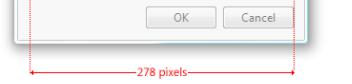
Recommended sizing for an options dialog box.
Documentation
When referring to Windows Desktop Gadgets:
●Refer to the gadgets feature as Windows Desktop Gadgets.
●Refer to specific gadgets by name, followed by Gadget, where Gadget is capitalized. Examples: Weather Gadget, CPU Meter Gadget.
●Don't capitalize gadget when referring to it generically. Example: Dock the gadget by default.
●Use Sidebar only with respect to gadgets running on Windows Vista. Always capitalize references to the Sidebar.
●Always capitalize references to the Gadget Gallery.
© 2010, Microsoft Corporation. All rights reserved. |
Page 806 of 882 |