

- •Windows User Experience Interaction Guidelines
- •Guidelines
- •Design Principles
- •Windows User Experience Design Principles
- •How to Design a Great User Experience
- •Powerful and Simple
- •Designing with Windows Presentation Foundation
- •Controls
- •Balloons
- •Check Boxes
- •Command Buttons
- •Command Buttons vs. Links
- •Command Links
- •Drop-Down Lists and Combo Boxes
- •Group Boxes
- •Links
- •List Boxes
- •List Views
- •Progress Bars
- •Progressive Disclosure Controls
- •Radio Buttons
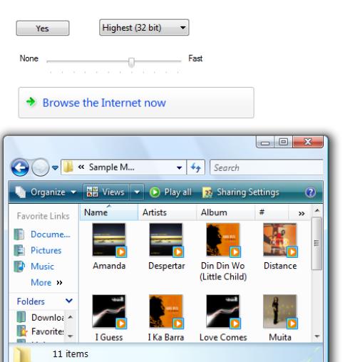
- •Search Boxes
- •Sliders
- •Spin Controls
- •Status Bars
- •Tabs
- •Text Boxes
- •Tooltips and Infotips
- •Tree Views
- •Commands
- •Menus
- •Menu Design Concepts
- •Toolbars
- •Ribbons
- •Program command patterns
- •Text
- •User Interface Text
- •Style and Tone
- •Messages
- •Error Messages
- •Warning Messages
- •Confirmations
- •Notifications
- •Interaction
- •Keyboard
- •Windows Keyboard Shortcut Keys
- •Mouse and Pointers
- •Touch
- •Accessibility
- •Windows
- •Window Management
- •Window Frames
- •Dialog Boxes
- •Dialog Box Design Concepts
- •Common Dialogs
- •Wizards
- •Property Windows
- •Property Window Design Concepts
- •Property Window Usage Patterns
- •Visuals
- •Layout
- •Layout Metrics
- •Fonts
- •Color
- •Icons
- •Standard Icons
- •Animations and Transitions
- •Graphic Elements
- •Sound
- •Experiences
- •Software Branding
- •Setup
- •First Experience
- •Printing
- •Windows Environment
- •Desktop
- •Start Menu
- •Taskbar
- •Notification Area
- •Windows Desktop Gadgets
- •Control Panels
- •Help
- •User Account Control
- •Visual Index
- •Glossary
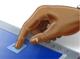
Touch
All Microsoft® Windows® applications should have a great touch experience. And doing so is easier than you think.
Design concepts
Guidelines
Control usage
Control sizing
Control layout and spacing
Interaction
Windows Touch gestures
Forgiveness
Documentation
Touch refers to the way Windows lets you interact directly with a computer using a finger. Compared to using a mouse, keyboard, or pen, touch is often much more natural, engaging, and convenient.
Using touch.
Many touch interactions are performed using gestures and flicks. A gesture is a quick movement of one or more fingers on a screen that the computer interprets as a command, rather than as a mouse movement, writing, or drawing. Windows 7 has new multitouch gestures such as pan, zoom, rotate, two-finger tap, and press and tap. One of the quickest and easiest gestures to perform is a flick. A flick is a simple gesture that results in navigation or an editing command. Navigational flicks include drag up, drag down, move back, and move forward, whereas editing flicks include copy, paste, undo, and delete.
A manipulation is a real-time, physical handling of an object. A manipulation differs from a gesture in that the input corresponds directly to how the object would react naturally to the action in the real world. For example, a photo viewing application might allow users to manipulate a photo by moving, zooming, resizing, and rotating the image. Multitouch manipulations use multiple contact points simultaneously.
For tasks that require fine movement or hover, Windows Vista® provides the touch pointer, which is a floating, onscreen pointer that looks like a mouse. Because the touch pointer isn't as easy to use as direct input, touchable programs avoid relying on the touch pointer. The touch pointer is disabled by default in Windows 7.
A program is considered touchable when it has only the touch support provided by Windows and the controls for the most important tasks are easy to touch. (Tasks that require using a fingernail aren't considered touch friendly
—touchable controls need to be large enough for easy targeting with a fingertip.) In practice, this means:
●The program's interactive controls are large enough to be easily touchable—at least 23x23 pixels (13x13 dialog units, or DLUs).
●The program has good keyboard and mouse support, so that relevant system gestures such as flicks, multitouch gestures, and drag-and-drop are functional.
●No tasks require using hover or the touch pointer.
●All controls use Microsoft Active Accessibility (MSAA) to provide programmatic access to the UI for assistive technologies.
© 2010, Microsoft Corporation. All rights reserved. |
Page 434 of 882 |

A program is considered touch-enabled when it has been designed for touch for its primary tasks, which usually means:
●The most frequently used controls are at least 40x40 pixels (23x22 DLUs).
●Relevant gestures are supported (including panning, zoom, rotate, two-finger tap, press and tap), and the effect occurs at the point of contact.
●The program provides smooth, responsive visual feedback while panning, zooming, and rotating so that it feels highly interactive.
A program is considered touch-optimized when it has been specifically designed for touch, which usually means:
●Tasks are designed for easy touch by placing the most frequently performed commands directly on the UI or content instead of in drop-down menus.
●The program's special experiences are designed to have an immersive touch experience (possibly using raw touch input data), with multitouch manipulations and details like having feedback with real-world physical properties, such as momentum and friction.
●Tasks are forgiving, allowing users to correct mistakes easily and handle inaccuracy with touching and dragging.
●Tasks are designed to avoid or reduce the need for heavy text input or precise selection.
Note: Guidelines related to mouse, pen, and accessibility are presented in separate articles.
Design concepts
Using touch for input has the following characteristics:
●Natural and intuitive. Everyone knows how to point with a finger and touch things. Object interactions are designed to correspond to how users interact with objects in the real world in a consistent manner.
●Less intrusive. Using touch is silent, and consequently much less distracting than typing or clicking, especially in social situations such as meetings. Compared to using a pen, using a finger is particularly convenient because you don't have to locate or pick up a pen.
●Portable. A computer with touch capability can be more compact because most tasks can be completed without a keyboard, mouse, or touchpad. It can be more flexible because it doesn't require a work surface. It enables new places and scenarios for using a computer.
●Direct and engaging. Touch makes you feel like you are directly interacting with the objects on the screen, whereas using a mouse or touchpad always requires you to coordinate hand movements with separate on-screen pointer movements—which feels indirect by comparison.
●Reduced accuracy. Users can't target objects as accurately using touch, compared to a mouse or pen. Consequently, you can't expect users to tap or manipulate small objects.
Touch provides a natural, real-world feel to interaction. Direct manipulation and animation complete this impression, by giving objects a realistic, dynamic motion and feedback. For example, consider a card game. Not only is it convenient and easy to drag cards using a finger, the experience takes on an engaging real-world feel when you can toss the cards and have them glide, spin, and bounce exactly like physical cards. And when you try to move a card that can't be moved, it's a better experience to have the card resist but not prevent movement, and settle back in place when released, to clearly indicate that the action was recognized but can't be done.
All Windows programs should be touchable
While touch is traditionally associated with Tablet PCs, it is becoming common on ordinary computers. The Windows Tablet and Touch Technology is a standard component of Windows Vista and Windows 7, so any compatible computer has the ability to take advantage of touch if it has the appropriate hardware. As a result, computer manufacturers are now including touchscreens in ordinary laptops and even in desktop monitors.
As touch spreads from Tablet PCs to other types of computers, software program developers and designers will find it increasingly important to support touch as well. All Windows programs should have a great touch
© 2010, Microsoft Corporation. All rights reserved. |
Page 435 of 882 |
experience. Users should be able to perform your program's most important tasks efficiently using their fingers. Some tasks, like typing or detailed pixel manipulation, may not be appropriate for touch, but those that are should be touchable.
Fortunately, if your program is already well designed, providing a great touch experience is easy to do. For this purpose, a well-designed program:
●Has good mouse support. The interactive controls have clear, visible affordances. Objects have standard behaviors for the standard mouse interactions (single and double left-click, right-click, drag, and hover).
●Has good keyboard support. The program makes users efficient by providing standard shortcut key assignments, especially for navigation and editing commands that can also be generated through touch gestures.
●Has controls large enough for touch. The controls have a minimum size of 23x23 pixels (13x13 DLUs), and the most commonly used controls are at least 40x40 pixels (23x22 DLUs). To avoid unresponsive behavior, there should be no small gaps between targets—the UI elements should be spaced so that adjacent targets are either touching or have at least 5 pixels (3 DLUs) of space between them.
●Provides smooth, responsive panning and zooming wherever appropriate. The program redraws quickly enough to pan and zoom events that it feels interactive during the gesture.
●Is accessible. Uses Microsoft Active Accessibility (MSAA) to provide programmatic access to the UI for assistive technologies. The program appropriately responds to theme and system metric changes.
●Works well and looks good in 120 dpi (dots per inch), which is the recommended default display resolution for computers enabled for Windows Touch.
●Uses common controls. Most common controls are designed to support a good touch experience. If necessary, the program uses well-implemented custom controls that are designed to support easy targeting and interactive manipulation.
●Uses constrained controls. Constrained controls like lists and sliders, when designed for easy touch targeting, can be better than unconstrained controls like text boxes because they reduce the need for text input.
●Provides appropriate default values. The program selects the safest (to prevent loss of data or system access) and most secure option by default. If safety and security aren't factors, the program selects the most likely or convenient option, thereby eliminating unnecessary interaction.
●Provides text auto completion. Provides a list of most likely or recently input values to make text input much easier.
Unfortunately, the converse is also true—if your program isn't well designed, its shortcomings are going to be especially obvious to users who use touch.
Just as accessible software benefits all users, providing a great touch experience benefits all users because everyone benefits when basic interactions are easy to perform, efficient, responsive, and forgiving.
Model for touch interaction
If you aren't experienced with using touch, the best introduction is to learn by doing. Get a touch-enabled computer, put the mouse and keyboard aside, and do the tasks that you normally do using just your fingers. If you have a Tablet PC, experiment with holding it in different positions, such as on your lap, lying flat on a table, or in your arms while you're standing. Try using it in portrait and landscape orientation.
As you experiment with touch, you'll discover that:
●Small controls are difficult to use. The size of the controls greatly affects your ability to interact effectively. Controls that are at least 23x23 pixels (13x13 DLUs) are usable with a finger, but larger controls of at least 40x40 pixels (23x22 DLUs) are even more comfortable to use. For example, the Start menu (42x35 pixels) is easy to touch whereas spin controls (15x11 pixels) are much too small to use with a finger.
●Task locality helps. While you can move the pointer across a 14-inch screen with a 3-inch mouse movement, using touch requires you to move your hand the full 14 inches. Repeatedly moving between targets that are far apart can be tedious, so it's much better to keep task interactions within the range of a resting hand whenever possible. Context menus are convenient because they require no hand movement.
●Hover must not be required. Most touchscreen technologies don't detect a hovering finger, even if they can detect a hovering pen. If a program has tasks that depend on hover, you won't be able to perform them efficiently using touch.
●Text input and selection are difficult. Lengthy text input is especially difficult using touch, so auto-completion and acceptable
© 2010, Microsoft Corporation. All rights reserved. |
Page 436 of 882 |
default text values can really simplify tasks. Text selection can also be quite difficult, so tasks are easier when they don't require precise cursor placement.
●Small targets near the edge of the display can be very difficult to touch. Some display bezels protrude, and some touchscreen technologies are less sensitive at the edges, making controls near the edge harder to use. For example, the Minimize, Maximize/ Restore, and Close buttons on the title bar can be harder to use when a window is maximized.
While there are several challenges here, addressing them improves the experience for all users.
Basic touch design principles
Each input device has its strengths and weaknesses. The keyboard is best for text input and giving commands with minimal hand movement. The mouse is best for efficient, precise pointing. Touch is best for object manipulation and giving simple commands. A pen is best for freeform expression, as with handwriting and drawing.
When thinking about touch support for your program:
●Don't assume that if a UI works well for a mouse, it also works well for touch. While good mouse support is a start, a good touch experience has a few additional requirements.
●You can assume that if a UI works well for a finger, it also works well for a pen. Making your program touchable goes a long way to providing good pen support. The primary difference is that fingers have a blunter tip, so they need larger targets. And again, hover must be optional. For guidelines about supporting pen input, see Pen.
●Don't depend on touch pointer to fix touch UI problems. Because the touch pointer isn't as easy to use as direct input, view the touch pointer as a last resort for programs that haven't been designed for touch.
Control sizes
Fitts' Law states that the time required to interact with a target depends upon the size of the target and the distance to it. The smaller a target is, and the further away it is, the harder it is to use. But due to the large surface area of the fingertip, small controls that are too close together can also be difficult to target precisely.
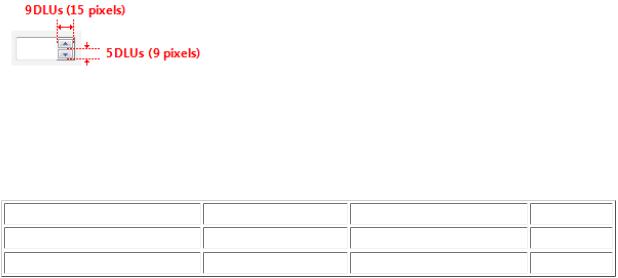
As a general rule, a control size of 23x23 pixels (13x13 DLUs) is a good minimum interactive control size for any input device. By contrast, the spin controls at 15x11 pixels are much too small to be used effectively with touch.
The spin control is too small for touch.
Note that the minimum size is really based on physical area, not layout metrics such as pixels or DLUs. Research
indicates that the minimum target area for efficient, accurate interaction using a finger is 6x6 millimeters (mm). This area translates to layout metrics as follows:
Font |
Millimeters |
Relative pixels |
DLUs |
9 point Segoe UI |
6x6 |
23x23 |
13x13 |
8 point Tahoma |
6x6 |
23x23 |
15x14 |
Furthermore, research shows that a minimum size of 10x10 mm (about 40x40 pixels) enables better speed and accuracy, and also feels more comfortable to users. When practical, use this larger size for command buttons used for the most important or frequently used commands.
© 2010, Microsoft Corporation. All rights reserved. |
Page 437 of 882 |

In this example, Microsoft Word uses buttons larger than 10x10 mm for the most important commands.
This version of Calculator uses buttons larger than 10x10 mm for its most frequently used commands.
The goal isn't to have giant controls—just easily touchable controls. You can make controls easily touchable without appearing excessively large by using the techniques listed in the guidelines section later in this article.
Note: When sizing controls, target 96 dpi. Users' ability to touch improves with higher resolutions.
Control spacing
The spacing between controls is also a factor in making controls easily touchable. Targeting is quicker but less precise when using a finger as the pointing device, resulting in users more often tapping outside their intended target. When interactive controls are placed very close together but are not actually touching, users may click on inactive space between the controls. Because clicking inactive space has no result or visual feedback, users are often uncertain what went wrong. If small controls are too closely spaced, the user needs to tap with precision to avoid tapping the wrong object. To address these issues, the target regions of interactive controls should either be touching or preferably have at least 5 pixels (3 DLUs) of space between them.
You can make controls within groups easier to differentiate by using more than the recommended vertical spacing between controls. For example, radio buttons at 19 pixels high are shorter than the minimum recommended size of 23 pixels. When you have vertical space available, you can achieve roughly the same effect as the recommended sizing by adding an additional 4 pixels of spacing to the standard 7 pixels.
© 2010, Microsoft Corporation. All rights reserved. |
Page 438 of 882 |
Correct:
Better:
In the better example, the extra spacing between the radio buttons makes them easier to differentiate.
There may be situations in which extra spacing would be desirable when using touch, but not when using the mouse or keyboard. In such cases, you should only use a more spacious design when an action is initiated using touch.
Control location
Task locality reduces tedious repeating cross-screen movements. To minimize hand movements, locate controls close to where they are most likely going to be used.
Incorrect:
© 2010, Microsoft Corporation. All rights reserved. |
Page 439 of 882 |

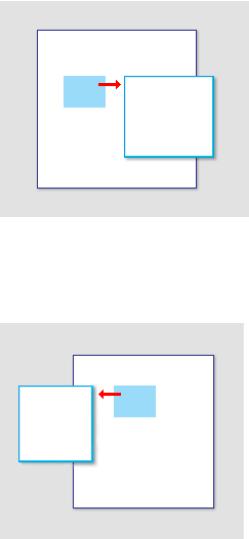
In this example from Windows XP, the color palette is too far from where it is likely to be used.
Consider that the user's current location is the closest a target can be, making it trivial to acquire. Thus, context menus take full advantage of Fitts' law, as do the mini-toolbars used by Microsoft Office.
The current pointer location is always the easiest to acquire.
Small targets near the display edge can be difficult to touch, so avoid placing small controls near window edges. To ensure that controls are easy to target when a window is maximized, either make them at least 23x23 pixels (13x13 DLUs) or place them away from the window edge.
Touch interactions
System gestures
System gestures are defined and handled by Windows. As a result, all Windows programs have access to them. These gestures have equivalent mouse, keyboard, and application command messages:
System gesture |
Synthesized equivalent message |
Hover (when supported) |
Mouse hover |
Tap (down and up) |
Mouse left-click |
Double tap (down and up twice) |
Mouse double left-click |
Press and hold (down, pause, up) |
Mouse right-click |
© 2010, Microsoft Corporation. All rights reserved. |
Page 440 of 882 |
Drag (down, move, up) |
Mouse left-drag |
Press, hold, and drag (down, pause, move, up) |
Mouse right-drag |
Select (down, move over selectable objects, up) |
Mouse select |
Developers: For more information, see SystemGesture Enumeration.
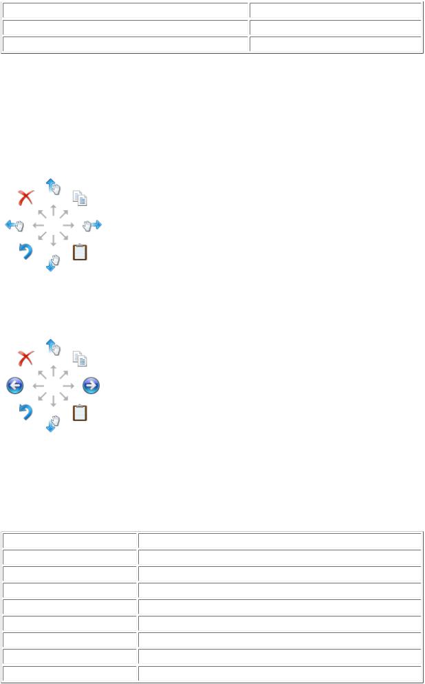
Flicks
Flicks are simple gestures that are roughly the equivalent of keyboard shortcuts. Navigational flicks include drag up, drag down, move back, and move forward. Editing flicks include copy, paste, undo, and delete. To use flicks, your program only needs to respond to the related keystrokes commands—or your program can handle the events directly.
The eight flick gestures and their default assignments in Windows 7. The navigation flicks were changed to correspond to panning (where the object moves with the gesture) instead of scrolling (where the object moves in the opposite direction of the gesture).
The eight flick gestures and their default assignments in Windows Vista.
The navigational flicks have natural mapping, so they are easy to learn and remember. The editing flicks are diagonals that require more precision and their mappings are not as natural (flick towards the Recycle Bin to delete, flick in the Back arrow direction to undo), so these aren't enabled by default. All flick actions can be customized using the Pen and Input Devices control panel item.
Flick |
Synthesized equivalent message |
Flick left |
Forward command (Back command for Windows Vista) |
Flick right |
Back command (Forward command for Windows Vista) |
Flick up |
Keyboard Scroll Down |
Flick down |
Keyboard Scroll Up |
Flick up-left diagonal |
Keyboard Delete |
Flick down-left diagonal |
Keyboard Undo |
Flick up-right diagonal |
Keyboard Copy |
Flick down-right diagonal |
Keyboard Paste |
© 2010, Microsoft Corporation. All rights reserved. |
Page 441 of 882 |

Application gestures
Applications can define and handle other gestures as well. The Microsoft Gesture Recognizer can recognize over 40 gestures. To use application gestures, your program must define the gestures it recognizes, and then handle
the resulting events.
Hover
Hover is a useful interaction because it allows users to get additional information through tips before initiating an action. Doing so makes users feel more confident and reduces errors.
Unfortunately, hover isn't supported by touch technologies, so users will not be able to hover when using a finger. The simple solution to this problem is to take full advantage of hover, but only in ways that are not required to perform an action. In practice, this usually means that the action can also be performed by clicking, but not necessarily in exactly the same way.
In this example, users can see today's date by either hovering or clicking.
Responsiveness and consistency
Responsiveness is essential for creating touch experiences that feel direct and engaging. To feel direct, gestures must take effect immediately, and an object's contact points must stay under the user's fingers smoothly throughout the gesture. The effect of a manipulation should map directly to the user's motion, so, for example, if the user rotates his fingers 90 degrees, the object should rotate 90 degrees as well. Any lag, choppy response, loss of contact, or inaccurate results destroys the perception of direct manipulation and also of quality.
Consistency is essential for creating touch experiences that feel natural and intuitive. Once users learn a standard gesture, they expect that gesture to have the same effect across all applicable programs. To avoid confusion and frustration, never assign non-standard meanings to standard gestures. Instead, use custom gestures for interactions unique to your program.
Forgiveness
What makes touch so natural, expressive, efficient, and engaging is its directness. In fact, interacting through touch is often referred to as direct manipulation. However, where there is direct manipulation, there can be accidental manipulation—and therefore the need for forgiveness.
Forgiveness is the ability to reverse or correct an undesired action easily. You make a touch experience forgiving
© 2010, Microsoft Corporation. All rights reserved. |
Page 442 of 882 |

by providing undo, giving good visual feedback, having a clear physical separation between frequently used commands and destructive commands, and allowing users to correct mistakes easily. Associated with forgiveness
is preventing undesired actions from happening in the first place, which you can do by using constrained controls and confirmations for risky actions or commands that have unintended consequences.
Editing text
Editing text is one of the most challenging interactions when using a finger. Using constrained controls, appropriate default values, and auto-completion eliminates or reduces the need to input text. But if your program involves editing text, you can make users more productive by automatically zooming input UI up to
150 percent by default when touch is used.
For example, an e-mail program could display UI at normal touchable size, but zoom the input UI to 150 percent to compose messages.
In this example, the input UI is zoomed to 150 percent.
If you do only six things...
1.Make your Windows programs have a great touch experience! Users should be able to perform your program's most important tasks efficiently using a finger (at least the tasks that don't involve a lot of typing or detailed pixel manipulation).
2.For common controls, use the standard control sizing. For other controls, make sure they have at least a
23x23 pixel (13x13 DLU) click target, even if their static appearance is much smaller.
3.Make use of hover, but don't make it the only way to perform an action. Hover isn't supported by most touchscreen technologies.
4.To create a direct and engaging experience, have gestures take effect immediately, keep contact points under the user's fingers smoothly throughout the gesture, and have the effect of the gesture map directly to the user's motion.
5.To create a natural and intuitive experience, support appropriate standard gestures and assign them their standard meanings. Use custom gestures for interactions unique to your program.
6.Make sure your program provides the ability to reverse or correct any undesired actions—especially for destructive commands. Accidental actions are more likely when using touch.
Guidelines
© 2010, Microsoft Corporation. All rights reserved. |
Page 443 of 882 |
Control usage
●Prefer using common controls. Most common controls are designed to support a good touch experience.
●Choose custom controls that are designed to support touch. You might need to have custom controls to support your program's special experiences. Choose custom controls that:
Can be sized large enough to be easily touchable.
When manipulated, move and react the way real-world objects move and react, such as by having momentum and friction.
Are forgiving by allowing users to easily correct mistakes.
Are forgiving of inaccuracy with clicking and dragging. Objects that are dropped near their destination should fall into the correct place.
Have feedback that is clearly visible even when the finger is over the control, such a ripple effect.
●Prefer constrained controls. Use constrained controls like lists and sliders whenever possible, instead of unconstrained controls like text boxes, to reduce the need for text input.
●Provide appropriate default values. Select the safest (to prevent loss of data or system access) and most secure option by default. If safety and security aren't factors, select the most likely or convenient option, thereby eliminating unnecessary interaction.
●Provide text auto-completion. Provide a list of most likely or recently input values to make text input much easier.
●For important tasks that use multiple selection, if a standard multiple-selection list is normally used, provide an option to use a check box list instead.
Control sizing
●For common controls, use the recommended control sizes. The recommended control sizing satisfies the 23x23 pixel (13x13
DLU) minimum size, except for check boxes and radio buttons (their text width compensates somewhat), spin controls (which aren't usable with touch but are redundant), and splitters.
© 2010, Microsoft Corporation. All rights reserved. |
Page 444 of 882 |
The recommended control sizes are easily touchable.
●For command buttons used for the most important or frequently used commands, use a minimum size of 40x40 pixels (23x22 DLUs) whenever practical. Doing so yields better speed and accuracy, and also feels more comfortable to users.
Whenever practical, use larger command buttons for important or frequently used commands.
● For other controls:
Use larger click targets. For small controls, make the target size larger than the statically visible UI element. For example, 16x16 pixel icon buttons can have a 23x23 pixel click target buttons, and text elements can have selection rectangles 8 pixels wider than the text and 23 pixels high.
Correct:
Incorrect:
Correct:
In the correct examples, the click targets are larger than the statically visible UI elements.
Use redundant click targets. It's acceptable for click targets to be smaller than the minimum size if that control has redundant functionality.
For example, the progressive disclosure triangles used by the tree view control are only 6x9 pixels, but their functionality is redundant with their associated item labels.
© 2010, Microsoft Corporation. All rights reserved. |
Page 445 of 882 |

The tree view triangles are too small to be easily touchable, but they are redundant in functionality with their larger associated labels.
●Respect system metrics. Use system metrics for all sizes—don't hardwire sizes. If necessary, users can change the system metrics or dpi to accommodate their needs. However, treat this as a last resort because users shouldn't normally have to adjust system settings to make UI usable.
In this example, the system metric for menu height was changed.
Control layout and spacing
●Choose a layout that places controls close to where they are most likely going to be used. Keep task interactions within a small area whenever possible. Avoid long distance hand movements, especially for common tasks and for drags.
●Use the recommended spacing. The recommended spacing is touch-friendly. However, if your program can benefit from larger sizing and spacing, consider the recommended sizing and spacing to be minimums when appropriate.
●Interactive controls should either be touching or preferably have at least 5 pixels (3 DLUs) of space between them. Doing so prevents confusion when users tap outside their intended target.
●Consider adding more than the recommended vertical spacing within groups of controls, such as command links, check boxes, and radio buttons, as well as between the groups. Doing so makes them easier to differentiate.
●Consider adding more than the recommended vertical spacing dynamically when an action is initiated using touch. Doing so makes objects easier to differentiate, but without taking more space when using a keyboard or mouse. Increase the spacing by a third of its normal size or at least 8 pixels.
© 2010, Microsoft Corporation. All rights reserved. |
Page 446 of 882 |
In this example, Windows 7 taskbar Jump Lists are more spacious when displayed using touch.
Interaction
●Make hover redundant. Take full advantage of hover, but only in ways that are not required to perform an action. This usually means that the action can also be performed by clicking, but not necessarily in exactly the same way. Hover isn't supported by most touch technologies, so users with such touchscreens can't perform any tasks that require hovering.
●For programs that need text input, fully integrate the touch keyboard feature by:
Providing appropriate default values for user input.
Providing auto-complete suggestions when appropriate.
Developers: For more information about integrating the touch keyboard, see ITextInputPanelInterface.
●Allow users to zoom the content UI if your program has tasks that require editing text. Consider automatically zooming to 150 percent when touch is used.
●Provide smooth, responsive panning and zooming wherever appropriate. Redraw quickly after a pan or zoom to remain responsive. Doing so is necessary to make direct manipulation feel truly direct.
●During a pan or zoom, make sure that the contact points stay under the finger throughout the gesture. Otherwise, the pan or zoom is difficult to control.
●Because gestures are memorized, assign them meanings that are consistent across programs. Don't give different meanings to gestures with fixed semantics. Use an appropriate program-specific gesture instead.
Windows Touch gestures
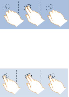
Use the following gestures whenever applicable to your program. These gestures are the most useful and natural.
●Panning
Entry state: One or two fingers in contact with the screen.
Motion: Drag, with any additional fingers remaining in same position relative to each other. Exit state: Last finger up ends the gesture.
Effect: Move the underlying object directly and immediately as the fingers move. Be sure to keep the contact point under the finger throughout the gesture.
© 2010, Microsoft Corporation. All rights reserved. |
Page 447 of 882 |
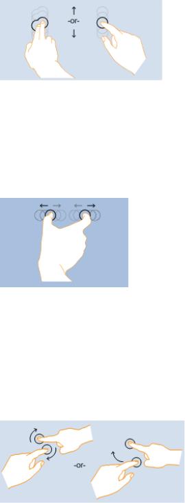
The pan gesture.
●Zoom
Entry state: Two fingers in contact with the screen at the same time. Motion: Fingers move apart or together (pinch) along an axis.
Exit state: Any finger up ends the gesture or the fingers break the axis.
Effect: Zoom the underlying object in or out directly and immediately as the fingers separate or approach on the axis. Be sure to keep the contact points under the finger throughout the gesture.
The zoom gesture.
If animated carefully, allowing users to zoom while panning can be a powerful, efficient interaction.
●Rotate
Entry state: Two fingers in contact with the screen at the same time.
Motion: One or both fingers rotate around the other, moving perpendicular to the line between them. Exit state: Any finger up ends the gesture.
Effect: Rotate the underlying object the same amount as the fingers have rotated. Be sure to keep the contact points under the finger throughout the gesture.
The rotation gesture.
Rotation makes sense only for certain types of objects, so it's not mapped to a system Windows interaction.
Rotation is often done differently by different people. Some people prefer to rotate one finger around a pivot finger, while others prefer to rotate both fingers in a circular motion. Most people use a combination of the two, with one finger moving more than the other. While smooth rotation to any angle is the best interaction, in many contexts, such as photo viewing, it is best to settle to the nearest 90 degree rotation once the user lets go. In photo editing, a small rotation can be used to straighten the photo.
●Two-finger tap
Entry state: Two fingers in contact with the screen at the same time. Motion: No motion.
Exit state: Any finger up ends the gesture.
Effect: Alternatively zooms or restores the default view for the object between the fingers.
© 2010, Microsoft Corporation. All rights reserved. |
Page 448 of 882 |
The two-finger tap gesture.
●Press and tap
Entry state: One finger in contact with the screen, followed by a second finger. Motion: No motion.
Exit state: Second finger up ends the gesture.
Effect: Performs a right click for the object under the first finger.
The press and tap gesture.
Forgiveness
●Provide an Undo command. Ideally, you should provide a simple way to undo all commands, but your program may have some commands whose effect cannot be undone.
●Whenever practical, provide good feedback on finger down, but don't take actions until finger up. Doing so allows users to correct mistakes before they make them.
●Whenever practical, allow users to correct mistakes easily. If an action takes effect on finger up, allow users to correct mistakes by sliding while the finger is still down.
●Whenever practical, indicate that a direct manipulation can't performed by resisting the movement. Allow the movement to happen, but have the object settle back in place when released to clearly indicate that the action was recognized but can't be done.
●Have clear physical separation between frequently used commands and destructive commands. Otherwise, users might touch destructive commands accidentally. A command is considered destructive if its effect is widespread and either it cannot be easily undone or the effect isn't immediately noticeable.
●Confirm commands for risky actions or commands that have unintended consequences. Use a confirmation dialog box for this purpose.
●Consider confirming any other actions that users tend to do accidentally when using touch, and which either go unnoticed or are difficult to undo. Normally, these are called routine confirmations and are discouraged based on the assumption that users
don't often issue such commands by accident with a mouse or keyboard. To prevent unnecessary confirmations, present these confirmations only if the command was initiated using touch.
© 2010, Microsoft Corporation. All rights reserved. |
Page 449 of 882 |
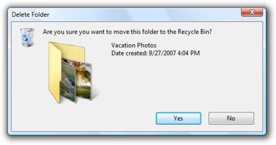
Routine confirmations are acceptable for interactions that users often do accidentally using touch.
Developers: You can distinguish between mouse events and touch events using the GetMessageExtraInfo API.
Documentation
When referring to touch:
●Refer to the user's hand when used as an input device as one or more fingers.
●Refer generically to the keyboard, mouse, trackball, pen, or finger as an input device.
●Use tap (and double-tap) instead of click when documenting procedures specific to using a finger or pen. Tap means to press the screen and then lift before a hold time. It may or may not be used to generate a mouse click. For interactions that don't involve the finger or pen, continue to use click.
●Touchscreen and touchpad are single, compound words. Don't refer to them as touch screen and touch pad.
© 2010, Microsoft Corporation. All rights reserved. |
Page 450 of 882 |
Pen
All Microsoft® Windows® applications should be pen enabled. And doing so is easier than you think.
Design concepts
Guidelines
Control usage
Control sizing, layout, and spacing
Interaction
Handedness
Forgiveness
Documentation
Pen input refers to the way Windows lets you interact directly with a computer using a pen. A pen can be used for pointing and also for gestures, simple text entry, and capturing free-form thoughts in digital ink.
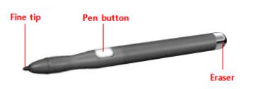
The pen used for input has a fine, smooth tip that supports precise pointing, writing, or drawing in ink. The pen may also have an optional pen button (used to perform right-clicks) and eraser (used to erase ink). Most pens support hover.
A typical pen.
When the pen is used for handwriting, the user's strokes can be converted to text using handwriting recognition. The strokes can be kept just as they were written, with recognition performed in the background to support searching and copying as text. Such unconverted strokes are called digital ink.
© 2010, Microsoft Corporation. All rights reserved. |
Page 451 of 882 |
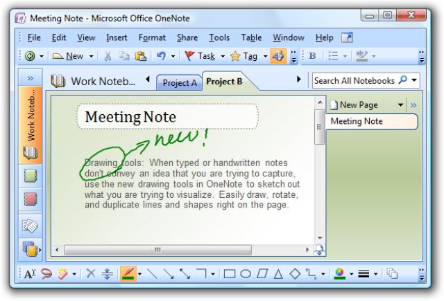
An example of ink input.
Most Windows programs are already pen-friendly in that a pen can be used instead of a mouse, the pen works smoothly for most important tasks and interactions, and the program responds to gestures. A program becomes handwriting-friendly when it assists with handwritten text input. A program becomes ink-enabled when it can handle ink directly, instead of requiring that pen strokes be translated to text or equivalent mouse movements. This allows users to write, draw, and add comments in free-flowing, high-quality digital ink. Collecting ink is different than collecting mouse events, because ink requires higher resolution and a higher sample rate, and it can also add nuance with pressure and tilt. For information about creating handwriting friendly and ink-enabled programs, see Integrating Ink and Text Input Using the Pen.
When positioning a pen, there is less need for a cursor because the tip represents itself. However, for targeting assistance, Windows provides a tiny pen cursor that indicates the current pen location. Unlike the mouse pointer it replaces, the pen cursor is not needed unless the pen is near the display, so it disappears after a few seconds of inactivity to allow an unobstructed view of information.
Most pen-friendly programs support gestures. A gesture is a quick movement of the pen on a screen that the computer interprets as a command, rather than as a mouse movement, writing, or drawing. One of the quickest and easiest gestures to perform is a flick. A flick is a simple gesture that results in navigation or an editing command. Navigational flicks include drag up, drag down, move back, and move forward, whereas editing flicks include copy, paste, undo, and delete.
All pointers except the busy pointer have a single pixel hot spot that defines the exact screen location of the pointer. The hot spot determines which object is affected by the interaction. Objects define a hot zone, which is the area where the hot spot is considered to be over the object. Typically, the hot zone coincides with the borders of an object, but it may be larger to make interaction easier.
Because a pen can point more precisely than a finger, if your user interface works well for touch it will also work well for a pen. Consequently, this article is primarily focused on adding pen support to programs that have already been designed for touch.
Note: Guidelines related to mouse, touch, and accessibility are presented in separate articles.
© 2010, Microsoft Corporation. All rights reserved. |
Page 452 of 882 |

Design concepts
Using a pen for input has the following characteristics:
●Natural and intuitive. Everyone knows how to point and tap with a pen. Object interactions are designed to correspond to how users interact with objects in the real world in a consistent manner.
●Expressive. Strokes of a pen are easy to control, making writing, drawing, sketching, painting, and annotating easier than doing so with a mouse.
●More personal. Just as a handwritten note or signature is more personal than a typed one, using a digitally handwritten note or signature is also more personal.
●Less intrusive. Using a pen is silent, and consequently much less distracting than typing or clicking, especially in social situations such as meetings.
●Portable. A computer with a pen capability can be more compact because most tasks can be completed without a keyboard, mouse, or touchpad. It can be more flexible because it doesn't require a work surface. It enables new places and scenarios for using a computer.
●Direct and engaging. Using a pen makes you feel like you are directly interacting with the objects on the screen, whereas using a mouse or touchpad always requires you to coordinate hand movements with separate on-screen pointer movements—which feels indirect by comparison.
All Windows programs should have a good pen experience. Users should be able to perform your program's most important tasks efficiently using a pen. Some tasks, like typing or detailed pixel manipulation, aren't appropriate for a pen, but they should at least be possible.
Fortunately, if your program is already well designed and is touch-friendly, providing good pen support is easy to do. For this purpose, a well-designed program:
●Has good mouse support. The interactive controls have clear, visible affordances, and have hover states for pointer feedback. Objects have standard behaviors for the standard mouse interactions (single and double left-click, right-click, drag, and hover). The pointer shape changes as appropriate to indicate the type of direct manipulation.
●Has good keyboard support. The program makes users efficient by providing standard shortcut key assignments, especially for navigation and editing commands that can also be generated through gestures.
●Has controls large enough for touch. The controls have a minimum size of 23x23 pixels (13x13 dialog units [DLUs]), and the most commonly used controls are at least 40x40 pixels (23x22 DLUs). To avoid unresponsive behavior, there should be no small gaps between targets—the UI elements should be spaced so that adjacent targets are either touching or have at least 5 pixels (3 DLUs) of space between them.
●Is accessible. Uses Microsoft Active Accessibility (MSAA) to provide programmatic access to the UI for assistive technologies. The program appropriately responds to theme and system metric changes.
●Works well and looks good in 120 dpi (dots per inch), which is the recommended default display resolution for pen-enabled computers.
●Uses common controls. Most common controls are designed to support a good pen experience. If necessary, the program uses well-implemented custom controls that are designed to support easy targeting and interactive manipulation.
●Uses constrained controls. When designed for easy targeting, constrained controls like lists and sliders can be better than unconstrained controls like text boxes, because they reduce the need for text input.
●Provides appropriate default values. The program selects the safest (to prevent loss of data or system access) and most secure option by default. If safety and security aren't factors, the program selects the most likely or convenient option, thereby eliminating unnecessary interaction.
●Provides text auto completion. Provides a list of most likely or recently input values to make text input much easier.
Unfortunately, the converse is also true—if your program isn't well designed, its shortcomings are going to be especially obvious to users who use a pen.
Model for pen interaction
© 2010, Microsoft Corporation. All rights reserved. |
Page 453 of 882 |
If you aren't experienced with using a pen, the best introduction is to learn by doing. Get a pen-enabled computer, put the mouse and keyboard aside, and do the tasks that you normally do using just a pen. Be sure to try both ink-enabled programs, such as Windows Journal, and programs that aren't ink-enabled. If you have a Tablet PC, experiment with holding it in different positions, such as on your lap, lying flat on a table, or in your arms while you're standing. Try using it in portrait and landscape orientation, and holding the pen for writing and just for pointing, in your left hand as well as your right.
As you experiment with using a pen, you'll discover that:
●Small controls are difficult to use. The size of the controls greatly affects your ability to interact effectively. Controls that are 10x10 pixels work reasonably for a pen, but larger controls are even more comfortable to use. For example, spin controls (15x11 pixels) are too small to use with a pen easily.
●Handedness is a factor. Your hand sometimes covers things that you might want to see or interact with. For example, for righthanded users context menus are hard to use if they appear to the right of the click point, so it's better if they appear on the left. Windows® allows users to indicate their handedness in the Tablet PC Settings control panel item.
●Task locality helps. While you can move the pointer across a 14-inch screen with a 3-inch mouse movement, using a pen requires you to move your hand the full 14 inches. Repeatedly moving between targets that are far apart can be tedious, so it's much better to keep task interactions within the range of a resting hand whenever possible. Context menus are convenient because they require no hand movement.
●Text input and selection are difficult. Lengthy text input is especially difficult using a pen, so auto-completion and acceptable default text values can really simplify tasks. Text selection can also be quite difficult, so tasks are easier when they don't require precise cursor placement.
●Small targets near the edge of the display can be very difficult to tap. Some display bezels protrude, and some touchscreen technologies are less sensitive at the edges, making controls near the edge harder to use. For example, the Minimize, Maximize/ Restore, and Close buttons on the title bar can be harder to use when a window is maximized.
Control location
Task locality reduces tedious repeating cross-screen movements. To minimize hand movements, locate controls close to where they are most likely going to be used.
Incorrect:
In this example from Windows XP, the color palette is too far from where it is likely to be used.
Consider that the user's current location is the closest a target can be, making it trivial to acquire. Thus, context menus take full advantage of Fitts' Law, as do the mini-toolbars used by Microsoft Office.
© 2010, Microsoft Corporation. All rights reserved. |
Page 454 of 882 |
The current pointer location is always the easiest to acquire.
Small targets near the display edge can be difficult to target, so avoid placing small controls near window edges. To ensure that controls are easy to target when a window is maximized, either make them at least 23x23 pixels (13x13 DLUs), or place them away from the window edge.
Pen interactions
System gestures
System gestures are defined and handled by Windows. As a result, all Windows programs have access to them. These gestures have equivalent mouse, keyboard, and application command messages:
System gesture |
Synthesized equivalent message |
Hover (when supported) |
Mouse hover |
Tap (down and up) |
Mouse left-click |
Double tap (down and up twice) |
Mouse double left-click |
Press and hold (down, pause, up) |
Mouse right-click |
Drag (down, move, up) |
Mouse left-drag |
Press, hold, and drag (down, pause, move, up) |
Mouse right-drag |
Select (down, move over selectable objects, up) |
Mouse select |
Developers: For more information, see SystemGesture Enumeration.
Flicks
Flicks are simple gestures that are roughly the equivalent of keyboard shortcuts. Navigational flicks include drag up, drag down, move back, and move forward. Editing flicks include copy, paste, undo, and delete. To use flicks, your program only needs to respond to the related keystrokes commands.
The eight flick gestures and their default assignments in Windows 7. The navigation flicks were changed to correspond to panning (where the object moves with the gesture) instead of scrolling (where the object moves in the opposite direction of the gesture).
© 2010, Microsoft Corporation. All rights reserved. |
Page 455 of 882 |

The eight flick gestures and their default assignments in Windows Vista.
The navigational flicks have natural mapping, so they are easy to learn and remember. The editing flicks are diagonals that require more precision and their mappings are not as natural (flick towards the Recycle Bin to delete, flick in the Back arrow direction to undo), so these aren't enabled by default. All flick actions can be customized using the Pen and Input Devices control panel item.
Flick |
Synthesized equivalent message |
Flick left |
Forward command (Back command for Windows Vista) |
Flick right |
Back command (Forward command for Windows Vista) |
Flick up |
Keyboard Scroll Down |
Flick down |
Keyboard Scroll Up |
Flick up-left diagonal |
Keyboard Delete |
Flick down-left diagonal |
Keyboard Undo |
Flick up-right diagonal |
Keyboard Copy |
Flick down-right diagonal |
Keyboard Paste |
Application gestures |
|
Applications can define and handle other gestures as well. The Microsoft Gesture Recognizer can recognize over 40 gestures. To use application gestures, your program must define the gestures it recognizes, and then handle
the resulting events.
Responsiveness and consistency
Responsiveness is essential for creating pen experiences that feel direct and engaging. To feel direct, gestures must take effect immediately, and an object's contact points must stay under the pen smoothly throughout the gesture. Any lag, choppy response, loss of contact, or inaccurate results destroys the perception of direct manipulation and also of quality.
Consistency is essential for creating pen experiences that feel natural and intuitive. Once users learn a standard gesture, they expect that gesture to have the same effect across all applicable programs. To avoid confusion and frustration, never assign non-standard meanings to standard gestures. Instead, use custom gestures for interactions unique to your program.
Editing ink and text
Editing ink and text are among the most challenging interactions when using a pen. Using constrained controls, appropriate default values, and auto-completion eliminates or reduces the need to input text. But if your program involves editing text or ink, you can make users more productive by automatically zooming input UI up to 150 percent by default when a pen is used.
For example, an e-mail program could display UI at normal size, but zoom the input UI to 150 percent to compose messages.
© 2010, Microsoft Corporation. All rights reserved. |
Page 456 of 882 |
In this example, the input UI is zoomed to 150 percent.
If you do only four things...
1.Make your Windows programs have a good pen experience! Users should be able to perform your program's most important tasks efficiently using a pen (at least those tasks that don't involve a lot of typing or detailed pixel manipulation).
2.Consider adding support for writing, drawing, and adding comments directly using ink in the most relevant scenarios.
3.To create a direct and engaging experience, have gestures take effect immediately, keep contact points under the user's pen smoothly throughout the gesture, and have the effect of the gesture map directly to the user's motion.
4.To create a natural and intuitive experience, support appropriate standard gestures and assign them their standard meanings. Use custom gestures for interactions unique to your program.
Guidelines
Control usage
●Prefer using common controls. Most common controls are designed to support a good pen experience.
●Prefer constrained controls. Use constrained controls like lists and sliders whenever possible, instead of unconstrained controls like text boxes, to reduce the need for text input.
●Provide appropriate default values. Select the safest (to prevent loss of data or system access) and most secure option by default. If safety and security aren't factors, select the most likely or convenient option, thereby eliminating unnecessary interaction.
●Provide text auto-completion. Provide a list of most likely or recently input values to make text input much easier.
●For important tasks that use multiple selection, if a standard multiple-selection list is normally used, provide an option to use a check box list instead.
●Respect system metrics. Use system metrics for all sizes—don't hardwire sizes. If necessary, users can change the system metrics or dpi to accommodate their needs. However, treat this as a last resort because users shouldn't normally have to adjust system settings to make UI usable.
© 2010, Microsoft Corporation. All rights reserved. |
Page 457 of 882 |
In this example, the system metric for menu height was changed.
Control sizing, layout, and spacing
●For common controls, use the recommended control sizes. These are large enough for a good pen experience, except for spin controls (which aren't usable with a pen but are redundant).
●Choose a layout that places controls close to where they are most likely going to be used. Keep task interactions within a small area whenever possible. Avoid long distance hand movements, especially for common tasks and for drags.
●Use the recommended spacing. The recommended spacing is pen-friendly.
●Interactive controls should either be touching or preferably have at least 5 pixels (3 DLUs) of space between them. Doing so prevents confusion when users tap outside the intended target.
●Consider adding more than the recommended vertical spacing within groups of controls, such as command links, check boxes, and radio buttons, as well as between the groups. Doing so makes them easier to differentiate.
Interaction
●For programs designed to accept handwriting, enable default inking. Default inking allows users to input ink by just starting to write, without having to tap, give a command, or do anything special. Doing so enables the most natural experience with a pen. For programs not designed to accept handwriting, handle pen input in text boxes as selection.
●Allow users to zoom the content UI if your program has tasks that require editing text. Consider automatically zooming to 150 percent when a pen is used.
●Because gestures are memorized, assign them meanings that are consistent across programs. Don't give different meanings to gestures with fixed semantics. Use an appropriate program-specific gesture instead.
Handedness
●If a window is contextual, always display it near the object that it was launched from. Place it out of the way so that the source object isn't covered by the window.
If displayed using the mouse, when possible place the contextual window offset down and to the right.
© 2010, Microsoft Corporation. All rights reserved. |
Page 458 of 882 |
Show contextual windows near the object that it was launched from.
If displayed using a pen, when possible place the contextual window so as not to be covered by the user's hand. For righthanded users, display to the left; otherwise display to the right.
When using a pen, also show contextual windows so that they aren't covered by the user's hand.
●Developers: You can distinguish between mouse events and pen events using the GetMessageExtraInfo API. You can determine the user's handedness using the SystemParametersInfo API with SPI_GETMENUDROPALIGNMENT.
Forgiveness
●Provide an undo command. Ideally, you should provide undo for all commands, but your program may have some commands whose effect cannot be undone.
●Provide good hover feedback. Clearly indicate when the pen is over a clickable target. Such feedback is a great way to prevent accidental manipulation.
●Whenever practical, provide good feedback on pen down, but don't take actions until a move or pen up. Doing so allows users to correct mistakes before they make them.
●Whenever practical, allow users to correct mistakes easily. If an action takes effect on pen up, allow users to correct mistakes by sliding while the pen is still down.
Documentation
When referring to pen input:
●Refer to a pen-shaped stylus input device as a pen. On first mention, use tablet pen.
●Refer to the button on the side of a pen as the pen button, not the barrel button.
●Refer generically to the keyboard, mouse, trackball, pen, or finger as an input device.
●Use tap (and double-tap) instead of click when documenting procedures specific to using a pen. Tap means to press the screen
© 2010, Microsoft Corporation. All rights reserved. |
Page 459 of 882 |
and then lift before a hold time. It may or may not be used to generate a mouse click. For interactions that don't involve the pen, continue to use click.
© 2010, Microsoft Corporation. All rights reserved. |
Page 460 of 882 |