

Beginning Visual Basic 2005 Express Edition - From Novice To Professional (2006)
.pdf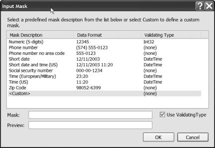
210 |
C H A P T E R 8 ■ B U I L D I N G W I N D O W S A P P L I C A T I O N S |
Figure 8-16. The MaskedTextBox control comes with a number of masks built in.
As you select masks in the list, notice how the Mask and Preview text boxes at the bottom of the dialog box change. The Mask text box shows you the actual value that will be fed into the Mask property of the MaskedTextBox, while the Preview text box shows you what the MaskedTextBox will look like to a user of your application. The underline characters that appear when you click on a format show where the user needs to enter data. Any other characters are inserted automatically.
If you take a look at the masks list, you’ll also notice a third column called Validating Type. In addition to forcing users to meet a certain mask when they enter data, the control can also check that the resulting data will fit into a specific type. For example, you could select a mask that defines just how to enter a date, but there’s still a risk that a user would put the day and month of the date in the wrong order. In that case, using a validating type of System.DateTime will ensure that the data entered not only is in the right format but also is a valid DateTime value. The data type shown here is entered into the ValidatingType property of the MaskedTextBox, a property that you can access only from within your code (it’s not shown in the Properties window).
You don’t have to use a ValidatingType, though. Just like a standard TextBox control, the MaskedTextBox control uses the Validated and Validating events to let you programmatically check that the value entered by the user not only conforms to the correct visual format but also contains a valid value.
C H A P T E R 8 ■ B U I L D I N G W I N D O W S A P P L I C A T I O N S |
211 |
In addition, the MaskedTextBox can automatically fire an event (the MaskInputRejected event) if the data entered by the user fails to match the mask. The reason this event exists is that if the user tries to enter something invalid into the box, the box will beep, but nothing more. Writing code into the MaskInputRejected event handler for a MaskedTextBox lets you provide the user with more information, usually by means of an ErrorProvider or ToolTip control.
Adding ToolTip Help
Another feature that your users might expect to find in your applications is ToolTips. Don’t go overboard, though; as annoying as it can be to not have ToolTips in confusing entry dialog boxes, it can quickly get really tiresome when you can’t move the mouse more than a millimeter without yet another ToolTip popping up.
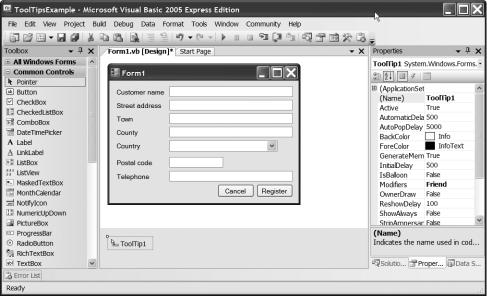
Go ahead and start up a Windows application and produce a form like my registration one from Chapter 7. You don’t have to copy it precisely; just put an assortment of labels and text boxes onto the form.
When you’re finished editing your form, double-click the ToolTip menu control in the Control palette. Notice how even though ToolTips are visible at runtime, the ToolTip control doesn’t actually sit on the form’s surface (see Figure 8-17).
Figure 8-17. The ToolTip control is not actually a visible control.
212 |
C H A P T E R 8 ■ B U I L D I N G W I N D O W S A P P L I C A T I O N S |
Adding a ToolTip control to a form merely makes it possible to show ToolTips. It doesn’t actually set up, display, or hold the tips themselves. Now that you have that control on the form, though, click on one of the text boxes and take a look at the Properties window. You’ll see a new property called ToolTip On ToolTip1. This is the ToolTip that you want displayed when the ToolTip control is enabled and the mouse is over the control. You could have more than one ToolTip control on a form and enable them or disable them at runtime by setting their Enabled properties to True or False. In that way, you could display different kinds of tips based on the user (from novice to expert, for example).
Put something into this property and set up the ToolTip On ToolTip1 properties on some of the other controls. Then run your program.
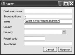
At runtime you’ll find that if you move the mouse over a control that has a ToolTip set and let it hover there for a while, a ToolTip will pop up (see Figure 8-18).
Figure 8-18. With a ToolTip control on the form and enabled, ToolTips associated with controls can be displayed at runtime. It’s automatic.
C H A P T E R 8 ■ B U I L D I N G W I N D O W S A P P L I C A T I O N S |
213 |
Try It Out: Adding an ErrorProvider
The validation example from earlier in the chapter puts up a message box when validation fails. This is a pretty neat visual way for an author to get your attention with some sample code in a book, but it’s not very elegant from a user interface perspective; suddenly the user needs to stop what she is doing and focus her attention on a new window that’s just appeared. It will also become really tedious if you have a complex form with a few dozen input areas that all need validation.
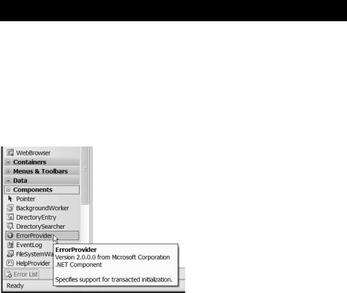
.NET provides a wonderful little control called an ErrorProvider that can help you out. The ErrorProvider exists solely to display icons and error messages for controls with problems. Load up the code you were just working on and then find the ErrorProvider control in the Toolbox. You can see what it looks like in Figure 8-19.
Figure 8-19. The ErrorProvider gives you a wonderful way to draw a user’s attention to problems on a page.
214 |
C H A P T E R 8 ■ B U I L D I N G W I N D O W S A P P L I C A T I O N S |
Double-click the control in the Toolbox to add it to the form. Notice that this is also a nonvisual control; it doesn’t actually appear on the form, but instead appears in the nonvisual controls area underneath the form editor.
What happens behind the scenes, of course, is that by double-clicking the ErrorProvider in the Toolbox, you just added a new ErrorProvider object into the form’s class, just as if you’d written the code by hand yourself.
Drop into the code window now by pressing F7 and find the Validating event handler you wrote in the preceding “Try It Out.” What you’re going to do here is remove the two MessageBox lines and instead use the ErrorProvider to feed error messages back to the user.
Replace both MessageBox.Show lines with the following highlighted code:
Private Sub numberBox_Validating(ByVal sender As System.Object, _
ByVal e As System.ComponentModel.CancelEventArgs) _
Handles numberBox.Validating
Dim numberEntered As Integer
If Integer.TryParse(numberBox.Text, numberEntered) Then If numberEntered < 1 Or numberEntered > 10 Then
e.Cancel = True
ErrorProvider1.SetError(numberBox, _
"You have to enter a number from 1 to 10")
End If
Else
e.Cancel = True
ErrorProvider1.SetError(numberBox, _ "You must enter an integer")
End If
End Sub
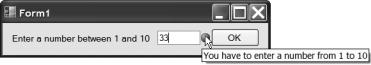
As you can see, the ErrorProvider is really quite easy to use. You just need to call SetError() and pass in the name of the control with the error, and the error message itself. At runtime, an error icon is displayed next to the offending control along with a pop-up ToolTip when you move the mouse over this icon. You can see this in Figure 8-20.
Figure 8-20. The ErrorProvider displays an error icon and a ToolTip containing the error
message next to a control.
C H A P T E R 8 ■ B U I L D I N G W I N D O W S A P P L I C A T I O N S |
215 |
You really should bear the ErrorProvider in mind when writing your own applications. It’s a much better way of providing feedback to users than the somewhat jarring standard of throwing a message box up on-screen for each and every error.
Choosing Things: Radio Buttons and Check Boxes
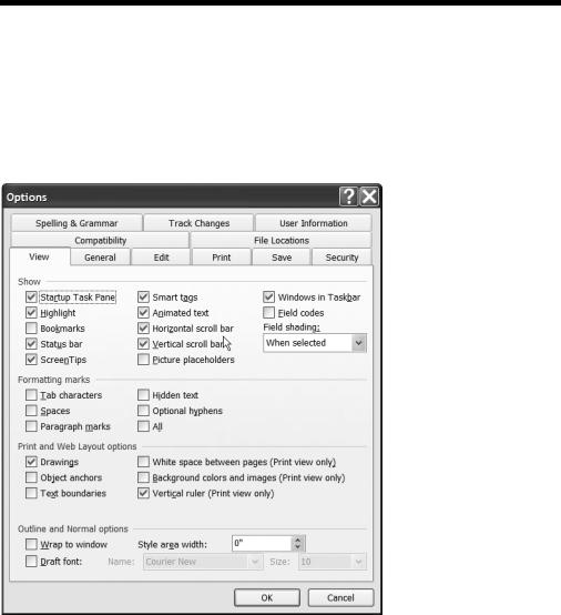
I’m sure you’ve seen option dialog boxes in Windows programs that ask you choose to turn certain things on or off, or to select one from a handful of options. Take a look at the Options dialog box from Microsoft Word in Figure 8-21 to see what I mean.
Figure 8-21. Lots of applications use controls that limit the number of possible things the user can choose.
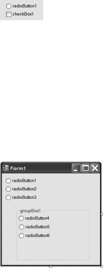
Aside from lists and drop-down lists, which I’ll cover later in this book, the two most common types of control you’ll use for this are the RadioButton and the CheckBox. You can see these in Figure 8-22.
216 |
C H A P T E R 8 ■ B U I L D I N G W I N D O W S A P P L I C A T I O N S |
Figure 8-22. The RadioButton and CheckBox controls limit the number of possible things a user can do or choose.
Although they look similar, the two controls work in very different ways. The check box (that’s the square one) simply forces the user to choose one of two things. Think of it as a switch; it could be on or off, black or white, yes or no, male or female—you get the idea.
The radio button, on the other hand, is mutually exclusive. What that means is that you can select only one radio button from a group. You would use this when you want the user to choose from a very small number of possible things. I recently came across a good example of this on a flight-booking website. Radio buttons were used to force the user to choose the class of ticket: Economy, Business, or First.
There is a catch, though, with radio buttons (isn’t there always): they are mutually exclusive within their container. Take a look at Figure 8-23.
Figure 8-23. Radio buttons are mutually exclusive within their container.
Figure 8-23 shows two sets of radio buttons in two different containers. The first set is placed directly on the form, so selecting any of them will instantly deselect any other in that group.
The second set is contained within a group box and works the same way. This means that even though there are six radio buttons in total, they are split into two groups of three, and the user would be free to choose two at once: one from the first group, and one from the second. Go ahead and build this form in VB Express and then run the program to see what I mean.
C H A P T E R 8 ■ B U I L D I N G W I N D O W S A P P L I C A T I O N S |
217 |
So, radio buttons and check boxes look similar but work in different ways. At a code level, though, they work the same way, exposing the same events and properties to work with them. At an event level, there really is just one event that you’ll be most interested in working with: the CheckedChanged event. It does exactly what it says, firing whenever the user clicks in a control to check or uncheck it.
In terms of properties, the controls support all the standard ones for appearance (Font, Text and so on), but also expose a Checked property. This is a Boolean (True/False) property. If the control is currently checked (selected), the property is True. If it’s False, the control isn’t checked.
Let’s take a look at an example and focus on the RadioButton control.
Try It Out: Radio Buttons
You’re going to produce a small form here for a fictitious flight-booking system. The form itself is the window the user will see when asked to confirm the class of ticket required, so you need to write code to figure what the user chose. You’ll do it the hard way first.
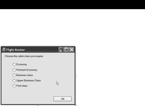
Start up a new Windows project. Then resize the form in the project and drop some radio buttons and a command button onto it so it looks like mine in Figure 8-24.
Figure 8-24. Arrange controls on your application’s form so it looks like this.
You can tell from the screen shot just what the Text properties of all the controls should be. Set the Name of the command button to okButton, and then set the names of the radio buttons to economyRadio, premiumRadio, businessRadio, upperRadio, and firstRadio.
With that out of the way, you can start coding. What I’d like to happen is that when the OK button is clicked, a message box appears confirming the class of ticket the user just selected. As I said a little while ago, you’ll do this the hard way first. That way, when I show you an alternate method shortly, you’ll appreciate it all the more.
218 |
C H A P T E R 8 ■ B U I L D I N G W I N D O W S A P P L I C A T I O N S |
Double-click the OK button to open up the code window and key this in:
Private Sub okButton_Click(ByVal sender As System.Object, _
ByVal e As System.EventArgs) Handles okButton.Click
Dim ticketClass As String
If economyRadio.Checked Then ticketClass = "Economy class"
ElseIf premiumRadio.Checked Then ticketClass = "Premium economy class"
ElseIf businessRadio.Checked Then ticketClass = "Business class"
ElseIf upperRadio.Checked Then ticketClass = "Upper business class"
Else
ticketClass = "First class" End If
MessageBox.Show("You have requested a seat in the " + _ ticketClass + " section of the aircraft")
End Sub
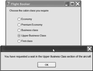
Run the application after you’ve set up the click event handler. You’ll find that you can click a radio button, then the OK button, and see a message telling you just what kind of ticket you ordered. You can see this in Figure 8-25.
Figure 8-25. Providing you typed in all the code correctly, this is what the result will look like.
C H A P T E R 8 ■ B U I L D I N G W I N D O W S A P P L I C A T I O N S |
219 |
There’s not a huge amount of code to type in there, but you’ll probably agree that it doesn’t look very elegant, did take you a little while to key in, and is generally just a bit hard to read. This is the way things used to be done prior to .NET’s arrival.
The code itself is actually quite simple. It declares a string variable to hold the name of the ticket type the user ordered, and then takes a look at the Checked property of each and every radio control on the form in order to figure out just what should be put into the string variable.
Because .NET supports shared event handlers, the same thing could be achieved with a lot less code, and in a much more readable way. From a coding style point of view, this is a good thing, because lots of code, or hard-to-read code, inevitably leads to bugs.
In the click event handler for the button, delete all the code you just typed in, except for the call to MessageBox.Show(). Then add the string variable back in, but near the top of the class itself to make it a member variable of the class. When you are finished, the class will look like this:
Public Class Form1
Dim ticketClass As String
Private Sub okButton_Click(ByVal sender As System.Object, _
ByVal e As System.EventArgs) Handles okButton.Click
MessageBox.Show("You have requested a seat in the " + _ ticketClass + " section of the aircraft")
End Sub
End Class
Okay, so this change makes the button’s event handler a lot more obvious. It shows a message telling the user the type of ticket he just ordered. You just need to write some code now to set up the variable with the correct type of ticket.
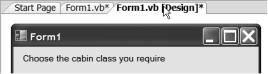
Go back to the form editor by selecting the designer tab at the top of the code window. Just as a memory refresher, it looks like the one in Figure 8-26.
Figure 8-26. You can switch between the code and design views for a form by using the tabs at
the top of the code editor window.