

3. Pie chart
The pie charts below show average household expenditure in Hong Kong and Britain in the year 2000.
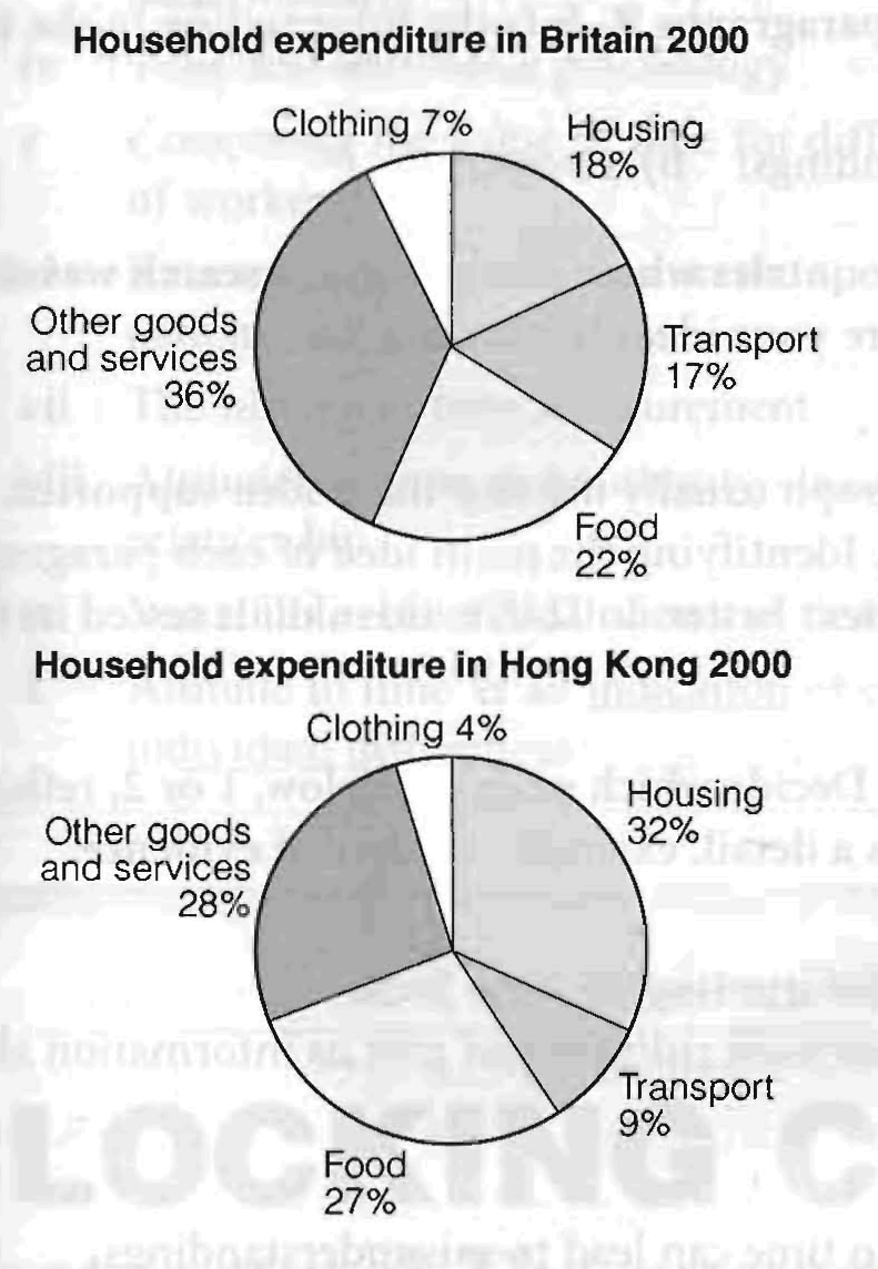
The pie charts show the proportion of money spent on various household expenses in Hong Kong and Britain in 2000.
We can see that in Hong Kong the greatest proportion of expenditure (32%) was on housing, while in Britain housing accounted for just 17% of the total.
In contrast, in Britain the greatest single expense was other goods and services at 36%, compared with 28% in Hong Kong. Food came in second place in Britain, at 22%, while in Hong Kong the actual proportion was higher (27%). In Britain another major expense was transport, at 17%, but this was much lower in Hong Kong (9%). In both countries the smallest percentage of expenditure was on clothing.
Overall, the data indicates that in both cases food, housing and other goods and
services were the main expenses, but that in Britain, transport and other goods and services took up a higher proportion of total expenditure than in Hong Kong.
3. Table
The table below gives information about the daily cost of water per person in five different countries. (Figures are based on the minimum daily requirement per person of 11.5 litres.)
Cost of minimum daily water requirement by country
|
Country |
Daily cost per person (US$) |
Cost as percentage of average daily wage |
|
Tanzania |
6.4 cents |
5.7% |
|
Uganda |
4.1 cents |
3.2% |
|
Pakistan |
1.76 cents |
1.1% |
|
UK |
1.3 cents |
0.013% |
|
US |
0.85 cents |
0.006% |
The table compares the amount people have to pay for their minimum daily water in five countries. It also shows the percentage of the average daily wage this represents in each place.
First of all, we can see that Tanzania and Uganda have the highest daily water costs while/whereas the UK and US have the lowest. This means, for instance, that Tanzanians pay 6.4c whereas/while Americans pay a mere 0.85c for the same amount of water.
These differences are even greater when we consider the percentage of the average daily wage this cost represents. In both Tanzania and Uganda, the cost is significant, representing 5.7% and 3.2% respectively. In the UK and US, however, the cost is only a tiny fraction of the daily wage at 0.013% and 0.006%. And, despite the daily cost of water in Pakistan being similar to that in the UK, it represents as much as 1.1% of the daily wage.
Overall, the table shows that there are huge differences between the cost of water in the developing countries and the industrialised west.
3.1
The table below gives figures for student applications and acceptances for UK university courses in the field of tourism, transport and travel.
Student statistics for university courses in tourism, transport and travel, 2000-2002
|
Applications |
Acceptances |
||||
|
year |
men |
women |
men |
women |
% of total |
|
2000 |
3,400 |
900 |
550 |
150 |
15.5 % |
|
2001 |
3,200 |
800 |
600 |
200 |
20% |
|
2002 |
2,750 |
750 |
580 |
170 |
21.4% |
The table concerns university courses related to tourism, transport and travel in the UK. It shows changes in the numbers of male and female students applying for and being accepted on such courses between 2000 and 1002.
Firstly, we can see that with regard to applications, in all three years, more men applied for such courses than women, although their numbers fell / declined / decreased / went down considerably, from 3,400 in 2000 to 2,750 in 2002. Female applications reached little more than a quarter of the figures for men in 2000 and 2001, and they fell / declined / decreased / went down to 750 in 2002. Total applications fell / declined / decreased / went down during the period.
In terms of acceptances, many more men and women applied for these courses than were accepted throughout the three years. However, the percentage of applications which were accepted rose/grew/increased/went up from about 15% in 2000 to over 21% in 2002, even though the total number rose / grew / increased / went up only slightly.
Overall, many more men were accepted than women in all three years. While total applications fell / declined / decreased / went down, the percentage of those accepted rose/grew/increased/went up considerably.
3.2
The table below gives information about the use of different modes of transport in Shanghai in 1996, and one possible projection (high motorisation scenario) for their use in 2020.
Percentage of passenger kilometres by different modes of transport in Shanghai
|
Mode of Transport |
1996 |
2020 (projection) |
|
walking |
7% |
3% |
|
bicycle |
27% |
3% |
|
scooter |
12% |
7% |
|
bus |
39% |
22% |
|
train |
- |
13% |
|
car |
15% |
52% |
The table predicts changes in the types of transport used in Shanghai between 1996 and 2020.
The figures show that in 1996 the most popular form of transport was public bus, accounting for 39% of passenger kilometres. This was followed by bicycles with 27% whereas cars and scooters were used less, representing only 15% and 12% of passenger trawl respectively. Predictably, walking made up the smallest percentage.
It is expected that in 2020 the use of cars will increase dramatically and account for over half of all distance travelled (52%). In addition, trains will probably account for 13% of passenger kilometres, while the use of all other means of transport will decrease, bus journeys, for example, will only represent 22% of distances travelled, while bicycle trips will drop to as little as 3%, similar to the figure for walking.
Overall, the table predicts a massive increase in the use of cars by 2020, at the expense of other forms of transport.
ASSESSMENT OF WRITING TASK
1.
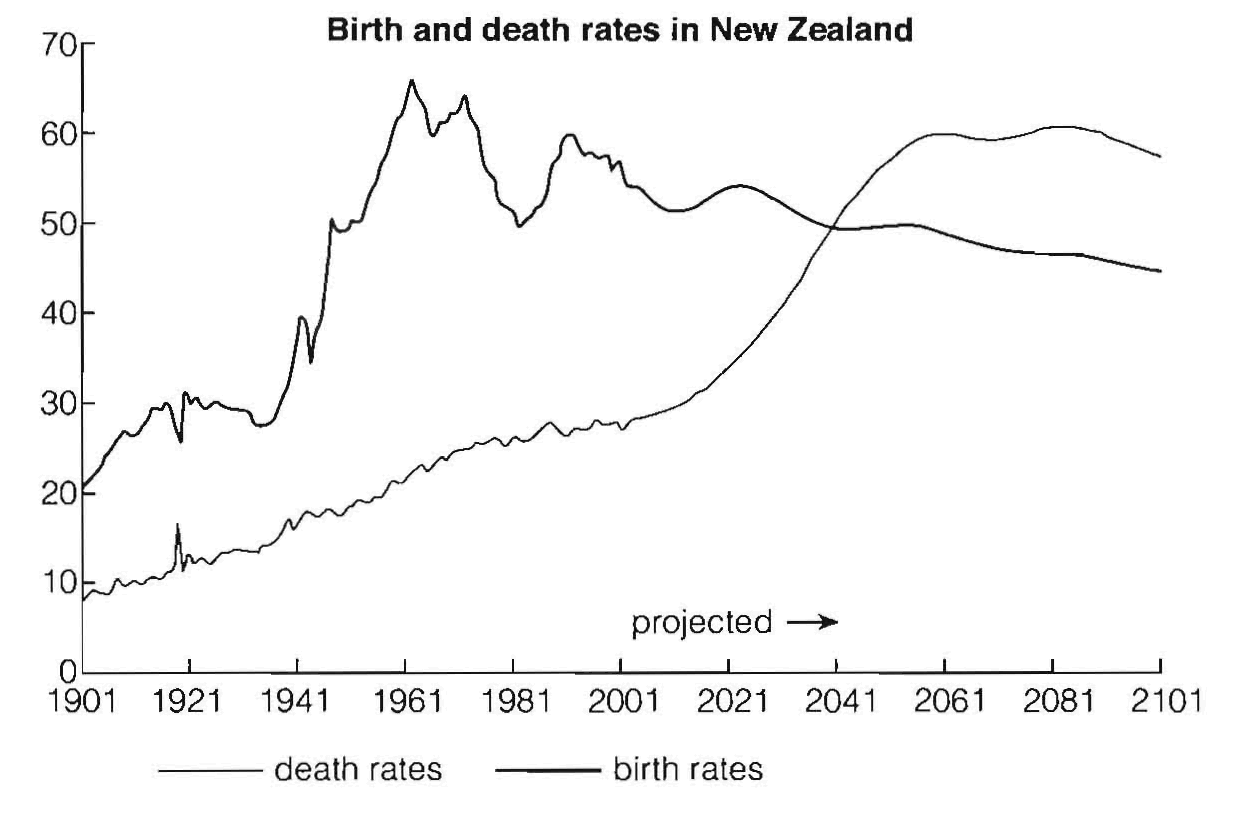
The graph below gives information about changes in the birth and death rates in New Zealand between 1901 and 2101.
Write a report for a university lecturer describing the information shown below.
Write at least 150 words.
Birth and death rates in New Zealand
Sample answer A
The graph gives information about changes in the birth and death rates in New Zealand between 1901 and 2101.
In 1901 the birth rate was 20,000 and the death rate was 9,000. \n 1961 the birth rate reached a peak of 66,000 while the death rate was 23,000. In 2001 there were 55,000 births and 38,000 deaths, and in 2061 there were 60,000 deaths and 48,000 births.
At the end of the period there were 58,000 deaths and 45,000 births.
Both the birth and death rates changed between 1901 and 2101. Perhaps this was because a lot of people did not want to have children.
(105 words)
Assessment
This is a weak answer. Problems:
• underlength
• introduction is copied from task
• no comparison between figures
• no focus on general trends
• no reference to the future (see projection on graph)
• conclusion tries to explain information rather than summarise it
• poor linking of ideas (only done by time markers)
• limited range of grammar and vocabulary
Sample answer B
The graph shows changes in the birth and death rates in New Zealand since 1901, and forecasts trends up until 2101.
Between 1901 and the present day, the birth rate has been consistently higher than the death rate. It stood at 20,000 at the start of this period and increased to a peak of 66,000 in 1961. Since then the rate has fluctuated between 65 and 50 thousand and it is expected to decline slowly to around 45,000 births by the end of the century.
In contrast, the death rate started below 10,000 and has increased steadily until the present time. This increase is expected to be more rapid between 2021 and 2051 when the rate will probably level off at around 60,000, before dropping slightly in 2101.
Overall, these opposing trends mean that the death rate will probably overtake the birth rate in around 2041 and the large gap between the two levels will be reversed in the later part of this century.
(166 words)
Assessment
This is a strong answer which would score a high IELTS band: Good points:
fulfils criteria for length
introduction is paraphrased.
main sets of data are compared and contrasted
clear focus on the different trends.
important features of the graph, (e.g. cross-over point) included
information summarised in conclusion
well organised information
range of linkers and referencing expressions
good range of vocabulary and structures, used accurately
2.
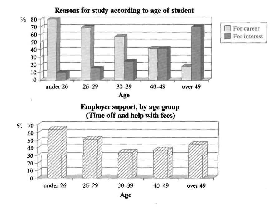
The charts below show the main reasons for study among students of different age groups and the amount of support they received from employers.
Summarise the information by selecting and reporting the main features, and make comparisons where relevant.
Sample answer
The first graph shows that there is a gradual decrease in study for career reasons with age. Nearly 80% of students under 26 years, study for their career This percentage gradually declines by 10-20% every decade Only 40% of 40-49 year olds and 18% of over 49year olds are studying for career reasons in late adulthood.
Conversely, the first graph also shows that study stemming from interest increases with age. There are only 10% of under 26уear olds studying out of interest. The percentage increases slowly till the beginning of the fourth decade, and increases dramatically in late adulthood. Nearly same number of 40-49yr olds study for career and interest. However 79% of over 49year olds study for interest in comparison to 18л studying for career reasons in that age group.
The second graph shows that employer support is maximum (approximately 60%) for the under 26yr students. It drops rapidly to 32% up to the Third decade of life, and then increases in late adulthood up to about 44%. If is unclear whether employer support is only for career-focused study, but the highest level is for those students who mainly study for career purposes.
Assessment
This answer summarises the key features of both charts and integrates them well. Clear trends are identified and supported with appropriately-selected figures. The answer could only be improved by adding an introduction to the general topic of the charts.
The information is well organised, with a clearly-signalled progression. Linking words are used accurately and precisely, although there is occasional omission. Paragraphing is used well initially, but lapses in the later section.
A very good range of vocabulary is used to convey the information concisely and accurately with only occasional inappropriacy. Words are used precisely and there are no errors in spelling or word form.
A wide range of structures is used and most sentences in this answer are accurate. Errors are rare and do not affect communication in this answer.
3
The table below gives information about the underground railway systems in six cities.
Summarise the information by selecting and reporting the main features, and make comparisons where relevant.
Underground Railway Systems
|
City |
Date opened |
Kilometres of route |
Passengers per year (in millions) |
|
London |
1863 |
394 |
775 |
|
Paris |
1900 |
199 |
1191 |
|
Tokyo |
1927 |
155 |
1927 |
|
Washington DC |
1976 |
126 |
144 |
|
Kyoto |
1981 |
11 |
45 |
|
Los Angeles |
2001 |
28 |
50 |
Sample answer
The table shows the details regarding the underground railway systems in six cities.
London has the oldest underground railway systems among the six cities. It was opened in the year 1863, and it is already 140years old. Paris is the second oldest, in which it was opened in the year 1900. This was then followed by the opening of the railway systems in Тоkyо, Washington DC and Kyoto. Los Angeles has the newest underground railway system, and was only opened in the year 2001. In terms of the site of the railway systems, London, for certain, has the largest underground railway systems. It has 394 kilometres of route in total, which is nеагly twice as large as the system in Paris. Кyotо, in contrast, has the smallest system. It оnly has 11 kilometres of route, which is more than 30 times less than that of London.
Interestingly, Tokyo, which оnly has 155 kilometres of route, serves the greatest number of passengers per year, at 1927 millions passengers. The system in Paris has the second greatest number of passengers, at 1191 millions passengers per year. The smalest underground railway system, Kyoto, serves the smallest number of passengers per year as predicted.
In conclusion, the underground railway systems in different cities vary a lot in the size of the system, the number of passengers served per year and in the age of the system.
Assessment
This answer selects and describes the information well. Key features are clearly identified, while unexpected differences are highlighted and illustrated. The answer is relevant and accurate with a clear overview.
Information is well-organised using a good range of signals and link words. These are generally accurate and appropriate, although occasional errors occur.
The writer successfully uses some less common words. There is a clear awareness of style but there are occasional inaccuracies and there is some repetition. Grammar is well-controlled and sentences are varied and generally accurate with only minor errors.