

1. Graph
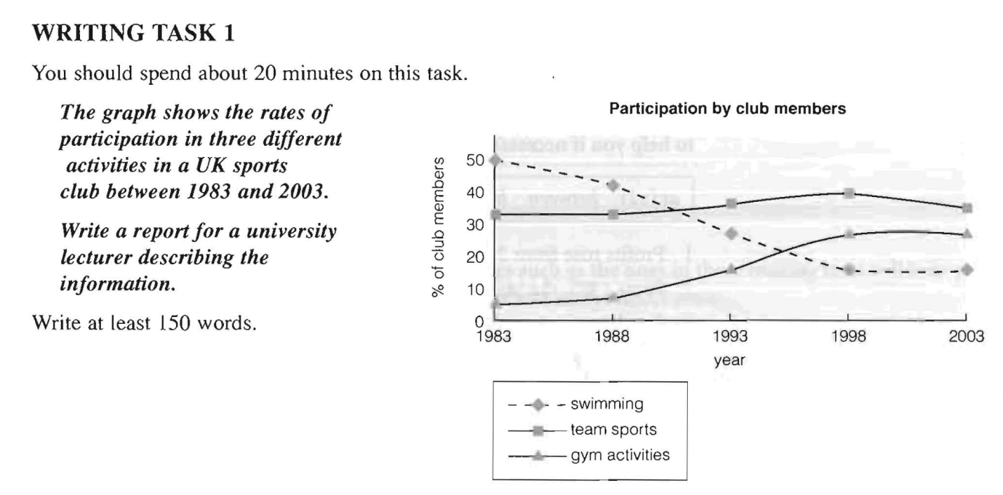
This graph shows changes in the popularity of three different activities in a UK sports dub over a period of 20 years.
In 1983 around 50% of club members participated in swimming, so this was clearly the most popular activity. However, this figure decreased steadily to 15% in 1998 and remained constant off at this rate until 2003.
In contrast, 32% of members did team sports in 1983, and this rate reached a peak of 40% in 1998 before dropping to its former level. Participation rates for team sports overtook those for swimming and became the highest for all activities from 1993 to 2003.
Finally, participation in gym activities stood at only 5% in 1983, but this figure grew rapidly from 1988 to 1998, eventually levelling off at around 25%, making gym the second most popular activity.
Overall, participation in swimming dropped considerably during the period. Team sports, however, remained popular, while participation in gym activities rose significantly over the period.
1.1
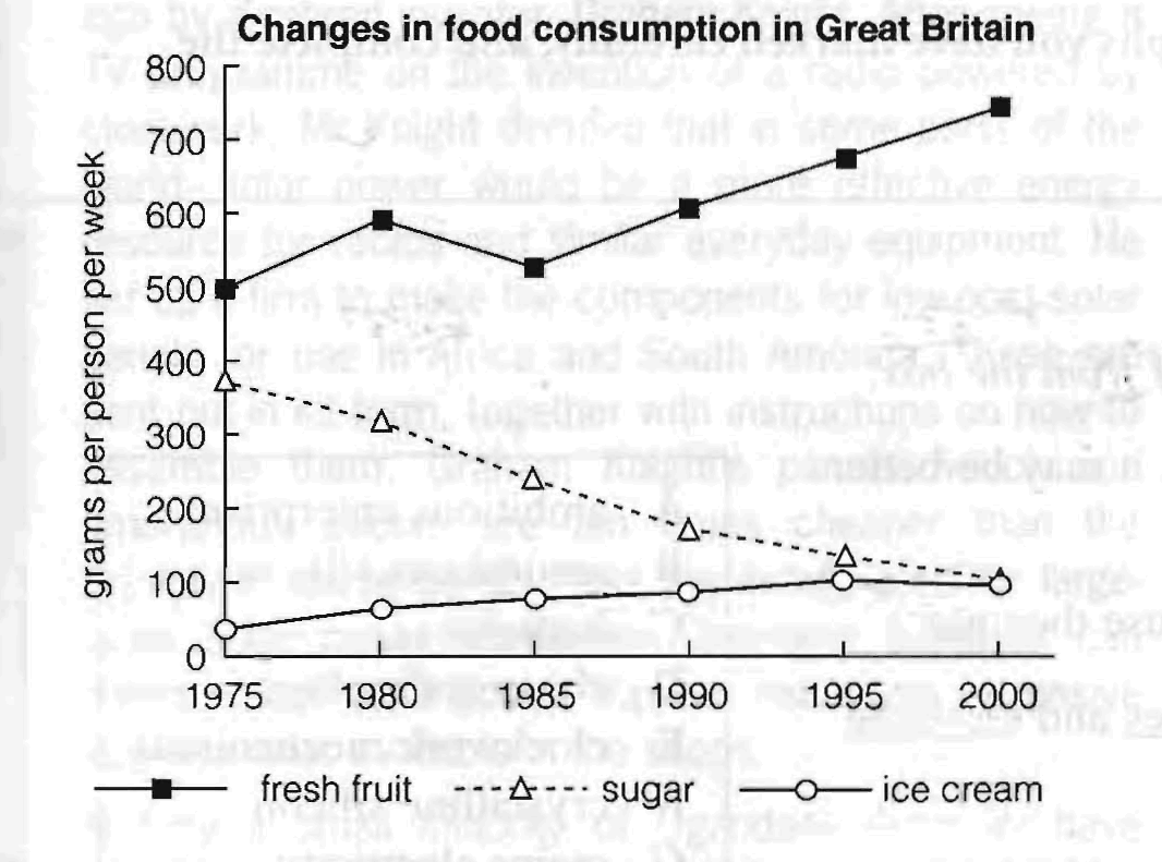
The graph shows changes in the amount of fresh fruit, sugar and ice-cream eaten per person per week in Britain between 1975 and 2000.
People consumed more fresh fruit than either sugar or ice-cream throughout the period.
In 1975, the consumption of fresh fruit stood at 500 grams, then increased to 600 grams in 1980.
Although it dipped in 1985, it then rose steadily and reached 750 grams in 2000.
In contrast, there was a consistent drop in sugar consumption.
The amount consumed decreased steadily from almost 400 grams per person to only 100 grams by 2000.
The amount of ice-cream consumed weekly started at about 50 grams.
However, this gradually increased throughout the period.
By 2000 it was at the same level as the consumption of sugar.
From the graph we can see that overall, the consumption of fruit rose, while the consumption of sugar fell.
In addition, the consumption of ice-cream, while at a relatively low level, rose significantly during this period.
2. Bar chart
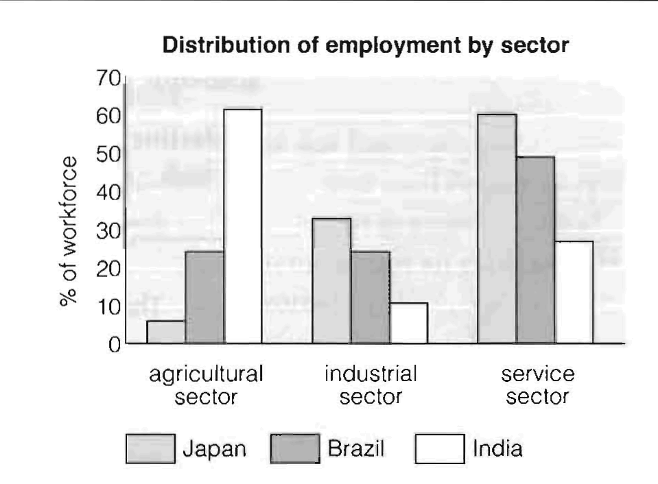
The bar chart gives information about the percentage of workers in different sectors of employment in three countries at different stages of economic development.
-
In Japan the highest proportion / the largest percentage of the workforce is in the service sector.
-
India has many more people employed in the agricultural sector than either Japan or Brazil, but it has fewer workers in the industrial sector.
-
Brazil has as many workers in the agricultural sector as it has in the industrial sector.
-
In India, most people work in the agricultural sector.
-
The majority of workers in Brazil are in the service sector.
-
The lowest proportion of Japanese workers are employed in the agricultural sector.
-
Of the three countries, Japan has the highest/largest percentage of employees in the industrial sector.
-
Countries which have more developed economies seem to have a larger percentage of the workforce in the service sector.
The chart compares proportion of the workforce employed in agricultural, industial and service sectors in three economically different countries.
First of all, we can see that both Japan and Brazil have the the largest percentage of the workforce in the service sector (61% and 50% respectively). But while Japan has the fewest people employed in the agricultural sector with only 7% of the working population, an equal number of Brazilians work in the agriculture and industry sectors (25% in each).
In contrast, we can see that the majority of the Indian workforce, amounting to 61%, is employed in the agricultural sector, the lowest percentage / smallest proportion of employees work in industry and the remaining 27% are in the service sector.
Overall, the data indicates that countries with more developed economies have a higher proportion of workers in the industrial and service sectors than in the agricultural sector.