

Примеры брендбуков / microsoft_windows-xp
.pdf
Windows XP Visual Guidelines: Controls
Text Field Border Color:
Normal: R: 127 G: 157 B: 185
Disabled: R: 245 G: 244 B: 234
Dropdown Combo Box states
Scroll Bars
Scroll bars are composed of three different pieces: the scroll arrow buttons, the scroll box, and the scrollbar shaft which is the vertical background of the scroll bar.
Scroll box and button states
file:///C|/temp/controls.htm (4 of 14)28.02.2004 0:36:27
Windows XP Visual Guidelines: Controls
Scroll shaft states
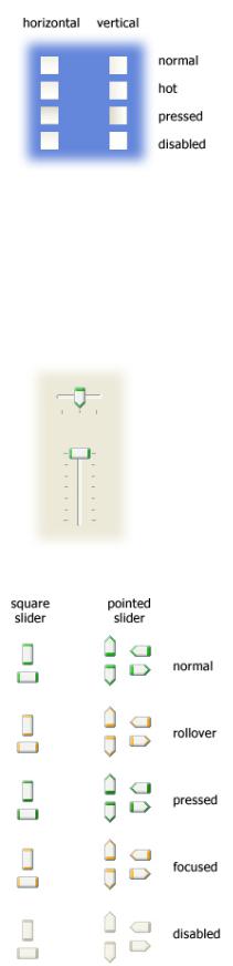
Slider
The slider control can be displayed in a vertical or horizontal orientation. Sliders are available in two different styles: square and pointed. The square style is typically used for vertical sliders, and the pointed style is used horizontally.
Slider control states
Spin Buttons
The text for an edit box should change depending on its state.
file:///C|/temp/controls.htm (5 of 14)28.02.2004 0:36:27

Windows XP Visual Guidelines: Controls
Text Field Normal
Outline Color: R: 130 G: 130 B: 130
Fill Color: R: 255 G: 255 B: 255
Text Field Disabled
Outline Color: R: 161 G: 161 B: 146
Fill Color: R: 235 G: 235 B: 228
Left/right spin buttons
Up/down spin buttons
Windows Status Bar
The status bar is located at the bottom of a window and displays information about the current state of the document or other information in the window.
The status bar is composed of 3 different pieces: the background area, separators to group information and grippers for resizing the window.
Example of a status bar
Separator Left Line: R: 199 G: 197 B: 178
Separator Right Line: white
Gripper Front Squares: R: 184 G: 180 B: 163
file:///C|/temp/controls.htm (6 of 14)28.02.2004 0:36:27

Windows XP Visual Guidelines: Controls
Gripper Front Squares: white
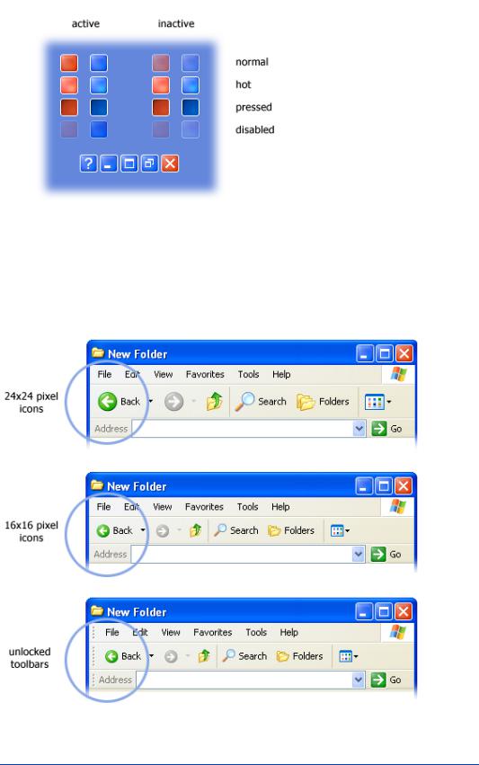
Window Title Bar and Frame
The window title bar and frame are the outer most elements of a window. There are two sets of frames and title bars: standard windows and tool palettes.
Standard window components in actual size
Title Bar Buttons
file:///C|/temp/controls.htm (7 of 14)28.02.2004 0:36:27
Windows XP Visual Guidelines: Controls
Example of the states for Title Bar buttons
Toolbars
The Windows XP toolbar displays 2 icon sizes: 24x24 and 16x16 pixels. There are 2 icon states: default and hot. By default, the icons are in color and on mouse-over they appear slightly more saturated.
Example of toolbar
Menus
Here are the colors and states for menus:
file:///C|/temp/controls.htm (8 of 14)28.02.2004 0:36:27

Windows XP Visual Guidelines: Controls
Highlight Background Color: R: 49, G: 106, B: 197
Highlight Text Color: R: 255, G: 255, B: 255
Border + Separator Color: R: 128, G: 128, B: 128
Disabled Text Color: R: 128, G: 128, B: 128
Background Color: R: 255, G: 255, B: 255
Enabled Text Color: R: 0, G: 0, B: 0
Column Heading Controls
The column heading control, also called a header control, has some new visual cues to help you sort your information. When you mouseover a column, an orange highlight appears on the column's header. Clicking on a column to sort displays a grey background under the list to give feedback on the sort selection.
Example of column header states
file:///C|/temp/controls.htm (9 of 14)28.02.2004 0:36:27
Windows XP Visual Guidelines: Controls
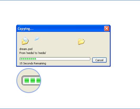
Progress Indicator
The progress indicator is composed of the progress track and the progress indicator. The progress track is the outline of the progress indicator. The progress indicator is the green square that fills the progress track.
Navigation Buttons
Navigation buttons are used for actions that navigate the user to a new place in Windows XP. The signage style of these buttons emphasizes their navigational purpose.
These buttons are used for a defined set of tasks or actions in Windows
XP. They should not be used for command buttons.
The color of the navigational buttons is designed to convey the level of severity of the action. Windows XP uses four colors:
Blue: A neutral action. Example: the control to minimize a window.
Green: The start of an action, or a simple navigation. Example: the Go button in the Address bar.
Red: |
An action that has a high impact result. Examples: the Close button in |
|
the title bar; the Shut down button in the Start menu. |
Yellow: A less severe result than red, but still high impact. Example: the Log
Off button in the Start menu.
These navigation buttons are used at these sizes: 32x32, 24x24, 21x21, 16x16, and 13x13 pixels.
file:///C|/temp/controls.htm (10 of 14)28.02.2004 0:36:27

Windows XP Visual Guidelines: Controls
Navigational buttons are completed by adding a white sign to the colored background. The following signs are available in Windows XP:
Start button and Taskbar
The Start button and taskbar define the look of Windows: colorful, softly curved and engaging the user in a fresh yet familiar way.
We've colored the Start button green to help improve discoverability of where users should to being their experience. Move your mouse over the Start button and it lights up to give you feedback. The plastic texture of the taskbar gives a nice tactile feel and the notification area on the right uses a lighter color value to indicate it has a unique usage.
Start button and taskbar
file:///C|/temp/controls.htm (11 of 14)28.02.2004 0:36:27

Windows XP Visual Guidelines: Controls
Taskbar button states
Start button states
Taskbar Elements
These are some of the main elements of the taskbar:
When you open several windows in one application, Windows XP automatically groups them together in one taskbar button, making the taskbar less cluttered and easier to use.
Locking the taskbar
The taskbar is locked by default to prevent users from moving it accidentally. To unlock the taskbar, right-click on a blank area of the taskbar and select Lock the taskbar. A gripper bar at the top of the taskbar appears when the taskbar is unlocked.
file:///C|/temp/controls.htm (12 of 14)28.02.2004 0:36:27

Windows XP Visual Guidelines: Controls
Taskbar Orientations
Top
Bottom
file:///C|/temp/controls.htm (13 of 14)28.02.2004 0:36:27